the design of everyday things norman 1990 design
play

The design of everyday things (Norman, 1990) Design principles The - PowerPoint PPT Presentation

The design of everyday things (Norman, 1990) Design principles The ordinary objects reflect the problems of user interface design Usability Door handles Evaluation Washing machines Telephones etc. Introduces the notion of


  1. The design of everyday things (Norman, 1990) Design principles The ordinary objects reflect the problems of user interface design Usability � Door handles Evaluation � Washing machines � Telephones � etc. Introduces the notion of affordance , metaphores , and conceptual models Provides design rules Metaphor 
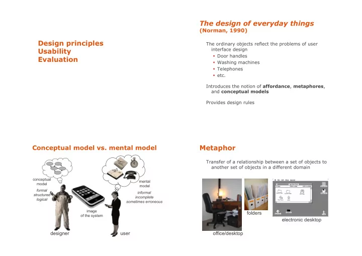
Conceptual model vs. mental model Transfer of a relationship between a set of objects to another set of objects in a different domain conceptual mental model model formal informal structured incomplete logical sometimes erroneous image folders of the system electronic desktop designer user office/desktop

  2. Affordances Affordances Quality of an object, which allows a user to perform an action The form, the size, the view of the object suggest what we can do with it « Much of everyday knowledge resides in the world, not in the head » (Norman, 1988) Affordances Affordances Button for pressing Dials for turning but action unknown Sliders for These sliding buttons?

  3. Affordances Perceived Affordances in this UI? The concept of affordance was first introduced by psychologist James J. Gibson in 1977. Gibson’s affordances are independent of the individual’s ability to recognize them. They depend on their physical capabilities. Norman’s affordances also depend on the individual’s perception. Norman explained that he would rather replace his term by the term « perceived affordances » . Constraints Constraints Our mental models of the mechanics and physics Are these user interfaces effective? help us predict and simulate the operation of an object

  4. Mappings Mappings Example: Find the correspondance between the stove Example: Find the correspondance between the stove burners and the controls burners and the controls ...and now? Example: designing a watch Example: designing a watch Conceptual model? Conceptual model? Affordances? Affordances? Mappings? Mappings? ...and user feedback ?

  5. Norman’s principles (1990) Usability 1. Make things visible « The extent to which a product can be used by specified We can know the state of a system by observing the users to achieve specified goals with effectiveness, user interface efficiency, and satisfaction in a specified context of use » 2. Principle of mapping (ISO 9241) 3. Principle of feedback A usable system is: easy to learn, easy to memorize, efficient, visually appealing and fast to recover from errors Inform the users about the state & result of their actions Usability principles (Nielsen 2001) Utility vs. Usability Visibility of system status Match between system and the real world A B User control and freedom utility high Consistency and standards Nielsen and Norman Help users recognize, diagnose and recover from errors C D Error prevention low Recognition rather than recall low high Flexibility and efficiency of use usability Aesthetic and minimalist design Help and documentation Is D better than A? What do you think?

  6. Visibility & feedback Visibility & feedback Objective: aid the use and learning of a system Recommendations: feed-forward gray out non-available commands Feed-back and feed-forward mechanisms to make input possibilities clear give list of possible inputs instead of typing reduce memory load give example of expected input prevent errors (more later) give intelligent default values reassure (e.g., progression of an operation) Recommendations: feed-back helps user understand each user action should be followed by a changed what actions are available representation in the interface what the system is doing inform users of long operations how it is interpreting the user’s input indicate currently used modes show status of system operations in progress … users should always be aware of what is going on Visibility & feedback Visibility & feedback Dealing with long delays System Response time (time to give feedback) Cursors how users perceive delays for short transactions < 0.1s perceived as “instantaneous” Percent done dialogs time/work left 1s user’s flow of thought stays uninterrupted, but estimated time delay noticed 10s limit for keeping user’s attention focused on the dialog Random for unknown times > 10s user will want to perform other tasks while waiting

  7. Visibility & feedback Match between system and real world Currently used modes The system should be integrated in user activities What mode Recommendations : am I in now? speak the user’s language e.g., informative messages information coherent with respect to other tools the user uses e.g., electronic version of a paper form What did I access to commands compatible to user’s task select? How is the e.g., frequent commands more visible, order of windows system interpreting Need to study and analyze user work practices my actions? Match between system and real world Match between system and real world Be as specific as possible about operations, Use meaningful mnemonics, icons & abbreviations based on user’s input e.g. File / Save Ctrl + S (abbreviation) Alt FS (mnemonic for menu action) (tooltip icon) Best within the context of the action

  8. User control and freedom Match between system and real world Users don’t like to feel trapped by the computer! should offer an easy way out of as often as possible Good use of metaphors and transfers Strategies: Cancel button (for dialogs waiting for user input) Universal Undo and Redo (can get back to previous state) Interrupt (especially for lengthy operations) Quit (for leaving the program at any time) Defaults (for restoring a partially filled form) … consider autosaving From Microsoft applications Consistency & standards Consistency & standards Global coherence of interface Recommendations internal: inside the application windows should look similar external: between applications (e.g., icons, shortcuts), e.g., search box at top right w.r.t. the metaphor of the system (e.g., desktop) consistent graphics e.g., information/controls in same location on all windows Principle: a system that seems familiar is seen as easy same vocabulary used for commands as other systems to use by users e.g., open / copy-paste / preferences / … syntax of commands coherent across all the interface Goal: help learning and use e.g., similar actions have similar effects Consistency is not only visual consistency Risk: block system evolution (rigidity of standards) Other examples: syntax, interaction, command result

  9. Consistency & standards Error prevention Style guides: published by system designers Even better than good error messages is a careful design describe the look and feel of a platform which prevents a problem from occurring in the first place. are often too strict: help those who follow them and make life difficult for anyone who wants to deviate … Either eliminate error-prone conditions or check for them Examples: and present users with a confirmation option before they commit to the action. � Apple Human Interface Guidelines � iOS Human Interface Guidlines � MS Windows Design Guidelines � Android Design Principles In principle good, but can be hard to follow Implemented (in part) in interface toolkits Error prevention Error prevention Prevent errors: try to make errors impossible Mode errors do actions in a mode thinking you are in another refer to file that’s in a different directory look for commands / menu options that are not relevant minimize by have as few modes as possible (or none) make modes highly visible Provide reasonable checks on input data e.g., if entering order for office supplies 500000 pencils is an unusually large order. Do you really want to order that many?

  10. Error recovery Error recovery Prevent/mitigate continuation of wrongful action: Help users recognize, diagnose, and recover from errors Gag deals with errors by preventing the user from continuing Error messages should be expressed in plain e.g., cannot get past login screen until correct password entered language (no codes) Warn Precisely indicate the problem, and warn people that an unusual situation is occurring constructively suggest a solution. … when overused, becomes an irritant e.g., audible bell, alert box Error recovery Error recovery Do nothing Lets talk about it illegal action just doesn’t do anything system initiates dialog with user to come up with user must infer what happened solution to the problem e.g., enter letter in numeric-only field (key clicks ignored) e.g., compile error brings up line in source code e.g., put a file icon on top of another file icon (returns it to original position) Teach me Self-correct system asks user what the action was supposed to have meant system guesses legal action and does it instead action then becomes a legal one but leads to a problem of trust e.g., spelling corrector e.g., adding a word in the spelling dictionary

Download Presentation
Download Policy: The content available on the website is offered to you 'AS IS' for your personal information and use only. It cannot be commercialized, licensed, or distributed on other websites without prior consent from the author. To download a presentation, simply click this link. If you encounter any difficulties during the download process, it's possible that the publisher has removed the file from their server.

Recommend


More recommend