Thanks and also hosts the webpages and javascript libraries. - - PowerPoint PPT Presentation

thanks
SMART_READER_LITE
LIVE PREVIEW

Thanks and also hosts the webpages and javascript libraries. - - PowerPoint PPT Presentation

OUTLINE What are we going to do with the data? What are we going to do? What are we going to do? Two-dimension table 1.Analyze data from a US based non-profit organization website that visualize allows individuals to donate money directly to


slide-1
SLIDE 1

Problem-Driven Design Studies

  • -Money Donation to Public

School

By Huaying Tian & Arthur Sun
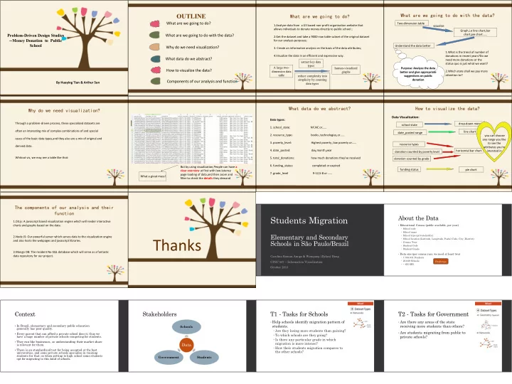
OUTLINE

What are we going to do with the data? How to visualize the data? What data do we abstract? Why do we need visualization? What are we going to do? Components of our analysis and function

What are we going to do?

1.Analyze data from a US based non-profit organization website that allows individuals to donate money directly to public school ; 2.Get the dataset and take a 9000-row table subset of the original dataset for our analysis purposes;

  • 3. Create an informative analysis on the basis of the data attributes;

4.Visualize the data in an efficient and expressive way. A large two- dimension data table human-visualized graphs astract key data types reduce complexity into simplicity by counting data types

What are we going to do with the data?

Two-dimension table visualize Graph,i.e line chart,bar chart,pie chart…… Understand the data better 1.What is the trend of number of donations in recent years?Do we need more donations or the status quo is just what we want? 2.Which state shall we pay more attention to? Purpose: Analyze the data better and give appropriate suggestions on public donation

Why do we need visualization?

Through a problem-driven process, these specialized datasets are

  • ften an interesting mix of complex combinations of and special

cases of the basic data types,and they also are a mix of original and derived data. Whitout vis, we may see a table like that: What a great mass! But by using visualization,People can have a clear overview at first with low-latency page loading of data,and then zoom and filter to check the details they demand

What data do we abstract?

Data types:

  • 1. school_state: NY,NC or……
  • 2. resource_type: books ,technologies,or……
  • 3. poverty_level: Highest poverty ,low poverty or……
  • 4. date_posted: day,month,year
  • 5. total_donations: how much donations they've received
  • 6. funding_status: completed or expired
  • 7. grade_level 9-12,5-8 or ……

How to visualize the data?

Data Visualization:

school state drop-down menu date_posted range line chart you can choose any range you like to see the attributes you're intersted in resource types donation counted by grade donation counted by poverty level funding status pie chart horizontal bar chart

The components of our analysis and their function

1.D3.js: A javascript based visualization engine which will render interactive charts and graphs based on the data. 2.Node JS: Our powerful server which serves data to the visualization engine and also hosts the webpages and javascript libraries. 3.Mongo DB: The resident No-SQL database which will serve as a fantastic data repository for our project.

Thanks

Students Migration

Elementary and Secondary Schools in São Paulo/Brazil

Carolina Roman Amigo & Wenqiang (Dylan) Dong CPSC 547 – Information Visualization October 2015

About the Data

§ Educational Census (public available, per year) – School code – School name – School type (private/public) – School location (Latitude, Longitude, Postal Code, City, District) – Census Year – Student Code – Student Grade

  • Data size (per census year, we need at least two)

– 7.789.831 Students – 20.029 Schools – ~ 650 MB Challenge

Context

§ In Brazil, elementary and secondary public education

generally has poor quality.

§ Every parent that can afford a private school does it, thus we

have a huge number of private schools competing for students.

§ They run like businesses, so understanding their market share

is relevant for them.

§ There is an standardized test for being accepted at the best

universities, and some private schools specialize in training students for that; so when getting to high school some students

  • pt for migrating to this kind of schools.

Stakeholders

Data

Schools Students Government

T1 - Tasks for Schools

  • Help schools identify migration pattern of

students. – Are they losing more students than gaining? – To which schools are they going? – Is there any particular grade in which migration is more intense? – How their students migration compares to the other schools?

T2 - Tasks for Government

  • Are there any areas of the state

receiving more students than others?

  • Are students migrating from public to

private schools?

slide-2
SLIDE 2

T1 - Help schools identify migration pattern of students T2 - Which areas of the state are receiving more students?

Thank you!

Carolina Roman Amigo carolamigo@gmail.com Wenqiang (Dylan) Dong wdong@cs.ubc.ca

VISUALIZATION OF YOUTUBE COMMENTS

  • Doesn’t support easy finding of entertaining

comments.


  • Emotionally draining arguments and trolls.


  • Doesn’t support easy finding of entertaining

comments.


Task 1: Explore for entertaining comments.

  • Emotionally draining arguments and trolls.


Task 2: Identify arguments.
 Task 3: Identify trolls.

  • Entertaining comments = highly liked comments

(generally)


  • Arguments = Long back-and-forth between

two users with little or no likes


  • Trolls = A single user (with little or no likes)

being bombarded by multiple users
 
 
 Idea: A Bird’s Eye View of the 
 Youtube Comment Section

Neuron electrophysiology data visualization (Neuroelectro)

Presented by: Dmitry, Emily and Mike

Introduction

Dmitri How does your brain work? It’s complicated

https://www.youtube.com/watch?v=u28ijlP6L6M

How does your brain work? It’s complicated

https://www.youtube.com/watch?v=u28ijlP6L6M

askabiologist.asu.edu

What is our data? Electrophysiology is the study of the electrical properties of biological cells and tissues. In neuroscience, it includes measurements of the electrical activity of neurons, and particularly action potential activity.

  • wikipedia

courses.candelalearning.com

slide-3
SLIDE 3

What is our data? How many neuron types are there? The debate has been ongoing for decades. We use enhanced NeuroLex.org definitions (~100 Neuron types)

http://www.anatomyzone.com

What is our data?

www.leica-microsystems.com

Experimental metadata - solutions used, temperature, electrode types, animal species, strain and age, etc. What is our data? To summarize we have (per article): 1) Electrophysiology properties 2) Neuron types 3) Experimental metadata We extract all of the above from published articles through text-mining and curation.

Current State

Mike

Problem Characterization

Emily Problem Characterization

  • We met with our stakeholder to ascertain high-level questions:

○ What do cells in different parts of the brain do? ○ How do experimental conditions affect electrophysiological measurements? ○ etc.

  • We refined these into a few abstract tasks...

Task Analysis

  • Discover relationships

○ Neuron types (categorical) ○ Electrophysiological properties (quantitative) ○ Experimental conditions (quantitative and categorical)

  • Narrow scope of analysis

○ Select experimental conditions and ephys properties to include ○ Filter by neuron type, ephys property, and experimental conditions

slide-4
SLIDE 4

Task Analysis

  • Explore sparseness of data

○ How many data points for each neuron type? property? experimental condition?

  • Localize neuron types and ephys properties in the brain
  • Lookup details for individual data points

Tentative Solution

How much time?

Henry

Data Description

  • Activity log of my commitments (e.g. CPSC547)
  • Only tracks about 40 hours every week
  • Categorized by name and project

Task

  • Insert text here

Existing Visualizations

  • Calendar
  • Pie chart
  • Bar chart

Partner welcome
 (no pressure)

VISUALISING FEATURE LEARNING

Jason Hartford

Machine learning algorithms work by aggregating “features”

eyes + antlers + ears + spots = ?

To understand features in a model, you used to just look at the fitted parameters

colour*age effect plot age Probability(released) 0.75 0.8 0.85 0.9 15 20 25 30 35 40 45 colour:Black colour:White 15 20 25 30 35 40 45

Term Coefficient

  • Std. Error

Z Score Intercept 2.46 0.09 27.60 lcavol 0.68 0.13 5.37 lweight 0.26 0.10 2.75 age −0.14 0.10 −1.40 lbph 0.21 0.10 2.06 svi 0.31 0.12 2.47 lcp −0.29 0.15 −1.87 gleason −0.02 0.15 −0.15 pgg45 0.27 0.15 1.74

may have…

Modern models learn features from data

100s 1000s

Millions

  • f parameters

This makes it very difficult to understand what’s going on in your model! In vision you can plot parameters directly. … but this only works because of the visual structure of their models.

[Krizhevsky et al. 2012] and [Zeiler et. al 2014]

Without visual structure, you get plots like this…

1 . 2 3 7 9 1 2.09845 1.31869 − . 7 1 7 3 1 0.09594 . 7 8 8 5 − . 6 7 3 1 1 . 8 2 2 8 6 − . 5 9 5 5 1 1.97677

X8

  • −0.71903

−0.38941 − 1 . 6 3 0.01162 0.01636 1.66924 − 1 . 6 3 7 5 6 −3.02533 3.4578 −0.73952

X7

  • 0.56189

0.72015 0.42411 −0.00098 − . 6 4 5 −0.48288 0.3132 2.2237 −2.46337 0.261

X6

. 8 1 8 5 2 −0.63204 −0.50117 0.52964 −0.05827 − 1 . 3 7 7 9 6 1.45046 0.09847 0.08494 −0.17513

X5

  • 0.57599

0.61282 0.7752 0.37036 − . 1 8 8 −0.42746 0.44165 1.51629 −1.64906 . 7 8 3 2 8

X4

  • −1.90855

−1.46169 −2.02442 0.21328 −0.02726 . 1 8 9 7 −0.24881 −0.03087 0.17777 −1.81907

X3

  • 0.3621

0.75439 0.31507 − . 1 9 6 3 4 −0.04007 −0.27979 0.46099 3 . 2 1 8 7 2 −3.27523 1.01727

X2

  • −0.71914

− . 7 3 5 1 9 − . 7 9 1 3 6 − . 8 1 4 1 5 . 2 1 4 4 −2.06238 2 . 1 6 1 4 9 0.61539 −0.6937 − . 5 6 7 2 8

X1

  • 0.47068
  • −0.60583

. 8 3 3 5 4

  • 0.20778
  • 1.34876
  • −1.30472
  • −1.30233

. 4 8 4 3 1

  • −0.46772
  • 0.95297
  • Y1
  • −1.50837

−1.32747 −1.25193 −1.41283 −0.02753 −0.79933 0.75731 4.47103 − 4 . 9 3 8 5 2 − 1 . 1 7 4 7 5

  • 1

1.49897

  • 1

[Beck 2013]

Idea: derive distance between the output of learnt features and hand-crafted features.

Height: Tall Hair colour: Blonde “Tall blondes”?

Hand-crafted Hand-crafted Learnt

Feature discovery “by analogy” My domain: Behavioural Game Theory

understanding human behaviour in strategic situations