
SLIDE 1
MAKI HIROSE
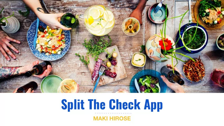
Split The Check App MAKI HIROSE The Mission Improve the experience - - PowerPoint PPT Presentation
Split The Check App MAKI HIROSE The Mission Improve the experience of splitting a check at a restaurant between a group of people, with a mobile app. 2 User Research: Survey & Interview Questions A user survey was sent out and in-person
MAKI HIROSE
Improve the experience of splitting a check at a restaurant between a group of people, with a mobile app.
The Mission
2
A user survey was sent out and in-person interviews were also conducted. These were the questions asked: 1. What are the pain points in your experience when splitting a check with other people? 2. What would you like to see in a check splitting app, what features would make your life easier and save you time?
User Research: Survey & Interview Questions
3
The demographic of our user research participants were: Gender: Male and Female Race: Various Age range: 22 - 54
User Research: Demographic
4
User Research: Highlights of Pain Points
83.3%
“Worst thing ever at a restaurant is when everyone orders different things, someone may get a T-bone steak with 3 cocktails while another person gets a salad and a lemonade. When the check comes, everyone is looking around the table to see who is the culprit for ordering the most.” - Pascal C. Everyone orders different priced items and consumes different quantities. For the person who
the check.
5
tax and tip amount.
separate checks and the checks would inevitably get mixed up. Some restaurants won’t even allow you to split checks.
the check on their credit card for the points. How do you decide who gets to do this?
User Research: Highlights of Pain Points (cont.)
6
Want different payment methods including: Cash, Credit Card, Zelle, Venmo.
User Research: Highlights of Wants in App
50%
another option for splitting the check evenly between everyone.
7
non-tech savvy and older generation.
Target Audience
8
Market Research: TAB App
9
not necessarily for non-tech savvy and older generation.
1) itemize check and split by paying members 2) split evenly
not.
Market Research: Problems with TAB
10
Market Research: Problems with TAB (cont.)
11
It is not clear which items on a page are buttons and which are
and buttons are the same color.
paying members besides cash and Venmo. These include Zelle which is widely used by banks, and credit card because users want credit card points.
Individual’s Total Page are inconsistent.
Market Research: Problems with TAB (cont.)
12
Market Research: Problems with TAB (cont.)
13
The page layout and wording
page (left) and Individual’s Total page (right) are inconsistent and
up” ?
Market Research: Problems with TAB (cont.)
14
This is confusing. There should be just one person who is
everyone and using the
simpler and easier to understand if this was just the request payment button. The pay button ought to be
Market Research: Problems with TAB (cont.)
15
Once either the Cash or Venmo button is pressed, things get even more
everyone? In this example, is MH
KH organizing the check?
member, together when requesting payment.
searching for the app.
incorporating in-app advertising in a non-invasive way to the user would enable an app to create a high and consistent revenue
Market Research: Problems with TAB (cont.)
16
User Flow
18
Mobile Sketches for Paper Prototyping
19
High Fidelity Mobile Sketches
20
High Fidelity Mobile Sketches
21
High Fidelity Mobile Sketches
22
High Fidelity Mobile Sketches
23
are colored and all non-buttons are in black.
Additional Notes on App Design
24
age where advertising has dwindled down to boring copy on a colored background--something that could have easily be made in Microsoft Word--having a photograph or illustration as a hero image is key for making an app more prominent to a user’s mind.
mind to a pleasurable experience dining out with a group.
Photography
25
Coded Prototype for Mobile Responsiveness Testing
Click here to view deployed prototype app
centered in the Sketch design might be better served with being aligned to the left upon testing mobile responsiveness with a coded prototype.
screensize so deciding on an overall position that works across different devices need to be considered.
same way intended in the original sketch.
Realizations having coded a Prototype
27
link e-mail that is sent to paying members.
Apple Card, Cashapp, and Bitcoin.
Future Development
28
Sketch Design: https://github.com/makicoding/Split-The-Check Code for mobile responsive prototype: https://github.com/makicoding/Split-The-Check-Prototype Deployed mobile responsive prototype: https://aqueous-bayou-95081.herokuapp.com/
GitHub & Heroku URLs
29
Contact Maki at: maki@makicoding.com makicoding.com