
SLIDE 1
MARC DRUMMOND
TALK DATE SPEAKER
JUNE 26, 2015
SIZING UP RESPONSIVE IMAGES
MAKE A PLAN BEFORE YOU DRUPAL
Photo credit: Dave Emerson, “Trouble”, Flickr Creative Commons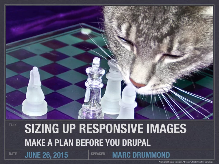
SIZING UP RESPONSIVE IMAGES TALK MAKE A PLAN BEFORE YOU DRUPAL - - PowerPoint PPT Presentation
SIZING UP RESPONSIVE IMAGES TALK MAKE A PLAN BEFORE YOU DRUPAL JUNE 26, 2015 MARC DRUMMOND DATE SPEAKER Photo credit: Dave Emerson, Trouble, Flickr Creative Commons Marc Drummond Front-end Developer, Lullabot @MarcDrummond
MARC DRUMMOND
TALK DATE SPEAKER
JUNE 26, 2015
MAKE A PLAN BEFORE YOU DRUPAL
Photo credit: Dave Emerson, “Trouble”, Flickr Creative Commons @MarcDrummond
mdrummond
IRC, drupal.org marcdrummond.com
Front-end Developer, Lullabot
AND IT INVOLVES CATS
SMALL SCREEN LARGE SCREEN SMALL PHOTO LARGE PHOTO
<picture> ¡ ¡ ¡<source ¡media="(min-‑width: ¡40em)" ¡ ¡ ¡ ¡ ¡srcset="big.jpg ¡1x, ¡big-‑hd.jpg ¡2x"> ¡ ¡ ¡<source ¡ ¡ ¡ ¡ ¡ ¡srcset="small.jpg ¡1x, ¡small-‑hd.jpg ¡2x"> ¡ ¡ ¡<img ¡src="fallback.jpg" ¡alt=""> ¡ </picture>
DIFFERENT IMAGE CROPS PER MEDIA QUERY
DIFFERENT ASPECT RATIOS PER MEDIA QUERY
.WEBP CAN FALLBACK TO .JPG
<img ¡src="small.jpg" ¡ ¡ ¡ ¡ ¡ ¡srcset="large.jpg ¡1024w, ¡ ¡ ¡ ¡ ¡ ¡ ¡ ¡ ¡ ¡ ¡ ¡ ¡ ¡ ¡medium.jpg ¡640w, ¡ ¡ ¡ ¡ ¡ ¡ ¡ ¡ ¡ ¡ ¡ ¡ ¡ ¡ ¡small.jpg ¡320w" ¡ ¡ ¡ ¡ ¡ ¡sizes="(min-‑width: ¡36em) ¡33.3vw, ¡ ¡ ¡ ¡ ¡ ¡ ¡ ¡ ¡ ¡ ¡ ¡ ¡100vw" ¡ ¡ ¡ ¡ ¡ ¡alt="A ¡rad ¡wolf">
USE RESPONSIVE IMAGES IN OLDER BROWSERS
PICTURE AND BREAKPOINTS MODULES
RESPONSIVE IMAGE AND BREAKPOINT MODULES (IN CORE!)
RESPONSIVE LAYOUTS ARE FLUID
IMAGE FILES ARE NOT
Photo credit: CelloPics, “Cat Only Loves Fresh Water”, Flickr Creative Commons WIDTH %
MEASURED IN PX, NOT %
ANALYZE
HOW DOES THIS TYPE OF IMAGE FIT INTO THE SITE LAYOUT?
Photo credit: Jenny Lee Silver, “Photo A Day: June 2006”, Flickr Creative Commons Tiger sunbathing in a box
I am unable to envision anything quite as adorable as my cat Tiger lounging in the sun, cuddled in his precious little box. He has been a fan of this box since he was just a kitten, and we have preserved it ever since. When Tiger was just nine months
that day. The next day, we brought in the box from the recycling, and he has been a happy cat ever since. I have taken many photos over the years of Tiger cuddled in this box, but I love how the light looks in this particular picture. You can feel the warmth of the sun, Tiger purring, and envision him slowly closing his eyes and yawning. There are few moments more tender than those of a sunbathing cat.
Tiger cuddles in his box, basking in the sun.
Photo credits: Clare, “I Am Not Too Big For This Box” and “Does This Box Make Me Look Fat?”, Flickr Creative Commons I am unable to envision anything quite as adorable as my cat Tiger lounging in the sun, cuddled in his precious little box. He has been a fan of this box since he was just a kitten, and we have preserved it ever since. When Tiger was just nine months old, we almost threw out this little half box. He mauled a couch that day. The next day, we brought in the box from the recycling, and he has been a happy cat ever
this box, but I love how the light looks in this particular picture. You can feel the warmth of the sun, Tiger purring, and envision him slowly closing his eyes and yawning. There are few moments more tender than those of a sunbathing cat.
Tiger sunbathing in a box
I am unable to envision anything quite as adorable as my cat Tiger lounging in the sun, cuddled in his precious little box. He has been a fan of this box since he was just a kitten, and we have preserved it ever since. When Tiger was just nine months
that day. The next day, we brought in the box from the recycling, and he has been a happy cat ever since. I have taken many photos over the years of Tiger cuddled in this box, but I love how the light looks in this particular picture. You can feel the warmth of the sun, Tiger purring, and envision him slowly closing his eyes and yawning. There are few moments more tender than those of a sunbathing cat.
Tiger cuddles in his box, basking in the sun.
<article ¡class="post"> ¡ ¡ ¡<figure ¡class="post__hero-‑image"><img ¡src="images/ suncat.jpg" ¡alt="Golden ¡sunbeams ¡warm ¡a ¡cut ¡curled ¡up ¡in ¡ a ¡box." ¡/></figure> ¡ ¡ ¡<div ¡class="post__inner"> ¡ ¡ ¡ ¡ ¡<main ¡class="post__body" ¡role="main"> ¡ ¡ ¡ ¡ ¡ ¡ ¡<h1 ¡class="post__title">Tiger ¡sunbathing ¡in ¡a ¡box</ h1> ¡ ¡ ¡ ¡ ¡ ¡ ¡<p>I ¡am ¡unable ¡to ¡envision ¡… ¡sunbathing ¡cat.</p> ¡ ¡ ¡ ¡ ¡</main> ¡ ¡ ¡ ¡ ¡<aside ¡class="post__aside" ¡role="complementary"> ¡ ¡ ¡ ¡ ¡ ¡ ¡<figure ¡class="post__aside-‑image"> ¡ ¡ ¡ ¡ ¡ ¡ ¡ ¡ ¡<img ¡src="images/suncat.jpg" ¡alt="Golden ¡sunbeams ¡ warm ¡a ¡cut ¡curled ¡up ¡in ¡a ¡box." ¡/> ¡ ¡ ¡ ¡ ¡ ¡ ¡ ¡ ¡<figcaption ¡class="post__aside-‑image-‑ caption">Tiger ¡cuddles ¡in ¡his ¡box, ¡basking ¡in ¡the ¡sun.</ figcaption> ¡ ¡ ¡ ¡ ¡ ¡ ¡</figure> ¡ ¡ ¡ ¡ ¡</aside> ¡ ¡ ¡</div> ¡ </article>
.post > .post__hero-image > img
.post ¡{ ¡ ¡ ¡@media ¡(min-‑width: ¡100em) ¡{ ¡ ¡ ¡ ¡ ¡left: ¡50%; ¡ ¡ ¡ ¡ ¡position: ¡relative; ¡ ¡ ¡ ¡ ¡transform: ¡translate(-‑50%, ¡0); ¡ ¡ ¡ ¡ ¡width: ¡100rem; ¡ ¡ ¡} ¡ }
img ¡{ ¡ ¡ ¡height: ¡auto; ¡ ¡ ¡width: ¡100%; ¡ }
Breakpoints .post .post__hero-image Final width Default 100% 100% 100% (min-width: 100em) 100rem 100% 100rem
.post > .post__inner > .post__aside > .post__aside-image > img
.post__aside ¡{ ¡ ¡ ¡padding: ¡5%; ¡ ¡ ¡width: ¡100%; ¡ ¡ ¡@media ¡(min-‑width: ¡37.5em) ¡{ ¡ ¡ ¡ ¡ ¡float: ¡left; ¡ ¡ ¡ ¡ ¡padding: ¡2%; ¡ ¡ ¡ ¡ ¡width: ¡40%; ¡ ¡ ¡} ¡ ¡ ¡@media ¡(min-‑width: ¡75em) ¡{ ¡ ¡ ¡ ¡ ¡padding: ¡1.5rem; ¡ ¡} ¡ }
Breakpoints .post .post__aside Final width Default 100% 100% - 5% x 2 90% (min-width: 37.5em) 100% 40% - 2% x 2 36% (min-width: 75em) 100% 40% - 1.5rem x 2 40% - 48px (min-width: 100em) 100rem 40% - 1.5rem x 2 640px - 48px
BALLPARK FIGURES
DETERMINE INITIAL SOURCE FILE WIDTHS
Photo credit: Fuzzy Gerdes, “Parker Loooves the Cubs”, Flickr Creative Commons Breakpoints Width Min px Max px Default 100% 320 1599 (min-width: 100em) 100rem 1600 1600
WIDTH X 1.25 HEIGHT X 1.25 PIXELS X 1.5625
320 400 500 625 781.25 976.5625 1,220.703125 1,525.8789063 1,907.3486329
Breakpoints Width Min px Max px Default 90% 288 540 (min-width: 37.5em) 36% 216 432 (min-width: 75em) 40% - 48px 432 592 (min-width: 100em) 640px - 48px 592 592
288 360 450 562.5 703.125
303.104 378.88 473.6 592
TWICE AS NICE
SCREEN RESOLUTION DENSITIES
Photo credit: Mrs eNil, “Bed cuddles”, Flickr Creative Commons 320 400 500 625 781.25 976.5625 1,220.703125 1,525.8789063 1,907.3486329 640 800 1000 1250 1562.5 1953.125 2441.40625 3,051.7578125 3814.6972656
303.104 378.88 473.6 592 606.208 757.76 947.2 1184
TIDY UP
SENSIBLE SOURCE FILE WIDTHS
Photo credit: Sandra Forbes, “Clean Kitty”, Flickr Creative Commons 320 400 500 625 781.25 976.5625 1,220.703125 1,525.8789063 1,907.3486329 320 400 500 625 800 1000 1250 1600
320 400 500 625 800 1000 1250 1600
25% 25% 25% 28% 25% 25% 28%
320 400 500 625 800 1000 1250 1600 640 800 1000 1250 1600 2000 2500 3200
320 400 500 640 800 1000 1280 1600 640 800 1000 1280 1600 2000 2560 3200
320 400 500 640 800 1000 1280 1600 640 800 1000 1280 1600 2000 2560 3200
320 400 500 640 800 1000 1280 1600 2000 2560 3200
25% 25% 25% 28% 25% 25% 28% 25% 25.6% 25%
320 400 500 640 800 1000 1280 1600 2000 2560 3200
11 source widths vs. 18 source widths
303.104 378.88 473.6 592 300 375 470 600
300 375 470 600
25% 27% 27.7%
300 375 470 600 600 750 940 1200
300 375 470 600 600 750 940 1200
300 375 470 600 750 940 1200
25% 27% 25% 27.7% 25.33% 27.7%
300 375 470 600 750 940 1200 7 source widths vs. 8 source widths
SIZES ATTRIBUTE
QUICK ACCESS LAYOUT INFO
Photo credit: London Looks, “Kittens!”, Flickr Creative Commons <img ¡sizes="(min-‑width: ¡100em) ¡100rem, ¡ 100vw"> ¡
Breakpoints Final width Sizes width Default 100% 100vw (min-width: 100em) 100rem 100rem
<img ¡sizes="(min-‑width: ¡100em) ¡ ¡37rem, ¡ ¡ ¡ ¡ ¡ ¡ ¡ ¡ ¡ ¡ ¡ ¡ ¡(min-‑width: ¡75em) ¡ ¡ ¡calc(40vw ¡-‑ ¡3rem), ¡ ¡ ¡ ¡ ¡ ¡ ¡ ¡ ¡ ¡ ¡ ¡ ¡(min-‑width: ¡37.5em) ¡36vw, ¡ ¡ ¡ ¡ ¡ ¡ ¡ ¡ ¡ ¡ ¡ ¡ ¡ ¡ ¡ ¡ ¡ ¡ ¡ ¡ ¡ ¡ ¡ ¡ ¡ ¡ ¡ ¡ ¡ ¡ ¡ ¡ ¡90vw"> ¡
Breakpoints Final width Sizes width Default 90% 90vw (min-width: 37.5em) 36% 36vw (min-width: 75em) 40% - 48px calc(40vw - 3rem) (min-width: 100em) 640px - 48px 37rem
SRCSET ATTRIBUTE
LIST IMAGE SOURCE FILES WITH WIDTHS
Photo credit: Mathias Erhart, “kittens”, Flickr Creative Commons 320 400 500 640 800 1000 1280 1600 2000 2560 3200 <img ¡srcset=" ¡ ¡ ¡hero320.jpg ¡ ¡320w, ¡ ¡ ¡ ¡hero400.jpg ¡ ¡400w, ¡ ¡ ¡ ¡hero500.jpg ¡ ¡500w, ¡ ¡ ¡hero640.jpg ¡ ¡640w, ¡ ¡ ¡hero800.jpg ¡ ¡800w, ¡ ¡ ¡hero1000.jpg ¡1000w, ¡ ¡ ¡hero1280.jpg ¡1280w, ¡ ¡ ¡hero1600.jpg ¡1600w, ¡ ¡ ¡hero2000.jpg ¡2000w, ¡ ¡ ¡hero2560.jpg ¡2560w, ¡ ¡ ¡hero3200.jpg ¡3200w"> ¡
300 375 470 600 750 940 1200 <img ¡srcset=" ¡ ¡ ¡side300.jpg ¡ ¡300w, ¡ ¡ ¡ ¡side375.jpg ¡ ¡375w, ¡ ¡ ¡ ¡side470.jpg ¡ ¡470w, ¡ ¡ ¡side600.jpg ¡ ¡600w, ¡ ¡ ¡side750.jpg ¡ ¡750w, ¡ ¡ ¡side940.jpg ¡ ¡940w, ¡ ¡ ¡side1200.jpg ¡1200w"> ¡
CSS RULES
MAKE IMAGES FLUID
Photo credit: Kevin Pelrine, “Leroy the Ruler”, Flickr Creative Commons BREAK DANCING
BREAKPOINTS AND BREAKPOINT GROUPS
Photo credit: Trish Hamme, “Ta-Da !!!!”, Flickr Creative Commons THEME.empty: ¡ ¡ ¡label: ¡Empty ¡ ¡ ¡mediaQuery: ¡'' ¡ ¡ ¡weight: ¡1
SEND IN THE ROBOTS
IMAGE STYLES
Photo credit: Andy Miicone, “Miisa”, Flickr Creative Commons 320 400 500 640 800 1000 1280 1600 2000 2560 3200
300 375 470 600 750 940 1200
LET’S MAP THIS OUT
PICTURE MAPPINGS AND FALLBACK STYLES
Photo credit: Little Dog Laughed, “Geography Cat”, Flickr Creative Commons <img ¡sizes="(min-‑width: ¡100em) ¡ ¡37em, ¡ ¡ ¡ ¡ ¡ ¡ ¡ ¡ ¡ ¡ ¡ ¡ ¡(min-‑width: ¡75em) ¡ ¡ ¡calc(40vw ¡-‑ ¡3em), ¡ ¡ ¡ ¡ ¡ ¡ ¡ ¡ ¡ ¡ ¡ ¡ ¡(min-‑width: ¡37.5em) ¡36vw, ¡ ¡ ¡ ¡ ¡ ¡ ¡ ¡ ¡ ¡ ¡ ¡ ¡ ¡ ¡ ¡ ¡ ¡ ¡ ¡ ¡ ¡ ¡ ¡ ¡ ¡ ¡ ¡ ¡ ¡ ¡ ¡ ¡90vw"> ¡
CHECK IT BEFORE YOU WRECK IT
IMAGE QUALITY MATTERS
Photo credit: Woodleyworks, “Lucky was inexorably drawn to the mirror”, Flickr Creative Commons STYLE SELECTIONS VIA UI
FIELD FORMATTERS AND YOU
Photo credit: George Pavlov, “I’m pretty kitty, right?”, Flickr Creative Commons STYLE SELECTIONS VIA CODE
THEME PREPROCESSING FUNCTIONS AND MORE
Photo credit: Brian Dailey, “Cat + Code + Snow”, Flickr Creative Commons function ¡THEME_preprocess_node(&$variables) ¡{ ¡ ¡ ¡ ¡ ¡ ¡ ¡ ¡ ¡if ¡($variables['type'] ¡== ¡'blog') ¡{ ¡ ¡ ¡ ¡ ¡$fallback_style ¡= ¡'width_400'; ¡ ¡ ¡ ¡ ¡ ¡ ¡if ¡($account ¡= ¡user_load($node-‑>uid)) ¡{ ¡ ¡ ¡ ¡ ¡ ¡ ¡ ¡ ¡if ¡(isset($account-‑>picture-‑>uri) ¡ ¡ ¡ ¡ ¡ ¡ ¡ ¡ ¡ ¡ ¡&& ¡($mapping ¡= ¡picture_mapping_load('author_image')) ¡ ¡ ¡ ¡ ¡ ¡ ¡ ¡ ¡ ¡ ¡&& ¡($breakpoints ¡= ¡ picture_get_mapping_breakpoints($mapping, ¡$fallback_style))) ¡{ ¡ ¡ ¡ ¡ ¡ ¡ ¡ ¡ ¡ ¡ ¡ ¡ ¡$image_options ¡= ¡array( ¡ ¡ ¡ ¡ ¡ ¡ ¡ ¡ ¡ ¡ ¡ ¡ ¡ ¡ ¡'uri' ¡=> ¡$account-‑>picture-‑>uri, ¡ ¡ ¡ ¡ ¡ ¡ ¡ ¡ ¡ ¡ ¡ ¡ ¡ ¡ ¡'alt' ¡=> ¡'', ¡ ¡ ¡ ¡ ¡ ¡ ¡ ¡ ¡ ¡ ¡ ¡ ¡ ¡ ¡'breakpoints' ¡=> ¡$breakpoints, ¡ ¡ ¡ ¡ ¡ ¡ ¡ ¡ ¡ ¡ ¡ ¡ ¡ ¡ ¡'style_name' ¡=> ¡$fallback_style, ¡ ¡ ¡ ¡ ¡ ¡ ¡ ¡ ¡ ¡ ¡ ¡ ¡); ¡ ¡ ¡ ¡ ¡ ¡ ¡ ¡ ¡ ¡ ¡ ¡ ¡$variables['user_picture'] ¡= ¡ ¡ ¡ ¡ ¡ ¡ ¡ ¡ ¡ ¡ ¡ ¡ ¡ ¡theme('picture', ¡$image_options); ¡ ¡ ¡ ¡ ¡ ¡ ¡ ¡ ¡} ¡ ¡ ¡ ¡ ¡ ¡ ¡} ¡ ¡ ¡ ¡} ¡ }
¡ ¡$content['side_image_responsive'] ¡= ¡array( ¡ ¡ ¡ ¡ ¡'#type' ¡=> ¡'responsive_image', ¡ ¡ ¡ ¡ ¡'#uri' ¡=> ¡'public://side-‑image.png', ¡ ¡ ¡ ¡ ¡'#attributes' ¡=> ¡array( ¡ ¡ ¡ ¡ ¡ ¡ ¡'alt' ¡=> ¡t('Hero ¡image'), ¡ ¡ ¡ ¡ ¡ ¡ ¡'title' ¡=> ¡t('Hero ¡image ¡title'), ¡ ¡ ¡ ¡ ¡), ¡ ¡ ¡ ¡ ¡'#responsive_image_style_id' ¡=> ¡'hero', ¡ ¡ ¡);
@MarcDrummond
mdrummond
IRC, drupal.org marcdrummond.com
Front-end Developer, Lullabot