
SLIDE 1
introduction to information graphics & data visualisation
4.5
max van kleek
(@emax)
University of Oxford ƒor
Open Data Institute Short Course
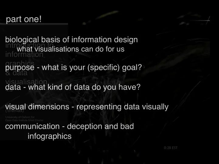
part one! biological basis of information design introduction to - - PowerPoint PPT Presentation
part one! biological basis of information design introduction to what visualisations can do for us information graphics purpose - what is your (specific) goal? & data visualisation data - what kind of data do you have? 4.5 visual
4.5
max van kleek
(@emax)
University of Oxford ƒor
Open Data Institute Short Course
University of Maryland
framebuffer(s) display
framebuffer(s) display eye / iris / fovea retina (sensing) visual cortex (pattern detection)
v3
v1 v2
v4 v5
parietal lobe + frontal cortex spatial orientation focus of attention eye control, perceptual fusion
visual cortex (pattern detection)
v3
v1 v2
v4 v5
parietal lobe + frontal cortex spatial orientation focus of attention eye control, perceptual fusion
“where/how” pathway “what” pathway
The Story of London's Most Terrifying Epidemic – and How it Changed Science, Cities and the Modern World.
“There was one significant anomaly - none of the monks in the adjacent monastery contracted cholera. Investigation showed that this was not an anomaly, but further evidence, for they drank only beer, which they brewed themselves.”
London Cholera Outbreak John Snow, 1854
31 Aug 1854 - 127 deaths in 3 da 10 Sept - 500 deaths End of outbreak - 616 deaths
19 May 1905 – 1 November 1993
steady state plasma glucose (response) glucose area under curve insulin area under curve
integral
fixed point
, , , ,
categorical relational
) g( ), q( )
alpha(-numeric)
fractional
integral
fixed point
, , , ,
categorical relational
) g( ), q( )
alpha(-numeric)
fractional
4 4 9 7 4 4 9 7 7 6
0" 1" 2" 3" 4" 5" 6" 7" 8" 9" 10" 1" 2" 3" 4" 5" 6" 7" 8" 9" 10"
histogram
box & whisker
median (middle) extrema (whiskers) Quartiles
0" 1" 2" 3" 4" 5" 6" 7" 8" 9" 10" 0" 0.5" 1" 1.5" 2" 2.5" 3" 3.5" 4" 4.5" 1" 2" 3" 4" 5" 6" 7" 8" 9"
sorted
0" 1" 2" 3" 4" 5" 6" 7" 8" 9" 10" 1" 2" 3" 4" 5" 6" 7" 8" 9" 10" 0" 1" 2" 3" 4" 5" 6" 7" 8" 9" 10" 0" 1" 2" 3" 4" 5" 6" 7" 8" 9" 10"
if these are observations of the [same] of object(s) over time “time series” if these are observations of different things at a single point in time “population” if these are observations of different things at a different points in time “observations”
0" 2" 4" 6" 8" 10" 12" 14" 16" 1" 2" 3" 4" 5" 6" 7" 8" 9" 10" 0" 2" 4" 6" 8" 10" 12" 14" 16" 1" 2" 3" 4" 5" 6" 7" 8" 9" 10"
stacked area
stacked bar
4 3 4 4 9 5 7 5 4 4 3 9 6 7 5 7 5 6 4
0" 1" 2" 3" 4" 5" 6" 7" 0" 1" 2" 3" 4" 5" 6" 7" 8" 9" 10"
scatter
0" 1" 2" 3" 4" 5" 6" 7" 8" 9" 10" 1" 2" 3" 4" 5" 6" 7" 8" 9" 10"
lines
relationship between dimensions each dimension’s variability
elements & their totals
???
0" 1" 2" 3" 4" 5" 6" 7" 8" 9" 10" 1" 2" 3" 4" 5" 6" 7" 8" 9" 10"
understanding elements clustered bar
0" 1" 2" 3" 4" 5" 6" 7" 8" 9" 10" 1" 2" 3" 4" 5" 6" 7" 8" 9" 10" 0" 2" 4" 6" 8" 10" 12" 14" 16" 1" 2" 3" 4" 5" 6" 7" 8" 9" 10"
position
relative location centrality
shape colour
saturation
size
width height
stroke
colour pattern, thickness
texture movement
juxtaposition
integral fixed point categorical relational alpha(-numeric)
...
range-limited
symmetry properties of the geometry
pop-out
Protanopia affects 8% of males, 0.5% females
hue ‘borders’ overemphasise small changes, hue ‘middles’ blend potentially important details
hyperbolic tree
treemap
charles joseph minard
how many dimensions?
1) size of the army 2) advancing/retreating at each location 3) divisions 4) path taken by each 5) temperature 6) dates of waypoints
E.J. Marey La méthode graphique (1885)
Designing effective infographics is about effectively conveying or facilitating an understanding of relationships in data
lifting” to our trained neural circuitry
While still an art, many design principles grounded in usability can provide guidance: natural mappings, simplicity, & avoiding distortion
visual + statistical sleight of hand to mislead the audience
10 25 40 55 70 85 100 1960 1970 1980 1990
using area (2 dimensions) to
using area to represent one dimensi
0" 5" 10" 15" 20" 25" 1" 2" 3" 4" 5" 6" 7" 8" 9" 10" 0" 1" 2" 3" 4" 5" 6" 7" 8" 9" 10" 1" 2" 3" 4" 5" 6" 7" 8" 9" 10"
0" 5" 10" 15" 20" 25" 1" 2" 3" 4" 5" 6" 7" 8" 9" 10"