
SLIDE 1
McCanns Oatmeal Irish Heritage Ad Campaign Tie Original Tie - - PDF document
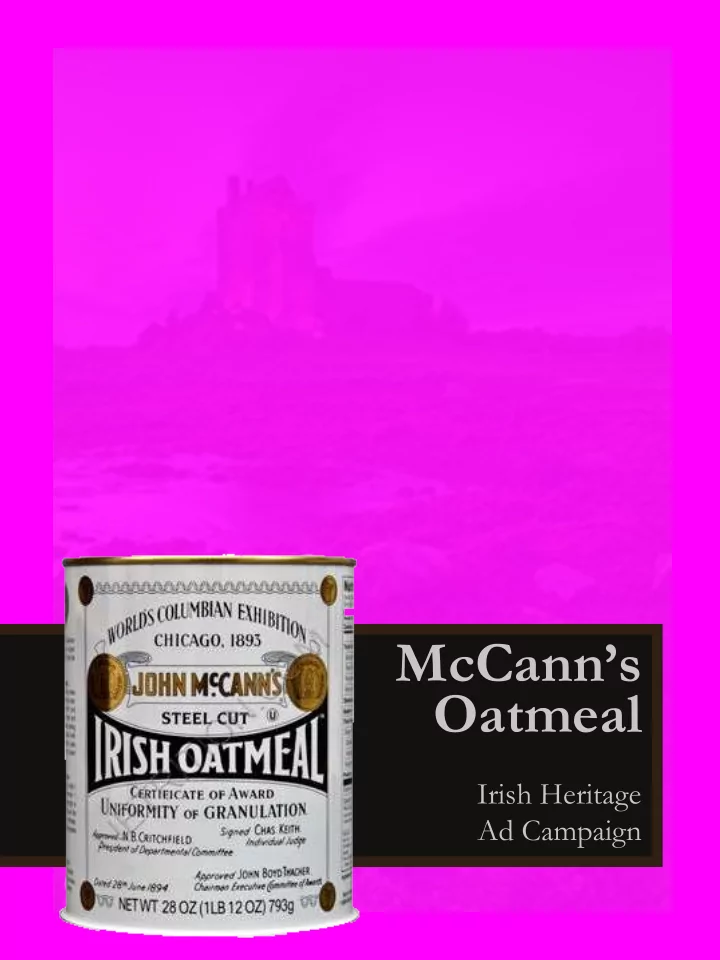
McCanns Oatmeal Irish Heritage Ad Campaign Tie Original Tie New Information and visuals are organized in proximity to each other. The black and antique white adds an old-fashion feel while providing great contrasts. Repetition is
Tie
Tie
Original Ad
Information and visuals are organized in proximity to each other. The black and antique white adds an old-fashion feel while providing great contrasts. Repetition is consistent in the colors and placement of text.
Original Ad
Easy to read sans serif font with drop shadowing to create a vintage feel consistent with the Ireland Heritage theme. Font in varied sizes creates interest. Body text done in serif font as well as their marketing “big idea” which is consistent in every campaign ad.
Original Ad
Black, antique whites and grey shades provide a vintage feel. The drop shadows add a dramatic feel. Monochromatic colors in differing tints adds interest and contributres to the
Black basecolor provides color contrasts to the font and picture colors. Helps to focus the viewers eye.
New Ad
Ad is aligned on both sides of the page. The text below is over the pricture. The tractor is over the body font on the other side of the page. Content has historical references and contrasts that are consist with the ad campaign.
,Information is organized in correct
proximity to information and visuals.
New Ad
Sans serif font is consistent in color and varying sizes. Font is layered
the original ad is. Drop shadows typically shouldn’t be used. However, they worked really well, so I kept them consistent with the original ad. Body text is sans serif for easier
Tag line is a serif font consistent with
New Ad
Vintage colors used, drop shadows
quality they provide. Striking color contrasts that draw the viewers eye to specifjc content is consistent with the original ad. Monochromatic colors that are consistent with the original ad providing an old-fashioned feel consistent with the heritage theme.
Grown in Ireland by people grown in Ireland.