SLIDE 1 GRAPHICAL PRESENTATION OF DATA
Mathematicians measure with their minds alone the forms of things separated from all
- matter. Since we wish the object to be seen, we will use a more sensate wisdom.
Leon Battista Alberti, (1436) On Painting
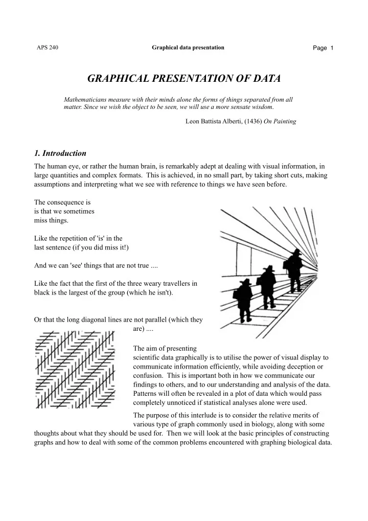
The human eye, or rather the human brain, is remarkably adept at dealing with visual information, in large quantities and complex formats. This is achieved, in no small part, by taking short cuts, making assumptions and interpreting what we see with reference to things we have seen before. The consequence is is that we sometimes miss things. Like the repetition of 'is' in the last sentence (if you did miss it!) And we can 'see' things that are not true .... Like the fact that the first of the three weary travellers in black is the largest of the group (which he isn't). Or that the long diagonal lines are not parallel (which they are) .... The aim of presenting scientific data graphically is to utilise the power of visual display to communicate information efficiently, while avoiding deception or
- confusion. This is important both in how we communicate our
findings to others, and to our understanding and analysis of the data. Patterns will often be revealed in a plot of data which would pass completely unnoticed if statistical analyses alone were used. The purpose of this interlude is to consider the relative merits of various type of graph commonly used in biology, along with some thoughts about what they should be used for. Then we will look at the basic principles of constructing graphs and how to deal with some of the common problems encountered with graphing biological data.
APS 240 Graphical data presentation Page 1
SLIDE 2
There are relatively few types of graph in common use. Most computer packages used for scientific graphs offer a similar selection, and it is these that will be dealt with here. (This is not to say that graphs have to be drawn using a computer, it is perfectly possible to produce publication quality figures by hand, but it simply provides a convenient starting point). 2.1 Scatter plot The basic 'graph' we are all familiar with. The circumstances in which it is useful are usually
- bvious, the most common being to examine a
relationship between two (non-sequential) variables. The figure here (right) is a typical situation, showing the relationship between the number of aphids clustered in a group on a twig and the length of time individual ants spent 'attending' (feeding at) that aphid cluster. It is hard for such a graph not to be informative about the data since all the data points are explicitly represented, hence it is very good for examining data to get a 'feel' for the patterns, and identify extreme or unusual values (outliers) for checking or further investigation. 2.2 Line plot Essentially a scatter plot in which the points are joined up. It is obviously only appropriate to join the data points where the sequence of points has some particular meaning. One common situation where line plots are often useful is where the x-axis represents some sequential variable like time, or distance along a transect (right, and below). In both cases there is an explicit (spatial or temporal) relationship between adjacent points along the x-axis, and the inclusion of the line makes the pattern of this sequence much clearer.
APS 240 Graphical data presentation Page 2
SLIDE 3 The other common use of line plots is where data (often from experiments) represent points along a gradient of conditions, and the y-axis represents the response to this
- gradient. In this case, it is often the shape of the whole
relationship we are interested in, or in comparison between different responses to the gradient. Linking the points here makes the overall shape of the response much
- clearer. The sugar cane yield plot (right) is a typical
example of a situation where a line plot provides the best way of presenting the data. However, it is important that line plots are only used where joining the points has some real meaning. In the ant data above it would be totally inappropriate (right). The points have no meaningful ordering, and whilst it seems that there is a positive relationship between the two variables, we would not want to try and suggest that the rather jagged line joining the points represents the actual relationship. Don’t do this!
APS 240 Graphical data presentation Page 3
SLIDE 4 2.3 Double-Y plots These, as the name suggests, have two different y-axes, allowing variables with different scales to be plotted on the same graph. Primarily used in the same sorts of situations as line plots, where you want to compare the pattern of change in two different types of variable (though there may be more than one set of points for either of the two variables) over time, space, or some other sequential x-variable . The example here (right) shows the use of a double-Y plot to show the changes over time,
- f both plant and fungal aspects of infection
with a pathogen (haustoria are the structures formed by a fungal pathogen through which it takes up nutrients from the host plant’s cells). Double-Y plots provide a compact way of presenting data of this sort, but can also get a bit cluttered, and you need to be careful to make sure that it is made very clear which line relates to which axis. However double-Y plots also have a more fundamental problem. Many people would argue that it is bad practice to mix data on two completely different scales on the same graph. Why? Well, the whole point of a graph is that it allows us to represent the relationships among data points visually. It therefore goes rather against the grain to put things on the same graph that using quite different scales, which are therefore not comparable. If we aren’t careful, then it is rather easy to slip into thinking that there is something significant about the relative position of the two lines. For example our attention is naturally drawn to the point where the lines cross. If the lines represented variables of the same type, and on the same scale (for example abundance of a predator and its prey) then this crossover point would indeed mean something useful: the point where both variables (e.g., predator and prey abundance) were equal. But in typical double-Y plots like the one here, the relative position of the two lines means nothing at all. For this reason it is often less confusing to present the data as separate plots with just a common x-axis (right). It takes a bit more space, but makes it quite clear that the lines represent quite different things,
APS 240 Graphical data presentation Page 4
SLIDE 5
However, whilst it is possible to argue the merits of either of the approaches above, whatever you do, do not make the mistake of presenting data as double- Y plots when they should be scatter plots, i.e., when it is really the relationship between the two variables that is of interest. For example, the double-Y plot of leaf damage and phenolics here (upper right) is totally inappropriate. The data are trees, which happen to be numbered 1 to 9, but this does not reflect any actual relationship between them, so plotting tree number on the x-axis makes no sense. And if we are interested in the relationship between leaf toughness and herbivore damage, then this is very poorly represented by the double-Y plot. A scatter plot (lower right) reveals the pattern much more clearly. Double-Y scatter plots, rather than line plots, are sometimes found. But these inherit the problems of their line-plot cousins, and tend to be even more confusing, as they lack even the lines to link the points in the two different datasets. There is almost always a better solution.
2.4 Bar charts
Bar charts are, after scatter plots, probably the most widely used type of graph in science. Bar charts are usually fairly straightforward to produce, and generally are either used to represent means (and appropriate error bars), as in the graph here (right), or counts of some sort, including proportions or percentages. Bar charts are distinct from histograms, in which frequencies are shown for classes on a continuous scale, rather than for categories. It is not especially important whether the bars in bar charts are vertically or horizontally orientated. Studies of visual perception suggest that we are slightly better at judging relative distances in the horizontal rather than the vertical orientation, but we
APS 240 Graphical data presentation Page 5
SLIDE 6 are very familiar with vertical bar charts and convention in biology weighs in their favour. However, not all forms of bar chart are equally
- good. One form is particularly problematic - the
stacked bar chart (right). This seems to be an attractive way of summarizing data where there are several classes within a larger sample e.g. items in a diet, colour morphs in a population. However, such charts are generally a rather poor way of presenting information, especially when bars are subdivided into many categories In general we are better at making position judgments than making length judgments - this requires a common reference point (provided by the baseline for the first category, but not for the
- thers). In a stacked bar chart it is often very hard to compare divisions, except for the division at the
bottom (for which all bars have the same baseline). Also, such graphs are only relevant when the total height of each bar has meaning. A further problem is that, although you could put error bars on each main bar, you cannot readily represent the errors associated with each subcomponent of the bar – which limits their usefulness for data other than counts. Sometimes it is useful to represent the data in terms
- f the proportion or percentage of different
elements making up a sample. Stacked bar charts are often used for this purpose. The data presented above can easily be rescaled in this way (right) and, arguably it is a little easier to interpret, though it shares many of the same limitations. The same data can always be presented as grouped,
- r individual, histograms ... but if there are many
categories and classes, grouped histograms may be cluttered, and individual histograms may take up too much space. In this case it may be necessary to think about whether all the data have to be presented all at once. Large numbers of bars... In some circumstances you may need to present bar charts with large numbers of bars. If the bars are results comparing particular treatments, for example, then the arrangement of the categories will be dictated by the treatments and comparisons being made (e.g. 'Copper' graph, above). However, if the results are not constrained in this way, then some improvement in clarity can be achieved by arranging the categories in rank order, making judgement of relative heights easier and allowing groups of categories with similar values to be identified. Compare the two graphs here (below).
APS 240 Graphical data presentation Page 6
SLIDE 7
In the case of the first graph (upper right) the pattern is much harder to extract; in the other graph (lower right) it is more obvious how the different sites relate to each other. However, when faced by these sort of data it is also worth asking whether the sorts of representations on the right are really the most useful way to summarize the data. What do you want the reader to get from the graphs? What aspect of the data are you interested in? In many situations it is not the values of each site that we want to know about it is the frequency of different distribution of different values: are most sites species poor, with a few species rich ones? for this purpose a histogram of the number of sites with different levels of species richness would be a better method of presentation (below). 2.5 Area plot Area plots combine features of line plots and stacked bar charts. They have similar disadvantages to the latter, though since such plots are generally used to show trends in time or space it is often easier to interpret, as the patterns of expansion or contraction of areas on the graph have a logical meaning. However, the difficulty of judging the sizes of areas is greater than with a stacked bar chart since we are required to judge distances between pairs of lines at different, and changing, angles. In this
APS 240 Graphical data presentation Page 7
SLIDE 8
circumstance, we tend to judge the distances roughly perpendicular to the lines - rather than parallel to the y-axis, which is what is being plotted. This can be seen by example ... here (right) we see two lines that seem to vary in the difference between them, but in fact they don’t, at all points they are exactly the same distance apart on the y-axis. In the example (below) of percentage cover of grasses along a transect, judging the variation of abundance, for example in Agrostis, is hard because of the variation in the lines beneath. The overall impression is dominated by the generally higher values around the middle of the transect. Plotting the data as a line plot for each species (either separately, or several lines on the same graph) will usually give a much clearer picture of the variation (right).
APS 240 Graphical data presentation Page 8
SLIDE 9 2.6 Pie diagram
Pie diagrams are familiar to everyone, much beloved of business graphics packages and the media, but of relatively limited use for scientific figures. There are two problems. Firstly, it is less easy to judge the relative magnitudes of values in a pie diagram than a histogram because we are less adept at angle judgements (2- dimensions) than linear distance judgements (1-dimension). Secondly, you cannot put error bars on a pie diagram, so it is restricted to frequency data only. Compare the same data presented as a pie diagram (right upper) and as a bar chart (right lower) ... it is much easier to order the values from the bar chart. Studies of accuracy of judgement indicate that when subjects are asked to judge quantities from pie charts they are markedly less accurate than when doing so from bar charts, and that while with bar charts the error in estimation is consistent for all quantities being judged, with pie charts it is increasingly variable as the quantity goes up. Data that presented as a pie diagram can always be presented as a histogram or bar chart which is both easier to make quantitative judgements from and, in the latter case, can also include error bars.
- 3. General principles and common problems
3.1 Shape and proportion The preferred proportions for most graphs are either roughly square or only slightly taller than wide - particularly for bivariate scatter plots - or slightly wider than tall, especially for data for temporal or spatial sequences. A reasonable rule of thumb is to try not to have the proportions (height to width) more extreme than 1.5:1 or 1:1.5, and preferably less extreme. Very tall and narrow, or short and wide, graphs can emphasize, or play down, the slopes of relationships (used to good effect in many political and economic debates!). We generally make poorer judgements of very steep or very shallow relationships than those of intermediate slope.
APS 240 Graphical data presentation Page 9
SLIDE 10 3.2 Scales and axes In general, it is sensible to arrange the scaling of a graph so that the data occupy a substantial proportion of the data area. Many computer packages will scale a graph to just include all the data - so the data occupy as much of the data area as possible. Unfortunately this often means that the axes start and finish at entirely arbitrary points. Some sort of compromise is usually appropriate. The appropriate choice of scale will result from consideration of:
- the data occupying reasonable proportions of the graph - can the pattern in the data be clearly seen?
- the axes having a sensible starting and finishing value (and should the axes go to zero?)
- the nature and purpose of the graph - what are you trying to communicate?
One of the most frequently discussed ‘tricks’ with presenting data graphically is the issue of how different impressions of the data can be generated by different choices of scale. Examples of changes that are exaggerated, or played down, by using a particular scale are common in the media - and certainly if you don’t look at the scales it is easy to leap to the wrong conclusion. In a scientific context, the two data sets below show how differences, or changes, in the data can appear dramatic when only a small part of the scale is used. In the case of the pH changes (right), the differences are probably real (the error bars tell us how confident we can be in the differences), but the actual change is very small - probably too small of be of much importance for most
- rganisms. In the case of the
boreholes (far right) the change looks quite encouraging if only part of the scale is used, but giving the full scale helps us put that change into perspective. In reality, as scientists, you shouldn’t be deceived by these sorts of differences - you should always read the scale
- f the graph you are looking
at and judge changes accordingly.
APS 240 Graphical data presentation Page 10
SLIDE 11 Axes should be slightly longer than required to accommodate the largest data value - otherwise an illusion is created that the largest point lies beyond the end of the axis, as in the left-hand graph (below). The axes can be improved in other ways too. Obviously the thickness of the axis lines here is excessive - to the extent that it almost conceals the data points that lie on the y-axis. Try to create figures with axes that enable the scaling information to be read easily but also allow the data to stand
- ut. By reducing the weight of the axes, rescaling them slightly, and adding a small offset to the y-axis
to allow the data with x=0 to have equal impact to the other points, the right hand graph (below) offers a much clearer picture of the data (and is more pleasing to the eye). It is often desirable to have axes that both originate at zero. However, this may conflict with scaling the graph so that the data occupy most of the data area. If so, a non-zero origin may be more appropriate. It is often suggested that you must show a break in the axes if origin is not at zero. This is not strictly necessary, but you should always look at the axis scales of a graph when you read it. If you do choose to have an axis break, then always use a break below the lowest datum. These are generally not confusing as the pattern of the data remains the same, but beware of axis breaks where there are data on either side of the break. In this case the value of the graphical display is much reduced because the relationships among the data are not properly represented. If you graph has such disparity of values that it requires this, then consider whether it would be better to try an alternative approach. If there is just one data set then the best approach may be to use the logarithms of the original data (or log(x+1) if there are zeros in the data). An example of the use of log axes in this situation is given in the next section. Other than scaling, axis design is straightforward. Opinions vary about whether tick marks should be
- n the inside or outside of the axis. Outside reduces clutter in the data area, but it's probably not worth
getting too bothered about. A common problem with tick marks is that computer packages sometimes
APS 240 Graphical data presentation Page 11
SLIDE 12
put in many more than necessary. Aim for about 4-12 major tick marks, unless the graph is specifically to be used for reading values from (e.g. a standard curve) then obviously more ticks may be appropriate. Using logarithmic axis scales There are various plotting scales that transform data in some way. Of these the logarithmic scale is by far the most common. Others, such as probability scales are usually encountered in very specific applications (such as testing for normality in a data set), rather than being used as a general tool to aid data visualization. A typical use of logarithms in graphical display is to represent data which have many small values and a few very large ones. This is common in biology, where things we measure are often influenced by multiplicative processes such as cell division. This graph (right) is fine as far as it goes, but it is hard to see what is going on in the low value data. An alternative would be to draw the graph on logarithmic axes. We can do this in two ways. Either the data can be left alone and the axes drawn ‘distorted’ to represent a logarithmic scale (below left). Alternatively we can take a log transformation of the data, and then plot these transformed data on normal axes (below right). You will notice that the pattern in the data is identical in both type of plot (which is reassuring!) but that the axes look very different. The log axis option (left hand graph) is more immediately readable as the numbers on the axis are in the original units - we’ve just distorted the distances between the values. However if you want to
APS 240 Graphical data presentation Page 12
SLIDE 13 read data off a graph then interpolating between the unequally spaced ticks on this type of axis can be tricky, and it may be better to go for a log transformation and then linear axis scale (right hand graph), then back transform the values you get. Note that in the second graph we have to make sure the axis label states that the numbers on the scale are logarithms of the data; in the log axis plot we don’t need to do this - it is obvious that the axes are logarithmic (and the actual numbers of course are not logs of the data - it is just the spacing of the intervals that’s different). Finally, also note that it is important to give the base of the logarithms used if the data are transformed (here we have used logs to the base 10)
- otherwise there is no way the reader can recover the original values from the graph. Log10 is
generally the easiest to use (i.e. 1 = log10 10, 2 = log10 100, 3 = log10 1000, etc...) but if we had used natural logs (loge) then it would be much harder to translate back to the original data (loge 1 = loge 2.718..., 2 = loge 7.389... etc...). It is important to bear in mind that log axes (or transformations) can also change the shape of relationships - and there are many instances in which this is why log transformations are used. A common situation is when the original data take the form of a power function, such as y = 0.5x2 , or the data represent a process such as exponential growth. e.g., y = 0.2e0.5. In these situations, loge transformation of both x and y (in the first case), or just y (in the second case), will transform the function to a linear form - so graphing the data on log axes will form straight line relationship, which is more amenable to statistical testing. Log transformations are widely used in biology and there are many issues relating to their use, but these lie beyond the scope of this document. The main thing to emphasize here is that logs can be useful for scaling data to display it more readily, but be aware of how looking at log transformed data can affect your interpretation of a graph. The most important thing to bear in mind is that equal distances between points on logarithmic graphs can represent very different distances in the original units. The graphs below show distances between the same pairs of points (designated ‘a’ and ‘b’) on plots with normal and log axes.
APS 240 Graphical data presentation Page 13
SLIDE 14 3.3 Plot symbols Symbols should be large enough to be obvious and small enough to avoid excessive overlap and to allow the coordinate of a point to be judged with reasonable accuracy. If you have more than one data set on a graph use clearly distinguishable symbols, bearing in mind confusion that may occur when symbols overlap (e.g. a solid circle at the same coordinate as an open circle of the same size will appear as a solid circle!). If open and closed symbols occur on same graph solid symbols tend to have more visual impact. This can be allowed for by reducing the sizes of the solid symbols
- slightly. This has been done in the graph here (right) to
balance the two data sets visually. A different choice of symbols could have rendered the graph much less readable, as the example here (left)
- indicates. And making both sets of symbols solid would
have been equally, or even more, problematic. Sometimes, where it is important for each point to be made visible (for example if values might need to be identified
- ff the graph) then judicious use of grey shading can
reduce the impact of solid symbols, allowing other very different symbols to be used (example - right). If the plotting order of the symbols can be controlled, then plotting the open symbols on top of the closed (grey) ones, means that every point can be clearly seen.
APS 240 Graphical data presentation Page 14
SLIDE 15 Often there will be more than two data sets to represent. All the same principles apply here, but there is an additional issue which is that if there are relationships among the data sets these are reflected in the choice of
- symbols. For example here (right) the
symbol shapes are the same for each of the two sites having the same rock type (one of the issues being addressed in this study) - with the open/closed symbol being used to differentiate between the actual sites. Note also that we have chosen to use grey and black for the two closed symbols; this is to ensure the two remain easy to distinguish. This combination of symbols makes it relatively easy to form an impression of the differences between sites within rock types, and the differences between rock types. If there are several data sets to be plotted together, or even just a couple of data sets with many points, there may be no good way of differentiating the data clearly. In this situation it is worth considering plotting the data as a panel of graphs, all using same scale. In the example here (right), there are four data sets, which if plotted on the same graph would be quite hard to distinguish, even with careful use of symbols. Plotting them on four graphs using the same scales allows the data sets to be compared, while also clearly displaying the pattern of each individual data set. In some cases a very effective method can be to display each data set on a separate graph panel, as here, but in addition to plot the other data in light grey on each panel as a reference - this allows the relative positions of each data set to be judged easily, while also making the pattern within each data set clear.
APS 240 Graphical data presentation Page 15
SLIDE 16 Symbols that coincide It is not uncommon in large data sets, or in data where the measurements can only take certain values (e.g., whole numbers) to have values that are identical, or sufficiently similar for points to obscure each
- ther. Unless you are aware of this in the dataset, you may not notice it in the graph (and obviously
your reader won’t either). However it is usually very important that the numbers of points are represented as correctly as possible since being able to judge the number of points in different parts of a graph is giving us important information about the distribution of the data. If there are many points within a single data set that are coincidental then sometimes different symbols can be used to indicate multiple points (e.g., in a data set represented by open circles, a filled circle could represent 2 or more coincident points). However this is sometimes tricky to achieve as it requires individual points within a data set to be given different symbols. It also doesn’t really work at all when there is more than one data set to represent. A better alternative is to add/subtract a small random amount to each point (called jitter) to allow the
- verlap to be seen. Some packages can do this automatically, if not it can be done to the original data
(or rather a copy of the original data – don’t do your statistics on these data!). The examples here (below) illustrate a data set that is poorly represented by a straightforward plot of the actual data (which are whole numbers), but where jittering the data, reducing the symbol size, and
APS 240 Graphical data presentation Page 16
SLIDE 17 judicious used of light shading and outlining of the symbols makes clear where the bulk of the data lie, and rather changes the impression given by the data. If you have manipulated the data in some way to make the graph clearer it is very important that you state in the figure legend that this has been done. Problems can also occur with error bars which overlap and lie on the axes, changing axis limits from the defaults, and adding/subtracting small amounts to the x-values can reduce the confusion
- considerably. This can be seen in the graphs used as examples for the line plots earlier (sugar cane
yield and nitrate application) - slight displacement of the points (in the x direction) has been used to separate the error bars, resulting in a clearer presentation. Some graphics packages allow error bars to be placed in one direction only - which is sometimes a useful trick for reducing clutter on the graph. However, in each case it is important to look at the resulting graph, and the legend, and ask yourself whether the adjustments you have made for clarity of presentation could lead to other
- misinterpretations. If correcting one problem causes another, then you might have to reconsider your
approach. 3.4 Text and other things on graphs Labels, annotations etc. on the data area can, where necessary, greatly enhance the information value of a plot. However they should be used sparingly and, if used, arranged so as not to distract from the pattern of the data. You will notice that the example graphs we have used here rarely have anything in the data area (the area inside the axes) except the data. In one or two we have allowed a text label (e.g. the grass transect, and the pig pasture plots), but this has only been done where the label can be positioned well away from the data and does not distract from it. As a guiding principle, start from the position that only data go in the data area. Once the data are represented then you can see whether it is appropriate to allow anything else, but only do so if it makes the graph(s) clearer, and does not distract from the data. Keys are often placed within the data area. However it is usually better not to do this unless there is a large area of the graph entirely clear of data where the legend can be placed without distracting from the data. As a general rule place the key outside the data area. Labeling data points is sometimes necessary, but it should done with care and only where a better solution cannot be found. If you end up with a graph that has 10 data points on it and each point has a separate symbol and entry in the key, then it may be more readable with labels, but most graphs don’t need them. If you do use labels, then it is often best to use a clear data symbol (e.g. a solid circle) and have a more muted label (e.g. in grey, or light type) to make the data positions stand out. Labels will also often need to be placed individually by hand - getting a graphics package to automatically label points will rarely result in clear placement of labels. You will often need to add lines to graphs, to illustrate trends in the data. Usually these are lines generated by statistical techniques such as regression. In the case of this type of line that is being fitted to the data, the important thing to remember is that you should not normally extend the fitted line
APS 240 Graphical data presentation Page 17
SLIDE 18 beyond the highest and lowest x-values in the data. Since you are only fitting the line to the data you have, you cannot assume it will be valid outside the range of those data. If you are explicitly using the line to make some predictions beyond the actual data, then you may need to extend the line, but this needs to be made clear in the legend. Avoid cluttering up the data area of the graph with the equation and statistics of a regression - even though this is something you will commonly see done. The graph gains no additional clarity or readability from having an equation, R2 value, or other numbers, scattered across the data area. These equations can go in the legend (below), or possibly in the key if there are lots of them. 3.5 Figure legends Scientific figures in reports and papers do not have a title above the graph (though this may be appropriate for a lecture or poster presentation) they have a legend (just to confuse things, many packages refer to the key, which indicates what each symbol represents, as the legend). The figure legend should be below the graph, and should concisely state what the graph represents. It should start with the figure number (e.g. Figure 1) and may also contain information concerning the symbols, lines and statistics associated with the graphed data (e.g. regression statistics). Left justify the legend like normal paragraph text, and get the appropriate proportion to the graph - it should be smaller type than the axis labels and distinctly separate from the graph. A figure legend should not begin "Graph to show that ... "! A legend may refer the reader to the text for more detailed information about the data, statistics or interpretation, but should make the essentials of the graph comprehensible without additional information. General points about text on graphs... Keep text sizes in sensible proportion to each other and generally larger than you think they should be! This is particularly important when graphs are being prepared for reports or papers where they will be reduced in size. Under reduction, the text will tend to become unreadable much sooner than the graphic content. Choose a clear font - a sans-serif font (e.g. Helvetica, Arial) is good if the graph is to be reduced. 3.6 Colour and pattern Colour can be a very powerful way of improving the clarity of graphs. Unfortunately, for the most part you will still need to produce figures in black and white. Although colour printing and photocopying are much more routine than a few years ago, production of reports and papers will, more often than not be in monochrome, due to the expense of colour printing. If you do have the opportunity to use colour, choose colours carefully and beware that printed colours may not appear exactly as on a computer
- screen. Many colour combinations have very poor contrast, and some colours easily dominate, so use
some judgement and sensible restraint!
APS 240 Graphical data presentation Page 18
SLIDE 19 Even in monochrome care is needed with choices of shading and hatching patterns, for example in bar
- charts. Solid black can dominate a graph and the juxtaposition of some hatching patterns can create
visually unpleasant effects.
Much of what has been said here is both obvious and often easy to implement, it simply requires a little thought and some care to be taken with the construction of figures. Plotting graphs using a computer has the disadvantage that you may be limited by what the computer allows you to do, but it has the advantage that figures can be plotted, altered and replotted very rapidly so you can experiment with presentation to get an effective result. You don't need to accept the first thing the computer throws at you - indeed in most cases it would be a thoroughly bad idea to do so! Graphical presentation of data is about generating insights into the relationships and patterns in data, and clearly communicating those insights and results to others. The ideas discussed here are not rules that will guarantee successful graphics, but suggestions towards that end. If effective communication in a particular situation requires a different approach then effective communication should be the guiding principle. However, it is worth being aware that biologists can be as conservative as anyone and that some areas of biology have their own styles and conventions which may be preferred, or even
- enforced. So look at the methods of presentation used in the field in which you are working.
Further reading
Bowen, R. (1992) Graph it! Prentice-Hall, New Jersey. [A readable, though fairly basic, guide] Cleveland, W. S. (1994) The elements of graphing data. Hobart Press, New Jersey. [An excellent and detailed look at methods of graphical presentation with particular reference to studies of visual perception] Tufte, E. R. (1983) The visual display of quantitative information. Graphics Press, Connecticut. [A wide ranging look at style and clarity in various types of visual presentation - well worth reading]
APS 240 Graphical data presentation Page 19