essential data preparation descriptive statistics and
play

Essential Data Preparation, Descriptive Statistics and - PowerPoint PPT Presentation

Essential Data Preparation, Descriptive Statistics and Visualizations with Examples for Slides by Michael Hahsler Purpose 1) "Get used to the data." 2) Clean the data (e.g., find missing values, outliers, mistakes) 3) "Make
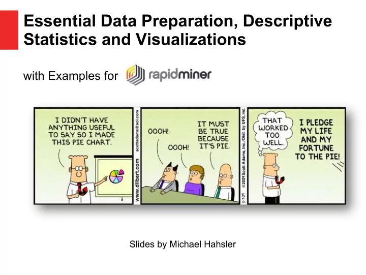

  1. Essential Data Preparation, Descriptive Statistics and Visualizations with Examples for Slides by Michael Hahsler

  2. Purpose 1) "Get used to the data." 2) Clean the data (e.g., find missing values, outliers, mistakes) 3) "Make sure the data makes sense." 4) Find simple relationships between variables. 5) Prepare data for predictive/prescriptive modeling.

  3. RapidMiner ● Install RapidMiner Studio and obtain an educational license (see course website). ● The dataset for the examples can be obtained from http://michael.hahsler.net/SMU/EMIS3309/data/census.csv ● Rapidminer processes for this slide set are available here (save and import process in Rapidminer): http://michael.hahsler.net/SMU/EMIS3309/data/rapidminer/Basic_Stat – istics_and_Visualizations.rmp http://michael.hahsler.net/SMU/EMIS3309/data/rapidminer/Cleaning – _and_preprocessing.rmp

  4. Importing Data For the examples we use a dataset with census data at the ZIP- code level (Data and processes can be found on the class website). Features/Attributes should not be integer! Observations Quantitative – ratio Categorical (RM: integer or real) (RM: polynomial)

  5. Single Variable - Quantitative 5-Number Summary: Descriptive Stats min – Rapidminer gives you this for Population per Zipcode: 1 st quartile – Median – Mean – 3 rd quartile – max – Histogram Visualization to show the distribution

  6. Single Variable - Categorical Count table Descriptive Stats ● Bar chart for counts Visualization ● Pie chart (not ideal for more than a few groups)

  7. Data Cleaning RapidMiner Operators in Cleansing – Missing values? Is this the result of reading the data? Are missing values correctly read in (or are there values like 99, 'N/A' or '.' as text)? Do we have to impute the missing values? – Outliers and strange values Identify in histograms and scatter plots. Examples: many zeros, weird visual pattern visible. Might be the result of data collection. Needs investigation! – Duplicates: Are these a data problem? – Dates : Make sure that these are read in correctly!

  8. Data Cleaning Set a higher number of bins. What do the spikes at 0 and 200,000 for median family income mean? What should we do?

  9. RapidMiner Data Transformation Operators in Blending and Cleansing Data needs to be often transformed to be useful in a model. ● Features – Feature Selection (select attributes) – Feature Generation (generate aggregation, etc.) – Nomalization (e.g, z-score) – Discretization (binning) – Manipulate values (map, replace) ● Observations – Sampling/Filtering examples – Grouping and aggregation

  10. Two Variables - Quantitative RapidMiner : Use Correlation Correlation Matrix node Descriptive Stats Example: population and # of housing units per zipcode have a (Pearson) correlation coefficient of: 0.975 Scatterplot Visualization

  11. Two Variables - Categorical Cross-tabulation Descriptive Stats (i.e., contingency table) RapidMiner : Use Aggregate and Pivot nodes Grouped bar Visualization charts Mosaic plot (not very popular)

  12. Two Variables - Mixed RapidMiner : Use Compare 5-number statistic Aggregate node Descriptive Stats grouped by categorical variable. Bar chart for Visualization individual statistic to compare groups Box plot

  13. Multiple Variables Are usually broken down into pairwise comparisons. Correlation matrix Scatterplot matrix

  14. Multiple Variables (cont.) Comparing multiple quantitative variables (or comparing a single quantitative variable between groups defined by another categorical variable). Tables with group-wise statistics or Boxplot (called Quartile in RapidMiner)

  15. Basic Descriptive Statistics and Data Visualization Cheat Sheet Single Variable - Explore the distribution Statistics Visualization Categorical Variable Counts Bar chart Quantitative Variable 5-number summary Histogram Two Variables - Explore the relationship Statistics Visualization Categorical Variables Contingency table Grouped bar chart (Cross tabulation) Quantitative Variables Correlation Scatter plot Mixed Variables Group-wise Box plot statistics (e.g., average) Bar chart of statistics 3+ Variables Break it down into pairwise statistics or plots. E.g., Correlation matrix, scatter plot matrix, box plot.

Download Presentation
Download Policy: The content available on the website is offered to you 'AS IS' for your personal information and use only. It cannot be commercialized, licensed, or distributed on other websites without prior consent from the author. To download a presentation, simply click this link. If you encounter any difficulties during the download process, it's possible that the publisher has removed the file from their server.

Recommend


More recommend