Announcements U nit 1: I ntroduction to data L ecture 2: E xploratory - - PowerPoint PPT Presentation

announcements u nit 1 i ntroduction to data l ecture 2 e
SMART_READER_LITE
LIVE PREVIEW

Announcements U nit 1: I ntroduction to data L ecture 2: E xploratory - - PowerPoint PPT Presentation

Warm-Up and Data Basics Announcements U nit 1: I ntroduction to data L ecture 2: E xploratory data analysis S tatistics 101 Nicole Dalzell May 14, 2015 Statistics 101 (Nicole Dalzell) U1 - L2: EDA May 14, 2015 2 / 1 Warm-Up and Data Basics


slide-1
SLIDE 1

Unit 1: Introduction to data Lecture 2: Exploratory data analysis Statistics 101

Nicole Dalzell May 14, 2015

Warm-Up and Data Basics

Announcements

Statistics 101 (Nicole Dalzell) U1 - L2: EDA May 14, 2015 2 / 1 Warm-Up and Data Basics

Review

Example Study: A researcher is interested in whether or not cats will choose to sleep less if they have toys to entertain themselves. She divides 250 cats (adults and kittens) into two rooms, with adult cats in one room and baby kittens in the other room. Within each room she erects a fence, randomly placing half the cats (or kittens) on each side of the fence. On one side of the fence she scatters a variety of cat toys. For 1 day, the researcher records the number of hours each cat spends sleeping. What is the research question? What are the explanatory and response variables? Is this an Experimental or Observational study? What are the controls and treatments? Is blocking employed in this study?

Statistics 101 (Nicole Dalzell) U1 - L2: EDA May 14, 2015 3 / 1 Warm-Up and Data Basics

Types of Variables Example

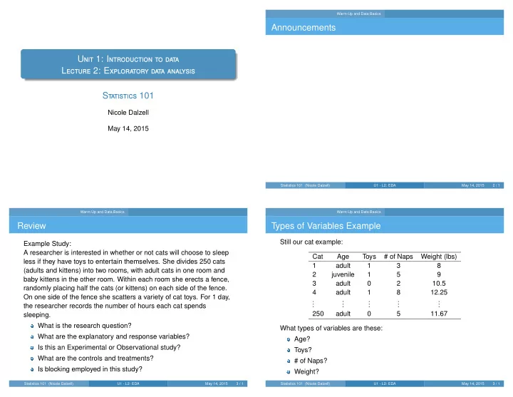
Still our cat example: Cat Age Toys # of Naps Weight (lbs) 1 adult 1 3 8 2 juvenile 1 5 9 3 adult 2 10.5 4 adult 1 8 12.25

. . . . . . . . . . . . . . .

250 adult 5 11.67 What types of variables are these: Age? Toys? # of Naps? Weight?

Statistics 101 (Nicole Dalzell) U1 - L2: EDA May 14, 2015 3 / 1

slide-2
SLIDE 2

Warm-Up and Data Basics Sampling Methods

Population to sample

It is usually not feasible to collect information on the entire population due to high costs of data collection so statisticians instead work with samples that are (hopefully) representative of the populations they come from.

population sample

We try to understand certain features of the population as a whole using summary statistics and graphs based on these samples.

Statistics 101 (Nicole Dalzell) U1 - L2: EDA May 14, 2015 4 / 1 Warm-Up and Data Basics Sampling Methods

Obtaining good samples

Almost all statistical methods are based on the notion of implied randomness. If observational data are not collected in a random framework from a population, these statistical methods – the estimates and errors associated with the estimates – are not reliable. Most commonly used random sampling techniques are simple, stratified, and cluster sampling.

Statistics 101 (Nicole Dalzell) U1 - L2: EDA May 14, 2015 5 / 1 Warm-Up and Data Basics Sampling Methods

Simple random sample

Randomly select cases from the population, each case is equally likely to be selected.

  • Statistics 101 (Nicole Dalzell)

U1 - L2: EDA May 14, 2015 6 / 1 Warm-Up and Data Basics Sampling Methods

Stratified sample

Strata are homogenous, simple random sample from each stratum.

  • Stratum 1

Stratum 2 Stratum 3 Stratum 4 Stratum 5 Stratum 6

Statistics 101 (Nicole Dalzell) U1 - L2: EDA May 14, 2015 7 / 1

slide-3
SLIDE 3

Warm-Up and Data Basics Sampling Methods

Cluster sample

Clusters are not necessarily homogenous, simple random sample from a random sample of clusters. Usually preferred for economical reasons.

  • Cluster 1

Cluster 2 Cluster 3 Cluster 4 Cluster 5 Cluster 6 Cluster 7 Cluster 8 Cluster 9

Statistics 101 (Nicole Dalzell) U1 - L2: EDA May 14, 2015 8 / 1 Warm-Up and Data Basics Sampling Methods

Participation question A city council has requested a household survey be conducted in a suburban area of their city. The area is broken into many distinct and unique neighborhoods, some including large homes, some with only

  • apartments. Which approach would likely be the least effective?

(a) Simple random sampling (b) Cluster sampling (c) Stratified sampling

Statistics 101 (Nicole Dalzell) U1 - L2: EDA May 14, 2015 9 / 1 Warm-Up and Data Basics Exploratory Data Analysis

Explore the Data

When you taste a spoonful of chili and decide it doesn’t taste spicy enough, that’s exploratory analysis. For data analysis, we perform exploratory data analysis, or EDA, to determine trends in features that may be present in the data. The distribution of a variable is a list of possible values the variable can take and how often it takes each of those values. Distributions are critical to assessing the probability of events. Plots are almost always useful for visualizing relationships and distributions in the data.

Statistics 101 (Nicole Dalzell) U1 - L2: EDA May 14, 2015 10 / 1 Warm-Up and Data Basics Exploratory Data Analysis

Visualizing numerical variables

Intensity map: Useful for displaying the spatial distribution. Dot plot: Useful when individual values are of interest. Histogram: Provides a view of the data density, and are especially convenient for describing the shape of the data distribution. Box plot: Especially useful for displaying the median, quartiles, unusual observations, as well as the IQR.

Statistics 101 (Nicole Dalzell) U1 - L2: EDA May 14, 2015 11 / 1

slide-4
SLIDE 4

Warm-Up and Data Basics Exploratory Data Analysis

Why visualize?

Describe the spatial distribution of race/ethnicity in the US.

http://demographics.coopercenter.org/DotMap/index.html Statistics 101 (Nicole Dalzell) U1 - L2: EDA May 14, 2015 12 / 1 Warm-Up and Data Basics Exploratory Data Analysis

Why visualize?

And let’s take a closer look at Durham.

Statistics 101 (Nicole Dalzell) U1 - L2: EDA May 14, 2015 13 / 1 Warm-Up and Data Basics Exploratory Data Analysis

Scatterplot

Scatterplots are useful for visualizing the relationship between two numerical variables. Do life expectancy and total fertil- ity appear to be associated or in- dependent? Was the relationship the same throughout the years,

  • r did it

change?

http://www.gapminder.org/world Statistics 101 (Nicole Dalzell) U1 - L2: EDA May 14, 2015 14 / 1 Warm-Up and Data Basics Exploratory Data Analysis

Cars: ... vs. weight

From the cars data:

miles per gallon (city rating) 2000 3000 4000 20 30 40 weight (pounds)

2000 2500 3000 3500 4000 10 20 30 40 50 60 weight (pounds) price ($1000s)

What do these scatterplots reveal about the data? How might they be useful?

Statistics 101 (Nicole Dalzell) U1 - L2: EDA May 14, 2015 15 / 1

slide-5
SLIDE 5

Numerical Variables Basic Plots

World Bank Data

This is public-use data available for download from http://data.worldbank.org/topic/energy-and-mining . What does the distribution of energy use per capita look like across different countries? Is energy use fairly uniform across different countries? If not, can we distinguish groups of countries that use more than

  • thers?

Country.Name X2011 37 Afghanistan 50 Angola 672.74 63 Albania 689.03 76 Arab World 1806.90 89 United Arab Emirates 7407.01 102 Argentina 1966.97 115 Armenia 916.26 128 American Samoa 141 Antigua and Barbuda 154 Australia 5500.79 167 Austria 3927.92 180 Azerbaijan 1369.32 193 Burundi 206 Belgium 5348.97 219 Benin 384.56 232 Burkina Faso 245 Bangladesh 204.72 258 Bulgaria 2615.04

Statistics 101 (Nicole Dalzell) U1 - L2: EDA May 14, 2015 16 / 1 Numerical Variables Basic Plots

Visualizing numerical variables

Intensity map: Useful for displaying the spatial distribution. Dot plot: Useful when individual values are of interest. Histogram: Provides a view of the data density, and are especially convenient for describing the shape of the data distribution. Box plot: Especially useful for displaying the median, quartiles, unusual observations, as well as the IQR.

Statistics 101 (Nicole Dalzell) U1 - L2: EDA May 14, 2015 17 / 1 Numerical Variables Basic Plots

Stacked Dot Plot

Higher bars represent areas where there are more observations, makes it a little easier to judge the center and the shape of the distribution.

gpa 3.0 3.2 3.4 3.6 3.8 4.0

  • Statistics 101 (Nicole Dalzell)

U1 - L2: EDA May 14, 2015 18 / 1 Numerical Variables Basic Plots

Dot Plot: Why visualize?

Dot plot of weight, in ounces

1000 2000 3000 4000

  • Do you see anything out of the ordinary?

Statistics 101 (Nicole Dalzell) U1 - L2: EDA May 14, 2015 19 / 1

slide-6
SLIDE 6

Numerical Variables Basic Plots

Why visualize?

Dot plot of weight, in ounces

1000 2000 3000 4000

  • Do you see anything out of the ordinary?

Statistics 101 (Nicole Dalzell) U1 - L2: EDA May 14, 2015 20 / 1 Numerical Variables Basic Plots

Why visualize?

What type of variable is average number of hours of sleep per night? Is this reflected in the dot plot below? If not, what might be the reason?

Dot plot of average number of hours of sleep per night

4 5 6 7 8 9

  • Statistics 101 (Nicole Dalzell)

U1 - L2: EDA May 14, 2015 21 / 1 Numerical Variables Basic Plots

Dot Plot: World Bank Data

5000 10000 15000

Eenrgy Data Dot Plot

Energy per capita

Statistics 101 (Nicole Dalzell) U1 - L2: EDA May 14, 2015 22 / 1 Numerical Variables Basic Plots

Histogram

Energy Use in 2011 (World Bank Data)

Energy Use (kg oil equivalent per capita) Number of Countries 5000 10000 15000 20 40 60 80 Country.Name X2011 Afghanistan Angola 672.74 Albania 689.03 Arab World 1806.90 United Arab Emirates 7407.01 Argentina 1966.97 Armenia 916.26

Bins 0-2000 2001 - 4000 4001 - 6000 6001 - 8000

. . .

Count 92 38 18 10

. . .

Statistics 101 (Nicole Dalzell) U1 - L2: EDA May 14, 2015 23 / 1

slide-7
SLIDE 7

Numerical Variables Basic Plots

Histogram: Bin Width

Energy Use in 2011 (World Bank Data)

Energy Use (kg oil equivalent per capita) Number of Countries 5000 10000 15000 20 40 60 80

Energy Use in 2011 (World Bank Data)

Energy Use (kg oil equivalent per capita) Number of Countries 5000 10000 15000 20000 20 40 60 80 120

Energy Use in 2011 (World Bank Data)

Energy Use (kg oil equivalent per capita) Number of Countries 5000 10000 15000 5 10 15 20 25 30 35

Statistics 101 (Nicole Dalzell) U1 - L2: EDA May 14, 2015 24 / 1 Numerical Variables Basic Plots

Bin Width

Which one(s) of these histograms are useful? Which reveal too much about the data? Which hide too much?

extracurricular hrs / week frequency 5 10 15 20 25 30 10 20 30 40 50 extracurricular hrs / week frequency 5 10 15 20 25 5 10 15 20 25 30 extracurricular hrs / week frequency 5 10 15 20 25 5 10 15 extracurricular hrs / week frequency 5 10 15 20 25 2 4 6 8 10 12 14 Statistics 101 (Nicole Dalzell) U1 - L2: EDA May 14, 2015 25 / 1 Numerical Variables Basic Plots

Histogram

Energy Use in 2011 (World Bank Data)

Energy Use (kg oil equivalent per capita) Number of Countries 5000 10000 15000 20 40 60 80

Provides a view of the data density. Very usual for examining the shape of a distribution.

Statistics 101 (Nicole Dalzell) U1 - L2: EDA May 14, 2015 26 / 1 Numerical Variables Distribution Shapes

Histogram

Energy Use in 2011 (World Bank Data)

Energy Use (kg oil equivalent per capita) Number of Countries

This distribution is right skewed and unimodal.

Statistics 101 (Nicole Dalzell) U1 - L2: EDA May 14, 2015 27 / 1

slide-8
SLIDE 8

Numerical Variables Distribution Shapes

Shape: Skewness

We describe histograms as right skewed, left skewed, or symmetric.

2 4 6 8 10 5 10 15 5 10 15 20 25 20 40 60 20 40 60 80 5 10 15 20 25 30

Histograms are said to be skewed to the side of the long tail.

Statistics 101 (Nicole Dalzell) U1 - L2: EDA May 14, 2015 28 / 1 Numerical Variables Distribution Shapes

Shape: Modality

The mode is defined as the most frequent observation in the data set. Does the histogram have a single prominent peak (unimodal), several prominent peaks (bimodal/multimodal), or no apparent peaks (uniform)?

5 10 15 5 10 15 5 10 15 20 5 10 15 5 10 15 20 5 10 15 20 5 10 15 20 2 4 6 8 10 12 14

In order to determine modality, it’s easiest to step back and imagine a density curve over the histogram. Use the limp spaghetti method.

Statistics 101 (Nicole Dalzell) U1 - L2: EDA May 14, 2015 29 / 1 Numerical Variables Distribution Shapes

Shape and Skew

How would you describe this distribution?

Histogram of average number of hours spent on school work per day

2 4 6 8 10 5 10 15 20 25 30 Statistics 101 (Nicole Dalzell) U1 - L2: EDA May 14, 2015 30 / 1 Numerical Variables Distribution Shapes

Shape: Why does this matter?

Symmetric Distribution

Value Height

Bimodal Distribution

Value Height

1 2 3 4 5 6 7 8 9 200 400 600 800 1000

Statistics 101 (Nicole Dalzell) U1 - L2: EDA May 14, 2015 31 / 1

slide-9
SLIDE 9

Numerical Variables Distribution Shapes

Participation question Which of these variables do you expect to be uniformly distributed? (a) weights of adult females (b) salaries of a random sample of people from North Carolina (c) house prices (d) birthdays of classmates (day of the month)

Statistics 101 (Nicole Dalzell) U1 - L2: EDA May 14, 2015 32 / 1 Numerical Variables Distribution Shapes

Commonly observed shapes of distributions

modality unimodal bimodal multimodal uniform skewness right skew left skew symmetric

Statistics 101 (Nicole Dalzell) U1 - L2: EDA May 14, 2015 33 / 1 Numerical Variables Distribution Shapes

Density Curves

A Density Curve is a smoothed density histogram where the area under the curve is 1. To draw a density curve from a histogram simply connect the peaks of a histogram with a smooth line, and normalize the values of the y-axis such that the area under the curve is 1.

Statistics 101 (Nicole Dalzell) U1 - L2: EDA May 14, 2015 34 / 1 Numerical Variables Distribution Shapes

Unusual Observations

Are there any unusual observations or potential outliers?

5 10 15 20 5 10 15 20 25 30 20 40 60 80 100 10 20 30 40 Statistics 101 (Nicole Dalzell) U1 - L2: EDA May 14, 2015 35 / 1

slide-10
SLIDE 10

Numerical Variables Distribution Shapes

Application exercise: Shapes of distributions

Statistics 101 (Nicole Dalzell) U1 - L2: EDA May 14, 2015 36 / 1 Numerical Variables Distribution Shapes

Describing Your Pictures

Bell Shaped: Data is bell shaped if the majority of the data is clustered around the center value (mean) with very few data points lying either way above or way below this value. Right Skewed: Data is positively skewed if you have several large positive data points creating a long tail to the right. Left Skewed: Data is negatively skewed if you have several large negative numbers creating a long tail to the left. Bimodal: Data is bimodal if it has two large clusters of data points. Symmetric: Data is symmetric if it looks like a mirror image around a point of inflection. Uniformly Distributed: Data is evenly spread across all possible values.

Statistics 101 (Nicole Dalzell) U1 - L2: EDA May 14, 2015 37 / 1 Descriptive Statistics Center

Mean

The sample mean, denoted as ¯ x, can be calculated as

¯

x = x1 + x2 + · · · + xn n

=

Sum of Data Points Number of Data Points, where x1, x2, · · · , xn represent the n observed values. The population mean is a parameter computed the same way but is denoted as µ. It is often not possible to calculate µ since population data is rarely available.

¯

x is an estimate of µ based on the observed data. The sample mean is a sample statistic, or a point estimate of the population mean. This estimate may not be perfect, but if the sample is good (representative of the population) it is usually a good guess.

Statistics 101 (Nicole Dalzell) U1 - L2: EDA May 14, 2015 38 / 1 Descriptive Statistics Center

Median

The median is the value that splits the data in half when ordered in ascending order. 0, 1, 2, 3, 4 If there are an even number of observations, then the median is the average of the two values in the middle. 0, 1, 2, 3, 4, 5 → 2 + 3 2

= 2.5

Since the median is the midpoint of the data, 50% of the values are below it. Hence, it is also the 50th percentile.

Statistics 101 (Nicole Dalzell) U1 - L2: EDA May 14, 2015 39 / 1

slide-11
SLIDE 11

Descriptive Statistics Center

Mean vs. Median

Link

If the distribution is symmetric, center is the mean

Symmetric: mean ≈ median

If the distribution is skewed or has outliers center is the median

Right-skewed: mean > median Left-skewed: mean < median

Right−skewed

mean median

Left−skewed

mean median

Symmetric

mean median

Statistics 101 (Nicole Dalzell) U1 - L2: EDA May 14, 2015 40 / 1 Descriptive Statistics Center

Back to our Energy Data

Energy Use in 2011 (World Bank Data)

Energy Use (kg oil equivalent per capita) Number of Countries 5000 10000 15000 20 40 60 80

Mean: 2532.631 Median: 1593.7

Statistics 101 (Nicole Dalzell) U1 - L2: EDA May 14, 2015 41 / 1 Descriptive Statistics Center

Measures of Center

The Mean of a dataset is what we commonly refer to as the average. The Median of a dataset is the middle value of your data. You find the median of your data by ordering from smallest to largest, then finding the value where 50% of your data is above and below that value. The Trimmed Mean is the calculation of the mean after removing a few of the very large and very small observations.

Statistics 101 (Nicole Dalzell) U1 - L2: EDA May 14, 2015 42 / 1 Descriptive Statistics Center

Are you typical?

http://www.youtube.com/watch?v=4B2xOvKFFz4

How useful are centers alone for conveying the true characteristics of a distribution?

Statistics 101 (Nicole Dalzell) U1 - L2: EDA May 14, 2015 43 / 1

slide-12
SLIDE 12

Descriptive Statistics Center

Describing distributions of numerical variables

When describing distributions of numerical variables always mention Shape: skewness, modality Center: an estimate of a typical observation in the distribution (mean, median, mode, etc.) Unusual observations: observations that stand out from the rest

  • f the data that may be suspected outliers

Spread: measure of variability in the distribution (SD, IQR, range, etc.)

−3 −2 −1 1 2 3 −3 −2 −1 1 2 3 −3 −2 −1 1 2 3

Statistics 101 (Nicole Dalzell) U1 - L2: EDA May 14, 2015 44 / 1 Descriptive Statistics Spread

Measures of Spread

The population Variance, σ2, measures each observation’s deviation from the mean. The population Standard Deviation, σ, is the square root of the variance. The Inner Quartile Range (IQR) measures the spread of the middle 50% of your data, and is visually depicted in Boxplots.

Link Statistics 101 (Nicole Dalzell) U1 - L2: EDA May 14, 2015 45 / 1 Descriptive Statistics Spread

Box Plot

The box in a box plot represents the middle 50% of the data, and the thick line in the box is the median.

# of study hours / week 10 20 30 40

Statistics 101 (Nicole Dalzell) U1 - L2: EDA May 14, 2015 46 / 1 Descriptive Statistics Spread

Anatomy of a Box Plot

# of study hours / week 10 20 30 40 lower whisker Q1 (first quartile) median Q3 (third quartile) upper whisker max whisker reach suspected outliers

Statistics 101 (Nicole Dalzell) U1 - L2: EDA May 14, 2015 47 / 1

slide-13
SLIDE 13

Descriptive Statistics Spread

Measures of Location

The 25th percentile is also called the first quartile, Q1. The 50th percentile is also called the median. The 75th percentile is also called the third quartile, Q3.

summary( d$study hours ) Min . 1 st Qu. Median Mean 3rd Qu. Max. NAs 3.00 10.00 15.00 17.42 20.00 40.00 13.00 Between Q1 and Q3 is the middle 50% of the data. The range these data span is called the interquartile range, or the IQR. IQR = 20 − 10 = 10

Statistics 101 (Nicole Dalzell) U1 - L2: EDA May 14, 2015 48 / 1 Descriptive Statistics Spread

Whiskers and Outliers

Whiskers of a box plot can extend up to 1.5 * IQR away from the quartiles.

max upper whisker reach : Q3 + 1.5 ∗ IQR = 20 + 1.5 ∗ 10 = 35 max lower whisker reach : Q1 − 1.5 ∗ IQR = 10 − 1.5 ∗ 10 = −5

An outlier is defined as an observation beyond the maximum reach of the whiskers. It is an observation that appears extreme relative to the rest of the data.

Statistics 101 (Nicole Dalzell) U1 - L2: EDA May 14, 2015 49 / 1 Descriptive Statistics Spread

Outliers (cont.)

Why is it important to look for outliers? Identify extreme skew in the distribution. Identify data collection and entry errors. Provide insight into interesting features of the data.

Statistics 101 (Nicole Dalzell) U1 - L2: EDA May 14, 2015 50 / 1 Descriptive Statistics Spread

Why visualize?

What does a response of 0 mean in this distribution?

  • 2

4 6 8 10 12

Number of drinks it takes students to get drunk

Statistics 101 (Nicole Dalzell) U1 - L2: EDA May 14, 2015 51 / 1

slide-14
SLIDE 14

Descriptive Statistics Spread

Example: Visualizing

What does our Energy Data look like?

5000 10000 15000

Energy Use Data Boxplot

Energy Usage

Statistics 101 (Nicole Dalzell) U1 - L2: EDA May 14, 2015 52 / 1 Descriptive Statistics Spread

Who uses the most energy?

Country.Name X2011 1 Iceland 17964.44 2 Qatar 17418.69 3 Trinidad and Tobago 15691.29 4 Kuwait 10408.28 5 Brunei Darussalam 9427.09 6 Oman 8356.29 7 Luxembourg 8045.90 8 United Arab Emirates 7407.01 9 Bahrain 7353.16 10 Canada 7333.28 11 North America 7062.22 12 United States 7032.35 13 Saudi Arabia 6738.42 14 Singapore 6452.33 15 Finland 6449.04

Statistics 101 (Nicole Dalzell) U1 - L2: EDA May 14, 2015 53 / 1 Descriptive Statistics Spread

Participation question Which of the following is false about the distribution of average number

  • f hours students study daily?
  • 2

4 6 8 10

Average number of hours students study daily

  • Min. 1st Qu.

Median Mean 3rd Qu. Max. 1.000 3.000 4.000 3.821 5.000 10.000 (a) There are no students who don’t study at all. (b) 75% of the students study more than 5 hours daily, on average. (c) 25% of the students study less than 3 hours, on average. (d) IQR is 2 hours.

Statistics 101 (Nicole Dalzell) U1 - L2: EDA May 14, 2015 54 / 1 Descriptive Statistics Spread

Measures of Spread

The population Variance, σ2, measures each observation’s deviation from the mean. The population Standard Deviation, σ, is the square root of the variance. The Inner Quartile Range (IQR) measures the spread of the middle 50% of your data, and is visually depicted in Boxplots.

Link Statistics 101 (Nicole Dalzell) U1 - L2: EDA May 14, 2015 55 / 1