
SLIDE 1
1
Design Psychology
Understanding the mind of the user rather than trying to change it to fit ours…
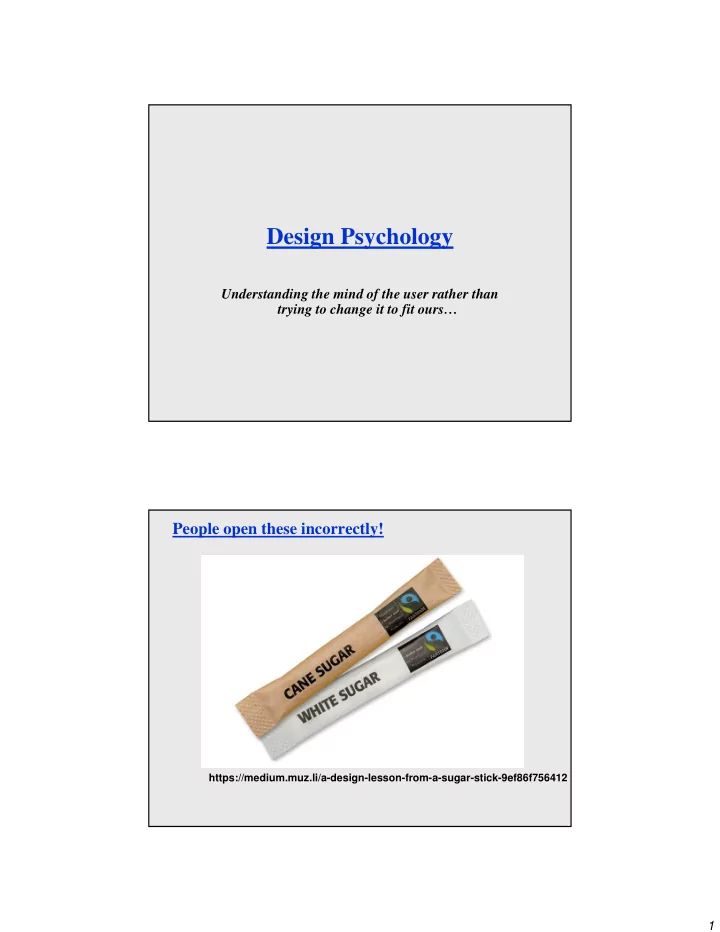
People open these incorrectly!
https://medium.muz.li/a-design-lesson-from-a-sugar-stick-9ef86f756412
Design Psychology Understanding the mind of the user rather than - - PDF document
Design Psychology Understanding the mind of the user rather than trying to change it to fit ours People open these incorrectly! https://medium.muz.li/a-design-lesson-from-a-sugar-stick-9ef86f756412 1 Award-Winning Light Switch??? Cool or
https://medium.muz.li/a-design-lesson-from-a-sugar-stick-9ef86f756412
http://web.mit.edu/persci/people/adelson/checkershadow_illusion.html
Go ahead – print it out – cut out the “B” box and move it over the “A” box!
– chair for sitting – table for placing things on – knobs for turning – slots for inserting things into – buttons for pushing – computers for ???
– when simple things need pictures, labels, instructions, then design has failed
Evan Golub / Ben Bederson / Saul Greenberg
Push or pull? Which side? Can only push, side to push clearly visible
– eg control-display compatibility
24 possibilities, requires:
arbitrary full mapping 2 possibilities per side so 4 total possibilities paired
Evan Golub / Ben Bederson / Saul Greenberg
HINT: It was an electric stove.
– incorrect effect
– invisible effect
Evan Golub / Ben Bederson / Saul Greenberg
– positive transfer: previous learning's also apply to new situation – negative transfer: previous learning's conflict with the new situation
Evan Golub / Ben Bederson / Saul Greenberg
– red means danger – green means safe
– Light switches America: down is off BUT Britain: down is on – Faucets America: anti-clockwise on BUT Britain: anti-clockwise off
– home handyman: light switches installed upside down – calculators vs. phone number pads: which should computer keypads follow?
– Qwerty keyboard: designed to prevent jamming of keyboard? – Dvorak keyboard (’30s): provably faster to use but not as fast as some think…
Because a trashcan in Thailand may look like this: might a Thai user be confused by the “trash can” in some operating systems? Years ago, Sun found their email icon problematic for some American urban dwellers who were unfamiliar with rural mail boxes.
Evan Golub / Ben Bederson / Saul Greenberg
A Mac user might find a Windows system only somewhat familiar. A pre-OS X Mac user might find an OS X Mac system only somewhat
From The Design of Everyday Things What are your initial impressions of these items?
– Support rapid, incremental, reversible actions – Don’t use dialogs to report normalcy – If it’s worth asking the user, it’s worth the program remembering
holes for something to be inserted
big hole for several fingers, small hole for thumb
between holes and fingers suggested and constrained by appearance
implications clear of how the operating parts work
four push buttons to push, but not clear what they will do can add text as a “crutch” but can still be non-obvious
no visible relation between button positions, actions, and end result
little relation to analog watches
age range might define “cultural sub-group” rather than geography for watches…
must be taught
Will the current wave of “smart watches” that seems to be coming make this better or worse?
– designer’s conceptual model communicated to user through system image: appearance, written instructions, system behavior through interaction, transfer, idioms and stereotypes – if system image does not make model clear and consistent, user will develop wrong conceptual model
Design Model Designer User's model User System System image Evan Golub / Ben Bederson / Saul Greenberg
– sensible – non arbitrary – meaningful
Evan Golub / Ben Bederson / Saul Greenberg
The person of medium height is able to see the mirror. The taller person must slouch. The shorter person is out of luck. WHAT WOULD YOU DO????
Evan Golub / Ben Bederson / Saul Greenberg
The person of medium height is easily able to walk through. The taller person better slouch. The shorter person is easily able to walk through. WHAT WOULD YOU DO????
Evan Golub / Ben Bederson / Saul Greenberg
– Maybe your ceiling height is 8’ but the tallest human is 8' 11"!
– but means 5% of population may be (seriously!) compromised
– may exclude half the audience
– font size, line thickness, color for color blind people?
mean 5th percentile 95th percentile 50th percentile standard deviation
eg: http://hcil.cs.umd.edu/trs/2004-12/2004-12.pdf
– computers, cell phones, cameras, tablets, etc.
– physical buttons, LEDs, display resolution – menus, descriptions, feedback consume screen real estate
– product might be pulled if not immediately successful (see HP)
– user demands and expectations keep changing too
Samsung's MM-A800
http://www.incontextdesign.com/chi-2011-the-design-of-cool/