Adults Age group Level 1.5 - 2.0 Time needed 50 - 55 min - - PDF document

adults age group level 1 5 2 0 time needed 50 55 min
SMART_READER_LITE
LIVE PREVIEW

Adults Age group Level 1.5 - 2.0 Time needed 50 - 55 min - - PDF document

Adults Age group Level 1.5 - 2.0 Time needed 50 - 55 min Learning objective(s) Presentation Procedure: Introducing Visual graphics. Vocabulary & speaking Key skills BUSINESS ENGLISH PRESENTATION PROCEDURE 08 INTRODUCING


slide-1
SLIDE 1

¡ ¡ ¡ ¡

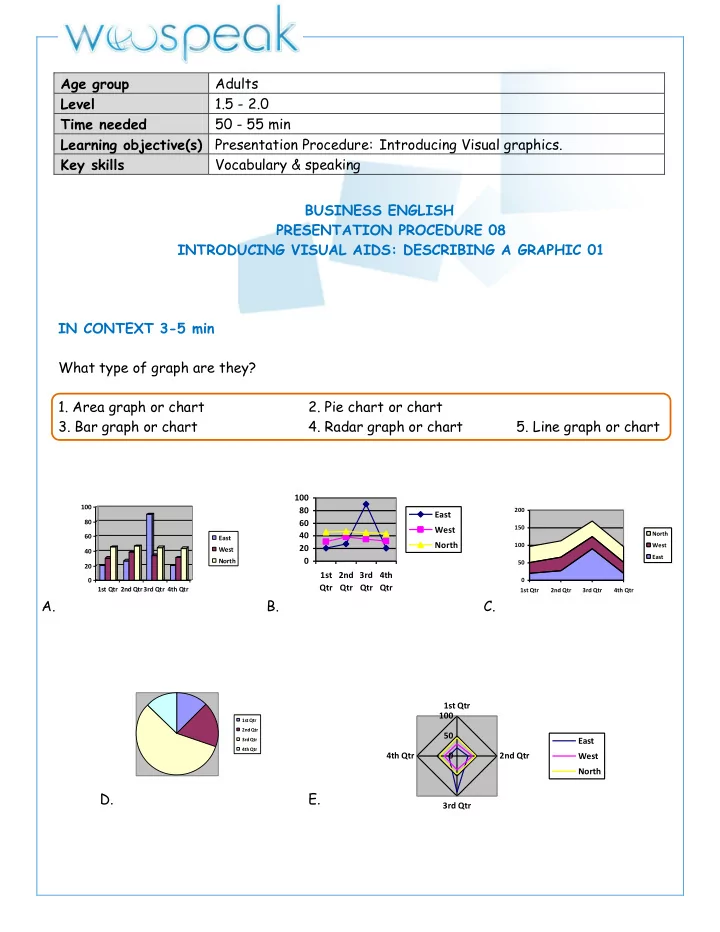
BUSINESS ENGLISH PRESENTATION PROCEDURE 08 INTRODUCING VISUAL AIDS: DESCRIBING A GRAPHIC 01 IN CONTEXT 3-5 min What type of graph are they?

  • 1. Area graph or chart
  • 2. Pie chart or chart
  • 3. Bar graph or chart
  • 4. Radar graph or chart
  • 5. Line graph or chart

A.

20 40 60 80 100 1st ¡Qtr 2nd ¡Qtr3rd ¡Qtr 4th ¡Qtr East West North

B.

20 40 60 80 100 1st Qtr 2nd Qtr 3rd Qtr 4th Qtr East West North

C.

50 100 150 200 1st ¡Qtr 2nd ¡Qtr 3rd ¡Qtr 4th ¡Qtr North West East

D.

1st ¡Qtr 2nd ¡Qtr 3rd ¡Qtr 4th ¡Qtr

E. Age group Adults Level 1.5 - 2.0 Time needed 50 - 55 min Learning objective(s) Presentation Procedure: Introducing Visual graphics. Key skills Vocabulary & speaking

50 100 1st ¡Qtr 2nd ¡Qtr 3rd ¡Qtr 4th ¡Qtr East West North

slide-2
SLIDE 2

VOCABULARY 8 - 10 min Read the description and match them with each diagram type.

  • a. is used to illustrate visually outline ideas and information.
  • b. is a tool to choose between several courses of action that uses a tree-like graph or model
  • f decisions and their possible consequences.
  • c. They show the relationship between two, three or four groups of information.
  • d. show how steps in a process fit together.
  • e. They are diagrams that show all possible logical relations between a collection of sets

(aggregation of things).

  • f. is a tool that helps identify, sort, and display possible causes of a specific problem

1 Matrix diagrams :

  • 2. Venn diagram or set diagrams:
slide-3
SLIDE 3
  • 3. Flow diagram or chart
  • 4. Decision Tree :
slide-4
SLIDE 4
  • 5. Cause-and-effect diagram
  • 6. Mind map
  • Which diagram type did you describe in a presentation ?

What was the presentation about? What did the diagram(s) describe ?

slide-5
SLIDE 5

There are also :

Gantt chart is a type of bar chart that illustrates a project schedule. Team chart is much like an Organization Chart in that it is arranged according to hierarchy or

class structure. However, a (Project) Team Chart is specific to a project rather than a hierarchical map of an entire company. Which one is a team chart or a Gantt Chart ?

  • What idea is best represented through these grahics ?
  • 1. A process 2. Targeting a market 3. Roles and responsibilities
  • 4. Decision making 5. Product positioning

Powerful business graphics for common ideas (Source: http://www.smartdraw.com)

Here are some ideas that you can communicate more effectively with a graphic.

  • 1. Marketing
  • a. with Matrix diagrams
  • b. with a Venn diagram
  • 2. Business Strategy
  • a. Presenting a with a flow diagram
  • b. process with a decision tree
  • c. Problem analysis with a cause-and-effect diagram
  • d. Presenting ideas with a mind map
  • e. Organization structure with an org chart
  • 3. Project Management
  • a. Presenting a project timeline
  • b. Project roadmaps with a Gantt chart
  • c. with a team chart
slide-6
SLIDE 6

DESCRIBING A GRAPHIC/DIAGRAM 12 - 15 min PART ONE

  • 1. Describing a trend

VERBS + ADVERBS to lift to increase to drop to plunge to fall to rise to decline to decrease to fluctuate to dip to go up to collapse to escalate to plummet to plunk to boost steadily slightly dramatically rapidly suddenly slowly constantly sharply steeply

  • a) Draw an horizontal arrow for verbs or nouns meaning « stable », a vertical arrow going

up meaning "upward" or meaning "downward" or a N/A for "Not applicable" b) Describe this graphic expressing the same idea 3 different ways using the vocabulary above from the 3 tables.

  • 2. Making comments

ADJECTIVES + NOUNS uneven dip slight sales large rise modest fall steep growth constant climb stable descent steady

VERBS to remain (stable)

  • to soar

to weaken to recover to keep (constant, steady) to hit a low to slump Table 1. Describing an evolution 1. 1. 2. 3. Table 2 Making comments 4. 5. 6.

slide-7
SLIDE 7

PART TWO

  • 3. Presenting a diagram / chart / graphic : Connecting ideas

USE

PHRASES Introducing / Explaining visuals

/ chart) showing First let me quickly explain The visual demonstrates you As you can see this diagram display You can see that the different (colors/sections/segment) have been used to illustrate

Highlight information

I d like to start drawing your attention to What I d like to point out here I think you ll be (not) surprised to see I d like to focus your attention on Let s look more closely at Pay close attention to

Cause

Since As + subject + verb Because Because of On account of + noun Due to

Effect

For this reason Therefore So that + subject + verb Thus As a result, In order to + basic verb form

Rewrite the sentences

  • 1. Then / will /pick up / for / rest of the year / the / profits / rapidly
  • 2. In / slightly / costs / decrease / next few years / will / the
  • 3. year / Costs / been / rapidly / rising / last / has
  • 4. I / profits / will / for / next two months /think / the / drop
  • 5. Profits / have / for / remained / last / six months / the / steady
slide-8
SLIDE 8

READING Complete the phrases with the vocabulary from the previous table. More than one answer is possible Presenting the decision tree diagram : 1. developping a new product generate a greater benefit of $270,400

  • 2. . the possible benefit
  • f developing a new product or consolidate
  • ne.
  • 3. The choice is evident. a

both product consolidation strategies bring a lower financial gain. b believe developping a product is an advantage. 4 return only one solution is clear developping thoroughly our product.

  • themslelve, I strongly recommend to start

working on creating a new product.

slide-9
SLIDE 9

LISTENING 5 8 min

  • 1. Before listening :

The graph presentation you will hear is about DSI (days of sales in inventory). It is a financial measure of a company performance giving an idea how long it takes a company to turn its inventory into sales. Ususally the lower DSI the better. Note that the average DSI from

  • ne industry to another varies.

To calculate it : DSI = x365

  • 2. Listen and complete the graphic.

Inventory Cost of sales 5 10 15 20 25 30 35 40

Number ¡of ¡Days

1996 1997 1998 1999 2000 2001 2002 2003 2004 2005

DSI ¡Comparison

DELL HPQ

slide-10
SLIDE 10

QUIZ 8 10 min Match. Area graph Radar chart Line graph Bar graph Pie chart A.

20 40 60 80 100 1st ¡Qtr 2nd ¡Qtr3rd ¡Qtr 4th ¡Qtr East West North

B.

20 40 60 80 100 1st Qtr 2nd Qtr 3rd Qtr 4th Qtr East West North

C.

50 100 150 200 1st ¡Qtr 2nd ¡Qtr 3rd ¡Qtr 4th ¡Qtr North West East

D.

1st ¡Qtr 2nd ¡Qtr 3rd ¡Qtr 4th ¡Qtr

E. Complete the description. Use the correct verb form. drop soar - pick remain the same - rose sharply stabilized- level out Crude oil, avg, spot price* chart in U.S. dollars (USD-$) per barrel

*Spot price (financial trem) : the current price of a commodity. 50 100 1st ¡Qtr 2nd ¡Qtr 3rd ¡Qtr 4th ¡Qtr East West North

This graph illustrates the price in US dollars per barrel of crude oil from 1960 to 2012. In the sixties the price 1)_______ at 1.2 usd. The next decade, the price 2)______ ______ at first and 3)________. From the mid 70s, it 4) _________ to reach about 30 usd and there was a 5)________ till the mid 80s. From that period and for about 20 years the price 6)_____ between 13 and 24 usd. After the price 7)__________ untill 2012 eacept for a sudden 8)_________ in 2011.

slide-11
SLIDE 11

Match the diagram with its use

  • 1. Positioning
  • 2. Cause of an issue
  • 3. Classifying and logical relation between a set of information
  • 4. Visual representation bewteen ideas and information
  • 5. Illustration of several course of action and its consequences

b) c) d

a)

e