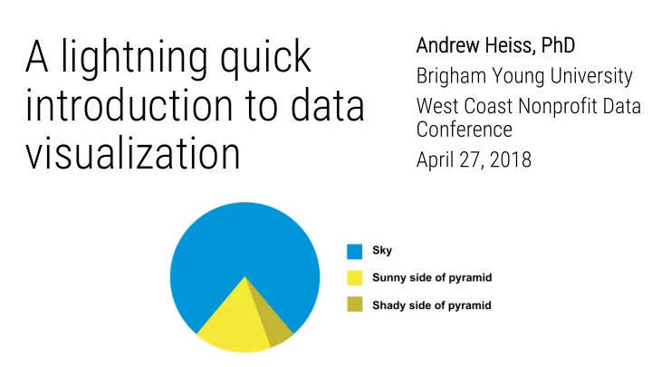
SLIDE 1 A lightning quick introduction to data visualization
An Andrew Heiss, Ph PhD Brigham Young University West Coast Nonprofit Data Conference April 27, 2018

SLIDE 2
Why visualize data?
Plan for today
Aesthetics and design Types of visualizations How do I do all this? Take a sad plot and make it better

SLIDE 3
talks.andrewheiss.com/wcnpd18

SLIDE 4
Why visualize data?

SLIDE 5
Theories are only stories until you have some data. Data alone cannot tell stories or prove theories.

SLIDE 6

SLIDE 7

SLIDE 8
Never trust summary statistics alone

SLIDE 9 Humans are visual creatures
@FacesPics

SLIDE 10

SLIDE 11

SLIDE 12
The War of 1812 (the European one)
Long distance!

SLIDE 13 The War of 1812 (the European one)
Very cold!
01-Oct 01-Nov 01-Dec

SLIDE 14 The War of 1812 (the European one)
Very sad!
Napoleon’s Grande Armée
Died Survived

SLIDE 15

SLIDE 16 Characteristics of graphical excellence
- 1. “... the well-designed presentation of interesting
data—a matter of substance, statistics, and design.”
- 2. Complex ideas communicated with
clarity, precision, and efficiency.
- 3. That which gives the viewer the greatest
number of ideas in the shortest time with the least ink in the smallest space.
- 4. Nearly always multivariate.
- 5. Requires telling the truth about the data.

SLIDE 17
What makes Minard’s graph so great?

SLIDE 18
We forget this!

SLIDE 19

SLIDE 20

SLIDE 21

SLIDE 22

SLIDE 23
Types of visualizations

SLIDE 24 Exploratory visualizations
Academic-ish Quick scatterplots, histograms, other charts to help understand your data
Explanatory visualizations
Publishable Consumable by the general public; Vox, NYT, Washington Post, FiveThirtyEight, etc.

SLIDE 25
Exploratory Explanatory

SLIDE 26
Exploratory data analysis
Visualize every variable individually

SLIDE 27
Exploratory data analysis
Visualize relationships between each variable

SLIDE 28
Explanatory data analysis
Annotate and tell a story

SLIDE 29
Explanatory data analysis
Annotate and tell a story

SLIDE 30
Which chart type do I use? datavizcatalogue.com

SLIDE 31
Dataviz gotchas: multiple y-axes

SLIDE 32
Dataviz gotchas: multiple y-axes

SLIDE 33 Dataviz gotchas: multiple y-axes
It’s okay if both axes measure the same thing

SLIDE 34
Dataviz gotchas: truncated y-axes

SLIDE 35 Truncation is okay sometimes!
…when small movements matter

SLIDE 36 Truncation is okay sometimes!
…when zero values are impossible

SLIDE 37 Truncation is okay sometimes!
…but never on bar charts!

SLIDE 38
Aesthetics and design

SLIDE 39 Fonts
Nice sans serif fonts; move away from Arial
Design principles
Co Contrast Re Repeti titi tion Al Alignment Pr Proxi ximity

SLIDE 40
Colors
Be aware of colorblind users!

SLIDE 41
Choose universally accessible palettes

SLIDE 42
How do I do all this?

SLIDE 43 Ba Barri rrier er to en entry ry (a (amount of coding req required red) Fl Flexibility an and power

SLIDE 44
Take a sad plot and make it better

SLIDE 45
talks.andrewheiss.com/wcnpd18
