
SLIDE 1
1
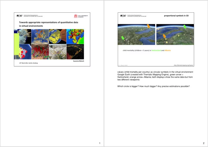
values (child mortality per country) as circular symbols in the virtual environment Google Earth (created with Thematic Mapping Engine), green arrow = Switzerland, orange arrow= Albania; both displays show the same data but from two different viewpoints Which circle is bigger? How much bigger? Any precise estimations possible?
2