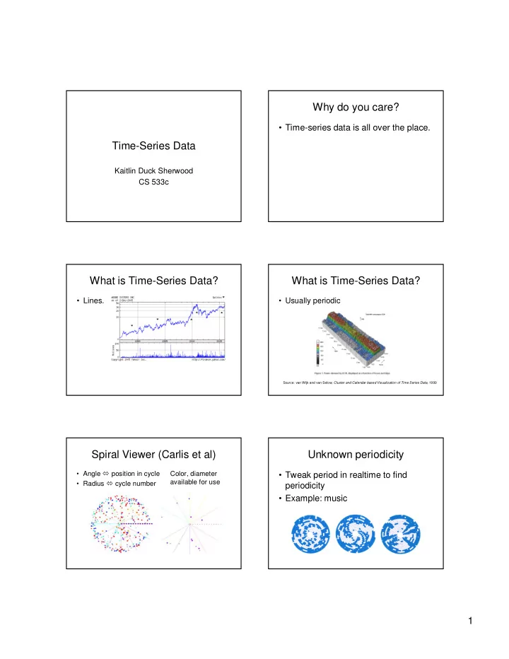
why do you care
play

Why do you care? Time-series data is all over the place. - PDF document

Why do you care? Time-series data is all over the place. Time-Series Data Kaitlin Duck Sherwood CS 533c What is Time-Series Data? What is Time-Series Data? Lines. Usually periodic Source: van Wijk and van Selow, Cluster and


  1. Why do you care? • Time-series data is all over the place. Time-Series Data Kaitlin Duck Sherwood CS 533c What is Time-Series Data? What is Time-Series Data? • Lines. • Usually periodic Source: van Wijk and van Selow, Cluster and Calendar based Visualization of Time Series Data, 1999 Spiral Viewer (Carlis et al) Unknown periodicity • Angle � position in cycle Color, diameter • Tweak period in realtime to find available for use • Radius � cycle number periodicity • Example: music 1

  2. Helices Spiral barchart • Example: Chimp eating Z-axis used for data habits • Angle � day of year • Radius � year • Z-axis* � type of food • Color � type of food • Diameter � amount Can step through spokes one at a time (Rings to beat occlusion) User feedback Good points of paper • Qualitative feedback from 12 • Compelling visuals users • Gave examples • “Buy into the notion of a spiral • Has software display” • Some user feedback • Couldn’t self-operate • Wanted more Bad points of paper Time-series bitmaps • Examples not compelling Repurposes heavily: • Graphs unlabeled • Chaos Game • Difficult to see quant info Representation • Questionable movie data • SAX • Weak user eval • Windows Explorer • Advantages over Cartesian? 2

  3. Chaos Game Representation SAX • Assign corner of square to each base • Converts reals into equiprobable letters • For each symbol, take a step in symbol • Eliminate trends with narrow window direction of half distance • Uses: clusters, motifs, anomalies • Color corresponds to number of times a pixel visited Time-series bitmaps Ubiquity • Data -> SAX -> CGR -> bitmap Use filesystem: • Linear color mapping (JET) • Thumbnails • Length normalization • Cluster (using MDS) Comparisons only Real-world data Good points • Clustering heterogenous data (15 • Pretty cool idea sets) • Repurposes material from other – Better than ARIMA or Markov fields well • Clustering of 20 ECG patients (perfect) • Ubiquitous visualization (filesys) • Video classification • Impressive results – Better than Euclidian or DTW • Classifying ECG data (perfect) 3

  4. Bad points Summary • Didn’t explain CGR well • Spirals. Cool pictures, what use? • Didn’t explain Windows • Bitmaps. Less cool, perhaps clustering more useful. • Data sets relatively small • No user testing References • Interactive Visualization of Serial Periodic Data , John V. Carlis and Joseph A. Konstan, Proc UIST 98. • Time-series Bitmaps: A Practical Visualization Tool for working with Large Time Series Databases Kumar, N., Lolla N., Keogh, E., Lonardi, S. , Ratanamahatana, C. A. and Wei, L. (2005). Proc. SDM '05, pp. 531-535 4

Download Presentation
Download Policy: The content available on the website is offered to you 'AS IS' for your personal information and use only. It cannot be commercialized, licensed, or distributed on other websites without prior consent from the author. To download a presentation, simply click this link. If you encounter any difficulties during the download process, it's possible that the publisher has removed the file from their server.

Recommend


More recommend