Where Are We? Feedback So far? Collection Cleaning Integration - - PowerPoint PPT Presentation

where are we feedback so far
SMART_READER_LITE
LIVE PREVIEW

Where Are We? Feedback So far? Collection Cleaning Integration - - PowerPoint PPT Presentation

Where Are We? Feedback So far? Collection Cleaning Integration Analysis Visualization Presentation Dissemination 1 CSE 6242 / CX 4242 1. How to Identify Vis Issues? 2. Class Project Duen Horng (Polo) Chau Georgia Tech Partly based on


slide-1
SLIDE 1

Where Are We? Feedback So far?

1

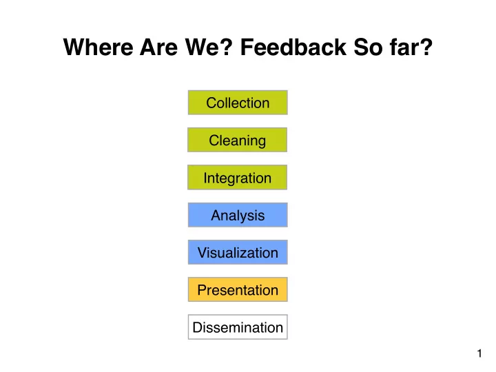
Collection Cleaning Integration Visualization Analysis Presentation Dissemination

slide-2
SLIDE 2
  • 1. How to Identify Vis Issues?
  • 2. Class Project

CSE 6242 / CX 4242 Duen Horng (Polo) Chau
 Georgia Tech

Partly based on materials by 
 Professors Guy Lebanon, Jeffrey Heer, John Stasko, Christos Faloutsos

slide-3
SLIDE 3

3

Student of 
 Edward Tufte

slide-4
SLIDE 4

4

Edward Tufte

An American statistician and professor emeritus of political science, statistics, and computer science at Yale University. He is noted for his writings

  • n information design and

as a pioneer in the field of data visualization.

  • Wikipedia
slide-5
SLIDE 5

Also Highly Recommended:

slide-6
SLIDE 6

Good charts? How would you improve them?

slide-7
SLIDE 7

7

How about this one?

slide-8
SLIDE 8

8

Which is better?

slide-9
SLIDE 9

9

Can you improve this table’s design?

Tables

What are they good for?

slide-10
SLIDE 10

What’s the problem with making everything 
 bold or italic?

slide-11
SLIDE 11

http://www.youtube.com/watch?v=A8I9pYCl9AQ

https://www.youtube.com/watch?v=1E9pKU_N15A

slide-12
SLIDE 12

“When everyone is super, 
 no one is super”

http://www.youtube.com/watch?v=A8I9pYCl9AQ

https://www.youtube.com/watch?v=1E9pKU_N15A

slide-13
SLIDE 13

“When everyone is super, no one is super”

12

slide-14
SLIDE 14

13

slide-15
SLIDE 15

13

A lot of “chart junk”. 
 Low “data to ink” ratio (Edward Tufte)

slide-16
SLIDE 16

14

Better? High “data to ink” ratio

slide-17
SLIDE 17

15

Aligning Numbers Look good? Or not?

slide-18
SLIDE 18

16

slide-19
SLIDE 19

17

This reminds you of what?

Bar Charts

slide-20
SLIDE 20

18

Better than Christmas.

slide-21
SLIDE 21

19

Company Profits

slide-22
SLIDE 22

19

Don’t show profits in red!!
 Think carefully about your color choices.

Company Profits

slide-23
SLIDE 23

20

slide-24
SLIDE 24

21

slide-25
SLIDE 25

21

Misleading Bar Charts

slide-26
SLIDE 26

22

Vertical axis of bar charts 
 should start at 0, almost always

slide-27
SLIDE 27

23

Disorienting color bars

slide-28
SLIDE 28

24

Better?

slide-29
SLIDE 29

25

slide-30
SLIDE 30

25

Exercise For Your Necks

slide-31
SLIDE 31

26

Bars Can be Horizontal

http://www.apple.com/macbook-pro/performance-retina/

slide-32
SLIDE 32

26

Bars Can be Horizontal

When labels are hard to read, try horizontal layout.

http://www.apple.com/macbook-pro/performance-retina/

slide-33
SLIDE 33

27

Line Charts

Does this look all right to you?

slide-34
SLIDE 34

28

Use “ticks” at regular intervals (e.g., 2, 5, 10, etc.)

slide-35
SLIDE 35

29

Note y-axis does not need to start at 0. 
 Why not as bad as in the case of bar chart?

Fever Line

slide-36
SLIDE 36

30

Fever Line

slide-37
SLIDE 37

31

Multiple Lines in one chart

We see this often in academic papers. Better ways?

slide-38
SLIDE 38

32

Which one is more effective? Why? 
 What if you have many lines you want to show?

slide-39
SLIDE 39

33

“Small Multiple” - Edward Tufte
 Better than overlapping (sometimes)

“a series or grid of small similar graphics or charts, allowing them to be easily compared”

slide-40
SLIDE 40

34

The Dreaded Pie Charts

Why people like to use pie charts?

slide-41
SLIDE 41

35 http://www.wired.com/2008/02/macworlds-iphon/

slide-42
SLIDE 42

36

slide-43
SLIDE 43

Log scale instead of linear scale

Include numbers from different orders of magnitude

37

slide-44
SLIDE 44

38

Example

log-log

slide-45
SLIDE 45

39

Example

“log” also works well for time

slide-46
SLIDE 46

40

OK for outliers that are *really* different

slide-47
SLIDE 47

Destroying your great results with poor powerpoint

Bad color schemes Bad fonts Too much animation Too much data

41

100 times faster!

http://www.youtube.com/watch?v=lpvgfmEU2Ck&feature=player_embedded

Don McMillan: Life After Death by PowerPoint

can you read this?

slide-48
SLIDE 48

Destroying your great results with poor powerpoint

How to fix?

  • Color schemes: start with black & white, add colors if needed
  • Fonts: sans-serif font looks nicer
  • On Mac: Helvetica is always good
  • On Windows: Arial?
  • Too much animation: start with no animation, then add if

appropriate

  • Too much data: don’t just copy figures from paper and past

them on the slides!

42

http://www.youtube.com/watch?v=lpvgfmEU2Ck&feature=player_embedded

Don McMillan: Life After Death by PowerPoint

slide-49
SLIDE 49

Suggestions: use pictures whenever appropriate

“Pictures” include most non-text elements: 
 tables, diagrams, charts, etc. Why?

  • “A picture is worth a thousand words”
  • People like pictures and love movies.
  • Picture is often more succinct, memorable

43

slide-50
SLIDE 50

Figures should be self-contained

Why?

  • Don’t make people go back and forth between text & figure
  • People skim; look at “interesting” things first
  • Especially in academia, busy reviewers look at figures first
  • Bad figures -> bad first impression 


(lower chance of paper acceptance) How to fix?

  • Succinctly describe your main messages 


(what you want the readers to learn)

44

slide-51
SLIDE 51

45

http://www.cs.cmu.edu/~dchau/polonium_sdm2011.pdf

Example

slide-52
SLIDE 52

46

Example

slide-53
SLIDE 53

Crown-jewel figure on first page

(nice to have)

Why?

  • Give an overview of what readers is going to

get -- cut to the chase

  • Again, people like to see interesting things

How to do it?

  • Use your most impressive figure
  • Can be similar to another shown later

47

slide-54
SLIDE 54

48

Example

slide-55
SLIDE 55

Suggestion: Design in grayscale first

Then add color If it doesn’t look good in black and white, it’s not gonna look good with color (Why iPhone comes in black or white first?)

49

slide-56
SLIDE 56

Suggestion: Use legible fonts

If people can’t see it, they won’t appreciate it

For printed materials, print them out and check! For slides, rule of thumb is about 7 lines of text per slide.

50

slide-57
SLIDE 57

Suggestion: you probably need to redo your figure for slides

Designing for print is different from designing for the screen

  • Resolution (which is higher?)
  • Levels of details (people mostly want a few

“take-away” messages from your talk)

51

slide-58
SLIDE 58

52

Example

slide-59
SLIDE 59

Higher is better. Apolo wins.

* Statistically significant, by two-tailed t test, p <0.05

Judges’ Scores

8 16

Model- based *Prototyping *Average

Apolo Scholar

Score

Example

slide-60
SLIDE 60

Project

Description is out, on course homepage 50% of course grade 4-5 students in a group You may mix grads, undergrads, on-campus, Q & Q3 students You must first read the “Teaming” section for caveats and suggestions

54

slide-61
SLIDE 61

Project

3 core requirements

  • 1. Large dataset
  • 2. Non-trivial analysis/algorithms/computation
  • 3. An interactive user interface that interact with the

algorithms Grading & Schedule

  • Proposal (writeup + in-class presentation)
  • Progress report (mostly as a “checkpoint”)
  • Final report (writeup + poster presentation)

55

slide-62
SLIDE 62

George Heilmeier

Former Director of DARPA 


slide-63
SLIDE 63

Heilmeier Questions

  • 1. What are you trying to do? 


Articulate your objectives using absolutely no jargon.

  • 2. How is it done today; what are the limits of current practice?
  • 3. What's new in your approach; why it will be successful?
  • 4. Who cares?
  • 5. If you're successful, what difference will it make?
  • 6. What are the risks and payoffs?
  • 7. How much will it cost?
  • 8. How long will it take?
  • 9. What are the midterm and final "exams" to check for success?

57

Preflight checklist for (your) successful projects

http://en.wikipedia.org/wiki/George_H._Heilmeier http://smlv.cc.gatech.edu/2010/10/17/heilmeiers-questions/

slide-64
SLIDE 64

IUI’15 Full conference paper

slide-65
SLIDE 65

KDD’15 Workshop paper