utility scale solar 2015
play

Utility-Scale Solar 2015 An Empirical Analysis of Project Cost, - PowerPoint PPT Presentation

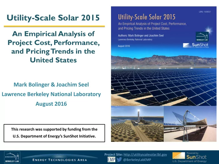
Utility-Scale Solar 2015 An Empirical Analysis of Project Cost, Performance, and Pricing Trends in the United States Mark Bolinger & Joachim Seel Lawrence Berkeley National Laboratory August 2016 This research was supported by funding


  1. Utility-Scale Solar 2015 An Empirical Analysis of Project Cost, Performance, and Pricing Trends in the United States Mark Bolinger & Joachim Seel Lawrence Berkeley National Laboratory August 2016 This research was supported by funding from the U.S. Department of Energy’s SunShot Initiative. Project Site: http://utilityscalesolar.lbl.gov @BerkeleyLabEMP

  2. Part of broader solar work in the Electricity Markets and Policy Group  Solar Cost-Related Work:  Annual solar “state of the market” reports • Residential/commercial systems: http://trackingthesun.lbl.gov • Large ground-mounted systems: http://utilityscalesolar.lbl.gov  Derivative analyses (e.g., Academic Partnership Program)  Renewable Energy Valuation and Grid Integration  Rate-Design Impacts on the Economics and Deployment of DPV  Impact of DPV on Traditional Utility Business Models  Impact of Utility-Scale and Distributed PV on Real Estate Assets  Technical Assistance and Policy Evaluations (e.g., RPS analyses) Project Site: http://utilityscalesolar.lbl.gov 2 @BerkeleyLabEMP

  3. Presentation Outline Strong growth of the utility-scale solar market offers increasing amounts of project-level data that are ripe for analysis. 1. Introduction and description of broader technology trends Key findings from analysis of the data samples (We discuss PV projects first, then focus on CSP projects ): Installed project prices 2. Operation and maintenance (O&M) costs 3. Performance (capacity factors) 4. Power purchase agreement (“PPA”) prices 5. 6. Future outlook Project Site: http://utilityscalesolar.lbl.gov 3 @BerkeleyLabEMP

  4. Utility-scale projects have the greatest capacity share in the U. S. solar market  Utility-scale solar had a 57% capacity share of 2015 installations and a 54% share of cumulative installations at the end of 2015 Sources: GTM / SEIA Solar Market Insight Reports, LBNL Database We define “utility-scale” as any ground-mounted project that is larger than 5 MW AC Smaller systems are analyzed in LBNL’s “Tracking the Sun” series. Project Site: http://utilityscalesolar.lbl.gov 4 @BerkeleyLabEMP

  5. Drivers of the utility-scale market: RPS  RPS has historically been MN: 26.5% by 2025 WA: 15% by 2020 ME: 40% by 2017 MT: 15% by 2015 Xcel: 31.5% by 2020 NH: 24.8% by 2025 a significant driver of VT: 75% by 2032 MI: 10% by 2015 MA: 11.1% by 2009 +1%/yr OR: 50% by 2040 (large IOUs) WI: 10% by 2015 utility-scale solar, NY: 30% by 2015 RI: 16% by 2019 5-25% by 2025 (other utilities) PA: 8.5% by 2020 CT: 23% by 2020 particularly in the NV: 25% by 2025 IA: 105 MW by 1999 NJ: 22.5% by 2020 DE: 25% by 2025 Southwest and Northeast IL: 25% by 2025 OH: 12.5% by 2026 DC: 20% by 2020 MD: 20% by 2022 CO: 30% by 2020 (IOUs) MO: 15% by 2021 CA: 50% by 2030  Recent RPS expansions 20% by 2020 (co-ops) 10% by 2020 (munis) NC: 12.5% by 2021 (IOUs) (e.g., in CA, OR) will 10% by 2018 (co-ops and munis) AZ: 15% by 2025 NM: 20% by 2020 (IOUs) 10% by 2020 (co-ops) ensure future RPS Source: relevance for utility-scale LBNL RPS Report 2016 TX: 5,880 MW by 2015 solar markets HI: 100% by 2045  Increasingly, utility-scale solar expansion into non- RPS states (Southeast) or continued deployment where RPS goals have been reached (e.g., Texas) Source: GTM 2016: The Next Wave of Utility-Solar Project Site: http://utilityscalesolar.lbl.gov 5 @BerkeleyLabEMP

  6. Non-RPS drivers of utility-scale solar  Voluntary Procurement:  3 rd party-ownership with competitive PPA deals (+ Hedge Value)  Utility-Owned Generation (Florida Power & Light, Georgia Power, Dominion, Duke, PNM)  PURPA (“avoided cost” rates for “Qualifying Facilities”)  e.g., North Carolina (~2700 MW), Utah (~700 MW), Idaho (~500 MW), Oregon  Potential for boom and bust cycles  Retail Procurement  Green tariffs / community solar  Direct access (e.g., Apple 130 + 150 MW California Flats PPA)  Community Choice Aggregation  Merchant Solar  e.g., Barilla Solar in Texas  Clean Power Plan??? Project Site: http://utilityscalesolar.lbl.gov 6 @BerkeleyLabEMP

  7. PV projects Photo Credit: sPower SEPV Palmdale East Project Site: http://utilityscalesolar.lbl.gov 7 @BerkeleyLabEMP

  8. PV project population broken out by tracking vs. fixed-tilt, module type, and installation year PV project population: 278 projects totaling 9,016 MW AC 4,500 9,000 Tracking Thin-Film Columns represent annual capacity additions 915 Annual Capacity Additions (MW AC ) 4,000 8,000 Cumulative Capacity Additions Tracking c-Si Areas represent cumulative capacity additions Fixed-Tilt Thin-Film 3,500 7,000 Fixed-Tilt c-Si 3,709 3,000 6,000 (MW AC ) 334 2,500 5,000 Cumulative Tracking Capacity is 4,684 MW (52%) (incl. hybrid projects with both thin-film and c-Si modules) 2,000 4,000 1,631 Cumulative Fixed-Tilt Capacity is 4,325 MW 1,500 3,000 2,823 Cumulative c-Si Capacity is 5,211 MW (58%) 1,000 2,000 Cumulative Thin-Film Capacity is 3,738 MW 201 500 1,000 640 1,502 0 0 2007-2009 2010 2011 2012 2013 2014 2015 Installation Year  2015 Trends :  Strong growth in c-Si capacity (81%) relative to thin-film capacity (19%), driven in part by the completion of the very large Solar Star project (594 MW AC ). Largest c-Si manufacturers are SunPower (33% of c-Si market), Trina (20%), and Jinko (16%), while the thin-film market is dominated by First Solar (93% of the installed capacity).  Increasing dominance of tracking projects (70% of newly installed capacity) relative to fixed-tilt projects (30%) Project Site: http://utilityscalesolar.lbl.gov 8 @BerkeleyLabEMP

  9. Historically heavy concentration in the Southwest and mid-Atlantic, but now spreading to Southeast Primarily fixed-tilt c-Si projects in the East Tracking (c-Si and, increasingly, thin- film) is more common in the Southwest Cumulative Capacity MW-AC % State 2015 2014 CA 56% 59% AZ 13% 17% NV 7% 5% NC 6% 2% TX 3% 3% Project Site: http://utilityscalesolar.lbl.gov 9 @BerkeleyLabEMP

  10. Utility-scale PV continues to expand beyond California and the Southwest 4,500 9,000 All Other States Cumulative PV Capacity Additions (MW AC ) 4,000 8,000 Annual PV Capacity Additions (MW AC ) Southwest (NV, UT, AZ, NM, CO) California 3,500 7,000 8% 3,000 6,000 Columns represent annual capacity additions 16% 2,500 5,000 28% Areas represent cumulative capacity additions 2,000 4,000 25% 1,500 3,000 11% 76% 19% 20% 1,000 2,000 47% 29% 500 55% 1,000 69% 41% 46% 25% 51% 25% 0 0 <=2010 2011 2012 2013 2014 2015 Installation Year  Strong percentage growth outside the established markets:  North Carolina (quadrupling previous capacity with 15 new projects)  Georgia (nearly tripling previous capacity with 6 new projects totaling 177 MW AC )  Nevada (more than doubling previous capacity with 4 new projects totaling 349 MW AC ) Project Site: http://utilityscalesolar.lbl.gov 10 @BerkeleyLabEMP

  11. The eastward expansion is reflected in the buildout of lower-insolation sites 6 Annual GHI (kWh/m 2 /day) 5.39 5.28 5 5.01 4 Fixed-Tilt PV Tracking PV Markers represent capacity-weighted averages , with 20th and 80th percentiles. All PV 3 2010 2011 2012 2013 2014 2015 n=10 n=35 n=43 n=38 n=64 n=83 (175 MW-AC) (485 MW-AC) (946 MW-AC) (1,344 MW-AC) (3,166 MW-AC) (2,824 MW-AC) Installation Year  Historical trend of increasing solar resource quality for the average project site did not continue in 2015 – the first year where the Global Horizontal Irradiance declined  The wide 80/20 distribution of fixed-tilt PV reflects deployment throughout the US, whereas tracking PV is concentrated more in the high-GHI Southwest. However, 2015 shows an expansion of tracking into less-sunny areas (note the decline in the 20% percentile)  All else equal, higher GHI should boost sample-wide capacity factors (reported later). The effects of the lower GHI for new 2015 projects will be evaluated in next year’s report once they have been operational for a full year Project Site: http://utilityscalesolar.lbl.gov 11 @BerkeleyLabEMP

  12. The average inverter loading ratio (ILR) has increased over time, to 1.31 in 2015 1.4 Inverter Loading Ratio (ILR) 1.33 1.31 1.3 1.31 1.2 Fixed-Tilt PV 1.1 Tracking PV All PV Markers represent capacity-weighted averages , with 20th and 80th percentiles. 1.0 2010 2011 2012 2013 2014 2015 n=10 n=35 n=43 n=38 n=64 n=83 (175 MW-AC) (485 MW-AC) (946 MW-AC) (1,344 MW-AC) (3,166 MW-AC) (2,824 MW-AC) Installation Year  As module prices have fallen (faster than inverter prices), developers have oversized the DC array capacity relative to the AC inverter capacity to enhance revenue  Fixed-tilt PV generally has a higher average ILR than tracking PV (fixed-tilt has more to gain from boosting ILR), dip in 2014 is skewed by several very large projects  The apparent decline in the capacity-weighted average ILR from 2013 to 2014 is related to several large projects – the median ILR held nearly constant in 2014  All else equal, a higher ILR should boost sample-wide capacity factors (reported later) Project Site: http://utilityscalesolar.lbl.gov 12 @BerkeleyLabEMP

Download Presentation
Download Policy: The content available on the website is offered to you 'AS IS' for your personal information and use only. It cannot be commercialized, licensed, or distributed on other websites without prior consent from the author. To download a presentation, simply click this link. If you encounter any difficulties during the download process, it's possible that the publisher has removed the file from their server.

Recommend


More recommend