
SLIDE 1
Two-Dimensional (2-D) Design A working definition: Orchestration - - PowerPoint PPT Presentation
Two-Dimensional (2-D) Design A working definition: Orchestration of the ELEMENTS of art Line Cy Twombly - Untitled Shape Arthur Dove - Formation I Space Giovanni Battista Piranesi - Carceri, Plate XI Color Stuart Davis - New York Elevated
Cy Twombly - Untitled
Arthur Dove - Formation I
Giovanni Battista Piranesi - Carceri, Plate XI
Stuart Davis - New York Elevated
Imogen Cunningham - The Unmade Bed
Edward Hopper - Night Shadows
Miriam Schapiro - The Poet #2
Unity: elements are visually similar to one another Variety: elements visually contrast with one another
similarity of textures promote unity
Anselm Kiefer - Jerusalem
repeated color harmonies promote unity
George Tooker - Fiesta
repeated shapes promote unity
Maxfield Parrish - Lantern Bearers
Contrasting color, pattern and texture create visual interest
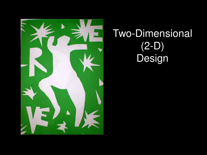
Henri Matisse - La Musique
contrast creates focal points which draw attention to various areas of the piece
Romare Bearden - Spring Way
Focal point created by isolating a shape
Romare Bearden - Spring Way
focal point created by color contrast
Richard Hart - editorial design
Focal point created by “lines of force” - other elements directing the eye toward focal point
George Bellows - Sharkeys
Sally Mann - Shiva at Whistle Creek
Tabor Photo-graphic - I want to understand
Equal distribution of visual “weight” within a composition - symmetrical / asymmetrical
virtually identical elements in each half
Diane Arbus - Identical twins
Equal distribution of “visual weight” within quadrants of composition, but not identical elements
Andreas Feininger - Railroad Ferry Hudson River, New York
for example
Pierre Bonnard - Model in Backlight
Pierre Bonnard - Model in Backlight
visual elements repeat in such a way as to evoke a “beat”
Man Ray - Rayograph 1926 “regular” rhythm
“irregular” / contrapuntal rhythm
Marcel Duchamp - Monte Carlo
John Heartsfield - Millions stand behind me
Proportion - size relationships within the composition
Frida Kahlo - What the water gave me
Scale - relative size
external standard
Both figure (“positive shapes”) and ground (“negative shapes”) appear to be purposefully constructed. Aubrey Beardsley - The Toilette of Salome
Ambiguous figure / ground relationships often used in logo design Munday Morning Creative Group - Centex Corp. Hearts And Hammers program logo
Evaluation of the composition of the work -
Is understanding of the principles of design evident in this work? Were the elements created and used in purposeful, imaginative ways? Are the principles used intelligently and sensitively to contribute to its meaning? How and what does the interaction of the elements and principles
Painting Photography Printmaking Etc. Drawing Digital Graphic Design Typography
Rembrandt - The Young Haaringh Most of the visual weight (small complex shapes) on this side of the composition - few counter-balancing elements on the other side.
Annibale Carracci - The Penitent Magdalene in the Wilderness Most visual weight on this side of the composition. Eye direction of Magdalene directs viewer off the page
Claude Garache - Seated Woman with a Fan Dynamic Figure / ground relationships on this side Most visual weight on this side Figure / ground relationship weaker on this side. Fewer elements to balance more complex right side
Milton Avery - Birches
illusion of space
sets up visual rhythm
top / bottom, side to side
Kiki Smith - Come Away With Her
dogs balanced by brighter colors on left side
semi-circles promotes unity
promotes unity
Phillip Guston - Green Rug
unity.
lines sets up visual rhythm
by complexity of bottom half
Audrey Flack - Jolie Madame
Jack Levine - Reconstruction
Hiroshige - Bridge at Awate
Franz Kline - New York
Bo Bartlett - Leviathan