
SLIDE 1
The Visual Rhetoric of Starbucks
The Visual Rhetoric of Starbucks Matches the Product From co ff ee, - - PowerPoint PPT Presentation
The Visual Rhetoric of Starbucks Matches the Product From co ff ee, tea and spices to food and more Logo Development Use of Color Logo #1Color Logo #1Color Brown Signi fj es: Co ff ee Tea Spices Use of Color Logo
The Visual Rhetoric of Starbucks
Matches the Product
è
From coffee, tea and spices to food and more
Logo Development
Logo #1—Color Logo #1—Color Brown Signifjes:
Use of Color
Use of Color
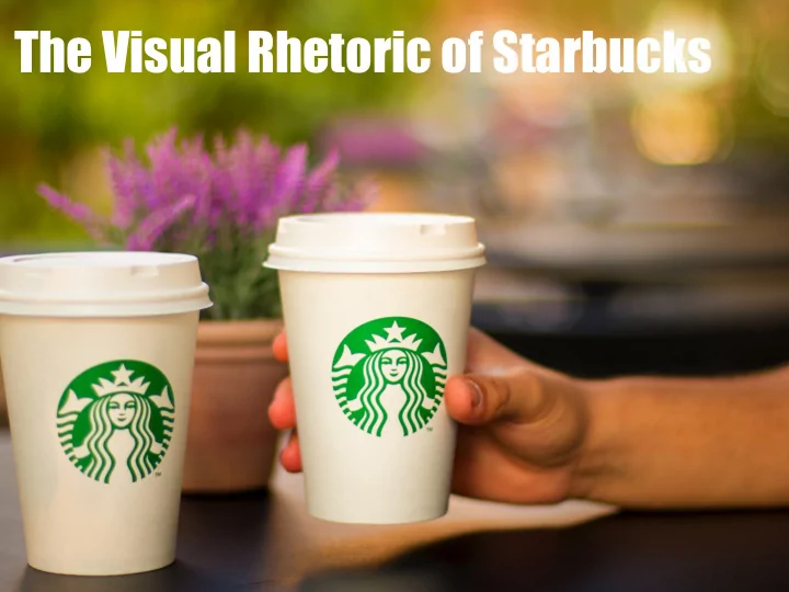
Logo #2-#4—Color Logo #2-#4—Color Green Signifjes:
Where did the Text Go?
Used to be a signi sed to be a signifj fjer er Minimalist design trends
How the Visuals Change to fit Audience Exigencies
Evolution of the Audience
1970s 1970s: local audience, not nationally known 1987 1987: growing in popularity, starts to serve food 1992 1992: expands to global markets, nationally known brand 2011 2011: company is known worldwide
Evolution of the Logo
Tie exigencies of the company shape logo design
Figure One: Te original Starbucks logo created in 1971 uses textual signifjers like cofgee, tea, and spices, to aid in audience understanding of the brand. Tis logo also utilizes a detailed siren to illustrate the mythology to customers. Figure Two: Starbucks’ second logo, released in 1987, followed the company’s move to serve food items. Tie association between the color brown and food was unappetizing to designers, so they decided to go with green—the color of money. Figure three: Starbucks’ third logo. Mir- rored their expansion to global markets in