
RoboVis
Alista ir Wic k
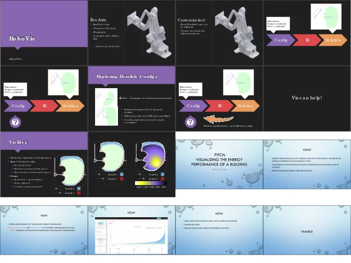
E vo Arm
- Sma ll ro b o t a rm
- 3 de g re e s o f fre e do m
- 3D printa b le
- Co ntro lle d with a Pytho n
App
- … whe re to g o fro m he re ?
Custo miza tio n!
- E
ve ry 3D-printe d a rm c a n b e diffe re nt
- Cha ng e me c ha nic s fo r
diffe re nt purpo se s
Co nfig I K So lutio n
Dime nsio ns De sig n c o nstra ints Se rvo c o nstra ints
Co nfig I K So lutio n
Dime nsio ns De sig n c o nstra ints Se rvo c o nstra ints
E xplor ing Possible Configs
T e dio us a nd impra c tic a l to try ma ny de sig ns Diffe re nt pe o ple ne e d diffe re nt c a pa b ilitie s Ca n the e xplo ra tio n pro c e ss b e ma de a c c e ssib le ? Cha ng ing o ne o f do ze ns o f pa ra me te rs
Co nfig I K So lutio n
Dime nsio ns De sig n c o nstra ints Se rvo c o nstra ints Wa nt to ra pidly ite ra te – ne w/ diffe re nt c o nfig s
Vis c a n he lp!
Vis Ide a
I nte ra c tive e xplo ra tio n o f de sig n spa c e Data: Ca lc ula te d o nline Re a c ha b le po ints Ma x lo a d (a c ro ss re a c ha b le spa c e ) Ma x ve lo c ity (a c ro ss re a c ha b le spa c e ) De sign: Spa tia l da ta -> spa tia l displa y? De rive a ttrib ute s? Co mb ine c e rta in pa ra me te rs? L e ng th 0 L e ng th 1 L e ng th 0 L e ng th 1 L e ng th 0 L e ng th 1 120N 110N 100N 90N 80N
PITCH: VISUALIZING THE ENERGY PERFORMANCE OF A BUILDING
ARASH SHADKAM
WHAT
- ENERGY PERFORMANCE DATA OF A BUILDING (FOR NOW THE BUILDING IS THE CENTER FOR
INTERACTIVE RESEARCH ON SUSTAINABILITY/”CIRS”)
- TIME-SERIES DATA FROM SENSORS INCLUDING TEMPERATURE AND OCCUPANCY DATA (IF
POSSIBLE)
- DERIVED: NORMALIZED ENERGY PERFORMANCE DATA
WHY
- BETTER UNDERSTANDING OF THE BUILDING’S ENERGY PERFORMANCE
- DISCOVERING TRENDS AND CORRELATIONS IN THE ENERGY PERFORMANCE DATA AND
IDENTIFY POTENTIAL OPTIMIZATION OPPORTUNITIES IN THE BUILDING’S PERFORMANCE
HOW HOW
- FACET: MULTI-FORM OVERVIEW-DETAIL VIEWS/LINKED HIGHLIGHTING
- MANIPULATE: SELECT
- REDUCE: FILTER/RANGE SLIDERS FOR DIFFERENT TIME SPANS
THANKS!