presentation skills good practice
play

Presentation Skills Good Practice From the Skills Team, University - PDF document

Presentation Skills Good Practice From the Skills Team, University of Hull This guide covers the following areas: Presentation structure Presentation design 5 top tips Slide design Presentation skills 5 top tips Why


  1. Presentation Skills – Good Practice From the Skills Team, University of Hull This guide covers the following areas:  Presentation structure  Presentation design – 5 top tips  Slide design  Presentation skills – 5 top tips Why are most presentations so bad? Well, most people who give presentations have not actually considered what is good practice in this field and most students have had such poor examples presented to them by academics that they do not know any better. Many lessons come from the world of business which is now moving away from text- rich slides full of bullet points to more visually interesting slides. Death by PowerPoint is a byword (byphrase?) for any presentation that is so dominated by the excess use of PowerPoint features (bullet points, animations, complex diagrams, clipart etc) that the content is lost and the audience are brain dead by the end of it. Presentation structure 
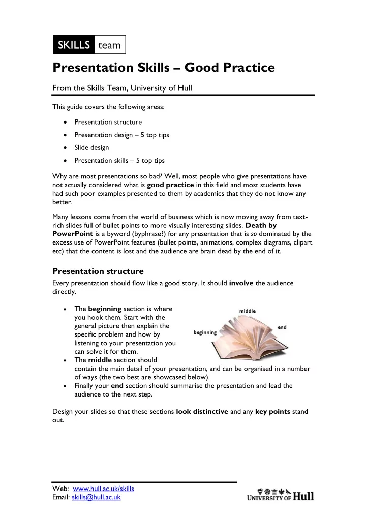
Every presentation should flow like a good story. It should involve the audience directly. The beginning section is where  you hook them. Start with the general picture then explain the specific problem and how by listening to your presentation you can solve it for them. The middle section should  contain the main detail of your presentation, and can be organised in a number of ways (the two best are showcased below). Finally your end section should summarise the presentation and lead the  audience to the next step. Design your slides so that these sections look distinctive and any key points stand out. Web: www.hull.ac.uk/skills Email: skills@hull.ac.uk

  2. Middle section structure option 1 - key points Several authors suggest using a structure that involves an introduction followed by a middle section containing special key point slides (usually 3). The ideas is that there is a heirarchy of slides so that after each key point you have other slides that explain or add detail to that key point. Cliff Atkinson (writer of Beyond Bullet Points) provides a story template to help you structure and plan your presentation in this way on his website at http://beyondbulletpoints.com/resources/ (download the BBP Story template for Word 2007). There are lots of other useful resources there too. Middle section option 2 - sparkline Nancy Duarte, from Duarte Design (the company employed to create Microsoft's own new promotional presentations) has written a book called Resonate in which she looks in detail at the structure of successful presentations throughout history (even back to Lincoln's Gettysburg Address). She discovered that many have the same presentation form which she calls a 'sparkline'. This structure involves there being a clear distinction between "What is" (the position before the presentation is seen and acted upon) and "What could be" (the position after the presentation is seen and acted upon). The idea is that the audience is introduced to the "What is" state at the beginning of the presentation and then switched back and forth between "What could be" and "What is" several times before ending in the "What could be" condition, which she calls "Reward: new bliss". Nancy explains this better on her website found here: http://www.duarte.com/books/resonate/sparkline-overview In terms of academic work the "What is" is the current level of knowledge or previous thinking on a subject and the "What could be" is the new knowledge or new thinking. The "new bliss" is what the audience could do or learn next now that they are aware of the change. 2

  3. Presentation design - 5 top tips 1. Don't use one of the themes that comes with PowerPoint Don't be tempted to use one of these built-in themes At best they are overused so that your presentation does not stand out, at worse they contain distracting elements and bad colour choices. 2. Make sure there is sufficient contrast between your background and any text on the slide As a general guideline, using coloured text on a coloured background is rarely necessary. Also, try to avoid black text on a white background as this is acknowledged as particularly troublesome for dyslexics in your audience. If you stick to the basic A second colour can be used for contrast only rules below you cannot go wrong. 3. Avoid unnecessary clutter Don't put a logo or image on every slide - if you need to use a logo, just put it on the first slide and the last slide (and on your handouts). 4. Keep fonts simple Don't use fancy fonts for the main text in your presentation. You should also avoid WordArt for the main text too. It is OK to use a fancy font if you are making a point with it, but otherwise stick to the simple ones. Oh, and NEVER use Comic Sans!! Some people say it is wrong to use the default fonts (usually Calibri or Cambria) but these are actually perfectly serviceable fonts. If you want to change to something else, just to show you are not boring, consider one of the fonts below which are still easily readable and yet have a bit of extra character (and are all standard in MS Office). If you decide to download a font from elsewhere, remember to change your Save options (found under PowerPoint Options at the bottom of the Windows menu) to Embed fonts so that you can use them on other machines. 3

  4. 5. Keep animation to a minimum Don't presentation-wide animations (like animating all titles to fly in or all text to build a point at a time). You should only use animation when it is absolutely necessary; to make it easier for the audience to understand or visualise something. If you apply it to all slides, this thought process is clearly not being followed. Slide design There has been a lot of research and much written about what is a well designed, effective slide. The main finding is that: A slide full of bullet points with a title that makes no immediate point is a poor slide. This is a very hard lesson for people creating academic presentations who feel that a good slide has a simple title then a list of points about that title. Most students will only ever see presentations where the majority of slides use that format and most will only ever create presentations which use that slide format. Ask yourself this question "Is PowerPoint the best way to transfer large amounts of textual information? The answer is "No, that is what a book or a document is for". People are very poor at reading and listening at the same time , which is what they are asked to do when attending most PowerPoint presentations. PowerPoint is a visual medium; its purpose is to help an audience visualise what the speaker is saying. The purpose of a presentation should not be information transfer, it should be about enabling understanding and encouraging further action or research. This section offers information about what makes a well designed slide and links to research that supports this finding. There are also links to books which will help you find solutions on how an audience can visualise information. Design slides like academic paragraphs On our essay writing pages, we give advice on creating academic paragraphs using the PEE acronym (Point, Evidence, Explanation). This same structure can be used for good academic slides.  The Point of the slide should be made in the title, it should be a full sentence in a conversational style. So, instead of "Costumes" you may have "The costumes are well researched and authentic" or instead of "Language" you may have "Language is more than the spoken word".  The Evidence should be shown in the main body of the slide and where possible this should be visual rather than textual (although in some cases quotes or very simple lists can be used).  The Explanation should be spoken in the narration and this is where the detail of the presentation should be contained. In order that you can produce useful handouts, it is recommended that you record this in the Notes section of PowerPoint. 4

Download Presentation
Download Policy: The content available on the website is offered to you 'AS IS' for your personal information and use only. It cannot be commercialized, licensed, or distributed on other websites without prior consent from the author. To download a presentation, simply click this link. If you encounter any difficulties during the download process, it's possible that the publisher has removed the file from their server.

Recommend


More recommend