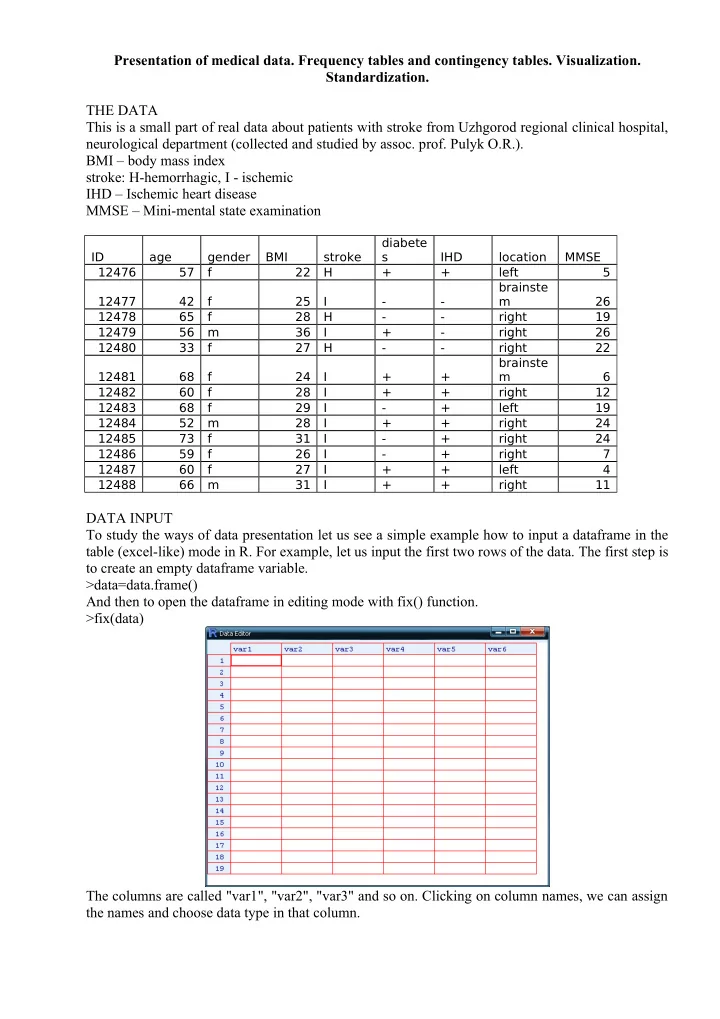
SLIDE 1 Presentation of medical data. Frequency tables and contingency tables. Visualization. Standardization. THE DATA This is a small part of real data about patients with stroke from Uzhgorod regional clinical hospital, neurological department (collected and studied by assoc. prof. Pulyk O.R.). BMI – body mass index stroke: H-hemorrhagic, I - ischemic IHD – Ischemic heart disease MMSE – Mini-mental state examination
ID age gender BMI stroke diabete s IHD location MMSE 12476 57 f 22 H + + left 5 12477 42 f 25 I
m 26 12478 65 f 28 H
19 12479 56 m 36 I +
26 12480 33 f 27 H
22 12481 68 f 24 I + + brainste m 6 12482 60 f 28 I + + right 12 12483 68 f 29 I
left 19 12484 52 m 28 I + + right 24 12485 73 f 31 I
right 24 12486 59 f 26 I
right 7 12487 60 f 27 I + + left 4 12488 66 m 31 I + + right 11
DATA INPUT To study the ways of data presentation let us see a simple example how to input a dataframe in the table (excel-like) mode in R. For example, let us input the first two rows of the data. The first step is to create an empty dataframe variable. >data=data.frame() And then to open the dataframe in editing mode with fix() function. >fix(data) The columns are called "var1", "var2", "var3" and so on. Clicking on column names, we can assign the names and choose data type in that column.
SLIDE 2
Clicking on a cell the corresponding text or number can be typed into the cell. In a such manner the whole table can be produced. Closing the table (but not the R itself), all changes are saved to the workspace. Another way is to prepare the table in excel, save it as "text files (with tabular delimiter, .txt)". Then it is possible to download that table to R using read.table() function: >data=read.table("c:/path_to_text_file/name_of_file.txt", header=TRUE) The argument header=TRUE tells that the first row consists of column names, not data. It can be shortened to header=T. To preserve the time, let us download already prepared file from internet: >stroke=read.table("http://stat.org.ua/data/stroke.txt", header=T) To see whether the download had success, type >fix(stroke) The table with data should appear. If there is no table, but some text instead, then a mistake in web- adress should be searched for and corrected. DESCRIPTIVE STATISTICS Now, when the researcher presents his data, he describes it with descriptive statistics. For example: "The studied sample consists from 13 M±m years old patients", where instead M the arithmetic mean and instead m – standard deviation of sample should be given. Let us find those numbers: >mean(stroke$age) >sd(stroke$age) This is a common way to describe the ratio (continuous) variable To see the age of the youngest and the oldest patients, we can use function range(): >range(stroke$age) The simplest descriptive statistics for nominal variables are counts and frequencies. To count how many men and women were among patients, we use function table() (it produces tables of counts): >table(stroke$gender) To transfer counts to frequencies, prop.table() can be used >prop.table(table(stroke$gender)) However, the frequencies in a such presentation are not common (since they are not enough pretty). To make the look better, express frequencies as percents and round them to two significant digits after zero. Firstly save previous result in a variable >gender= prop.table(table(stroke$gender)) then make some refinement >round(100*gender,2) The tables that describe mutual distribution of two nominal variables are called contingency tables. Such tables are produced with already known function table() with just adding the second variable as a parameter. For example, let us see what are the numbers of men and women having diferrent types of stroke: >table(stroke$gender, stroke$stroke) The rows in such table are created by levels (options) of one variable, and columns – by another variable. Here we see, that there were no men with hemorrhagic stroke, however, amon women this kind os stroke is also not typical. In a similar way let us see the contingency table of gender and IHD: >gender.HID=table(stroke$gender, stroke$IHD) >gender.HID To add margins we can use corresponding function addmargins()
SLIDE 3 >addmargins(gender.HID) There are three ways to calculate percents for contingency tables: row-wise, column-wise and
- verall. Within the first option each row will have the sum of its values equal to 100%, within the
second – each column will have the sum of its values equal to 100%. The first variant is choosed when additional argument 1 is passed to prop.table() function, the second – with passing 2. The
- verall version where all cells of table will sum up to 100% is obtained when passing no additional
- argument. Let us check
>prop.table (gender.HID, 1)*100 >prop.table (gender.HID, 2)*100 >prop.table (gender.HID)*100 It is possible to downgrade ratio values to ordinal (and treat them like nominal) by dividing them into groups, each containing values in some defined interval. Such grouping can be made with cut()
- function. We can tell the function to create the prespecified number of groups:
>cut(stroke$age, 4) >table(cut(stroke$age, 4)) In such way the intervals will have equal length and will be based on the range of data. Also it is possible to define custom intervals with breaks parameter. Let us define groups "50 and younger", "50-60", "60-70","older than 70" >age.grouped=cut(stroke$age,breaks=c(0,50,60,70,150)) >table(age.grouped) Now, such variable can be used in contingency tables: >table(stroke$gender, age.grouped) VISUALIZATION Visualization is a nice way to show your idea to others. In order to produce nice plots with minimal coding we will use ggplot2 package. First, download and install the package (this is required only for the first time you do visualization on that computer). >install.packages("ggplot2") And now turn it on for current session >library(ggplot2) There are two main functions in this package which are called qplot() and ggplot(). The first is more simple but has fewer possibilities, the second is more complex, however much richer. We should be satisfied even with qplot(). This function can guess what kind of plots to produce depending on types of data provided. Descriptional plots – plot only one variable at once. For nominal data the default plot is bar plot of counts: >qplot(data$gender) In a layman literature the most common way to visualize one nominal variable is pie-chart. Pie charts are widely criticized in statistical literature, so there are no simple way to produce it with ggplot2: > qplot(factor(1), fill=stroke$gender)+coord_polar("y") Instead, we can pass count table to function pie() from basic R: >pie(table(stroke$gender)) The best way to present ratio (continuous) data visually is the histogram. >qplot(stroke$age) However, the default binning is not satisfactory, so let us adjust it (force it to make grouping with 10 years interval): >qplot(stroke$ age, binwidth=10) Another good way is to produce boxplot > qplot(x=1, y=stroke$age, geom="boxplot") The scatterplot with IDs of patients on x-axis can be an option. >qplot(x=factor(stroke$ID), y=stroke$age, geom="point")
SLIDE 4 Inferential plots – visualize two or more variables at once with the aim to support some conclusions about their relationships. Association between two nominal variables can be studied with stacked bar plots: >qplot(stroke$gender, fill=stroke$IHD) Or, if we want to convert counts to frequencies and see where there are different proportions, use argument position=fill. >qplot(stroke$gender, fill=stroke$IHD, position="fill") See whether diabetes has effect on the location of stroke >qplot(stroke$diabetes, fill=stroke$location, position="fill") Association between nominal and ratio variable can be viewed with scatterplot. Let us study whether the severety of stroke depends on IHD > qplot(stroke$IHD, stroke$MMSE) However, much better way is to use boxplots: >qplot(stroke$IHD, stroke$MMSE, geom="boxplot") With such wonderful package as ggplot2 we can use even both: >qplot(stroke$IHD, stroke$MMSE, geom=c("boxplot", "point")) If we have too many point, they can be placed one onto other, so the overplotting issue arise. The way to workaround that problem is to add some random noise to the position of points. That technique is called jittering. > qplot(stroke$IHD, stroke$MMSE, geom=c("boxplot", "jitter")) To search for association between two ratio (continuous) variables, scatterplot is usually used. For example, look whether age has effect on MMSE score >qplot(stroke$age, stroke$MMSE) The trend lines can be added. Nonlinear: >qplot(stroke$age, stroke$MMSE, geom=c("point","smooth")) Or linear >qplot(stroke$age, stroke$MMSE, geom=c("point","smooth"), method="lm") Does BMI has effect on MMSE? >qplot(stroke$BMI, stroke$MMSE, geom=c("point","smooth"), method="lm") If time is one of the variables, then the line plot is a good option. This kind of plot is produced with geom="line". >qplot(stroke$BMI, stroke$MMSE, geom="line") STANDARDIZATION That terms has several meanings in biostatistics. We will study two of them. The first is the standardization of sample. The sample is standardized when it has zero mean and standard deviation
- f 1. The resulting values are often called Z-scores (however, many statisticians say that is a wrong
name, while the correct one is t-score). Such procedure is carried out when we want to compare values of different variables, which are measured in different units. For example, let us see data of the first patient: >stroke[1,] Now, do the value of age 57 common in a sample? And whether the value of MMSE (5) is typical among studied patient? And if not, which variable has more typical value for a given patient? To answer this, we need to transform both variables to the common scale. This can be done with R function scale(). Let us standardize both age and MMSE values and see the results for the first patient. > scale(stroke[c("age","MMSE")])[1,] The value for age variable means that the age of first patient is less than average on 0.13 standard
- deviations. That is tiny difference, so the age is typical for a sample. Another variable, MMSE, is
less typical with Z-score -1.3. So the MMSE value of the first patient is less than average MMSE on 1.3 standard deviations. That is moderate difference. If Z-score is greater than 3 or lesser than -3, the corresponding object is an outlier for studied sample.
SLIDE 5 Another way of standardization is a standardization of some statistics. Standardization of a statistics means adjusting it for potential effect of some confounding variable. Here is an example, copied from the book (B. Rosner, Fundamentals of Biostatistics) (OC – oral contraceptives): Age is often an important confounder influencing both exposure and disease rates.For this reason, it is often routine to control for age when assessing disease–exposurerelationships. A first step is sometimes to compute rates for the exposed and unexposedgroups that have been “age standardized.” The term “age standardized” meansthe expected disease rates in the exposed and unexposed groups are each based onan age distribution from a standard reference population. If the same standard isused for both the exposed and unexposed groups, then a comparison can be madebetween the two standardized rates that is not confounded by possible age differencesbetween the two populations. Example: The presence of bacteria in the urine (bacteriuria) has been associated with kidney
- disease. Conflicting results have been reported from several studies concerning the possible role of
OCs in bacteriuria. The following data were collected in a population-based study of nonpregnant premenopausal women younger than age 50. The data are presented on an age-specific basis in Table. The prevalence of bacteriuria generally increases with age. In addition, the age distribution of OC users and non-OC users differs considerably, with OC use more common among younger women. Thus, for descriptive purposes we would like to compute age-standardized rates of bacteriuria separately for OC users and non-OC users and compare them using an RR.
SLIDE 6
Another example of standardization is the plot of deaths by year in USA
SLIDE 7 While the number of deaths is growing, the relative value (per 100 000 population, this is intensive index) which is called crude death rate has light decrease. However, when adjust mortality by age, the down-going trend is evident. Such situation is due to change in demographic structure of
- population. Now there are much more older people, than in a first half of XX century. Naturally,
- lder people have higher mortality rates. That is why, to see the real progress in medicine, we
should derive standardized – age-adjusted death rates.