practicing for your presentation
play

Practicing For Your Presentation Use Visual Aids! But Dont abuse - PDF document

Practicing For Your Presentation Use Visual Aids! But Dont abuse your visuals aids Whatever your visuals may be, keep them simple and dont put too many words on them. The audience isnt there to read your slides, they are


  1. Practicing For Your Presentation • Use Visual Aids! But … • Don’t abuse your visuals aids – Whatever your visuals may be, keep them simple and don’t put too many words on them. The audience isn’t there to read your slides, they are there to listen to you present. • 
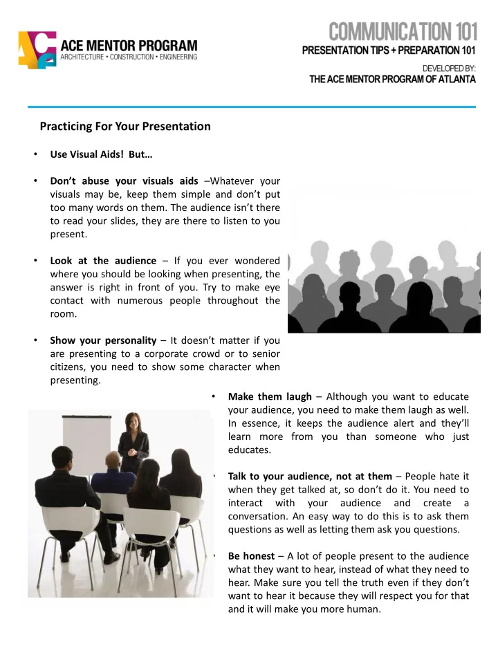
Look at the audience – If you ever wondered where you should be looking when presenting, the answer is right in front of you. Try to make eye contact with numerous people throughout the room. • Show your personality – It doesn’t matter if you are presenting to a corporate crowd or to senior citizens, you need to show some character when presenting. • Make them laugh – Although you want to educate your audience, you need to make them laugh as well. In essence, it keeps the audience alert and they’ll learn more from you than someone who just educates. • Talk to your audience, not at them – People hate it when they get talked at, so don’t do it. You need to interact with your audience and create a conversation. An easy way to do this is to ask them questions as well as letting them ask you questions. • Be honest – A lot of people present to the audience what they want to hear, instead of what they need to hear. Make sure you tell the truth even if they don’t want to hear it because they will respect you for that and it will make you more human.

  2. Practicing For Your Presentation CONTINUED • Don’t over prepare – You need to be prepared enough to know what you are going to talk about but make sure your presentation flows naturally instead of sounding memorized. • Show some movement – Make sure you show some gestures or pace around a bit (not too much) on the stage when speaking. Remember, no one likes watching a stiff. People are more engaged with an animated speaker. • Watch what you say – You usually don’t notice when you say “umm”, “ah”, “like”, or any other useless word frequently, but the audience does. Some members of the audience will probably count how many times you say these useless words. • Differentiate yourself – If you don’t do something unique compared to all the other presenters the audience has heard, they won’t remember you.

  3. Making a Better Presentation Chances are you’ve already done one major presentation in your life so far. And chances are that you have some things about that presentation that you’d like to “do over” . Use your next presentation as a second chance to get it right. Take some time to look through these new tips that should aid the visual side of your presentations. Presentation Design • Don’t overload your slides with too much text or data. • FOCUS. In general, using a few powerful slides is the aim. • Let the picture or graphic tell the story. Avoid text. • Type key words in the PowerPoint Notes area listing what to say when displaying the slide. The notes are printable. • Number your slides and give them a title. • Use the “summary slide” feature in slide sorter view to prepare an Agenda or Table of Contents slide. • Prepare a company logo slide for your presentation. • You can add a logo and other graphics to every slide using the slide master feature. • Proof read everything, including visuals and numbers. • Keep “like” topics together • Strive for similar line lengths for text. Visual Elements • A font size of 28 to 34 with a bold font is recommended for subtitles. The title default size is 44. Use a san serif font for titles. • Use clear, simple visuals. Don’t confuse the audience. • Use contrast: light on dark or dark on light. • Graphics should make a key concept clearer. • Place your graphics in a similar location within each screen. • To temporarily clear the screen press W or B during the presentation. Press Enter to resume the presentation.

  4. Making a Better Presentation CONTINUED Text • Font size must be large enough to be easily read. Size 28 to 34 with a bold font is recommended. • It is distracting if you use too wide a variety of fonts. • Overuse of text is a common mistake. o Too much text makes the slide unreadable. You may just as well show a blank slide. Stick to a few key words. o If your audience is reading the slides they are not paying attention to you. If possible, make your point with graphics instead of text. o You can use Word Art, or a clip art image of a sign, to convey text in a more interesting way.

Download Presentation
Download Policy: The content available on the website is offered to you 'AS IS' for your personal information and use only. It cannot be commercialized, licensed, or distributed on other websites without prior consent from the author. To download a presentation, simply click this link. If you encounter any difficulties during the download process, it's possible that the publisher has removed the file from their server.

Recommend


More recommend