
SLIDE 1
# of true positives true positive rate = # of known positives - - PowerPoint PPT Presentation
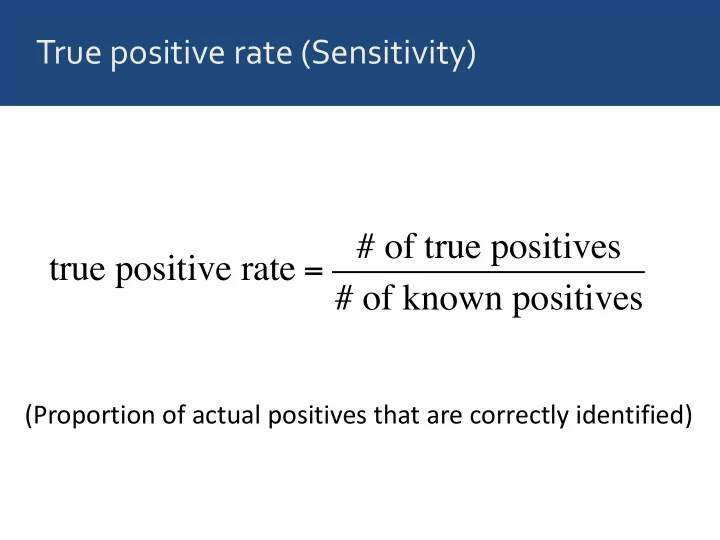
True positive rate (Sensitivity) # of true positives true positive rate = # of known positives (Proportion of actual positives that are correctly identified) True negative rate (Specificity) # of true negatives true negative rate = # of known
Image from: http://en.wikipedia.org/wiki/Receiver_operating_characteristic
Predictor M1 clump_thickness ✔ normal_nucleoli marg_adhesion bare_nuclei uniform_cell_shape bland_chromatin
Predictor M1 M2 clump_thickness ✔ ✔ normal_nucleoli ✔ marg_adhesion bare_nuclei uniform_cell_shape bland_chromatin
Predictor M1 M2 M3 clump_thickness ✔ ✔ ✔ normal_nucleoli ✔ ✔ marg_adhesion ✔ bare_nuclei uniform_cell_shape bland_chromatin
Predictor M1 M2 M3 M4 clump_thickness ✔ ✔ ✔ ✔ normal_nucleoli ✔ ✔ ✔ marg_adhesion ✔ ✔ bare_nuclei ✔ uniform_cell_shape bland_chromatin
Predictor M1 M2 M3 M4 M5 clump_thickness ✔ ✔ ✔ ✔ ✔ normal_nucleoli ✔ ✔ ✔ ✔ marg_adhesion ✔ ✔ ✔ bare_nuclei ✔ ✔ uniform_cell_shape ✔ bland_chromatin ✔
Model Area Under Curve (AUC) M1 0.909 M2 0.968 M3 0.985 M4 0.995 M5 0.996
Keller, Mis, Jia, Wilke. Genome Biol. Evol. 4:80-88, 2012
# fit a logistic regression model glm_out <- glm(outcome ~ clump_thickness, data = biopsy, family = binomial)
# fit a logistic regression model glm_out <- glm(outcome ~ clump_thickness, data = biopsy, family = binomial) # prepare data for ROC plotting df <- data.frame(predictor = predict(glm_out, biopsy), known_truth = biopsy$outcome, model = 'M1')
# fit a logistic regression model glm_out <- glm(outcome ~ clump_thickness, data = biopsy, family = binomial) # prepare data for ROC plotting df <- data.frame(predictor = predict(glm_out, biopsy), known_truth = biopsy$outcome, model = 'M1') # the aesthetic names are not the most intuitive # `d` (disease) holds the known truth # `m` (marker) holds the predictor values p <- ggplot(df, aes(d = known_truth, m = predictor)) + geom_roc(n.cuts = 0) + coord_fixed() p # make plot
# the function calc_auc needs to be called on a plot object # that uses geom_roc(): calc_auc(p) # PANEL group AUC # 1 1 -1 0.908878 # Warning message: # In verify_d(data$d) : # D not labeled 0/1, assuming benign = 0 and malignant = 1!