
SLIDE 1
Johns Hopkins University What is Engineering? M. Karweit 5/26/01 Presentations
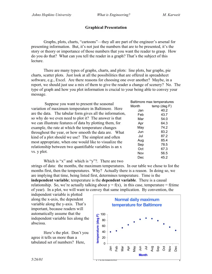
1 Graphical Presentation Graphs, plots, charts, “cartoons”—they all are part of the engineer’s arsenal for presenting information. But, it’s not just the numbers that are to be presented, it’s the story or theory or importance of those numbers that you want the reader to grasp. How do you do that? What can you tell the reader in a graph? That’s the subject of this lecture. There are many types of graphs, charts, and plots: line plots, bar graphs, pie charts, scatter plots. Just look at all the possibilities that are offered in spreadsheet software, e.g., Excel. Are there reasons for choosing one over another? Maybe, in a report, we should just use a mix of them to give the reader a change of scenery? No. The type of graph and how you plot information is crucial to your being able to convey your message. Suppose you want to present the seasonal variation of maximum temperature in Baltimore. Here are the data. The tabular form gives all the information, so why do we even need to plot it? The answer is that we can illustrate features of data by plotting them, for example, the rate at which the temperature changes throughout the year, or how smooth the data are. What kind of a plot should we use? The simplest and often most appropriate, when one would like to visualize the relationship between two quantifiable variables is an x
- vs. y plot.
Which is “x” and which is “y”?. There are two strings of data: the months, the maximum temperatures. In our table we chose to list the months first, then the temperatures. Why? Actually there is a reason. In doing so, we are implying that time, being listed first, determines temperature. Time is the independent variable; temperature is the dependent variable. There is a causal
- relationship. So, we’re actually talking about y = f(x), in this case, temperature = f(time
- f year). In a plot, we will want to convey that same implication. By convention, the
independent variable is plotted along the x-axis, the dependent variable along the y-axis. That’s important, because readers will automatically assume that the independent variable lies along the abscissa. Here’s the plot. Don’t you agree it tells us more than a tabulated set of numbers? Here,
Baltimore max temperatures Month temp (deg F) Jan 40.2 Feb 43.7 Mar 54.0 Apr 64.3 May 74.2 Jun 83.2 Jul 87.2 Aug 85.4 Sep 78.5 Oct 67.3 Nov 56.5 Dec 45.2
Normal daily maximum temperature for Baltimore
20 40 60 80 100 Jan Feb Mar Apr May Jun Jul Aug Sep Oct Nov Dec Month temperature (deg F)