SLIDE 1 MITOCW | watch?v=JE80wLNIhjE
The following content is provided under a Creative Commons license. Your support will help MIT OpenCourseWare continue to offer high quality educational resources for free. To make a donation, or to view additional materials from hundreds of MIT courses, visit MIT OpenCourseWare at ocw.mit.edu. ANDREW LO: What I want to do today is to continue where we left off last time in talking about the capital asset pricing model, and we're going to finish that off in the next 15 or 20 minutes. And then, I'm going to turn to applications of the capital asset pricing model. In particular, I want to focus
- n capital budgeting. That's going to be the last major topic we take on for this course. So let
me finish the capital asset pricing model and then I'll talk a little bit about where we're going to go for the remainder of the lectures. You remember last time where we left off was, I decided to estimate the CAPM relationship for a couple of stocks, Biogen and Motorola. And we found that the estimated alphas, the deviations from the CAPM, were pretty sizable for both of these companies. And the interpretation is either, wow these companies are really exceptional values, they offer investors much, much larger expected return than justified by the appropriate market betas. That's one interpretation, or the other interpretation is there something missing with the
- CAPM. The CAPM doesn't quite capture all of the risks that are giving you these kinds of
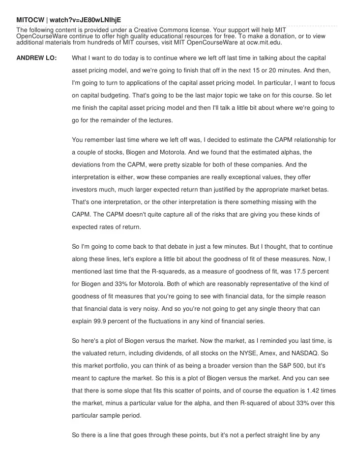
expected rates of return. So I'm going to come back to that debate in just a few minutes. But I thought, that to continue along these lines, let's explore a little bit about the goodness of fit of these measures. Now, I mentioned last time that the R-squareds, as a measure of goodness of fit, was 17.5 percent for Biogen and 33% for Motorola. Both of which are reasonably representative of the kind of goodness of fit measures that you're going to see with financial data, for the simple reason that financial data is very noisy. And so you're not going to get any single theory that can explain 99.9 percent of the fluctuations in any kind of financial series. So here's a plot of Biogen versus the market. Now the market, as I reminded you last time, is the valuated return, including dividends, of all stocks on the NYSE, Amex, and NASDAQ. So this market portfolio, you can think of as being a broader version than the S&P 500, but it's meant to capture the market. So this is a plot of Biogen versus the market. And you can see that there is some slope that fits this scatter of points, and of course the equation is 1.42 times the market, minus a particular value for the alpha, and then R-squared of about 33% over this particular sample period. So there is a line that goes through these points, but it's not a perfect straight line by any
SLIDE 2
- means. You can see there's a scatter. And so there's a tendency for Biogen to move together
with the market, but it's not a perfect linear relationship by any means. That's why the R- squared is not 100%. It's because we're not able to explain all of the fluctuations with a simple linear relationship. Life is more complicated than that, and so the CAPM is really just an approximation to a much more complex reality. Now, a particular stock has a lot of idiosyncratic risk. That's what we talked about last time as the dancing the Irish jig on that catwalk when you're window washing on these skyscrapers. So you can see that that idiosyncratic risk is really quite significant. What happens if we plot, not Biogen against the market, but another market portfolio against the market. like let's say
- NASDAQ. Well, the next plot shows you. Look at NASDAQ versus the market as a whole.
Now NASDAQ, as you know, tends to have smaller stocks, stocks that seem to be technology
- riented, and as a result NASDAQ might be more volatile. But nevertheless, there is a very
strong common relationship between these two market indexes. And so now, look at this. Scatter of points is a lot tighter. Right? Still, it's not exactly linear, but comparing this to that, you can see the difference. Right? There was a stronger relationship here. And not surprisingly, when you put securities into a portfolio, what gets averaged out? AUDIENCE: Outliers. ANDREW LO: Exactly, the outliers, and what else? What other component? Leland. AUDIENCE: The idiosyncratic risk. ANDREW LO:
- Exactly. The Idiosyncratic risk, The unusual stock specific kinds of randomness that gets
averaged out. So not surprisingly, when you put things into portfolios the noise, or the idiosyncratic risks average out and what you're left with is whatever common factors remain. So I'm going to show you some evidence for how well, or how poorly the CAPM works by looking not at individual stocks, because we know there's a lot of noise with individual stocks. I want to show you what happens when you put stocks into portfolios and you look at how those portfolios do. So let's do one simple example, market cap portfolios. Let's take a look at small stocks and big stocks. Remember at the introduction of this series of lectures, I showed you some empirical evidence that illustrated the fact that small stocks seem to do really well relative to large stocks, the size anomaly. So let's now take the size anomaly and look at it through the lens of the CAPM and ask the
SLIDE 3 So let's now take the size anomaly and look at it through the lens of the CAPM and ask the question, with the CAPM can we explain the difference between small and large? OK. Well, let's take a look. Over the 40 years from 1960 to 2000, approximately, we see that the small stock portfolio, the smallest decile, the smallest tenth of stocks, in terms of market cap, as a group, as a portfolio, had an average monthly return of 1.33% and a beta of 1.4. On the other hand, the large stock portfolio had an average monthly return of 0.9% and a beta of 0.94. So that seems like it's sort
- f consistent. Lower risk, lower expected return, but let's plug it in and see if the CAPM
relationship actually can tell us something. So the expected return of the stock, according to the CAPM, is going to be given by the risk free rate, plus beta, multiplied by the market risk premium over the sample period that I'm looking at. The market risk premium is about a half a percent per month. So roughly 6% a
- year. And the risk free rate is also about a half a percent per month during this time period.
So now, let's ask the question, what is the expected return of a large stock portfolio? Well according to this, it should be 93 basis points per month. What about the small stock portfolio? According to this, it should be 1.16% per month. Now, this is an amazingly good fit, so I wouldn't take this as typical in the finance literature. But it just so happens that over this 40 year period, the CAPM actually works pretty darn well. 0.99 is the average realize return and 0.93 is what was predicted. For the small cap portfolio, 1.33 is what was realized and 1.16 was what was predicted. So that's pretty good. Now, I want to emphasize the point that this is really good because, let's take a look at other ways of dividing up the universe and seeing whether or not we can get a better explanation of risk and expected return. Here's a picture of size sorted portfolios along the security market line. So remember, security market line is a graph of beta and expected return. Right? The security market line applies to all portfolios and securities, unlike the capital market line that applies only to efficient portfolios and securities. So in this case, we expect a linear relationship. And with the exception of this little outlier up here. From 1960 to 2001 there was actually a pretty reasonable relationship between beta and expected return. In other words, the CAPM looks like it's actually doing OK for size sorted portfolios. The higher the beta, the higher the expected return. The lower the beta, the lower the expected return for size sorted portfolios. Now, what about for beta sorted portfolios? Suppose you took a bunch of portfolio and grouped them into beta's and asked the
SLIDE 4 question, do the high beta portfolios have higher expected return? Low betas have low expected return? It turns out that, again you get a reasonable relationship. Not exactly what ' would expect according to the CAPM. So the slope of this line, remember, is going to be given by the risk premium, the market risk premium. In fact, the realized relationship looks linear, but it's at a slightly different slope. It doesn't look like the risk premium is the right slope, something a little bit less than that seems to be the right slope. And it turns out that in 15.433, you're going to learn a new theory of the CAPM that was developed by Fisher Black called the Balck CAPM. And the Black CAPM says that there is no risk-free rate. In fact, what you ought to be using is the rate of return of something called a zero beta portfolio. Well it turns out that if you do that, you would actually get a line that fits this line almost exactly. So the Black Zero-Beta CAPM seems to be a better approximation, but for now the CAPM is actually a pretty reasonable first approximation, so let's finish off that first and I'll come back to the Black Zero-Beta CAPM in a minute.
- OK. So this is a plot of the expected return of beta sorted portfolios. Higher beta, higher
average return. Lower beta, lower average return. So it seems like a CAPM is actually pretty
- reasonable. I'm not perfect, but it gets at the heart of what risk really means. Now in order to
emphasize the point, let me show you a couple of other graphs. This is volatility sorted
- portfolios. So now, I'm sorting stocks based upon their total volatility, not just their beta.
Remember, the beta measures a part of their total volatility. Right? The beta is the systematic component of the risk. Volatility is the entire amount of risk of a security. If you use volatility as a way of sorting stocks, then look at the expected rate of return. There is no systematic relationship between volatility and return. The higher the volatility, you don't get necessarily the higher the return. So in other words, volatility is not the right measure of the risk reward trade-off. One of the first things I talked to you about in this course is that, if we've learned anything in modern finance we've learned that you don't get something for nothing, and in particular, if you are gonna bear more risk, you have to be paid to bear more risk, but you have to define risk appropriately. In this case this diagram shows that volatility is not the right measure of risk. You might have to bear more volatility for whatever reason, but you won't always get
- rewarded. Right? Because volatility is not the relevant measure of risk from the capital markets
point of view. What you get rewarded for is the risk that you cannot get rid of by diversification and that kind of risk is not sigma, it's beta. So beta, you do get rewarded. Sigma, you do not
SLIDE 5 get rewarded necessarily. Right? Higher risk does not mean necessarily higher expected rates
- f return when you measure risk with volatility. Higher risk in the form of beta does seem to be
associated with higher expected rates of return. OK. Now, in the most recent literature there have been-- oh, question? AUDIENCE: So if I remember the definition of volatiility-- or based [INAUDIBLE], it's a ratio of two standard deviations, right? ANDREW LO: Beta is the ratio of a covariance to the variance. It's not the ratio of standard deviations. In the case of an efficient portfolio, it's the ratio of two standard deviations. Other questions? OK. So what I'm going to tell you now is about the most current research. The most current research suggests that, while beta does seem to have some impact on explaining expected returns, there are other factors out there that seem to contribute to that explanation. In other words, the CAPM, while it's a very interesting and compelling first approximation, it is only an
- approximation. There are other factors, like book to market, like liquidity, like trading volume,
that seems to also add to the explanatory power of these kinds of relationships. So what we're at today is that we think there are multiple betas out there, not just one market beta. So the basic vanilla flavored theory of finance, and what you're going to be learning how to use over the next few lectures remaining in this course, is the single beta CAPM. But where we are at the cutting edge of research, or some would argue the bleeding edge of research, is that there are multiple betas out there, multiple sources of common risk. So it's not just the market risk, that is by far the biggest, but there is liquidity risk, there is currency risk, there is term structure risk, there is a variety of risks that cannot be diversified away with a large portfolio of very, very different kinds of assets. And So a better version of the CAPM, one that you might use if you are becoming an expert in finance theory, is to try to identify other sources of betas, other sources of expected return that have risks attached to them and to use these multiple factors in your analysis. So these are some references that you can take a look at, but the fact is that the CAPM is used, almost universally, among portfolio managers, among venture capitalist, and project managers, and chief financial officers. So the CAPM is a very, very powerful framework for thinking about risk and return. And so it's important to understand it, but just keep in mind that like any other finance theory it's just a theory, its just meant to be an approximation to a much more complex reality. So what we're going to do now-- Yeah, question.
SLIDE 6 AUDIENCE: Would the other betas always have to be associated with like some kind of market portfolio or some representative portfolio, or do they just track a defaulted [INAUDIBLE] or something like that. ANDREW LO: So that's a great question, let me repeat that. The question is, does factors that are useful for the CAPM always have to be associated with some kind of a tradable market portfolio, or index, or can it be some other factor, like macroeconomic like unemployment? Well, there's a big difference between factors that are economically relevant and factors that are financially relevant, and let me explain the difference. Factors that are economically relevant may well explain the returns of certain securities. A good case in point is unemployment. Unemployment is a factor that does seem to have some explanatory power for stock market returns. The reason that we don't focus on those kinds of factors from a financial decision making point of view is that while they may identify interesting economic relationships between certain parts of
- ne part of the economy and other, it doesn't really allow you to make any kind of market
- decisions. In other words, if you can't trade it, then you can't manage it. So from the
perspective of financial applications, most of the factor models that you will see are factor models where the risk factors are portfolios of securities, or in some other sense tradable So for example, if I had a particular beta exposure-- For example, if I'm holding a portfolio over here and this is more beta than I want, I can get rid of that beta by trading in S&P futures contracts to decrease the beta. You can't trade unemployment. All right? At least not as easily as you could market beta's. So while there are many research papers out there that try to document the relationship between all sorts of economic indicators and financial markets from the applications perspective the kind of models that we will be dealing with will be factors that are associated with portfolios of marketable securities that you can trade, purely from a practical perspective.
- OK. So the key points for these series of lectures, lectures 15 through 17, what I want you to
take with you is that there are two critical relationships that you must understand. The first, is the risk reward trade for efficient portfolios, that's the capital market line. And the second, is the risk reward relationship for all other kinds of portfolios, that's the security market line of the
- CAPM. The CAPM. requires equilibrium. That's a departure from everything we've done in this
course up until now. All of the pricing relationships that I've argued have to hold things like present values of bonds, of stocks, of futures, of forwards, of options, all of those pricing models, all of them, rely just on this notion of no free lunch, that people prefer more money to
SLIDE 7 less money. But with the CAPM, I actually had to invoke a much stronger condition. I actually had to require that supply equals demand. It was through supply equaling demand that I was able to identify that the tangency portfolio is equal to the market portfolio. OK? So what we've done is to look into the heart of the market and try to infer from that what the market is actually doing by coming up with a particular discount rate that is consistent with those market views. And that now provides us with a complete theory of finance from your
- perspectives. You now know how to value 99.9% of anything that's out there, you've got the
tools to do that. So what I want to do with the remainder of the course is I'm going to force you to apply those tools In several different contexts until you understand how the tools work. OK? So that's a we're going to do for the rest of the course. Let me just pull up the syllabus. Amazingly, we're actually on schedule despite the crisis and all our discussions thereof. We are to be focusing on capital budgeting today, next lecture, and the third lecture, where we take the tools of net present value calculations and risk adjustments and then just apply them to a bunch of different contexts. We're going apply them left and right. And what I'd like to do after that is to put it all together. In the very last lecture I'm going to try to give you a sense of where we stand today in terms of how to apply these tools more broadly given the market conditions that prevail. So I'm going to talk about market efficiency versus behavioral finance, psychology and I'm going to bring in some evidence from the cognitive neurosciences that will integrate all of the different parts of the course. So make sure if you're going to come for one lecture, you're going to come to that one, because that's where I'm going to put it all together for you. OK. So we're going to turn now to this notion of capital budgeting. I'm going to take the perspective that we now understand how markets work. We understand how pricing works, we know how to make risk adjustments, and we're going to take those ideas and apply them to very practical
- settings. And so in that respect I'm going to ask you to change your focus. Up until now we've
been looking at markets from the perspective of an investor, either Warren Buffett, or the investor that's steeped in portfolio theory. Now, I want you to change your perspective and say that you are a corporate financial officer, or you're a project manager and you're trying to make financial decisions about various different alternatives. You're not principally trying to beat the market, or you're not principally trying to invest you're wealth, you're trying to make a decision about whether or not to take on certain projects. And the question is, how do we use the tools that we've developed to do that?
SLIDE 8 So we're going to start with the NPV rule, which is the rule that we've developed at the very beginning of this course. It's very appropriate that we end the course with a discussion on this rule, but now with a much more sophisticated understanding of how to apply it. I'm going to talk about cash flow computations because it will turn out that cash flows are what you need to discount with NPV, not accounting earnings which have all sorts of conventions that are not necessarily realistic, or relevant for economic decision making, but rather I want you to focus
- n actual dollars and cents that you're going to be getting period by period. I'm going to talk
about discount rates and applying them over time, project interactions, alternatives to the NPV role, and how capital budgeting is currently done. There are going to be three different main points to this sequence of lectures. The first main point is to use proper risk adjustments in doing NPV calculations. That's something that I think by now should be already ingrained in your way of thinking, but I want to make sure that that's
- true. The second main point I want to get across is that, there are lots of different ways of
doing capital budgeting, but in this case there's only one right way to do it from the perspective
- f economic analysis. Now, economic analysis may not be the only consideration. When you
make a decision about whether to take on a project, there are economic considerations, but there are also political, social, practical, cultural, all sorts of other considerations. I'm not going to say anything about those because that's outside the purview of this finance course, but from the business and financial decision making perspective, NPV is always the right thing to do and I want to emphasize that by showing you three wrong ways of doing capital budgeting. These are ways that people still will make use of today. So things like using IRR, or using payback, or using profitability indexes. I'm going to go through each of those and argue why those are not the correct way of making financial decisions, but because they're so prevalent I want you to at least be aware of them and understand how they relate to NPV. And the last thing I want to do is to tell you about the complexities of financial decision making by talking about time as an element. In other words, the fact that decisions are being made over time makes these kinds of interactions among projects very, very complicated. And I'm not going to be able to solve all of those for you, that's what 15.434 of this course on capital budgeting and corporate financing will do, but I want to give you a taste of it so you are aware that there is a whole other world out there where you've got to take these tools and understand how to apply
So let's talk about the NPV role. We started this course with a statement that all assets are
SLIDE 9 nothing more than a sequence of cash flows. That's what I call an asset. Every single asset can be reduced, essentially, to a sequence of task flows. So this is a sequence of cash flows for a particular project, or asset. And the current market value is simply the NPV where now you've got a discount by the appropriate cost of capital that is an appropriate risk adjusted cost
- f capital where you are adjusting the risk relevant to that particular cash flow.
So you'll notice that I use r1 for cash flow one, and I use rT for cash T. What that means is that you can have two different discount rates for two different cash flows of the same project because those two different cash flows may actually have two different risks. So now when you see this expression, which is exactly the same expression I showed you at the very beginning
- f this course, it should have much more meaning to you because now you understand what
amount of effort goes in to coming up with that appropriate discount rate. It turns out that because of something called value additivity we can make decisions about how to allocate our resources simply by picking those projects with big positive NPVs. In other words, you don't have to worry about project interactions unless there are interactions that are explicitly involving your decisions. Having a firm and combining high NPV projects is the best way to increase the value of that firm. So you look at each project on a standalone basis and if there are project interactions you then evaluate those interactions separately, and I'll give you examples of that.
- OK. So we're all familiar with this. This is just the standard approach to calculating market
- value. Now, the investment criteria that I'm going to propose for capital budgeting, for project
selection is this. For a single project, if you've got one project you're trying to decide upon, take it if and only if the NPV is positive. If it's positive take it, if it's negative do not take it, or sell
- it. Short it, if you can.
[LAUGHTER] OK? It's hard to short projects it's not that hard to short securities. For many independent projects, take all of them with positive NPV. If they're independent, meaning that taking one doesn't preclude you from doing another, or there's no project interactions, take them all as long as they have positive NPV. If there are project interactions, then you have to take that into
- account. So one simple example of a project interaction is you can only take one of many. And
if that's the case, then you pick the one that's got the highest NPV. Where you have to use the proper risk adjustment for that particular project.
SLIDE 10 So in order to compute NPV you need three things, you need cash flows, obviously, you need the discount rates, and you need to consider strategic options. The first and the third I'm not going to help you with, that's your business. That's the business of business. You've got to identify what those cash flows are and you've got to identify what your options are. What I could help you with, in the context of this course, is evaluating the market value of those
- possibilities. Those strategic options, you now understand how to use option pricing analysis
and for discount rates, you now know how to use risk adjustments to calculate the appropriate discount rates. But the other stuff is domain specific expertise that you bring to the table. And so I told you at the very beginning of the course that finance is the language of business, this is what I mean. You can't even talk about making a decision unless you speak the language of finance, unless you evaluate projects in this kind of a framework. OK. So in terms of cash flow calculations, I'm going to give you some examples in a few minutes, but let me summarize what I'm going to tell you and then we can talk about the specifics through that example. The first point, is you should use cash flows, not accounting earnings because again, accounting earnings are meant for purposes other than decision making. Accounting is really meant as a kind of a checkup to see how you've done. How you've done is not the same thing as how you're going to do. One of the things that I think is apparently not emphasized enough is that when you look at accounting data you're looking at numbers that are not random variables, they have been realized. There's no uncertainty in what a balance sheet, or an income statement says. It's about the past. And accountants hate uncertainties. I don't know how many people are accountants here, or how many accountants you know, but if you know them you know there's a certain personality type that gets drawn into that
- profession. And these are not big risk takers, they want to see order and certainty in what
they're doing. That's what a good accountant will do, is to try to understand where to put all the expenses and revenues into the proper boxes so that it all adds up. Accounting is
- incapable. It is not designed to manage and reflect uncertainty. You've heard the term off-
balance sheet item, right? For example, I've spoken before about a credit default swap, or a futures contract. If you engage in a futures transaction, the moment you engage in that transaction what's the NPV of a futures contract? AUDIENCE: Zero. ANDREW LO:
- Zero. Exactly. And as a result, that does not go on the balance sheet because it is neither an
asset nor is it a liability. It's both, or neither, depending on how you look at it. It's an off-
SLIDE 11 balance sheet item because it doesn't-- Where do you put it? It has zero value. But the point is that entering into one of those agreements has a big impact on your future risk. So accounting, the language of accounting is not ideally suited for thinking about the future. It's a wonderful method for understanding what happened in the past and you need to understand that in order to plan for the future, you need to know what your current assets are and what your current liabilities are, but that doesn't tell you where your risks are going to be and it doesn't allow you to speak about the dynamics of cash flows because that's not what an accountants job is. That's not what accounting is designed to do. Right? This is not meant to be a critique of accounting, but simply that you can't use it for purposes that it wasn't ideally designed to serve. So the first point is, you've got to use cash flows, not accounting earnings. Second point, you've got to use after-tax cash flows. Why? Because you have to pay taxes. That's one of the, along with death and some other unavoidable aspects of life, you have to pay taxes. So if you have to pay taxes, then you may as well look at after-tax cash flows. The reason this is important is because there are certain things that show up as cash flows that you wouldn't
- rdinarily think of as cash flows because of the tax code. For example, depreciation.
Depreciation is an accounting technique for attributing the decline of capital assets. When you buy a machine it's new on day one, but after 50 years it's not new anymore and it's not worth the same after 15 years as it is on day one. Now, how you account for the loss in value of that machine, how you account for how the machine gets used up over 15 years, that's a matter of accounting practice that may have no bearing on the actual economics of the machine, but it has absolute bearing on the cash flows that you are going to receive because you get to deduct depreciation expenses off of your taxes. So after tax cash flow is as important. And finally, this third point sounds simple, but it's anything but simple unless you practice with it and do a lot of examples. Use cash flows attributable to the project. In other words, you've got to compare the firm with and without the project and look at the cash flows. OK? It's very, very easy to forget certain cash flows that either come along with the project, or have to be spent if you take on the project and you'll end up missing one element or another. And in many cases those kinds of omissions can have a huge impact on whether or not you decide to take on the project. So there are lots of examples about how you might do that here, but in the end practice, practice, practice is going to get you to understand how to take into account each of the features.
SLIDE 12 So I want to just go through a few of these now and then I'm going to talk about the point that I started with earlier, which is I want to show you some techniques for capital budgeting that are incorrect and how they relate to the NPV rule. So let me just tell you a little bit more about accounting earnings versus cash flows. Cash flows are what you need to use for calculating NPV because in the end what matters is the cash that you get, not the accounting profits that may or may not be realizable. So cash flows are simply equal to cash cash inflows minus cash
- utflows. That sounds simple, right? It's not simple because you've got to figure out what
those cash inflows or outflows are from, in many cases, accounting data. And so you need to know a little bit about how the accounting interacts with these kinds of calculations. So I'll just give you a little bit more detail, and I'll leave it up to you to focus on specific applications because the accounting rules, first of all they change fairly often and actually right now at the heart of the debate in the financial crisis is this notion of fair value accounting, FAS 157, which says that you've got to use market values for updating your assets and liabilities. And that's a new ruling that has created some problems because market values, during times
- f stress, can drop precipitously. And this is why I told you early on that accounting is not
ideally suited to deal with a lot of issues having to do with risky assets because risk is not an element that the accounting framework is well-suited to deal with. So how do we get cash inflows minus cash outflows. Well, operating revenues is typically what cash inflows involve for a given project, operating revenues. And then, you subtract from that
- perating expenses without depreciation. The reason you don't take into account depreciation
is, as I told you, depreciation is one of these magic accounting concepts that has no bearing
- n reality. It's a mechanism for simply accounting for a decline in the market value of a
particular kind of equipment, or asset. And there are a lot of different accounting conventions that are a function of tax code changes. For example, in some cases you can accelerate the depreciation of an asset. Even though a machine is working fine, there are certain situations where you can assume that half of the machine evaporated after one year. Now how does that happen? Well it's an accounting tool that Congress passed years ago to allow companies, businesses, to accelerate the depreciation and therefore get a tax advantage. Question? AUDIENCE: Aren't income taxes linked to the accounting nuances? So if we're using taxes, I'm saying, sort
- f, we can't use accounting [INAUDIBLE] because it's a depreciation-- Depending what
depreciation that you used, do income taxes change? ANDREW LO:
- Yes. That's right. And so we're going to take that into account, but the point is that for the
SLIDE 13 purposes of cash flow, the depreciation schedule will impact the cash flow only in terms of the actual tax shields that it generates. Not that it will decrease the value of the machine when the accountants tell you that it will. OK? So the idea is that your operating expenses are expenses you have to pay irrespective of what the depreciation schedule is. So accounting expenses without depreciation is what you're paying out in cash. It's the actual cash outflow every single
- year. Capital expenditures is what you spend on new equipment, and then income taxes.
So this is your point, Louis. All of the effect of depreciation on your income tax gets included in
- here. Income taxes you have to pay every year, so that's a cash outflow. Right? So if there's
something that can reduce your cash outflow, you better take that into account. And that's where depreciation comes in. It's a tax shield that allows you not to pay as much taxes, so it reduces your tax burden, it reduces your income taxes. But again, the focus is on cash flows. Money in versus money out. That's what you're trying to measure. And once you get the measure of money in minus money out, then you can start discounting using your appropriate cost of capital, but you got to get the cash flows right. And so there are a number of other subtleties. For example, the project income taxes that you pay for your project is going to be the corporate tax rate, times the operating profit, minus the tax rate, times your depreciation. So your depreciation doesn't actually affect the profitability of the particular piece of equipment, or the project, except in so far as it affects the taxes you have to pay. So project income taxes, that income taxes associated with your particular project, are going to simply be the tax rate multiplied by the operating profit, minus the tax rate, times whatever depreciation you can claim, and so this is how you can get depreciation into your cash flows. It affects the amount of income taxes you're paying and that's it. So the bottom line, what's your task flow? It's going to be one, minus your tax rate, times the
- perating profits. Operating profits is operating revenues, minus operating expenses without
- depreciation. Without depreciation.
Depreciation comes in later when you're talking about the taxes. So here is where the depreciation comes in. So your cash flow is operating profits, multiplied by one, minus the tax rate, minus your capital expenditures, and by the way, your capital expenditures, notice that you're not getting taxed on that. Nor do you get a deduction for that. You don't get to deduct capital expenditures the way you get to deduct ordinary expenses from running a company because capital expenditures are treated differently by the tax code. Does that make sense? Who knows. That's for the tax experts to decide upon. The fact is that
SLIDE 14 capital expenditures have a different tax treatment and you have to know that, that's why you need accountants to tell you how they get treated. The way they get treated is you get to depreciate the capital expenditures as the accountants tell you you're using them up. So if you buy a piece of equipment for $25 million, you don't get to deduct it right away because you're not using all of it right away. You're using part of it every year. How much are you using? That's where the depreciation schedule becomes relevant. So here what you're getting, in terms of cash flows, what you're getting is the depreciation that you report every year, multiplied by the tax rate. You're getting that as a positive cash flow. Why is that? Who can tell me why that is? Yeah. AUDIENCE: Because you're not paying any expenses. ANDREW LO: That's not quite right. It's along those lines, but not exactly, that's not exactly the mechanism. [INAUDIBLE]? AUDIENCE: This position is expense, but it's not out of cash flow. ANDREW LO:
- Right. Depreciation is an expense you get to deduct, so you're right about that, but you're
getting to deduct it purely because of the tax code. And because you get to deduct it you don't have to pay this much tax. In other words, without the depreciation you would be out this much
- money. But because you have that deduction, it's like a get out of jail free card, you basically
take this card and say, here I don't have to pay this much tax, how much is that card worth? Well, it's worth this. So this is actually the amount of cash you're going to get to keep in your pocket if you have this depreciation tax shield. That's what it's called, a tax shield. It prevents you from paying a certain amount of taxes. You actually get to keep that money in your
- company. So it's actual cash flows to you.
So the accounting impact of depreciation is here. And it's important, I know it seems like it's a waste of time for us to spend time for my telling you how to do accounting, but this is an important enough point that people forget when you're doing NPV calculations that I want to hammer this home. What matters, from an economic perspective, is the cash that you're getting for your project year in and year out. Keep your eyes on the cash. Don't keep it on the accounting numbers, keep it on the cash. And if you do that, you'll never go wrong. OK. Here's an example just to make the point. A machine is purchased for a $1 million with a life of 10 years and it generates annual revenues of 300,000 and operating expenses of 100,000. If
SLIDE 15 you assume that the machine gets depreciated over 10 years using straight line depreciation. What does that mean, straight line? Yeah. AUDIENCE: Equal amounts every year. AUDIENCE:
- Exactly. So if the machine is worth a million bucks and you're depreciating it over 10 years
straight line, what do you deduct every year? AUDIENCE: 1,000 [INAUDIBLE] ANDREW LO: 100,000. Yeah. Yeah, that's right. It'd be 100 years if you did 10,000. That would be a long life
- f the machine. That's right $10,000-- $100,000 a year for 10 years, that's how much the
accountants are telling you you're using up the machine. And so every year you get to deduct $100,000 from that kind of depreciation. So what is your after-tax cash flow? Now, you're accounting earnings, the way that an accountant would accrue the earnings would be this. It's 3 million, minus 100k, minus a 300k, minus 100k, minus 100k, that's 100k of earnings. So an accountant would tell you that your earnings for this situation is $100,000 a year. Right? However, that's not the cash flows. Let's look at the task flows. The cash flows on an after tax basis, assuming a 40% corporate tax rate is 1 minus 0.4, times revenue of 300, minus
- perating expenses of 100. So you're making $200 cash every year before tax, but then
you've got to pay tax, but then you're getting a depreciation deduction of $100,000 a year. So you're actually getting $160,000 of cash every year. Not a 100, but 160. So when you do an NPV calculation it makes a world of difference whether your NPVing this guy, or your NPVing this guy. They're not the same. Right? And from an economic decision perspective, this is what you ought to focus on, not on this. Yeah, Edward? AUDIENCE:
- Yes. Probably through the accounting calculation, you will have the million up front. While here
you will have a cash flow and a cash in flow from here [INAUDIBLE], right? ANDREW LO: Yeah. AUDIENCE: In the accounting. ANDREW LO: That's right. So there are other considerations that you might want to bring into the analysis, but my point is simply using accounting earnings versus after tax cash flows will give you a different number. In both cases, I'm not I'm not taking into account the upfront outlay of a
SLIDE 16 AUDIENCE: But in the accounting you would never. ANDREW LO: Right. AUDIENCE:
ANDREW LO:
- Agreed. That's right. And that's part of the problem. That's one of the reasons, by the way,
why certain companies are incentivized to acquire other companies. It's because the acquisition costs aren't accounted for in the same way that the operating costs. So if you've got a company that's generating a lot of profits, it's very profitable, but it cost you a lot of money to acquire, from the counting perspective it can make you look really good because your earnings are going to get a big boost, but in fact the NPV of the situation may not be as
- attractive. The bottom line from shareholder wealth, if you are doing this for your own personal
account you'd want to be making decisions not on accounting earnings alone, but rather on cash flows. All right? NPVs. Yeah, [INAUDIBLE]. AUDIENCE: What about if you can give a working capital? Aren't you supposed to take it also in to consideration? ANDREW LO: In what sense? You're looking at the net incremental impact on your working capital and this take that into account. Wokring capital is the change-- is demanding opportunity to invest in the business in order to make the business to grow. ANDREW LO: Yeah, that's right. So I haven't talked about what the NPV. Is if you want to do the NPV you've got to ask the question, does the after tax cash flow justify a million dollars? I haven't talked about that yet. So I'm not I'm not suggesting that we've got an answer for what you should do with this particular situation, I'm simply using this as an illustration to point out that accounting earnings is not the same thing as after tax net cash task flows. Yeah. AUDIENCE: So from a finance [INAUDIBLE] point, we don't care about this [INAUDIBLE] company, as well as this ability to generate future cash flows? ANDREW LO: Well, no I didn't I did not say that. The question about whether or not you care about the solvency of the company is a question about what the ultimate costs of bankruptcy are, but from a shareholder's perspective, if you ask the question what does the shareholder want you, the corporate manager, to do, the answer is simple. The shareholder wants you to maximize the net present value of the business. OK? If there are dramatic costs of bankruptcy, or
SLIDE 17 financial stress, then you're going to have to incorporate that into your calculation for what you should do. Absolutely. But the point is that when you're looking at net present value, net present value gives you the appropriate data to make that trade off. Always use net present value to at least calculate the implications of the various different investments. In the case of bankruptcy costs, if there are dramatic costs of financial distress, then you don't want to go there because then you're not going to be serving the best interest of the shareholders. But if on the other hand, there are very little risks of financial distress and there's an incredibly good opportunity for you to take
- n certain risk that looks more than worthwhile relative to the compensation you're getting,
then I would argue that it makes sense to do so. So the question is one about magnitude. What are the bankruptcy costs versus the value of the upside for the particular project at hand? And you've got to make that decision with all the various different data properly
- computed. What I'm telling you how to do is to compute that data.
All right. Here are some other calculations that describe what went on in the previous. This is a case of accounting earnings after tax, cash flow after tax. The bottom line is that they're
- different. So for the perspective of NPV calculations you ought to focus on the particular
calculation that gives you net cash flows. So now I'm going to turn to focusing on the denominator, discount rates. We already went through an analysis about how to pick the discount rate. The discount rate that you use is the one that adjusts for the risk of the project, but keep in mind that a project's discount rate, the required rate of return is the expected return demanded by investors for the project. The way you ought to think about it is the project, think of it like a stock and ask the question, for people who are going to buy that project, they're going to buy the stock, what kind of a discount rate are they going to place on the riskiness of that stock. It's just like Gillette versus General Motors, we talked about that last time. Depending on how risk averse the population is, that will determine a particular market risk premium. The market risk premium and the beta is going to determine what the appropriate discount rate is for that particular stock, and the idiosyncratic risk is going to be assumed away because nobody has to bear that risk. Everybody can be diversified if they want to be. The second thing is that the discount rate, in general, depends on the timing and the risks of the cash flows. I'm going to give you an example in a few minutes that'll throw you off a bit because there's going to be two different kinds of risks and you're going to have to
SLIDE 18
differentiate between the two. So let me come back to that point with an example that will be much clearer. And the last couple of points is that, the discount rate is usually different for different projects. Now, this is something that, again, a lot of corporate managers miss. They feel that if they're in a particular division then that division has a particular cost of capital and from that point on you should always use the cost of capital for anything that the division does. What if it's the case that the division is doing something so different from what it originally started with? And I'm going to give you an example of that. An example is something that happened just a couple of years ago. I don't know how many of you realize, but Bloomberg, you know the maker of those nice terminals that everybody uses, Bloomberg has actually a publishing company. Yeah that's right. There's a Bloomberg Business press. They publish books and this particular business just got launched a couple of years ago. They already have a whole bunch of books. In fact, they're publishing a book that I've been working on with a former student of mine a series of interviews of technical analysts. And so as part of this idea of setting up a business press, they had to figure out what the appropriate cost of capital is for that activity, and then ask for money from the parent company to launch this. So the question is, how do they do that? Do they use the appropriate cost of capital for Bloomberg? Bloomberg's business is not publishing. All right? They're an information vendor, and they're a technology company. And as such, they have a certain multiple, right? Those of you who are in venture capital, project financing, you know about multiples, right? If you have a company with a particular kind of earnings, then the value of the company is typically stated as a multiple of those earnings. The multiple for an IT company, a technology company, a financial services company, a multiple there is not the same as the multiple for a publishing company. By the way, which multiple is higher? Does anybody know? AUDIENCE: IT? ANDREW LO: Yes? AUDIENCE: Actually, publishing is higher. ANDREW LO: Multiple for publishing is higher?
SLIDE 19 AUDIENCE: [INAUDIBLE] I think it would be higher unless it's [INAUDIBLE] particular-- ANDREW LO: And why is that? What's the logic for IT being higher? AUDIENCE: Higher growth potential. ANDREW LO: Higher growth potential, that's one. Also, profit margins tend to be higher. Publishing is not a growing business. I don't know how many of you realize that. Because of the internet, because
- f text messaging, all sorts of innovations have really hurt the publishing business. And that's
why a lot of publishers have either gone out of business or have combined, so that now we have a few mega publishers. Yeah. So if you're an entrepreneur that's looking to set up Bloomberg Press and now Bloomberg is using a particular cost of capital, you may say, "Well, hey, wait a minute, that's not the right cost of capital because publishing is a different multiple." How would you do that, then? How would you figure out what to use in order to calculate the value of a venture for Bloomberg Press? Courtney? AUDIENCE: Just look at the comparable companies and take, like, look at all the betas of all of them, and do analysis from them. ANDREW LO:
- Exactly. So let's look at other companies that are in the business that we want to get into and
see what kind of beta they have, and what the appropriate cost of capital is. Anant? AUDIENCE: So I understand why they doing that. But at the end of the day, if Bloomberg, the company, has, you know, $1 million or whatever to invest, why would it look at going into an area like this with a lower rate of return than, you know, a product where it could get a high rate of return? Unless you have some facilities, in which case facilities plus rate of return should be at least equal to the rate of return for the economy. ANDREW LO: So let's hold off on that discussion for a moment. I'm not going to try to justify why they get into it, I just want to understand the mechanics of how they decide on whether or not to get into it. I'll come back to why later. Let's come back to that in just a few minutes though. Before we get to that, let's figure out how they even evaluate. All right? So I've suggested here that they might use the beta of John Wiley & Sons. That's a publicly- traded publishing company. But they could also use the beta of McGraw-Hill. Which should we pick? McGraw-Hill or John Wiley? Louis?
SLIDE 20 AUDIENCE: John Wiley. ANDREW LO: Why? AUDIENCE: Because McGraw-Hill's not a pure play publisher. ANDREW LO:
- Exactly. McGraw-Hill has lots of other businesses besides publishing. So while they do do a lot
- f publishing, they also do a lot of other things. Give me another business that McGraw-Hill is
involved in it. Anybody? Yeah? AUDIENCE: Standard & Poor's? ANDREW LO:
- Exactly. McGraw-Hill owns Standard & Poor's. And Standard & Poor's does a lot of things,
including publishing ratings as well as indexes. So those businesses are not the same as publishing books. McGraw-Hill has lots of other subsidiaries, whereas John Wiley & Sons, all they do is publishing. They are what is known as a pure play company. So let's take a look. This is the revenues of John Wiley & Sons in 2007. If you look at the core business-- 39% professional trade, 70% higher ed, 44% scientific, technical, and medical-- that's not a perfect match for Bloomberg, but that's not bad, right? That's within the same general area. What we would really prefer is if it were just this slice that we could carve out and figure out what that business looked like. But that's not so easy to do because of the fact that it's one company that's doing all of it. Ken? AUDIENCE: How much does size matter? How much should Bloomberg take into consideration the fact that John Wyley is [INAUDIBLE] doing it at a different scale? ANDREW LO: Well, so I guess I would be lying if I told you that size didn't matter. That's usually the case. Size matters in the sense that you want to have a company that's representative of what you're trying to do. And smaller companies bear certain risks that larger companies don't. And vice versa, larger companies have access to certain benefits and technologies that smaller companies don't. So the point is that we don't always get to choose what's available. You've got to look at the various different alternatives out there and the best way to approach it is to get a range. So if you're going to be doing this in a more serious fashion, what you do is to make a study of the publishing business. Find companies at both ends of the spectrum. The small ones and the big ones, the pure plays and the conglomerates, and estimate the cost of capital for all of
SLIDE 21 the big ones, the pure plays and the conglomerates, and estimate the cost of capital for all of
- them. And then say, given this spectrum of results, we think that the appropriate cost of capital
should be here. And basically make a choice after having looked at the evidence. So what I'm giving you is not a simple recipe that will work in every circumstance but rather an approach that, with sufficient study and analysis, will yield an intelligent answer. So let's actually take a look at the answer here, all right? So we've got John Wiley & Sons, we've got their performance over a period of time, the share price and so on. If you take the beta of John Wiley & Sons series A shares, and you can get that from Yahoo, it's a beta of 1.29 as of last year. Then, with a risk-free rate of 5% and a market-risk premium of 6%-- which is when Bloomberg was trying to decide when to go into the business, about two years ago-- it turns out that the cost of capital is 12.7%. So that's actually a pretty reasonable cost of capital, which says that that's the number you use in figuring out whether or not the cash flows from a publishing business make sense. OK? Now to Anant's question, why on earth would you do that when you could invest in a business that may have a higher cost of capital or a higher rate of return? We don't know that they do. In other words, at this point, Bloomberg may not have any ability to invest in its current business or others that have a higher rate of return. So one could argue that a cost of capital
- f about 12.7% is actually a pretty reasonable hurdle rate for a new business. So in other
words, I would only invest in this business if it yielded a positive NPV. Now a positive NPV means it's earning more than 12.7% on average, right? That's a pretty good rate of return for a new business. Now, there is another business that Bloomberg could get into which is the hedge fund business, right? I mean, why not? They've got all this data, they may as well make use of it and turn into a hedge fund. Now, that business, I suspect that the cost of capital is a lot higher. Higher because the riskiness is more substantial. And there, you have to start talking about the riskiness of bankruptcy. Would it really be a good idea to jeopardize Bloomberg's entire franchise on one mega hedge fund? I don't know, maybe? But probably not, if you really are serious about preserving the franchise value the company. Mike? AUDIENCE: So then, to that point, how do you consider the impact on the rest of Bloomberg, given this additonal-- if they go into this additional division? ANDREW LO: Well, so that's the project interactions that I haven't talked about. Up until now, I'm assuming this is a standalone subsidiary. And I'm evaluating it as positive NPV or not. OK? The next step
SLIDE 22 in the capital budgeting process is to then ask the question, OK, as a standalone entity, I think I understand it. I got the cash flows down, I got the discount rate down. I know what the comparisons are. I've evaluated the NPV and it looks positive. Now let me ask, what does this do strategically for the firm? That's the third question, the strategic options. Is it good? Or is it not so good? And if so can I put a number on that? Now, from Bloomberg, I wasn't involved in any discussions internally so I can't tell you what Bloomberg came up with. But from what I gather, they decided that there are some positive synergies between a business press and their other media type of access. That they felt that there were some cross-selling opportunities so that, when there was a good book, they could put it on the Bloomberg screen and advertise free, basically. And then the print media would actually help to support attention to Bloomberg as an outlet for news. So in that case, they determined that this interaction was all good, that there wasn't a downside to it. And part of the reason, I think, is because they were able to assemble a team of very experienced publishers and editors. They pulled them out of other publishing firms to start this new venture, and they ended up getting some really good people involved. And I've had the pleasure to work with some of them. They are very, very professional. So Bloomberg actually made a pretty good decision, at least from the perspective of getting this thing launched. Whether or not it will be profitable, who knows? It's only been around for a couple of years, but so far they've developed a pretty impressive list of authors. Yeah? AUDIENCE: I guess what I'm saying-- Let's just say the rest of Bloomberg had a cost of capital of 10. They go to this, let's say it pulls everything up to 11. The rest of their business is now more
- expensive. That was more my question. Will we include the value of destruction on the rest of
their business for raising their overall cost? ANDREW LO: Well, so-- If there's any kind of value creation or destruction, you're implicitly assuming some kind of market irrationality. Right? Because what you're assuming is that, if they pull this thing up, they pull up the cost of capital for the entire firm, they lower the valuation of the entire firm. You're assuming that people in the industry can't see through the fact that they've got a
- subsidiary. And in some cases, you may be right. But I would argue that a better perspective is
to say that analysts are going to be able to do division-by-division valuation and say, OK, they got a publishing division. These are the revenues, these are the costs, they're segregated, and it makes sense for them, given the synergies. Blah, blah, blah. So I would expect that those considerations may not be as significant.
SLIDE 23 Now if, on the other hand, this publishing operation were really big-- In other words, if it ended up that it grew so big that it accounted for half of the revenues of Bloomberg, the entity, then I think your point would be well taken, would be much more serious. Right now, it's a tiny, little blip in the grand scheme of things that may turn into something big. But for example, if you're an investment bank-- Nowadays, we don't have any more of those but at one point we did. If you're an investment bank and you've got a franchise based upon customer-driven business, very reliable, very high multiples, very, very valuable kind of franchise-- And then the question is, should you get involved in prop trading? Prop trading, proprietary trading, basically being a hedge fund, carries in the marketplace no multiple. Actually in some cases, the multiple is negative, I mean, that is, less than 1. Right? Because if you're thinking about acquiring a hedge fund, the typical hedge fund will provide you with whatever earnings they have this year, but next year they could blow up. So there is no multiple assigned to hedge funds, typically. Not always. I can give you examples over the last couple of years where hedge funds have sold for multiples, but there are not many of them. And typically, a hedge fund, when you look at the value of the future earnings, the multiple that is applied can be less than 1 if there is a concern that the hedge fund can drag down the value of the parent company. So there are situations where, for a distress sale, people have paid $0.50 on the dollar of assets of a hedge
- fund. Of the actual cash that the hedge fund has generated for its shareholders, they've paid
less than a dollar for dollar because of that kind of effect on the parent company. Goldman Sachs, after they went public, they really had a lot of difficulty internally, thinking about prop trading, because prop trading accounted during certain years for such a large fraction of the Goldman franchise that it ended up having the effect that Mike was talking
- about. That is, people said, gee, Goldman is nothing but a prop trading firm. I'm not going to
give it a multiple of seven. Let's try a multiple of 2 and 1/2. That is value destruction. That's a concern. But for small projects that aren't about the entire corporation, that aren't likely to affect the perception of the entire corporation, you don't have to worry about that. So size does matter in another way. Yeah, [INAUDIBLE]? AUDIENCE: How did you with, like, [INAUDIBLE] and risk-free rate? So today what rate would be used?
SLIDE 24 ANDREW LO: Today I'd use 1%. So this is the time element that I mentioned to you before. When you take
- n a project, you've got to have the right time. It's got to be the right time. And so things
- change. The cost of capital changes. So right now, I would use 1% for this particular project.
So you might think it'd be easier to get it launched, but try getting cash in a setting like today. Yeah? AUDIENCE: If you start a project, say it's a two-year project and you start it at 1%, and then all of a sudden the risk-free rate goes up. Does that mean that you might, economically, need to cancel your project halfway through? ANDREW LO: Yeah, absolutely. Yeah. At one point, John Maynard Keynes was criticized for flip flopping on the gold standard and Keynes had a very, very sensible reply, which I think I may have mentioned in class. Which is that, when the facts change, sir, I change my mind. What do you do? So absolutely. If cost of capital changes a year from now, you may have to cancel your project. Or you may wish you had taken two of the projects, but you didn't get to. These kinds of project interactions over time make it really complicated. That's one of the reasons why we have a whole separate course on capital budgeting, is to come up with tools to deal with these kind of interactions. So absolutely. In fact, I'm going to give an example of that in just a minute where that time element actually is very important. Let's actually go over that right now. So here's an example that you don't know how to do yet. We're going to figure out how to do it
- together. All right? And it has to do with time and with risks. So a firm is investing in an oil
exploration project. We're going to drill a bunch of holes in a particular area where I'm trying to find oil. And it's going to take time to drill these holes. So it's going to take at least a year. And at the end of the first year, there's going to be a probability of 1/3 that we find three million barrels of oil. But there's a probability of 2/3 that we find nothing, we come up dry. 1/3, 2/3 probability. Now, if we are successful with that 1/3 probability, then the 3 million barrels of oil will be pumped out of the ground by the end of the second year. So at the end of the first year, if we're successful, we'll find oil. And then it'll take a year to extract it and barrel it. Put it in barrels and sell it. And we'll have 3 million barrels to be able to do that, and then after that, the field will be depleted. Now the expected after-tax profit per barrel is $20. We're going to make $20 a barrel after-tax.
SLIDE 25 Not now, but a year from now. The risk-free rate is 5%. The industry discount rate of oil production is 20%. That's a very high cost of capital. But oil production is a high beta activity, as you can sort of tell, right? Market prices are down. Oil prices down. When the market was up, oil prices were pretty high. Oil has a high beta, OK? So the discount rate is 20%, but the exploration risk-- this 1/3, 2/3 probability-- that has a beta
- f 0. What's the NPV of this project? How do you figure that out? Believe it or not, you actually
have all the tools to solve this problem. But it's hard. And not only is it hard for all of you, it's actually hard for professionals. A couple of years ago, I taught the Sloan Fellows program during the summer. I don't know how much you know about the Sloan Fellows program but this is a program where we bring executives who've worked for 15, 20, 30 years, made their fortunes, and have decided to take a year off to get a degree. And so these are very seasoned, senior professionals, so teaching them is a whole other challenge. They're very-- they know a lot. And they know a lot about virtually anything and everything you ever care to talk about. To case in point, I gave this example to the Sloan Fellows class. Somebody in the back of the room said, "Excuse me. First, Lo, but I don't recall that we actually used this analysis when we were doing oil exploration." And I said, well, why don't you tell us about what you did, and who you are, and so on. And the fellow said, "Well, I'm the senior vice-president for oil exploration at Saudi Aramco." This is the biggest oil company in the world, and he was the man in charge
- f drilling those holes. And he actually said that they didn't do this analysis, but that he actually
was going to try it out because he thought it made a lot of sense. So that was a little scary, I have to tell you. A very intimidating audience. But the point is that this is a very subtle idea. Let me tell you what it is. Let me tell you how it works, OK? There are two risks going on here. There is the market risk of pumping the oil out
- f the ground and selling it. And that we understand quite well. That has a beta given by this
particular cost of capital, 20%. So we already know what the discount rate is in that second
- year. But we need to figure out how to discount from the second year to the first year. What
should the appropriate risk-adjusted discount rate is from the first year back to year zero. That's the key. Right? That's the hard part. At the end of the second year, we're going to have 3 million barrels of oil, each priced at $20 a barrel for a profit of $60 million, right? Or $6 million here. Yeah. So $60 million at the end of
SLIDE 26 two years. Now we're going to discount it back to the beginning of that two year period. So in
- ther words, we're going to discount it from the end of the second year to the beginning of that
second year, or the end of the first year, and that's what we get as $50 million, right? $60 million discounted back by 20% discount rate, that's $50 million at year one, if we strike oil. But there's a 1/3 probability that we strike oil. There's a 2/3 probability that we don't. The question is, what do we discount this possibility back to year zero? And I'm going to argue you discount it back, not at 20% but at 5%. 5%? That's the risk-free rate. Now, why on earth would you do that? This is the oil industry we're talking about. The reason you discount the first year back to year zero at risk-free rate is because the risk of coming up dry, that risk is completely diversifiable. That is complete, idiosyncratic risk. There is no beta, right? The oil deposits underground don't know whether it's a bull market or a bear
- market. They couldn't care less. They're either there or they're not there, and you're drilling for
- it. So your risk of not striking oil has no bearing on the market. If you are well diversified, then
that risk is actually not something that you're going to get rewarded for. And therefore, you need to discount it at the risk-free rate. So in fact, the NPV of this project is $15.9 million, which is a lot bigger number than if you were to discount it by 20% both years. But it's because the risks are different. So to Brian's point, when risk changes over time, you've got to use the appropriate discount rate for that particular kind of risk. Now, it just so happens that here ahead of time, we actually understood where the risks were coming from. So we know the risks between year zero and year one are different from the risks between year one and year two. You've got to use the appropriate discount rate for that kind of risk. This is a very subtle problem that you have to think about carefully in order to understand it fully. But it's an important one so that's why I spent time on it. Any questions about this? Any debate? Any argument? Do you agree with this? Does this make sense to you? If it doesn't make sense, speak up now or forever hold your peace. Right? Because it's important that you absorb the lesson from this particular example. Yeah, Andy? AUDIENCE: So suppose that you know for a fact there's a third of 20 million barrels in the ground. You consider the same project? That has the exact same-- ANDREW LO: That's right.
SLIDE 27 AUDIENCE:
ANDREW LO: That's right. Absolutely. Because there, you have no uncertainty. And you're just simply taking the expected value and assuming that you're getting the expected value. And it's because the uncertainty of this project in the first year is completely diversifiable. It's a coin flip. It's a coin
- flip. And you're not going to get rewarded for bearing that coin flip because, if you diversify--
Put it another way. Suppose you were Saudi Aramco and, instead of doing one of these fields, you did 100? Well, then you've diversified across all sorts of possible coin flips, and then the law of large numbers would actually reduce your payoff to something very, very riskless, or close to riskless. Right? Ted? AUDIENCE: Would you just restate again why the first year is at 5% as opposed to 20%? ANDREW LO:
- Sure. The first year is the 5% because I told you here that the exploration risk is completely
non-systematic. It's zero beta. So when you're drilling for holes, whether or not you find oil or you don't find oil has absolutely no bearing on whether the market is up or down. There's no correlation. If there's no correlation, then that means that it's a kind of risk that you're not going to get rewarded for. This is the Irish jig dance-- you know, the dancing on that platform. You're not going to get paid extra for dancing an Irish jig on that platform when you're window washing. OK? So the key here is this statement right here. The exploration risk is non-systematic. If the exploration risk were systematic for any reason, then of course, you'd have to use a discount rate that would be commensurate with the appropriate beta. And there's no telling that that beta is going to be the same as pumping the oil out. Oil exploration is not the same thing as oil
- production. There are two different kinds of activities that carry with it different kinds of risks.
OK? Other questions or comments? Yeah? [INAUDIBLE]. AUDIENCE: How often does this happen in practice? I mean, most of the time during my experience, we would forecast that 15 or 20 years down the line. ANDREW LO: Yeah. AUDIENCE: Most of the time we would pick a discount rate that, you know, tries to-- It's a level discount
- rate. We're not going to, you know, try and change that discount rate.
SLIDE 28 ANDREW LO: Right. AUDIENCE: It could be 10 year-- ANDREW LO:
- Yeah. So the answer is, it depends on the industry. For certain industries where you cannot
identify discrete changes in the riskiness of the activities, then it makes sense. The only thing you can do is to come up with one discount rate. But for industries like this where there are discrete phases of these different projects, then you actually do use different discount rates. Because the uncertainty resolves in a different manner, depending on the industry. So if you keep in mind the lesson that the appropriate discount rate should be commensurate with the risks of that particular cash flow-- Think of each cash flow as a piece of paper that you're auctioning off to people in a marketplace. And ask the question, what would those folks in the marketplace demand in terms of the appropriate compensation for that kind of risk? You'll be able to make the right decisions. OK? And if you can't tell, then you may as well use
- ne discount rate. If you can't tell one cash flow from another, then what you're telling me is
that, effectively, it's the same kind of project.
- OK. We're out of time. I wish you all a Happy Thanksgiving. We'll see you on Monday where
we're going to continue on with capital budgeting and do some more applications.