SLIDE 1 Slide 1 / 141 Slide 2 / 141
Algebra I
Data & Statistical Analysis
2015-11-25 www.njctl.org
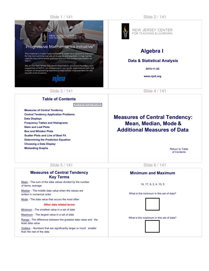
Slide 3 / 141 Table of Contents
Determining the Prediction Equation Data Displays Measures of Central Tendency Central Tendency Application Problems Frequency Tables and Histograms Stem and Leaf Plots Box and Whisker Plots Choosing a Data Display Misleading Graphs Scatter Plots and Line of Best Fit
Click on the topic to go to that section
Slide 4 / 141
Measures of Central Tendency: Mean, Median, Mode & Additional Measures of Data
Return to Table
Slide 5 / 141
Mean - The sum of the data values divided by the number
Median - The middle data value when the values are written in numerical order Mode - The data value that occurs the most often Other data related terms: Minimum - The smallest value in a set of data Maximum - The largest value in a set of data Range - The difference between the greatest data value and the least data value Outliers - Numbers that are significantly larger or much smaller than the rest of the data
Measures of Central Tendency Key Terms Slide 6 / 141
14, 17, 9, 2, 4, 10, 5 What is the minimum in this set of data? 2 What is the maximum in this set of data? 17
Minimum and Maximum
SLIDE 2 Slide 7 / 141
Which of the following data sets have outlier(s)?
- A. 1, 13, 18, 22, 25
- B. 17, 52, 63, 74, 79, 83, 120
- C. 13, 15, 17, 21, 26, 29, 31
- D. 25, 32, 35, 39, 40, 41
Outliers - Numbers that are relatively much larger
than the data
Outliers Slide 8 / 141
1 Which of the following data sets have outlier(s)?
- A. 13, 18, 22, 25, 100
- B. 17, 52, 63, 74, 79, 83
- C. 13, 15, 17, 21, 26, 29, 31, 75
- D. 1, 25, 32, 35, 39, 40, 41
Slide 9 / 141
2 The data set: 1, 20, 30, 40, 50, 60, 70 has an outlier which is ________ than the rest of the data. A higher B lower C neither
Slide 10 / 141
Given the following set of data, what is the median? 10, 8, 9, 8, 5 8 Who remembers what to do when finding the median of an even set of numbers?
What is the Median? Slide 11 / 141
When finding the median of an even set of numbers, you must take the mean of the two middle numbers. Find the median 12, 14, 8, 4, 9, 3 8.5
Find the Median Slide 12 / 141
3 Find the median: 5, 9, 2, 6, 10, 4 A 5 B 5.5 C 6 D 7.5
SLIDE 3
Slide 13 / 141
4 Find the median: 15, 19, 12, 6, 100, 40, 50 A 15 B 12 C 19 D 6
Slide 14 / 141
5 Find the median: 1, 2, 3, 4, 5, 6 A 3 & 4 B 3 C 4 D 3.5
Slide 15 / 141
Given a maximum of 17 and a minimum of 2, what is the range? 15
What is the Range Slide 16 / 141
6 Find the range: 4, 2, 6, 5, 10, 9 A 5 B 8 C 9 D 10
Slide 17 / 141
7 Find the range, given a data set with a maximum value of 100 and a minimum value of 1.
Slide 18 / 141
8 Find the range for the given set of data: 13, 17, 12, 28, 35
SLIDE 4
Slide 19 / 141
Find the mode 10, 8, 9, 8, 5 8 Find the mode 1, 2, 3, 4, 5 No mode What can be added to the set of data above, so that there are two modes? Three modes?
Find the Mode Slide 20 / 141
9 What number can be added to the data set so that there are 2 modes: 3, 5, 7, 9, 11, 13, 15 ? A 3 B 6 C 8 D 9 E 10
Slide 21 / 141
10 What value(s) must be eliminated so that data set has 1 mode: 2, 2, 3, 3, 5, 6 ?
Slide 22 / 141
11 Find the mode(s): 3, 4, 4, 5, 5, 6, 7, 8, 9 A 4 B 5 C 9 D No mode
Slide 23 / 141
To find the mean of the ages for the Apollo pilots given below, add their ages. Then divide by 7, the number of pilots. Apollo Mission 11 12 13 14 15 16 17 Pilot's age 39 37 36 40 41 36 37
Finding the Mean
Mean = 39 + 37 + 36 + 40 + 41 + 36 +37 = 266 = 38 7 7 The mean of the Apollo pilots' ages is 38 years.
Slide 24 / 141
Find the mean 10, 8, 9, 8, 5 8
Find the Mean
SLIDE 5
Slide 25 / 141
12 Find the mean 20, 25, 25, 20, 25
Slide 26 / 141
13 Find the mean 14, 17, 9, 2, 4,10, 5, 3
Slide 27 / 141
14 The data value that occurs most often is called the A mode B range C median D mean
Slide 28 / 141
15 The middle value of a set of data, when ordered from lowest to highest is the _________. A mode B range C median D mean
Slide 29 / 141
16 Find the maximum value: 15, 10, 32, 13, 2. A 2 B 15 C 13 D 32
Slide 30 / 141
17 Identify the set(s) of data that has no mode. A 1, 2, 3, 4, 5, 1 B 2, 2, 3, 3, 4, 4, 5, 5 C 1, 1, 2, 2, 2, 3, 3, D 2, 4, 6, 8, 10
SLIDE 6 Slide 31 / 141
18 Find the range: 32, 21, 25, 67, 82.
Slide 32 / 141
19 Identify the outlier(s): 78, 81, 85, 92, 96, 145.
Slide 33 / 141
20 If you take a set of data and subtract the minimum value from the maximum value, you will have found the ______. A
B median C mean D range
Slide 34 / 141
High Temperatures for Halloween Year Temperature 2003 91 2002 92 2001 92 2000 89 1999 96 1998 88 1997 97 1996 95 1995 90 1994 89 1993 91 1992 92 1991 91 Find the mean, median, mode, range and
- utliers for the data below.
Find... Slide 35 / 141
88 89 90 91 92 93 94 95 96 97
Mean Median Mode Range Outliers
1193 91.8 91 91 and 92 97-88 = 9 None 13 ~ ~ High Temperatures for Halloween
Year Temperature 2003 91 2002 92 2001 92 2000 89 1999 96 1998 88 1997 97 1996 95 1995 90 1994 89 1993 91 1992 92 1991 91
High Temperatures for Halloween
Hint
Slide 36 / 141
Candy Calories Butterscotch Discs 60 Candy Corn 160 Caramels 160 Gum 10 Dark Chocolate Bar 200 Gummy Bears 130 Jelly Beans 160 Licorice Twists 140 Lollipop 60 Milk Chocolate Almond 210 Milk Chocolate 210 Milk Chocolate Peanuts 210 Milk Chocolate Raisins 160 Malted Milk Balls 180 Pectin Slices 140 Sour Balls 60 Taffy 160 Toffee 60 Find the mean, median, mode, range and outliers for the data.
SLIDE 7 Slide 37 / 141
2470 137.2 160 160 210-10 = 200 10 and 60 18 ~ ~
Mean Median Mode Range Outliers
0 10 20 30 40 50 60 70 80 90 100 110 120 130 140 150 160 170 180 190 200 210 Candy Calories Butterscotch Discs 60 Candy Corn 160 Caramels 160 Gum 10 Dark Chocolate Bar 200 Gummy Bears 130 Jelly Beans 160 Licorice Twists 140 Lollipop 60 Milk Chocolate Almond 210 Milk Chocolate 210 Milk Chocolate Peanuts 210 Milk Chocolate Raisins 160 Malted Milk Balls 180 Pectin Slices 140 Sour Balls 60 Taffy 160 Toffee 60
Calories from Candy Slide 38 / 141
Central Tendency Application Problems
Return to Table
Slide 39 / 141
Jae bought gifts that cost $24, $26, $20 and $18. She has one more gift to buy and wants her mean cost to be $24. What should she spend for the last gift? 3 Methods : Method 1: Guess & Check Try $30 24 + 26 + 20 + 18 + 30 = 23.6 5 Try a greater price, such as $32 24 + 26 + 20 + 18 + 32 = 24 5 The answer is $32.
Application Problems - Method 1 Slide 40 / 141
Jae bought gifts that cost $24, $26, $20 and $18. She has
- ne more gift to buy and wants her mean cost to be $24.
What should she spend for the last gift? Method 2: Work Backward In order to have a mean of $24 on 5 gifts, the sum of all 5 gifts must be $24 5 = $120. The sum of the first four gifts is $88. So the last gift should cost $120 – $88 = $32. 24 5 = 120 120 – 24 – 26 – 20 – 18 = 32
Application Problems - Method 2 Slide 41 / 141
Method 3: Write an Equation Let x = Jae's cost for the last gift. 24 + 26 + 20 + 18 + x = 24 5 88 + x = 24 5 88 + x = 120 (multiplied both sides by 5) x = 32 (subtracted 88 from both sides)
Application Problems - Method 3 Slide 42 / 141
Your test scores are 87, 86, 89, and 88. You have one more test in the marking period. You want your average to be a 90. What score must you get on your last test?
Application Problems - Method 3
Answer
SLIDE 8 Slide 43 / 141
21 Your test grades are 72, 83, 78, 85, and 90. You have
- ne more test and want an average of an 82. What
must you earn on your next test?
Slide 44 / 141
22 Yes No Your test grades are 72, 83, 78, 85, and 90. You have one more test and want an average of an 85. Your friend figures out what you need on your next test and tells you that there is "NO way for you to wind up with an 85 average." Is your friend correct? Why or why not?
Slide 45 / 141
Consider the data set: 50, 60, 65, 70, 80, 80, 85 The mean is: The median is: The mode is: What happens to the mean, median and mode if 60 is added to the set of data? Mean: Median: Mode:
Consider the Data Set
Answer
Slide 46 / 141
Consider the data set: 55, 55, 57, 58, 60, 63 · The mean is 58 · the median is 57.5 · and the mode is 55 What would happen if a value x was added to the set? How would the mean change: if x was less than the mean? if x equals the mean? if x was greater than the mean?
Consider the Data Set Slide 47 / 141
Let's further consider the data set: 55, 55, 57, 58, 60, 63 · The mean is 58 · the median is 57.5 · and the mode is 55 What would happen if a value, "x", was added to the set? How would the median change: if x was less than 57? if x was between 57 and 58? if x was greater than 58?
Consider the Data Set Slide 48 / 141
Consider the data set: 10, 15, 17, 18, 18, 20, 23 · The mean is 17.3 · the median is 18 · and the mode is 18 What would happen if the value of 20 was added to the data set? How would the mean change? How would the median change? How would the mode change?
Consider the Data Set
Answer
SLIDE 9 Slide 49 / 141
Consider the data set: 55, 55, 57, 58, 60, 63 · The mean is 58 · the median is 57.5 · and the mode is 55 What would happen if a value, "x", was added to the set? How would the mode change: if x was 55? if x was another number in the list other than 55? if x was a number not in the list?
Consider the Data Set Slide 50 / 141
23 Consider the data set: 78, 82, 85, 88, 90. Identify the data values that remain the same if "x" is added to each value. A mean B median C mode D range E minimum
Slide 51 / 141
Data Displays
Return to Table
Slide 52 / 141 Tables
Ticket Sales for School Play Charts Graphs
Friday Saturday Sunday 7 PM 78 67 65 9 PM 82 70 30 Matinee NA 35 82
Data Display Examples Slide 53 / 141
24 In a recent poll in Syracuse, New York, 3,000 people were asked to pick their favorite baseball
accompanying circle graph shows the results of that poll.
Yankees 180 Mets 120 Red Sox
A B C D 300 500 1200 1800
From the New York State Education Department. Office of Assessment Policy, Development and
- Administration. Internet. Available from
www.nysedregents.org/IntegratedAlgebra; accessed 17, June, 2011.
Slide 54 / 141
Frequency Tables and Histograms
Return to Table
SLIDE 10 Slide 55 / 141
A frequency table shows the number of times each data item appears in an interval. To create a frequency table, choose a scale that includes all of the numbers in the data set. Next, determine an interval to separate the scale into equal parts. The table should have the intervals in the first column, tally in the second and frequency in the third. Time Tally
Frequency
10-19 IIII 4 20-29 30-39 IIII 5 40-49 IIII 4 50-59 60-69 III 3
Vocabulary Slide 56 / 141
The following are the test grades from a previous year. Organize the data into a frequency table. 95 85 93 77 97 71 84 63 87 39 88 89 71 79 83 82 85
Frequency Table Slide 57 / 141
95 85 93 77 97 71 84 63 87 39 88 89 71 79 83 82 85 Step 1: Find the range of the data then determine a scale and interval. Hint: Divide the range of data by the number of intervals you would like to have and then use the quotient as an approximate interval size.
Determine Range, Scale and Interval Slide 57 (Answer) / 141
95 85 93 77 97 71 84 63 87 39 88 89 71 79 83 82 85 Step 1: Find the range of the data then determine a scale and interval. Hint: Divide the range of data by the number of intervals you would like to have and then use the quotient as an approximate interval size.
Determine Range, Scale and Interval
[This object is a pull tab]
Answer RANGE: 97 – 39 = 59 SCALE: 59/6 = 9.5555 so 10 would be the size of the intervals INTERVALS: 30-39, 40-49, 50-59, 60-69, 70-79, 80-89, 90-99
Slide 58 / 141
95 85 93 77 97 71 84 63 87 39 88 89 71 79 83 82 85 Grade Tally Frequency Test Grades
Create a Frequency Table
Grade Tally Frequency 30-39 I 1 40-49 50-59 60-69 I 1 70-79 IIII 4 80-89 IIII III 8 90-99 III 3 Move to see answer
Slide 59 / 141
Walking Time Time Tally Frequency 10-19 IIII 4 20-29 30-39 IIII 5 40-49 IIII 4 50-59 60-69 III 3 Length of Time Walking 15 30 15 45 45 30 30 60 30 60 15 30 45 45 60 15 Move to see answer
Create a Frequency Table
Answer
SLIDE 11 Slide 60 / 141
A histogram is a bar graph that shows data in intervals. Since the data is shown in intervals,there is no space between the bars. F R E Q U E N C Y
8 6 4 2 0 30-
40- 50- 60- 70- 80- 90- 39 49 59 69 79 89 99 GRADE
Test Grades
Histogram Slide 61 / 141
Grade Tally Frequency 30-39 I 1 40-49 50-59 60-69 I 1 70-79 IIII 4 80-89 IIII III 8 90-99 III 3 95 85 93 77 97 71 84 63 87 39 88 89 71 79 83 82 85
F R E Q U E N C Y
8 6 4 2 0 30-
40- 50- 60- 70- 80- 90- 39 49 59 69 79 89 99 GRADE
Note: Frequency tables and histograms show data in intervals Test Grades Test Grades
Create a Histogram Slide 62 / 141
Questions
F R E Q U E N C Y
8 6 4 2 0 30-
40- 50- 60- 70- 80- 90- 39 49 59 69 79 89 99 GRADE
Test Grades
- 1. How many students scored an A?
- 2. How many students scored an 87?
- 3. How are histograms and bar graphs alike?
- 4. How are histograms and bar graphs different?
- 5. Why are there no spaces between the bars of a histogram?
Questions Slide 63 / 141
F R E Q U E N C Y
8 6 4 2 0 30-
40- 50- 60- 70- 80- 90- 39 49 59 69 79 89 99 GRADE
Test Grades Notice that the test scores are closely grouped except one. In statistics when a value is much different then the rest
- f the data set it is called an outlier.
Histograms Slide 64 / 141
25 In the following data what number is the outlier? { 1, 2, 2, 4, 5, 5, 5, 13 }
Slide 65 / 141
26 In the following data what number is the outlier? { 27, 27.6, 27.8 , 27.8, 27.9, 32 }
SLIDE 12 Slide 66 / 141
27 In the following data what number is the outlier? { 47, 48, 51, 52, 52, 56, 79 }
Slide 67 / 141
Example Test Scores 95 85 93 77 97 71 84 63 87 39 88 89 71 79 83 82 85
F R E Q U E N C Y
8 6 4 2 0 30-
40- 50- 60- 70- 80- 90- 39 49 59 69 79 89 99 GRADE
Grade Tally Frequency 30-39 I 1 40-49 50-59 60-69 I 1 70-79 IIII 4 80-89 IIII III 8 90-99 III 3
Create a Frequency Table and Histogram Slide 68 / 141 Create a Frequency Table and Histogram
Test Scores 87 53 95 85 89 59 86 82 87 40 90 72 48 68 57 64 85
F R E Q U E N C Y
8 6 4 2 0 40-
50- 60- 70- 80- 90- 49 59 69 79 89 99 GRADE
Grade Tally Frequency
Slide 68 (Answer) / 141 Create a Frequency Table and Histogram
Test Scores 87 53 95 85 89 59 86 82 87 40 90 72 48 68 57 64 85
F R E Q U E N C Y
8 6 4 2 0 40-
50- 60- 70- 80- 90- 49 59 69 79 89 99 GRADE
Grade Tally Frequency
[This object is a pull tab]
Answer
F R E Q U E N C Y
8 6 4 2 0 40-
50- 60- 70- 80- 90- 49 59 69 79 89 99 GRADE
Grade Tally Frequency 40-49 II 2 50-59 III 3 60-69 II 2 70-79 I 1 80-89 IIII II 7 90-99 II 2
Slide 69 / 141
Both compare data in different categories and use bars to show amounts. Histograms show data in intervals, the height of the bar shows the frequency in the interval and there are no spaces between the bars. Bar Graphs show a specific value for a specific category, and have a space between bars to separate the categories.
F R E Q U E N C Y
8 6 4 2 0 30-
40- 50- 60- 70- 80- 90- 39 49 59 69 79 89 99 GRADE
Compare and Contrast Bar Graphs and Histograms Slide 70 / 141
Stem and Leaf Plots
Return to Table
SLIDE 13 Slide 71 / 141 Stem-and-Leaf Plots
First, order from least to greatest: 42, 67, 73, 78, 82, 84, 86, 91, 94, 94, 99 4 2 6 7 7 3 8 8 2 4 6 9 1 4 4 9 Example: Bobby's Test Grades Key: 4 2 = 42 A type of graph that shows each data value and the number of
- ccurrences. The leaf is the last digit and the stem consists of
the remaining digits List of math test grades for Bobby: 73, 42, 67, 94, 78, 99 84, 91, 82, 86, 94
Slide 72 / 141
Create a stem-and-leaf for the data. Remember: · the leaf is the last digit and the stem consists of the remaining digits · include a key Daily Temperatures: 82, 95, 102, 78, 84, 96, 90, 80, 75, 101 Key:
Stem-and-Leaf Plots
Answer
Slide 73 / 141
4 2 6 7 7 3 8 8 2 4 6 9 1 4 4 9 Test Grades Key: 4 2 = 42 The median is the middle data value when the values are written in numerical order. Remember! If a data set has an even number of values, the median is the mean of the two middle values.
Median
The median of this stem-and-leaf is 84. Answer
Slide 74 / 141
28 What is the median of the data in the following stem-and-leaf plot? 6 0 2 2 7 5 7 8 9 8 2 5 8 9 3 5 7 Key: 6 0 = 60 Test Grades 79 Answer
Slide 75 / 141
4 2 6 7 7 3 8 8 2 4 6 9 1 4 4 9 Key: 4 2 = 42 Test Grades The mean is the sum of the data values divided by the number of values. Step 1: Add all of the numbers 42 + 67 + 73 + 78 + 82 +84 + 86 + 91 + 94 + 94 + 99 = 890 Step 2: Divide the sum by the number of values (numbers) 890 divided by 11 = 80.9 So, 80.9 is the mean, also known as the average for this stem and leaf.
The Mean Slide 76 / 141
29 What is the mean of the data in the following stem-and-leaf plot? 6 0 2 7 5 7 8 8 2 5 8 9 3 5 7 Key: 6 0 = 60 Test Grades
SLIDE 14 Slide 76 (Answer) / 141
29 What is the mean of the data in the following stem-and-leaf plot? 6 0 2 7 5 7 8 8 2 5 8 9 3 5 7 Key: 6 0 = 60 Test Grades
[This object is a pull tab]
Answer
81.1
Slide 77 / 141
4 2 6 7 7 3 8 8 2 4 6 9 1 4 4 9 Test Grades Key: 4 2 = 42 The mode of this stem-and-leaf is 94. The mode is the data value that occurs most often. Remember! The data set can have
- ne mode, more than
- ne mode or no mode.
The Mode Slide 78 / 141
30 What is the mode of the data in the following stem-and-leaf plot? 6 0 2 2 7 5 7 8 8 2 5 8 9 3 5 7 Key: 6 0 = 60 Test Grades
Slide 78 (Answer) / 141
30 What is the mode of the data in the following stem-and-leaf plot? 6 0 2 2 7 5 7 8 8 2 5 8 9 3 5 7 Key: 6 0 = 60 Test Grades
[This object is a pull tab]
Answer
62
Slide 79 / 141
31 Jorge made the accompanying stem-and-leaf plot of the weights, in pounds, of each member of the wrestling team he was coaching. What is the mode of the weights? Stem Leaf 10 9 11 12 3 8 13 2 4 4 6 8 14 1 3 5 5 9 15 2 3 7 7 9 16 1 3 7 8 8 8 9 17 3 8 Key 16 1 = 161
From the New York State Education Department. Office of Assessment Policy, Development and Administration.
- Internet. Available from www.nysedregents.org/IntegratedAlgebra; accessed 17, June, 2011.
A B 145 150 C D 152 168
Slide 80 / 141
32 Stem Leaf 4 3 6 0 5 5 7 9 7 2 5 6 8 9 9 9 9 0 1 2 5 9 The student scores on Mrs. Frederick’s mathematics test are shown on the stem-and-leaf plot below. Find the median of these scores. Key 4 3 = 43 points
From the New York State Education Department. Office of Assessment Policy, Development and Administration.
- Internet. Available from www.nysedregents.org/IntegratedAlgebra; accessed 17, June, 2011.
SLIDE 15 Slide 81 / 141
The stem is the first digit (the tens digit) which goes on the left. The leaf is the second digit (the ones digit) which goes on the right. Be sure to organize the leaves in numerical order. Test Scores 95 85 93 77 97 71 84 63 87 39 88 89 71 79 83 82 85 Stem Leaf
The Stem and the Leaf Slide 82 / 141
3 4 5 6 7 8 9 9 3 1179 23455789 357 Test Scores Stem Leaf Key 3 9 = 39 Test Scores 95 85 93 77 97 71 84 63 87 39 88 89 71 79 83 82 85
The Stem and the Leaf Slide 83 / 141
Compare the stem and leaf plot to the frequency table from before. Grade Tally Frequency 30-39 I 1 40-49 50-59 60-69 I 1 70-79 IIII 4 80-89 IIII III 8 90-99 III 3 Key 3 9 = 39 Test Scores 95 85 93 77 97 71 84 63 87 39 88 89 71 79 83 82 85
The Stem and the Leaf
3 4 5 6 7 8 9 9 3 1179 23455789 357
Stem Leaf
Slide 84 / 141
Try This! Create a Stem & Leaf Plot for the data. Look at the example on the left for guidance.
Example
Test Scores 95 85 93 77 97 71 84 63 87 39 88 89 71 79 83 82 85 3 4 5 6 7 8 9 9 3 1179 23455789 357 Stem Leaf Key 3 9 = 39
Slide 85 / 141
4 08 5 379 6 48 7 2 8 2556779 9 05 Stem Leaf Test Scores 87 53 95 85 89 59 86 82 87 40 90 72 48 68 57 64 85 Key 40 = 40 Test Scores 95 85 93 77 97 71 84 63 87 39 88 89 71 79 83 82 85
Example
Answer
Slide 86 / 141
4 08 5 379 6 48 7 2 8 2556779 9 05 Stem Leaf
F R E Q U E N C Y
8 6 4 2 0 40-
50- 60- 70- 80- 90- 49 59 69 79 89 99 GRADE
Stem and Leaf plots contain the information needed to make a histogram.
- 1. Compare the stem and leaf plot to the histogram. How are they
alike? How are they different?
- 2. Can you make a stem and leaf plot from either a frequency table
- r histogram? Can you make a frequency table from a histogram?
- 3. How can you make a histogram from a stem and leaf plot?
(Rotate the stem and leaf plot to demonstrate)
Stem and Leaf Plots
SLIDE 16 Slide 87 / 141
Box and Whisker Plots
Return to Table
Slide 88 / 141
A box and whisker plot is a data display that organizes data into four groups
1 2 3 4 5 6 7 8 9 10
90 100 110 120 130 140 150
The median divides the data into an upper and lower half The median of the lower half is the lower quartile. The median of the upper half is the upper quartile. The least data value is the lower extreme . The greatest data value is the upper extreme.
Box and Whisker Plot Slide 89 / 141
1 2 3 4 5 6 7 8 9 10
90 100 110 120 130 140 150
Drag the terms below to the correct position
- n the box and whisker graph.
median lower quartile upper quartile lower extreme upper extreme
Box and Whisker Plot Slide 90 / 141
1 2 3 4 5 6 7 8 9 10
80 90 100 110 120 130 140 150
The entire box represents 50% of the data. 25% of the data lie in the box on each side of the median Each whisker represents 25% of the data median 25% 25% 25% 25%
Box and Whisker Plot Slide 91 / 141
33 The lower extreme is A 87 B 104 C 122 D 134
1 2 3 4 5 6 7 8 9 10
90 100 110 120 130 140 150
Slide 92 / 141
34 The median is A 87 B 104 C 122 D 134
1 2 3 4 5 6 7 8 9 10
90 100 110 120 130 140 150
SLIDE 17 Slide 93 / 141
35 The lower quartile is A 87 B 104 C 122 D 134
1 2 3 4 5 6 7 8 9 10
90 100 110 120 130 140 150
Slide 94 / 141
36 The upper quartile is A 87 B 104 C 122 D 134
1 2 3 4 5 6 7 8 9 10
90 100 110 120 130 140 150
Slide 95 / 141
37 In a box and whisker plot, 75% of the data is between A lower extreme and the median B lower extreme and the upper extreme C lower quartile and the upper extreme D lower extreme and the upper quartile
1 2 3 4 5 6 7 8 9 10
90 100 110 120 130 140 150
Slide 96 / 141
38 In a box and whisker plot, 50% of the data is between A lower extreme and the median B lower extreme and the upper extreme C lower quartile and the upper quartile D median and the upper extreme
1 2 3 4 5 6 7 8 9 10
90 100 110 120 130 140 150
Slide 97 / 141
39 In a box and whisker plot, 100% of the data is between A lower extreme and the median B lower extreme and the upper extreme C lower quartile and the upper quartile D median and the upper extreme
1 2 3 4 5 6 7 8 9 10
90 100 110 120 130 140 150
Slide 98 / 141
8 8 9 667 10 1557 11 1259 12 2224589 13 236899 14 78 Find the median Steps for creating a box and whisker plot:
Find the Median
SLIDE 18 Slide 99 / 141
8 8 9 667 10 1557 11 1259 12 2224589 13 236899 14 78 Then find the median of each half of the data median = 122
Find the Median Slide 100 / 141
8 8 9 667 10 1557 11 1259 12 2224589 13 236899 14 78 Then find the lowest and highest values Lower Quartile = 105 Median = 122 Upper Quartile = 133
Find the Lowest and Highest Values Slide 101 / 141
8 8 9 667 10 1557 11 1259 12 2224589 13 236899 14 78 Create a box and whisker plot by plotting all 5 pieces of information. Then draw the plot.
1 2 3 4 5 6 7 8 9 10
80 90 100 110 120 130 140 150
Lower Extreme = 88 Lower Quartile = 105 Median = 122 Upper Quartile = 133 Upper Extreme = 148
Draw the Plot Slide 102 / 141
1 2 3 4 5 6 7 8 9 10
90 100 110 120 130 140 150
8 8 9 667 10 1557 11 1259 12 2224589 13 236899 14 78 Lower Extreme = 88 Lower Quartile = 105 Median = 122 Upper Quartile = 133 Upper Extreme = 148 Create a box and whisker plot by plotting all 5 pieces of information. Then draw the plot.
Draw the Plot Slide 103 / 141
40 True False Compare the two box and whisker plots. Wrestling Team Weights
1 2 3 4 5 6 7 8 9 10
90 100 110 120 130 140 150
Last year This year Last year's team had a greater median.
Slide 104 / 141
41 True False Compare the two box and whisker plots. Wrestling Team Weights
1 2 3 4 5 6 7 8 9 10
90 100 110 120 130 140 150
Last year This year Both teams have about the same range.
SLIDE 19 Slide 105 / 141
42 True False Compare the two box and whisker plots. Wrestling Team Weights
1 2 3 4 5 6 7 8 9 10
90 100 110 120 130 140 150
Last year This year Last year's quartiles and median are lower than this year's.
Slide 106 / 141
43 True False Compare the two box and whisker plots. Wrestling Team Weights
1 2 3 4 5 6 7 8 9 10
90 100 110 120 130 140 150
Last year This year 50% of the wrestlers weighed between 105 and 130 last year.
Slide 107 / 141
2 66689 3 56789 4 0011123458 5 02335567 6 12347 7 03 Stem Leaf
1 2 3 4 5 6 7 8 9 10
Try this!
Lower Extreme = Lower Quartile = Median = Upper Quartile = Upper Extreme =
Slide 108 / 141
10 7 11 56 12 9 13 24 14 0224589 15 2344445 Stem Leaf Lower Extreme = Lower Quartile = Median = Upper Quartile = Upper Extreme =
1 2 3 4 5 6 7 8 9 10
Try this! Slide 109 / 141
Scatter Plots and the Line of Best Fit
Return to Table
Slide 110 / 141
A scatter plot is a graph that shows a set
- f data that has two variables.
Time Studying Test Score 45 89 30 78 50 90 60 92 40 85 48 87 55 95 35 82 What do you observe? Time spent studying Test Score
Scatter Plot
SLIDE 20 Slide 111 / 141
Time spent studying Test Score Predict the test score of someone who spends 52 minutes studying. Predict the test score of someone who spends 75 minutes studying.
Scatter Plot Slide 112 / 141 Slide 113 / 141
Notice that the points form a linear like pattern. To draw a line of best fit, use two points so that the line is as close as possible to the data points. Our line is drawn so that it fits as close as possible to the data
- points. This line was drawn through (35,82) and (50,90).
Draw a Line Slide 114 / 141
44 Consider the scatter graph to answer the following: Which 2 points would give the best line of fit? A B C D
X Y 3 9 4.5 8 5 7 6 5 8 4 9 3 10 1
B C D A and D B and C C and D there is no pattern A
Slide 115 / 141
45 Consider the scatter graph to answer the following: Which 2 points would give the best line of fit? A B C D
X Y 5 2 6 4 7 3 8 4 9 4.5 9 5 10 3
A and D B and C C and D there is no pattern A C B D
Slide 116 / 141
Determining the Prediction Equation
Return to Table
SLIDE 21 Slide 117 / 141
The points form a linear like pattern, so use two of the points to draw a line of best fit. Our line is drawn so that it fits as close as possible to the data
- points. This line was drawn through (35,82) and (50,90).
Draw a Line Slide 118 / 141
Use the two points that formed the line to write an equation for the line. This equation is called the Prediction Equation. Find m Find b Where S is the score for t minutes of studying.
Prediction Equation
m = m = 90 – 82 8 50 – 35 15 90 = 90 = 190 8 80 15 3 50 + b + b 3 = b S = 8 15 t +190 3
Slide 119 / 141
Prediction Equations can be used to predict other related values. If a person studies 15 minutes, what would be the predicted score? This is an extrapolation, because the time was
- utside the range of the original times.
Extrapolation
S = 8 15 t +190 3 S = 8 15 190 3 (15) – ≈ 71.3
Slide 120 / 141
If a person studies 42 minutes, what would be the predicted score? This is an interpolation, because the time was inside the range of the original times.
Interpolation
S = 8 15 190 3 (42) – ≈ 85.7
Slide 121 / 141
Interpolations are more accurate because they are within the set. The farther points are away from the data set the less reliable the prediction. Using the same prediction equation, consider: If a person studies 120 minutes, what will be there score? What is wrong with this prediction?
What is Wrong?
S = 8 15 190 3 (120) + ≈ 127.3
Slide 122 / 141
If a student got an 80 on the test, What would be the predicted length of their study time? The student studied about 31 minutes.
What is the Prediction?
80 = 8 15 190 3 t + 16.7 = 8 15 t 31.25 = t
SLIDE 22 Slide 123 / 141
46 Consider the scatter graph to answer the following: What is the slope of the line of best fit going through A and D? A B C D
X Y 3 9 5 7 6 5 8 4 9 3 10 1
A D
(9, 3) (3, 9)
3 4 –3 4 1 –1
Slide 124 / 141
47 Consider the scatter graph to answer the following: What is the y-intercept of the line of best fit going through A and D?
X Y 3 9 4.5 8 5 7 6 5 8 4 9 3 10 1
A D
(9, 3) (3, 9)
A B C D 9 10 11 12
Slide 125 / 141
48 Consider the scatter graph to answer the following The equation for our line is y = –1x + 12. What would the prediction be if x = 7? Is this an interpolation or extrapolation? 5, interpolation 5 , e x t r a p
a t i
6, interpolation 6, extrapolation A B C D
X Y 3 9 4.5 8 5 7 6 5 8 4 9 3 10 1
A D
Slide 126 / 141
49 Consider the scatter graph to answer the following: The equation for our line is y = –1x + 12. What would the prediction be if x = 14? Is this an interpolation or extrapolation? A B C D
X Y 3 9 4.5 8 5 7 6 5 8 4 9 3 10 1
A D –4, interpolation – 4 , e x t r a p
a t i
–2, interpolation –2, extrapolation
Slide 127 / 141
50 Consider the scatter graph to answer the following: The equation for our line is y = –1x + 12. What would the prediction be if y = 11? Is this an interpolation or extrapolation? A B C D
X Y 3 9 4.5 8 5 7 6 5 8 4 9 3 10 1
A D 1, interpolation 1 , e x t r a p
a t i
2, interpolation 2, extrapolation
Slide 128 / 141
51 In the previous questions, we began by using the table at the right. Which of the predicted values (7,5) or (14, –2) will be more accurate and why? A B C D
X Y 3 9 4.5 8 5 7 6 5 8 4 9 3 10 1
(7,5); it is an interpolation (7,5); there already is a 5 and a 7 in the table (14, -2) it is an extrapolation (14, -2); the line is going down and will become negative
SLIDE 23 Slide 129 / 141
Choosing a Data Display
Return to Table
Slide 130 / 141
A circle graph is used to illustrate a part to whole relationship
Part to a Whole Slide 131 / 141
You have also learned about: · Bar Graphs · Histograms · Frequency Tables · Box and Whisker Graphs · Stem and Leaf Graphs
Time Tally Frequency 10-19 IIII 4 20-29 30-39 IIII 5 40-49 IIII 4 50-59 60-69 III 3
6 0 2 7 5 7 8 8 2 5 8 9 3 5 7
F R E Q U E N C Y
8 6 4 2
30- 40- 50- 60- 70- 80- 90- 39 49 59 69 79 89 99 GRADE 1 2 3 4 5 6 7 8 9 1
080
90 100 110 120 130 140 150
What You Have Learned Slide 132 / 141
52 Choose the best data display to show the number
- f hours of video games played each week for two
months. A bar graph B histogram C circle graph D frequency table E stem-and-leaf F box-n-whisker
Slide 133 / 141
53 Choose the best data display to show the lower 25% of the scores on a math test. A bar graph B histogram C circle graph D frequency table E stem-and-leaf F box-n-whisker
Slide 134 / 141
54 Choose the best data display to show the number of students that earned an A, B, C, D & E on the last test. A bar graph B histogram C circle graph D frequency table E stem-and-leaf F box-n-whisker
SLIDE 24 Slide 135 / 141
55 Choose the best data display to show the percent
- f students that earned an A, B, C, D & E on the
last test. A bar graph B histogram C circle graph D frequency table E stem-and-leaf F box-n-whisker
Slide 136 / 141
56 Choose the best data display to show the interval of grades for 50% of the students. A bar graph B histogram C circle graph D frequency table E stem-and-leaf F box-n-whisker
Slide 137 / 141
Misleading Graphs
Return to Table
Slide 138 / 141
Changing the scale The bigger the interval on the horizontal axis the more vertical the graph looks The bigger the interval on the vertical axis, the more horizontal the graph looks Gap in the scale Tricks the viewer into thinking that bars or lines begin at a value different from the actual value Changing the size of objects The apparent sizes of objects may appear different from actual data values
Scale and Size Slide 139 / 141
57
You own a toothpaste company. Which graph would you select to use as an advertisement for your toothpaste? A B
Slide 140 / 141
SLIDE 25 Slide 141 / 141
59 Super Crunch Cheeze Puffs is coming out with a new "healthy" snack food. Determine which of the graphs would best fit their "healthy" advertising needs. A B C D Cheeze Puffs 80g
Cheeze Puffs 80g
Cheeze Puffs 80g
Cheeze Puffs 80g
Butter 100g
Butter 100g
Butter 100g
Butter 100g