
SLIDE 1
1 chapter 5
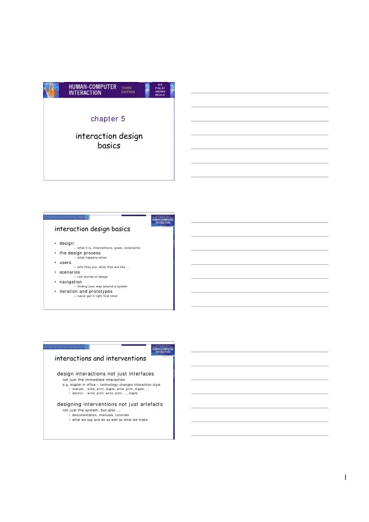
interaction design basics
interaction design basics
- design:
– what it is, interventions, goals, constraints
- the design process
– what happens when
- users
– who they are, what they are like …
- scenarios
– rich stories of design
- navigation
– finding your way around a system
- iteration and prototypes
– never get it right first time!
interactions and interventions
design interactions not just interfaces
not just the im m ediate interaction e.g. stapler in office – technology changes interaction style
- manual:
write, print, staple, write, print, staple, …
- electric:
write, print, write, print, … , staple
designing interventions not just artefacts
not just the system , but also …
- documentation, manuals, tutorials
- what we say and do as well as what we make