
SLIDE 1
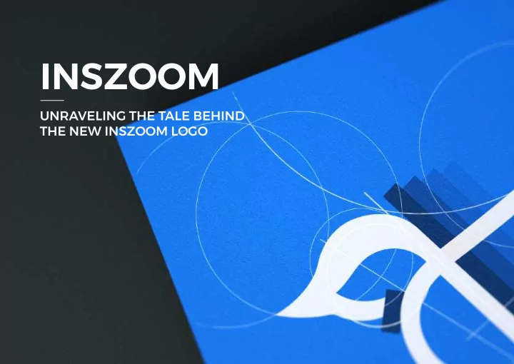
INSZOOM
UNRAVELING THE TALE BEHIND THE NEW INSZOOM LOGO
INSZOOM UNRAVELING THE TALE BEHIND THE NEW INSZOOM LOGO Hi there! - - PowerPoint PPT Presentation
INSZOOM UNRAVELING THE TALE BEHIND THE NEW INSZOOM LOGO Hi there! Im Bhumi, digital marketing analyst at INSZoom.com, Inc. I am so excited to tell you the story of our new logo. Were sad to let the old logo go, but even more excited
UNRAVELING THE TALE BEHIND THE NEW INSZOOM LOGO
Hi there! I’m Bhumi, digital marketing analyst at INSZoom.com, Inc. I am so excited to tell you the story
We’re sad to let the old logo go, but even more excited to bring in the new. Change is good and necessary, isn’t it? Without further ado, let’s unravel the story behind the new INSZoom logo together!
PAGE 02 / 44
Both wanted a new logo for an upcoming product and reached
and Founder, INSZoom.com,
The seed of the logo design was planted by our very own Zoomers — Sudhanva and Aruna. Oh, in case you’re wondering, everyone working at INSZoom is proudly called a ‘Zoomer!’
PAGE 03 / 44
PAGE 04 / 44
UMESH HAD OTHER PLANS!
He wanted a logo that not only represented our current product but also the products INSZoom builds in the future. One logo accommodating everything that INSZoom is.
Umesh met Designer — Andrey Retinskiy, in the parking lot. He drew the logo on a piece of paper for Andrey. He said, “I want our logo to represent people traveling across the globe and back.”
IDEA
PAGE 05 / 44
THE DESIGN TEAM REDREW THE ROUGH SKETCHES
INS ZOOM
INS ZOOM
Z
INS Z OM
PAGE 06 / 44
FOLLOWED BY — ARROW GLYPH VARIATIONS
PAGE 07 / 44
Umesh’s reaction to the redrawn sketches made it clear that he didn’t like the logo design. It was time to work on something more
Umesh’s reaction to the redrawn sketches made it clear that he didn’t like the logo design. It was time to work on something more
PAGE 08 / 44
After lots of research and tons of articles, Andrey Retinskiy found the perfect icon representing immigration in wild nature.
PAGE 09 / 44
Arctic Terns travel the longest regular migratory route of any animal on earth. Every year these sea birds travel from pole to pole and back, so they experience two summers per
44,300 miles. Yes, that’s right!
PAGE 10 / 44
ANDREY BELIEVED THAT THIS IMAGE WOULD BE A GREAT LOGO BASE TO START.
PAGE 11 / 44
HMMM, THIS LOOKED TOO COMPLICATED!
PAGE 12 / 44
OOPS! HE JUST MADE A PENGUIN WITH HUGE WINGS. TICK TICK TOCK TICK TOCK, TIME WAS RUNNING OUT!
PAGE 13 / 44
FIRST PRESENTATION
PAGE 14 / 44
Umesh wanted to see how far had the designers reached in the logo creation process. The presentation had the below three references of the Arctic Tern.
PAGE 15 / 44
Umesh was impressed with the representation of immigration by an Arctic Tern. But there was a lot of work to be done!
The designer hand drew the sketches of the Arctic Tern.
SKETCHES
PAGE 16 / 44
SOME MORE…
PAGE 17 / 44
AFTER SOME 50+ PAPER SKETCHES, THE TEAM SELECTED FEW VERSIONS TO REDRAW THEM IN VECTOR FORMAT
PAGE 18 / 44
PAGE 19 / 44
THE PREFERRED VERSION OF THE NEW LOGO WAS
PAGE 20 / 44
The designer spent hours to hone the shape of the
and wings were created. All of this with geometric validity.
IMPROVEMENTS AND MODIFICATIONS!
PAGE 21 / 44
The very first step was to investigate if there were any existing similar icons out there. Well, there were none! It was now time to test the logo in different environments and media placeholders.
The very first step was to investigate if there were any existing similar icons out there. Well, there were none! It was now time to test the logo in different environments and media placeholders.
PAGE 22 / 44
PAGE 23 / 44
STATIONERY
PAGE 24 / 44
PAGE 25 / 44
ON OBJECTS WITH VISUAL BRANDING
YES, WE TESTED THE LOGO ON A PILLOW COVER AS WELL!
PAGE 26 / 44
PAGE 27 / 44
PAGE 28 / 44
WE WENT ALL OUT ;)
PAGE 29 / 44
PAGE 30 / 44
LOGIN SCREEN
PAGE 31 / 44
THE UPCOMING TO-DO PORTAL
PAGE 32 / 44
WE COULDN’T WAIT TO HAVE THE LOGO TESTED ON THE WALLS AND INTERIORS OF OUR UPCOMING OFFICE IN PLEASANTON, CA!
PAGE 33 / 44
WOAHHHH!
PAGE 34 / 47 PAGE 34 / 44
NEW INTERIOR
With a space between the letters INS and Zoom? Remove the space? Oh wait, what about the arrow? Do we retain it?
THE NEXT STEP WAS TO DETERMINE HOW THE COMPANY’S NAME WOULD BE WRITTEN
PAGE 35 / 44
PAGE 36 / 44
PAGE 37 / 44
LETTERING AND OPTICAL KERNING
AND FINALLY, THE VARIATIONS OF THE NEW LOGO LOOKED LIKE
PAGE 38 / 44
Determining the perfect blue and grey! Compared with the earlier blue, we wanted a brighter blue which was cool and refreshing. Determining the perfect blue and grey! Compared with the earlier blue, we wanted a brighter blue which was cool and refreshing.
PAGE 39 / 44
#0033FF
PANTONE 293
C : 100 M : 70 Y : 0 K : 5
#323C5A
PANTONE 432
C : 65 M : 40 Y : 25 K : 80
IMAGES SUPPORTING THE LOGO
PAGE 40 / 44
A lot of thought went into defining the imagery that transferred the right emotions resonating with immigration and the symbol to our audience.
SOME EXAMPLES OF GRAPHICS WE WILL BE USING IN THE INSZOOM APPLICATION!
PAGE 41 / 44
AND THIS IS HOW INSZOOM’S NEW LOGO CAME INTO
BASED ON A TRUE STORY!