how to create an effective poster presentation
play

How to create an effective poster presentation By Rose O. Sherman, - PDF document

Strictly Clinical Strictly Clinical How to create an effective poster presentation By Rose O. Sherman, EdD, RN, NEA O RGANIZERS of nursing con- Allowable poster sizes for con- Presenting your project at a ferences depend on nurses


  1. Strictly Clinical — Strictly Clinical — How to create an effective poster presentation By Rose O. Sherman, EdD, RN, NEA O RGANIZERS of nursing con- Allowable poster sizes for con- Presenting your project at a ferences depend on nurses ferences vary widely. conference? Here’s advice that who have created new pro- Poster content should close- grams or are doing research ly follow the format of the ab- can make your poster more to submit their work for pres- stract you submitted. But keep effective and eye-catching. entation at conferences. in mind that a poster is not an Through these presentations, nursing knowledge is abstract. With a poster, your goal is to tell a clear, sim- disseminated. ple story of your work. If your poster topic is a project If you belong to a professional organization, you’ve o
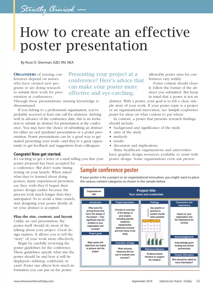
r an organizational innovation, see Sample conference probably received at least one call for abstracts. Arriving poster for ideas on what content to put where. well in advance of the conference date, this is an invita- In contrast, a poster that presents research findings tion to submit an abstract for presentation at the confer- should include: ence. You may have the choice of submitting an abstract • background and significance of the study for either an oral (podium) presentation or a poster pres- • aims of the study entation. Poster presentations can be a good way to get • methods started presenting your work—and they’re a great oppor- • results tunity to get feedback and suggestions from colleagues. • discussion and implications. Many healthcare organizations and universities Congrats! Now get started. have graphic design resources available to assist with It’s exciting to get a letter or e-mail telling you that your poster design. Some organizations even ask presen- poster proposal has been accepted for a conference. But don’t waste timing Sample conference poster resting on your laurels. When asked what they’ve learned about doing If your poster is for a project or an organizational innovation, you might want to place posters, many experienced presenters the various content categories as shown in the sample below. say they wish they’d begun their poster design earlier because the process took much longer than they anticipated. So to avoid a time crunch, start designing your poster shortly af- ter your abstract is accepted. Plan the size, content, and layout Unlike an oral presentation, the poster itself should do most of the talking about your project. Good de- sign matters. It allows you to tell the “story” of your work more effectively. Begin by carefully reviewing the poster guidelines for the conference. These guidelines specify what size the poster should be and how it will be displayed—tabletop, corkboard, or easel. Poster size affects how much in- formation you can put on the poster. www.AmericanNurseToday.com September 2010 American Nurse Today 13

  2. ters to use a specific template. Today many posters visual image—a photograph, an illustration, a graph. are designed with Microsoft PowerPoint templates, • Make it readable. Design the poster so it can be but you can also lay out the sections of your poster read from a distance of 4' to 6'. To accomplish this, on a large piece of poster board (available at art sup- lettering has to be at least 1" high. The title should ply or office supply stores) before finalizing it. Or be readable from 15' to 20' away, with letters 2" to you might consider using an Internet vendor (such as 3" high. Try to have high contrast between the back- www.makesigns.com). Many vendors not only guide ground and text. Generally, a lighter background you through poster design but also can print and with darker text is easier to read. ship your poster. • Pick fonts carefully. Arial and Tahoma are examples of nonserif fonts that work well for poster titles. Serif Use a “less is more” design fonts, such as Times New Roman and Courier, are The maxim “less is more” is good advice to follow for easier to read at smaller sizes and work well for a poster. Although you may be tempted to include body text. Having too many font types on a poster every detail of your project or research, you won’t can be distracting, so use at most two to three fonts, have enough space to do this. What’s more, you with bold or italics for emphasis only. Avoid all up- shouldn’t do this; it would make your poster too busy. percase letters (capitals) in your poster, as this Here are some design tips to follow: makes material harder to read. • Leave adequate white space. Some empty space is • Use color sparingly. Although most presenters want critical to readability and legibility. Without it, the colorful posters, color must be incorporated careful- reader has no visual pauses. ly. Blue and green are popular because they’re con- sidered calming. • Ask colleagues for help. If this is your first time designing a P poster, ask an experienced col- league for help. Before the poster is printed, have col- resenting a poster is a leagues familiar with your sub- ject area review it for clarity and chance to learn from possible errors. Proofread the attendees about aspects of poster carefully before you transport it to the conference. your work that particularly Transporting and setting up resonate with your audience. your poster Posters can be delivered to the conference site by overnight services, such as FedEx or UPS, but many presenters prefer to hand-carry them in poster can- isters or portfolios. Normally, posters are set up just before the conference begins. You should receive advance guide- • Convey your message clearly. The poster should lines from conference organizers telling you how to capture the attention of attendees and convey at set up your poster. If the poster will be attached to least one significant idea they’ll remember. Most corkboard, find out if you’re expected to bring the re- people spend 3 to 5 minutes viewing a poster, quired materials (usually pushpins or Velcro strips) to so use plain, descriptive language that leaves no adhere it. doubt what your poster is about. Generally, posters Most professional meeting agendas set aside specific are read from left to right; organize the content times for poster presentations. Many organizations offer with this in mind. When possible, lead the viewer continuing education credit for poster session atten- through the logical flow using bold take-home dance. Be aware that if your poster is accepted at a points or arrows. conference, a presenter familiar with the project or re- • Use a visual image. People retain visual images search is expected to be available during poster ses- longer than the written word, so aim for at least one sions to answer questions. Volume 5, Number 9 www.AmericanNurseToday.com American Nurse Today 14

Download Presentation
Download Policy: The content available on the website is offered to you 'AS IS' for your personal information and use only. It cannot be commercialized, licensed, or distributed on other websites without prior consent from the author. To download a presentation, simply click this link. If you encounter any difficulties during the download process, it's possible that the publisher has removed the file from their server.

Recommend


More recommend