
SLIDE 1
Feature selection, dimensionality reduction, clustering, marker - - PowerPoint PPT Presentation
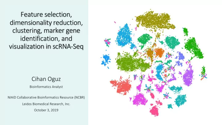
Feature selection, dimensionality reduction, clustering, marker gene identification, and visualization in scRNA-Seq Cihan Oguz Bioinformatics Analyst NIAID Collaborative Bioinformatics Resource (NCBR) Leidos Biomedical Research, Inc.
(with enough read counts/above background) are identified.
by a factor (e.g., 10,000) and log-transformed (not scaled data).
sensitive to the exact number of selected genes.
additional noise into downstream analysis.
groups within batches) do not dominate downstream results.
genes do not dominate. Elbow plots show the number
(URD tool in R can automatically detect the elbow). Jackstraw analysis generates a p-value (significance) of each PC 1% of the data is randomly permuted, PCA is rerun, ‘null distribution’ of gene scores constructed (these steps repeated many times). ‘Significant’ PCs have a strong enrichment
PC score plots show genes that dominate each PC PC heatmaps visualize anti-correlated gene sets (yellow: higher expression)
biological interest?
Nothing regressed out Cells separated with respect to cell cycle phase G1, G2/M and S phase scores regressed out Difference between G2/M & S phase scores regressed out
between points in high-dimensional space).
dimensionality).
t-SNE can capture capture non-linear dependencies in the data, PCA can’t. t-SNE tries to recreate a low dimensional space that follows the probability distribution dictating the relationships between various neighboring points in higher dimensions
Cosine similarity & Pearson/Spearman correlation are scale invariant (driven by relative differences between cells, robust to library or cell size differences)
Diffusion map: Each DC (diffusion map dimension) highlights the heterogeneity
Connectivity ~ probability of walking between the points in one step of a random walk (diffusion) Force-directed graph layout via ForceAtlas2 Nodes repulse each other like charged particles, while edges attract their nodes, like springs.
Luecken MD, Theis FJ. Current best practices in single-cell RNA-seq analysis: a tutorial. Molecular systems biology (2019).
k=5 k=10
Kiselev, Vladimir Yu, Tallulah S. Andrews, and Martin Hemberg. "Challenges in unsupervised clustering of single-cell RNA-seq data." Nature Reviews Genetics (2019).
Differential expression approaches for marker identification:
test for significance.
residuals/fitting errors or normally distributed variances).
Classifier based approach for marker identification:
per gene).
distinguish between two groups of cells (e.g. KO vs WT, cluster 1 vs 2, or cluster 1 vs all clusters).
the gene. Butler et al. Integrating single-cell transcriptomic data across different conditions, technologies, and species. Nature biotechnology. 2018 May;36(5):411.
Finak et al. MAST: a flexible statistical framework for assessing transcriptional changes and characterizing heterogeneity in single-cell RNA sequencing data. Genome biology. 2015 Dec;16(1):278.
Cluster 1 vs Cluster 2 Positive class:C1, Negative class:C2 True positive (TP) True membership: C1, Prediction: C1 False positive (FP) True membership: C2, Prediction: C1
Cluster 1 vs Cluster 2 Positive class:C1, Negative class:C2 True positive (TP) True membership: C1, Prediction: C1 False positive (FP) True membership: C2, Prediction: C1
Average log FC Ratio of expression in log-space pct.1= percent of cells in Cluster 1 in which the gene is detected pct.2=percent of cells in Cluster 2 p_val_adj=FDR
Volcano plot Dot plot (Clusterprofiler in R)
https://galaxyproject.github.io/training-material/topics/transcriptomics /tutorials/rna-seq-viz-with-volcanoplot/tutorial.html
Acknowledgements: NIAID Collaborative Bioinformatics Resource (NCBR) Justin Lack (Lead), Arun Boddapati, Susan Huse, Vasu Kuram, Tovah Markowitz, Paul Schaughency