
SLIDE 1
CS-5630 / CS-6630 Visualization for Data Science How to Critique a Vis and Exam Review
Alexander Lex alex@sci.utah.edu
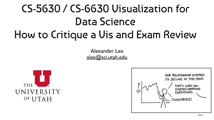
[xkcd]
CS-5630 / CS-6630 Visualization for Data Science How to Critique a - - PowerPoint PPT Presentation
CS-5630 / CS-6630 Visualization for Data Science How to Critique a Vis and Exam Review Alexander Lex alex@sci.utah.edu [xkcd] Exam Format: Google Doc Link with Instructions Download doc or copy to edit Write concise and relevant answers
Alexander Lex alex@sci.utah.edu
[xkcd]
Given a vis, analyze what’s good/bad and redesign. Analyze in the context of theory taught
point, line, shape, …
positizion, size, saturation, color, …
Cole Nussbaumer www.storytellingwithdata.com/2011/07/death-to-pie-charts.html
Share of coverage
Flowing Data
VizWiz
Mother Jones
Mother Jones