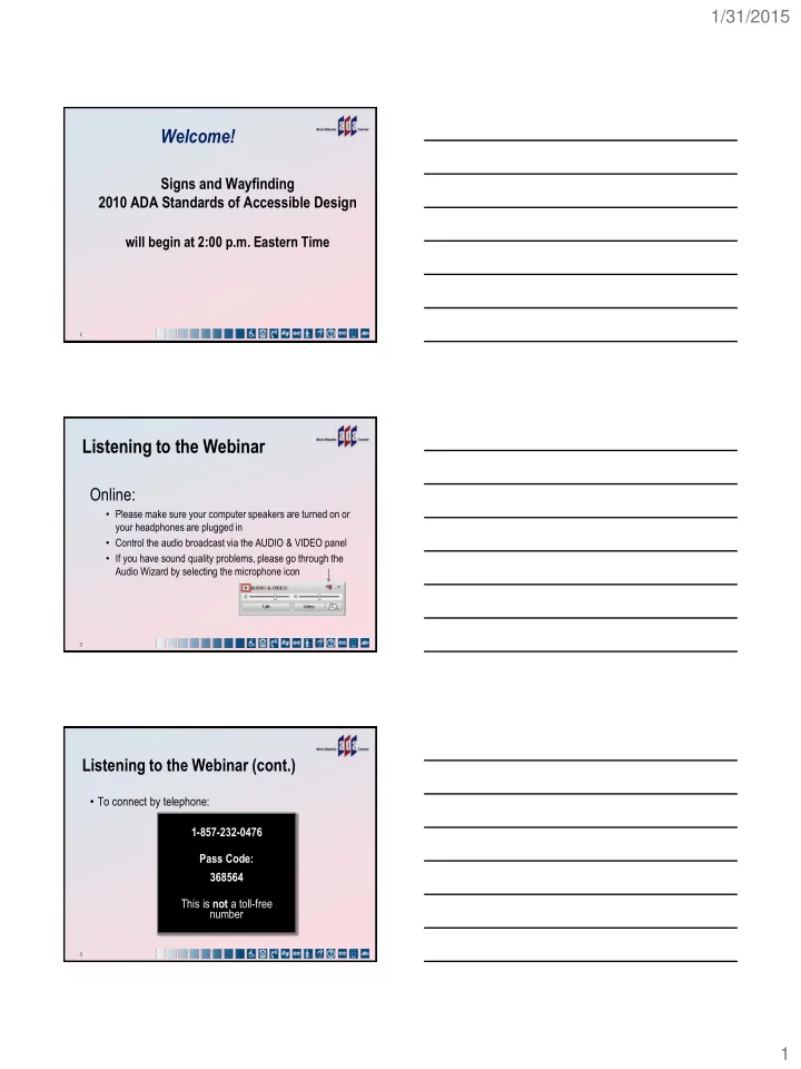
welcome
play

Welcome! Signs and Wayfinding 2010 ADA Standards of Accessible - PDF document

1/31/2015 Welcome! Signs and Wayfinding 2010 ADA Standards of Accessible Design will begin at 2:00 p.m. Eastern Time 1 Listening to the Webinar Online: Please make sure your computer speakers are turned on or your headphones are plugged


  1. 1/31/2015 Welcome! Signs and Wayfinding 2010 ADA Standards of Accessible Design will begin at 2:00 p.m. Eastern Time 1 Listening to the Webinar Online: • Please make sure your computer speakers are turned on or your headphones are plugged in • Control the audio broadcast via the AUDIO & VIDEO panel • If you have sound quality problems, please go through the Audio Wizard by selecting the microphone icon arrow points to microphone icon on audio and video panel 2 Listening to the Webinar (cont.) • To connect by telephone: 1-857-232-0476 Pass Code: 368564 This is not a toll-free number 3 1

  2. 1/31/2015 Captioning Real-time captioning is provided; open the window by selecting the “cc” icon in the Audio & Video panel • You can re-size the captioning window, change the font size, and save the transcript arrow points to the "cc" icon in the audio and video panel 4 Submitting Questions Participant list • In the webinar platform:  Double- click on “Mid - Atlantic ADA Center” in the Participant List to open a tab in the Chat panel (keyboard: F-6 and arrow up or down to find Mid- Atlantic ADA Center); type your question in the text box and “enter” o Your question will be sent to the presenters; other participants will not be able to see it • E-mail: ADAtraining@transcen.org 5 Technical Assistance If you experience technical difficulties • Use the Chat panel to send a message to the Mid-Atlantic ADA Center • E-mail ADAtraining@transcen.org • Call 301-217-0124 6 2

  3. 1/31/2015 Archive • This webinar is being recorded and can be accessed within a few business days • You will receive an email with information on accessing the archive 7 Certificate of Participation • Please consult the reminder email you received about this session for instructions on obtaining a certificate of participation for this webinar. • You will need to listen for the continuing education code which will be announced at the conclusion of this session. • Requests for continuing education credits must be received by 12:00 PM EDT February 5, 2015 8 Signs and Wayfinding 2010 ADA Standards of Accessible Design Presented by: Today’s presenter: Sharon Toji 9 3

  4. 1/31/2015 New Signs of Access Signs and Wayfinding 2010 ADA Standards of Accessible Design Working Together for Universal Access The Latest Standards • Finally! A new, more universal set of sign standards • The 2010 ADA Standards for Accessible Design (SAD), which is the federal standard since September 15, 2010 became legally enforceable on March 15, 2012 across the country. • The 2010 Standards acknowledge the needs of both “ touch ” readers and visual readers, including those with multiple disabilities. 12 4

  5. 1/31/2015 Imagine You Are Blind • You may be functionally blind, unable to see at all. • You can read only by touch. You may not know how to read braille. • You may be legally blind, but can see enough to get around, or your vision may be color deficient. • You can read signs visually if they have certain characteristics. 13 You May Have Other Disabilities • You may be deaf or hard of hearing and blind, or with limited usable vision. You may not speak clearly. • You may have a cognitive disability, or be autistic. • You may be in a wheelchair or scooter. • You may be someone who uses crutches or a cane. • You may be a “ little person. ” You take small steps. Walking may be difficult. 14 You May Be Alone! 15 5

  6. 1/31/2015 You Need a New Kind of Sign • If you read by touch, you need small widely spaced characters with definite profiles, and may need braille. • The color and surface of the sign don ’ t matter. • If you read by sight, you need larger bolder letters, letters that contrast with the background, and no glare. • Now, new rules can serve both kinds of readers! 16 Signs That Identify 17 Tactile Signs Visual (Informational) Exempt (Temporary) Tactile (Room number) (slide provided by US Access Board) 18 6

  7. 1/31/2015 Restroom with Number Restroom 100B [Restroom in Braille] 19 What Does This Mean? • 703.1 General. Signs shall comply with 703. Where both visual and tactile characters are required, either one sign with both visual and tactile characters, or two separate signs, one with visual, and one with tactile characters, shall be provided. 20 It Means Separation! • You can have separate visual characters and raised characters (accompanied by braille). • The raised characters do not have to comply with rules for contrast and non-glare surfaces. • They can be on one sign, or two signs. • Or, you can do it the original way, and use just one set of characters that you can both touch and see. 21 7

  8. 1/31/2015 This Means the Same Thing • 703.5 EXCEPTION: Where visual characters comply with 703.2 and are accompanied by Braille complying with 703.3, they shall not be required to comply with 703.5.2 through 703.5.9. • It means that if you use only one set of characters to identify a room or space, (raised characters that you can both see and touch) instead of two sets, then they must comply with the raised section of the code, not the visual section. 22 Except for Two Things! • “ Double Duty ” characters must follow the visual rules in two important ways: • Dark/light contrast between the characters and background. • Non-glare finishes for characters and background. 23 Dual Purpose Sign Meeting Room 23 Also shows raised letters and Braille 24 8

  9. 1/31/2015 The Dual-Purpose Sign Big, bold text, high- contrast, non-glare; Perfect for visual reading Small, thin-stroked text concentrated in a small area; Perfect for tactile reading. Contrast and glare do not matter. 25 The Two-Sign Solution (version 1) For example, take a pre- ADA sign system visually ADA compliant in terms of font, contrast and glare. Virtually invisible supplemental retrofit. Braille/tactile sign element expands systems to full compliance without having to replace signs 26 The Two-Sign Solution (version 2) Visual sign system. Visually ADA compliant in terms of font, contrast and glare. Virtually invisible supplemental sign. Braille/tactile sign element expands systems to full compliance without interfering with design. 27 9

  10. 1/31/2015 Dual Purpose with Insert 140 William A. Galvin Attorney at Law Carol Galvin LCSW [raised “140” & Braille “140” 28 Angled Surface Sign Dual purpose sign designed 245 Radiology by Roger Whitehouse, Also shows angled who originated surface this sign type. The angled surface makes it easier to read. 29 The Superimposed Sign This sign looks like the numbers are all one-piece, Raised numbers but the raised 333 number has thin, rounded strokes and sits on top of the visual number, which is bolder. 30 10

  11. 1/31/2015 Something for Everyone Fitness Center with images, raised text and Braille This sign has it all: Large bold type for everyone, including those with low vision. Raised text with braille for people with no vision. A pictogram for those who can ’ t read. Aesthetic values, and use of brushed metal. 31 Questions? Cartoon character scratching head 32 Contrast and Glare The Most Important Visual Sign Rules! 33 11

  12. 1/31/2015 High Contrast Characters The 2013 Code • 703.5.1 Finish and Contrast. Characters and the their background shall have a non-glare finish. Characters shall contrast with their background with either light characters on a dark background or dark characters on a light background. • When separate tactile and visual text is provided, only the visual characters must comply. 34 Dark/Light Contrast • Text must have a very high dark to light contrast with the background. • Color doesn ’ t matter as much. Some people can ’ t see color. Red is almost black, so red and black don ’ t contrast. Pale pink is light green or gray, and red is almost black, so they do contrast. • Take a sign off the wall and put it in a black and white copier. How good is the contrast? • If you were color blind, or visually impaired, could you read the sign? 35 Low contrast picture of sign Classroom 123 A high school ’ s choice of “ light on dark ” for their signs! 36 12

  13. 1/31/2015 Do you think it contrasts? To someone with a rare form of “ red/green color blindness ” it has almost no 3 EXIT signs showing different colors and contrast contrast. For those with the more common form, the red becomes a dark green. It ’ s essentially invisible for some or very difficult to see for others. That ’ s why the rule is about dark and light, and does not mention color, or “ hue. ” 37 Before & After Photographs show use of silver and dark letters and the contrast Not only does silver not contrast with light backgrounds, it can also reflect dark backgrounds, and therefore may not contrast with those, either. 38 Signs -- Not Mirrors! • Text and background must be non-glare. • Most metals reflect light, and many people can ’ t read the signs. The lights get right into their eyes. • Shiny plastics and paints can reflect too much as well. • Think about the way lights can glare at night on the highway, especially in the rain. That ’ s what ’ s happening the eyes of many older people, and people with certain vision impairments. 39 13

Download Presentation
Download Policy: The content available on the website is offered to you 'AS IS' for your personal information and use only. It cannot be commercialized, licensed, or distributed on other websites without prior consent from the author. To download a presentation, simply click this link. If you encounter any difficulties during the download process, it's possible that the publisher has removed the file from their server.

Recommend


More recommend