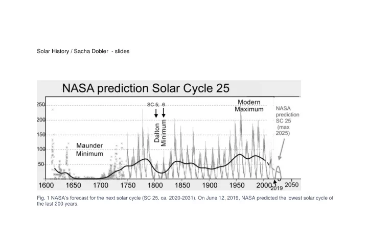
Solar History / Sacha Dobler - slides Fig. 1 NASAs forecast for the - - PowerPoint PPT Presentation

solar history sacha dobler slides
SMART_READER_LITE
LIVE PREVIEW

Solar History / Sacha Dobler - slides Fig. 1 NASAs forecast for the - - PowerPoint PPT Presentation

Solar History / Sacha Dobler - slides Fig. 1 NASAs forecast for the next solar cycle (SC 25, ca. 2020 -2031). On June 12, 2019, NASA predicted the lowest solar cycle of the last 200 years. Fig. 2 Anthropogenic death rate by decade (actual


slide-1
SLIDE 1

Solar History / Sacha Dobler - slides

  • Fig. 1 NASA’s forecast for the next solar cycle (SC 25, ca. 2020-2031). On June 12, 2019, NASA predicted the lowest solar cycle of

the last 200 years.

slide-2
SLIDE 2

2

  • Fig. 2 Anthropogenic death rate by decade (actual number of casualties per decade adjusted for world population of the according

decade) in comparison to solar activity expressed in 14C. Solar data Muscheler et al 2007). Chart: Sacha Dobler

slide-3
SLIDE 3
  • Fig. 3 Solar Maximum, strong solar wind, high

magnetic field strength. Dark sunspots indicate increased release of solar flares and Corneal Mass Ejections (CMEs). Much of the galactic cosmic ray influx is blocked from entering the heliosphere of the solar system. Also, more of the electromagnetic radiation such as Gamma- and X- rays from space are blocked from the inner solar

  • system. Graphic: Sacha Dobler,

AbruptEarthChanges.com

slide-4
SLIDE 4

4

  • Fig. 4: Solar Minimum: Week Solar magnetic field,

less sunspots, more galactic cosmic rays reach Earth’s atmosphere and surface. Graphic: Sacha Dobler AbruptEarthChanges.com

slide-5
SLIDE 5

Solar History

  • Fig. 5 Cosmic Rays entering

Earth’s upper atmosphere at near light- speed and cascading into sub-atomic particles, such as muons. The cosmic ray particles, mostly protons, disintegrate after collision. Sketch: Sacha Dobler

slide-6
SLIDE 6

6

  • Fig. 6 Correlation of specific humidity and

sunspot numbers (smoothed over 100 months) from 1940 to 2010, at around 30,000 feet (tropopause) reveals a high agreement over the course of the Schwabe cycles Sun spot count: line beginning middle left. Source: tall bloke blog, solar system dynamics. specific humidity; https://tallbloke.wordpress.com/2011/09/17/cloud-albedo-what-does-it-respond-to/:

slide-7
SLIDE 7

Solar History

  • Fig. 7 Tchijevsky’s construction of the "

Index of Mass Human Excitability " (published in Russian 1926). The number of important historical events is plotted on top, the number of sunspots

  • below. The histories of 72 countries were

compiled and plotted against the sunspot activity from 1750 to 1922. Tchijevsky found that 80% of the most significant human events occurred during the 5 years of maximum solar activity; 60% of all the events were concentrated in the 3 years of the solar maximum. (Graph after: McCraty Rollin; Coherence: Bridging personal, social, and global health.)

slide-8
SLIDE 8

8

  • Fig. 8 Peaks of Schwabe cycles 1- 23 and some

corresponding historic events. Not included is the peak of solar cycle 24 in April 2014. (Graph: Adam Michalec, 1990: Solar Activity and Human History.)

slide-9
SLIDE 9

Solar History

  • Fig. 9 Chart No.1: socio- political events in the 2nd millennium, not quantitative comparisons of social impacts. Here, I sketched out

the timeline of important social and political events without quantitative data of the people affected. Dark bars: high excitability, revolts, wars. Light bars: social progress, reforms promoting rationality and individual rights.

slide-10
SLIDE 10

10

  • Fig. 10 Naked-eye sunspot records. 50-year moving average
  • f the number of annual naked-eye sunspots during the last

millennium (white) vs. anthropogenic death rate (black). We recognize a strong overlap with all the peaks in solar activity

  • f the past millennium except the 1780 maximum, when few

sunspots are recorded. sunspot data after Vaquero, J. M.: 2007: Historical sunspot observations: A review; AA (Departamento de Física Aplicada, Universidad de Extremadura, Cáceres, Spain); Advances in Space Research Elsevier, Volume 40, Issue 7, p. 929-941 p. 930 graph composite Sacha Dobler 2018.

slide-11
SLIDE 11

Solar History

  • Fig. 11 Climate and solar activity in the 2nd millennium.

Top: Reconstruction of precipitation amounts for the edge

  • f the Tibetan Plateau. Bars on the chart depict prominent

weak phases of solar activity, which correspond to Om = Oort Minimum; Wm = Wolf Minimum; Sm = Spörer Minimum; Mm = Maunder Minimum; Dm = Dalton Minimum), from Sun & Liu (2012). Center: solar modulation as in 14C; after Muscheler et al 2007, Bottom: Temperature after Loehle 2008. The base line is 1°C, the bottom line of the chart is -1.2°C. Composite graph Sacha Dobler.

slide-12
SLIDE 12
  • Fig. 12 Chart No. 2: Death rate during 2nd millennium versus solar activity 14C, death rate in proportion to world population per decade
slide-13
SLIDE 13

Solar History

  • Fig. 13 Anthropogenic death rate plus the three

epidemics in the Americas in the 1500s (light gray peaks) 1.) wars/ armed conflicts, 2.) genocide (ethnic cleansing), 3.) forced labor, 4.) anthropogenic exaggerated famines, and 5.) epidemics; all in proportion to world population. (death rate) vs 14C (Muscheler at al 2007). Deaths per decades / world population) graph Sacha Dobler

slide-14
SLIDE 14

14

  • Fig. 14 Absolute numbers of anthropogenic casualties per decade, not adjusted

for world population. The count for the 1930-50s amounts to over 150 million.

slide-15
SLIDE 15

Solar History

  • Fig. 15 A visualization of the suggested correlation of

archeological evidence of advanced cultures and high solar activity. Graph Maurice Cotterell: 2001: The Tutankhamun Prophecies: The Sacred Secret of the Maya, Egyptians, and Freemasons; Inner Traditions/ Bear, Source of geophysical and astrophysical data: Eddy, John A., 1977: Climate change and the Changing climate, p.18

slide-16
SLIDE 16

16

  • Fig. 16 Sunspot numbers for the past 7,000 years and the pacification process/ reduction of violence in Europe from the 11th to the

20th century, peeking roughly during the Little Ice Age, the 14th to the 19th century; in this time span, violent crime was reduced by a factor of between 10:1 to 50:1. Solar data: Usoskin 2007. Data of violent crime see fig. below)

slide-17
SLIDE 17

Solar History

17

  • Fig. 17 Detail from Fig. 16. Timelines for different quantification methods of

the reduction in violence in Europe given by: Pinker, 2011; Gurr, 1981; and Frost, 2015, the “War on Murder” began already in the 11th century. But the most drastic decline in violence was registered in the 15th to 20th century.

slide-18
SLIDE 18

18

  • Fig. 18 Comparison of solar activity versus rate of death in

conflict in greater Europe 1400-2000. Anthropogenic data: Pinker, S. 2011: The Better Angles of our Nature. Penguin

  • London. P. 230. (Solar data: proxy atmospheric 14C data from

Muscheler et al 2007)

slide-19
SLIDE 19

Solar History

19

  • Fig. 19 Above: Share of violent deaths for non- state societies: Below: Share of violent death for state societies, from ‘Our World in

Data’: Share of violent death for non- state compared to state societies. Prehistoric non-state death rates are comparable to historical non-state death rates. The data reveals for instance, in Europe/ US, between 1900- 1960, including two World Wars, less than 2 %

  • f the population were killed by human action compared to up to 60% in hunter-gatherer societies throughout history.
slide-20
SLIDE 20

20

  • Fig. 20 World population

1000- 2000 in millions. Data: UN Population Division.

slide-21
SLIDE 21

Solar History

21

  • Fig. 21 Real Wages in Britain

after Clark 2005 shows Real wages (adjusted for inflation) in England doubled in the 50 years between 1850 and 1900. Chart recreated after The Economist; Economic history; Did living standards improve during the Industrial Revolution? 5. 2018; https://www.economist.com/free- exchange/2013/09/13/did-living- standards-improve-during-the- industrial-revolution

slide-22
SLIDE 22

22

  • Fig. 22 Solar activity versus price
  • f grain in Western Europe from

1201 to 1960, decennial movements in the price of grain in five European nations. It includes wheat in England, France and Italy, and rye in Austria and

  • Germany. Prices are decennial

means, converted to silver equivalents (grain of pure silver per 100 kilograms of grain). The source for grain prices: Willhelm

  • Abel. Agrarkrisen und

Agrarkunjunktur: Eine Geschichte der Land und Ernäungs wirtschaft Mitteleuropas seit dem höherern Mittelalter (1935: Namburg und Berlin, 1966), appendix. The raw data are from price lists of Rogers, d’Avenel, Barolini, Parenti, Magaldi, and Fabris. Reproduced in: Hackett Fischer David; 1999: The Great Wave: Price Revolutions and the Rhythm of History; Oxford University Press, p. 6

slide-23
SLIDE 23

Solar History

23

  • Fig. 23 Solar activity in 14C compared to inequality in

Spain (approximated by the land rent/ wages ratio) plotted against time 1326-1842. The vertical axis shows the estimated land rent/ wage ratio, as it increases, inequality goes up because land lords gain relative to workers. Data

  • source. Alvarez-Nogal and Prados de la Escosura (2007,

2013) Graph recreated after: Milanovic, Branko; 2016: Global Inequality A New Approach for the Age of Globalization; Belknap Press. Solar data Muscheler et al 2007.

slide-24
SLIDE 24

24

  • Fig. 24 Dow Jones Industrial Index versus

sunspot numbers.1925- 2015: Image: Theodore Modis, October 2007: Sunspots, GDP and the stock market; Percent deviations with respect to the long-term trends as calculated via 11-year moving

  • averages. The arrows point at the

“significant” DJIA peaks. The last arrow is a forecast (Jun-2008) https://www.researchgate.net/figure/Percent- deviations-with-respect-to-the-long-term- trends-as-calculated-via-11-year- moving_fig2_228434379

slide-25
SLIDE 25

Solar History

25

  • Fig. 25 Daily Sunspot Number (bottom) vs. Civil

Unemployment Rate (Top). The average 11.4 years periodicity is visible. Note the recent solar cycle peaked earlier than in the last 5 cycles (Unemployment data: Fred, Economic Research; Federal Reserve Bank of St. Louis; https://fred.stlouisfed.org/series/UNRATENSA; Solar Data: NASA

slide-26
SLIDE 26

26

  • Fig. 26 Lower curve: Male height from skeletons in Europe,

AD 1-2000 plus US native born and Swedish men after

  • 1800. Graph after Clark, Gregory, 2007 - A Farewell to

Alms: A Brief Economic History of the World. Princeton University Press. Purington and Oxford p. 60. Data from Steckel, 2001, figure 3 and 4, and Koepke and Baten, 2005; Upper curve: Solar modulation Muscheler et al, 2007

slide-27
SLIDE 27

Solar History

27

  • Fig. 27 inverted number of preserved wood samples for dendrochronology of German Oak trees 1000 AD to 2000 AD. vs. solar

activity expressed in inverse 14C levels. In Grand Solar Minima, more oak samples survived in Germany. The upper line at the top of the image marks 0 samples, the central line designates 150 sample of West German oak per year. Data Frenzel, Burkhard; 1977: Dendrochronologie und postglacziale Klimaschwankungen in Europa, F. Steiner Verlag, Wiesbaden. p. 19

slide-28
SLIDE 28

28

  • Fig. 28 Tree ring growth is not tree ring sample density. Tree

ring growth roughly follows temperature, but is at times also aligned with solar activity peaks independents from Temperature (1600 AD). Top: Temperature in °Kelvin after Storch et al (2004) Center: Fluctuations in tree ring growth in middle European Oak (bottom) 1000- 2000 smoothed curve. Bottom: Solar Activity, 14C

slide-29
SLIDE 29

Solar History

29

  • Fig. 29 Aurora activity is

strongly corelated with solar modulation and inversely correlated with cosmic rays. Top 14C data collection of Muscheler et al 2007, below: aurora frequency data: Hood L.L. and J. L. Jirikowic; 1990: A Probable

  • - 2400 Year Solar Quasi-

Cycle In Atmospheric A14c; Lunar and Planetary Laboratory, University of Arizona Tucson, Arizona USA p. 102

slide-30
SLIDE 30

30

  • Fig. 30 Sun spot observation with telescope Simply mount

your binoculars or telescope in such a way that they project a cone of sunlight onto a white surface in the shade. Experiment with distance and focus. Image: Sacha Dobler

slide-31
SLIDE 31

Solar History

31

  • Fig. 31 Small Sun Spots of 2-13-2018 as visualized on Solar Dynamics Observatory.
slide-32
SLIDE 32

32

  • Fig. 32 Sun spots 2-13-2018. The same sunspots as

above on a telescope projection. A group of medium sized sunspots (at the time the largest of 2018) in the sun’s equatorial region. As the sun’s photosphere rotates, the sunspots traverse the observed side of the sun in about 9 days from left to right. Image: Sacha Dobler

slide-33
SLIDE 33

Solar History

33

  • Fig. 33. Some historical events in relation to

recent sunspot activity in the Schwabe cycles

  • f the new millennium, from 2000 to 2018.

Solar data: NASA/SWPC Boulder, COB USA

slide-34
SLIDE 34

34