
SLIDE 1
3/31/2017 1
Presenting Data
IMGD 2905
Chapter 2
2
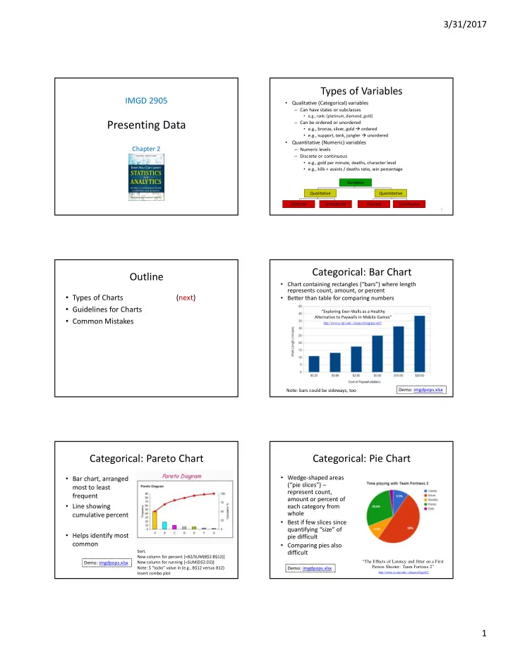
Types of Variables
- Qualitative (Categorical) variables
– Can have states or subclasses
- e.g., rank: [platinum, diamond, gold]
– Can be ordered or unordered
- e.g., bronze, silver, gold ordered
- e.g., support, tank, jungler unordered
- Quantitative (Numeric) variables
– Numeric levels – Discrete or continuous
- e.g., gold per minute, deaths, character level
- e.g., kills + assists / deaths ratio, win percentage
Variables Qualitative Ordered Unordered Discrete Continuous Quantitative
Outline
- Types of Charts
(next)
- Guidelines for Charts
- Common Mistakes
Categorical: Bar Chart
- Chart containing rectangles (“bars”) where length
represents count, amount, or percent
- Better than table for comparing numbers
Note: bars could be sideways, too
http://www.cs.wpi.edu/~claypool/mqp/paywall/
“Exploring Exer-Walls as a Healthy Alternative to Paywalls in Mobile Games”
Demo: imgdpops.xlsx
Categorical: Pareto Chart
- Bar chart, arranged
most to least frequent
- Line showing
cumulative percent
- Helps identify most
common
Demo: imgdpops.xlsx
Sort. New column for percent [=B2/SUM(B$2:B$12)] New column for running [=SUM(D$2:D2)] Note: $ “locks” value in (e.g., B$12 versus B12) Insert combo plot
Categorical: Pie Chart
- Wedge-shaped areas
(“pie slices”) – represent count, amount or percent of each category from whole
- Best if few slices since
quantifying “size” of pie difficult
- Comparing pies also
difficult
“The Effects of Latency and Jitter on a First Person Shooter: Team Fortress 2”
http://www.cs.wpi.edu/~claypool/iqp/tf2/
Demo: imgdpops.xlsx