
Presentation and Analysis Options, Possible Next Steps
Link to The Compass Pilot Report for North Devon
- Document the process of developing and refining the criteria
- Refine the criteria and how the scores are graded based on feedback from the survey
- Develop a “user guide” on how to operationalise the compass to ensure consistency of
approach.
COMPASS CARD PRESENTATION OPTIONS
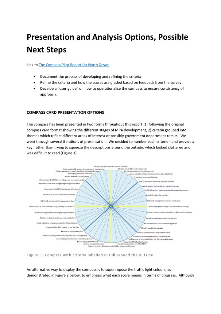
The compass has been presented in two forms throughout this report: 1) following the original compass card format showing the different stages of MPA development, 2) criteria grouped into themes which reflect different areas of interest or possibly government department remits. We went through several iterations of presentation. We decided to number each criterion and provide a key, rather than trying to squeeze the descriptions around the outside, which looked cluttered and was difficult to read (Figure 1). Figure 1: Compass with criteria labelled in full around the outside An alternative way to display the compass is to superimpose the traffic light colours, as demonstrated in Figure 2 below, to emphasis what each score means in terms of progress. Although