Monday, April 25, 16 During the 1970s, the relevance of Modernism - - PowerPoint PPT Presentation

monday april 25 16 during the 1970s the relevance of
SMART_READER_LITE
LIVE PREVIEW

Monday, April 25, 16 During the 1970s, the relevance of Modernism - - PowerPoint PPT Presentation

Monday, April 25, 16 During the 1970s, the relevance of Modernism is challenged. Designers emerged who werent afraid to reference historical movements within their design work. Monday, April 25, 16 Postmodern graphic design is


slide-1
SLIDE 1

Monday, April 25, 16

slide-2
SLIDE 2

During the 1970s, the relevance

  • f Modernism is challenged.

Designers emerged who weren’t afraid to reference historical movements within their design work.

Monday, April 25, 16

slide-3
SLIDE 3

“Postmodern” graphic design is brought about by:

  • Swiss designers who broke away from the

Traditional International Style

  • New Wave Typography (Wolfgang Weingart)
  • The 1980s “look” from the Memphis Group in Milan
  • The San Francisco “group” (The Michaels)

and most of all...

  • The arrival of the MacIntosh in the late 80s!

Monday, April 25, 16

slide-4
SLIDE 4

Monday, April 25, 16

slide-5
SLIDE 5

Monday, April 25, 16

slide-6
SLIDE 6

Rosemarie Tissi ad for Lutz & Company 1964

Monday, April 25, 16

slide-7
SLIDE 7

Seigfried Odermatt ad for Union Wall Safes 1968

Monday, April 25, 16

slide-8
SLIDE 8

Rosemarie Tissi ad for Englersatz AG 1980

Monday, April 25, 16

slide-9
SLIDE 9

Rosemarie Tissi ad for Englersatz AG 1980

Monday, April 25, 16

slide-10
SLIDE 10

Bruno Monguzzi poster for an exhibition

  • f The Photogram in

20th Century Art 1990

Monday, April 25, 16

slide-11
SLIDE 11

In the 60s, designers like Tissi were expanding the boundaries of the International Style without rebelling against it. That would change in the 70s with an approach that would be known as New Wave Typography

Monday, April 25, 16

slide-12
SLIDE 12

Wolfgang Weingart portion of German typesetter’s exam, 1963

Monday, April 25, 16

slide-13
SLIDE 13

Weingart was able to break the typographic rules masterfully, because he knew them and understood them. He believed in the “Gutenberg approach,” in that students should understand printing processes as well as design principles

Monday, April 25, 16

slide-14
SLIDE 14

Wolfgang Weingart taught at the Basel School

  • f Design and breathed new spirit into the

typography of order and neatness set by the Swiss masters of the International Style.

Monday, April 25, 16

slide-15
SLIDE 15

Wolfgang Weingart experimental text setting, 1969

Monday, April 25, 16

slide-16
SLIDE 16

Wolfgang Weingart typographic experiments, 1971

Monday, April 25, 16

slide-17
SLIDE 17

Wolfgang Weingart announcement from typographic magazine, 1974

Monday, April 25, 16

slide-18
SLIDE 18

Wolfgang Weingart, exhibition posters, 1977, 1982

Monday, April 25, 16

slide-19
SLIDE 19

Wolfgang Weingart exhibition poster 1982

Monday, April 25, 16

slide-20
SLIDE 20
  • https://www.youtube.com/watch?

v=WA5CYRrd8qo#t=16

Monday, April 25, 16

slide-21
SLIDE 21

Dan Friedman typographic magazine cover 1971

Monday, April 25, 16

slide-22
SLIDE 22

Dan Friedman, another student of Weingart’s, taught at Yale and gave his students extensive typographic exercises.

Monday, April 25, 16

slide-23
SLIDE 23

Dan Friedman (instructor) Rosalie Hanson (student) typographic permutations, 1970

Monday, April 25, 16

slide-24
SLIDE 24

Dan Friedman Bonwit Teller gift packaging proposal 1977

Monday, April 25, 16

slide-25
SLIDE 25

April Greiman, who studied with Weingart in Switzerland, opened a studio in Los Angeles in the early 70s.

Monday, April 25, 16

slide-26
SLIDE 26

April Greiman masthead for Luxe magazine 1978

Monday, April 25, 16

slide-27
SLIDE 27

April Greiman China Club advertisement 1980

Monday, April 25, 16

slide-28
SLIDE 28

April Greiman poster for California Institute of the Arts 1979

Monday, April 25, 16

slide-29
SLIDE 29

Willi Kunz pages from 12 typographic interpretations 1975

Monday, April 25, 16

slide-30
SLIDE 30

Willi Kunz, photography exhibition poster, 1978

Monday, April 25, 16

slide-31
SLIDE 31

Willi Kunz Typographic workshop poster 1974

Monday, April 25, 16

slide-32
SLIDE 32

Christoph Radl and Valentina Grego Memphis logo designs early 1980s

Monday, April 25, 16

slide-33
SLIDE 33

The Memphis aesthetic was about bright color, exaggerated geometric forms and references to classical culture. Their work set the tone for a decade

  • f highly decorative design.

Monday, April 25, 16

slide-34
SLIDE 34
  • Wm. Longhauser, poster for Michael Graves exhibit, 1983

Monday, April 25, 16

slide-35
SLIDE 35

The San Francisco style or “The Michaels” of the early 80s: Michael Vanderbyl Michael Cronin Michael Manwaring

Monday, April 25, 16

slide-36
SLIDE 36

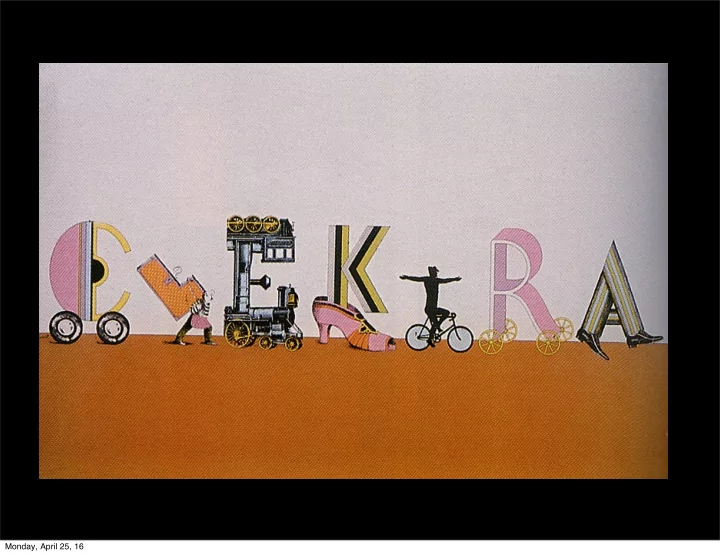
Michael Vanderbyl California Public Radio poster 1979

Monday, April 25, 16

slide-37
SLIDE 37

Michael Vanderbyl promotional mailer for Simpson Paper company, 1985

Monday, April 25, 16

slide-38
SLIDE 38

Michael Vanderbyl cover for HBF Furniture catalog 1985

Monday, April 25, 16

slide-39
SLIDE 39

Michael Vanderbyl postmodern architecture poster 1984

Monday, April 25, 16

slide-40
SLIDE 40

Michael Manwaring retail display poster for Santa Cruz 1984

Monday, April 25, 16

slide-41
SLIDE 41

Michael Manwaring brochure cover for Barr Exhibits 1984

Monday, April 25, 16

slide-42
SLIDE 42

Michael Cronin and Shannon Terry Beethoven Festival poster 1983

Monday, April 25, 16

slide-43
SLIDE 43
  • http://bcove.me/wph9pu9j

Monday, April 25, 16

slide-44
SLIDE 44

Retro (or backward-looking) design revisited historical design from the era between the two world wars. Vernacular design is a reference to earlier commonplace graphic forms like baseball cards, old-time packaging

  • r naive illustration styles.

Monday, April 25, 16

slide-45
SLIDE 45

Paula Scher poster for Swatch Watches 1985

Monday, April 25, 16

slide-46
SLIDE 46

Herbert Matter, Swiss Tourism poster

Monday, April 25, 16

slide-47
SLIDE 47

Paula Scher poster for CBS Records 1979

Monday, April 25, 16

slide-48
SLIDE 48

Paula Scher, “Great Beginnings” spread from Koppel & Scher brochure, 1984

Monday, April 25, 16

slide-49
SLIDE 49

Paula Scher poster for MTV’s Free Your Mind campaign 1994

Monday, April 25, 16

slide-50
SLIDE 50
  • https://vimeo.com/18839878

Monday, April 25, 16

slide-51
SLIDE 51

Paula Scher, Louise Fili and Carin Goldberg initiated the Retro Style in New York City.

Monday, April 25, 16

slide-52
SLIDE 52

Louise Fili book cover for The Lover 1985

Monday, April 25, 16

slide-53
SLIDE 53

Carin Goldberg and Frank Metz book cover for The Sonnets to Orpheus 1987

Monday, April 25, 16

slide-54
SLIDE 54

Daniel Pelavin and Judith Loeser cover for The Notebooks of Malte Laurids Brigge 1985

Monday, April 25, 16

slide-55
SLIDE 55

Inspired by this Gustav Klimt poster

Monday, April 25, 16

slide-56
SLIDE 56

Charles S. Anderson Marine Midland Automotive Financing Division trademark 1985

Monday, April 25, 16

slide-57
SLIDE 57

A hugely successful design firm in Minneapolis, Duffy Design Group was inspired by old clip art from the 20s, 30s and 40s.

Monday, April 25, 16

slide-58
SLIDE 58

Joe Duffy and Charles S. Anderson identity program for line of Chaps/ Ralph Lauren clothing 1987

Monday, April 25, 16

slide-59
SLIDE 59

Charles S. Anderson (designer and illustrator) and Lynne Schulte (illustrator) packaging for Classico Pasta Sauce 1985

Monday, April 25, 16

slide-60
SLIDE 60

Charles S. Anderson Design Co. watches & packaging 1992

Monday, April 25, 16

slide-61
SLIDE 61

Charles S. Anderson Design Co. cover for CSA Archive Catalog

  • f Stock Art

1995

Monday, April 25, 16

slide-62
SLIDE 62

Neville Brody record album cover design for Parliament 1985

Monday, April 25, 16

slide-63
SLIDE 63

Neville Brody, contents page logos from The Face, nos. 49, 52 & 55, 1984. the word contents deconstructed into changing icon

Monday, April 25, 16

slide-64
SLIDE 64

Neville Brody reused a graphic design element from one of his earlier designs in a story about Andy Warhol.

Monday, April 25, 16

slide-65
SLIDE 65

Neville Brody, spread from The Face, no. 59, 1985

Monday, April 25, 16

slide-66
SLIDE 66

Monday, April 25, 16

slide-67
SLIDE 67
  • https://vimeo.com/32207784

Monday, April 25, 16

slide-68
SLIDE 68

This era of design saw the beginning of the computer-assisted graphic design age. Working with historical forms would be changed forever by the greatest visual communication technology since Gutenberg’s moveable type and printing press.

Monday, April 25, 16