
1
Math 140 Introductory Statistics
Professor Silvia Fernández Chapter 2 Based on the book Statistics in Action by A. Watkins, R. Scheaffer, and G. Cobb.
Visualizing Distributions
Recall the definition:
The values of a summary statistic (e.g. the average age of the laid-off workers) and how
- ften they occur.
Four of the most common basic shapes:
Uniform or Rectangular Normal Skewed Bimodal (Multimodal)
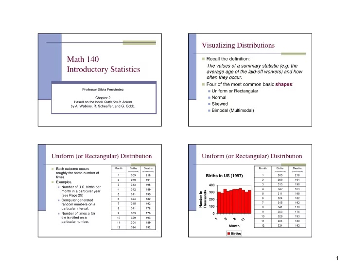
Uniform (or Rectangular) Distribution
Each outcome occurs
roughly the same number of times.
Examples.
Number of U.S. births per
month in a particular year (see Page 25)
Computer generated
random numbers on a particular interval.
Number of times a fair
die is rolled on a particular number.
192 324 12 189 304 11 193 329 10 176 353 9 178 341 8 192 345 7 182 324 6 195 311 5 189 342 4 198 313 3 191 289 2 218 305 1 Deaths
(in thousands)
Births
(in thousands)
Month
Uniform (or Rectangular) Distribution
Births in US (1997)
100 200 300 400 1 5 8 1 1 Month Number in Thousands Births
192 324 12 189 304 11 193 329 10 176 353 9 178 341 8 192 345 7 182 324 6 195 311 5 189 342 4 198 313 3 191 289 2 218 305 1 Deaths
(in thousands)
Births
(in thousands)
Month