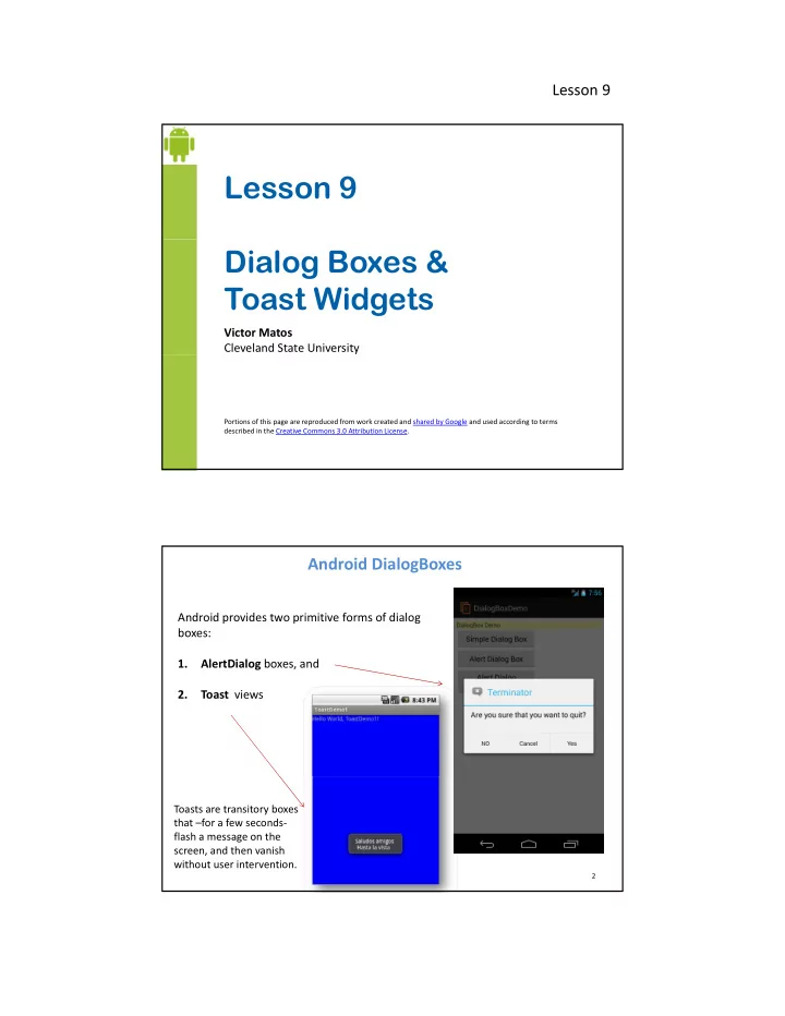
Lesson 9 Dialog Boxes & Toast Widgets Victor Matos Cleveland - - PDF document

lesson 9 dialog boxes toast widgets
SMART_READER_LITE
LIVE PREVIEW

Lesson 9 Dialog Boxes & Toast Widgets Victor Matos Cleveland - - PDF document

Lesson 9 Lesson 9 Dialog Boxes & Toast Widgets Victor Matos Cleveland State University Portions of this page are reproduced from work created and shared by Google and used according to terms described in the Creative Commons 3.0 Attribution


slide-1
SLIDE 1

Lesson 9

Lesson 9 Dialog Boxes & Toast Widgets

Victor Matos Cleveland State University

Portions of this page are reproduced from work created and shared by Google and used according to terms described in the Creative Commons 3.0 Attribution License.

Android DialogBoxes

Android provides two primitive forms of dialog boxes: 1 Al tDi l b d 1. AlertDialog boxes, and 2. Toast views

2

Toasts are transitory boxes that –for a few seconds‐ flash a message on the screen, and then vanish without user intervention.

slide-2
SLIDE 2

Lesson 9

The AlertDialog Box

The AlertDialog is a message box that: (1) Displays as a small floating window on top of the (obscured) current UI. (2) The dialog window presents a message to the user as well as three optional buttons. (3) The box is dismissed by either clicking on the exposed buttons or touching any portion of the UI outside the borders of

3

portion of the UI outside the borders of the DialogBox.

Note: Android’s DialogBoxes are NOT modal views! A fully modal view remains on the screen waiting for user’s input while the rest of the application is on hold (which is not the case of Android’s DialogBoxes). A modal view (including Android’s) has to be dismissed by an explicit user’s action.

The AlertDialog

Dissecting an AlertDialog Box:

Icon Title Message

4

Negative Button Positive Button Neutral Button

The image shown here uses: Theme_Holo_Light_Dialog and STYLE_NORMAL

slide-3
SLIDE 3

Lesson 9

In this example the application’s UI shows three buttons. When you click on them a different type of AlertDialog box is shown.

Example 1. AlertDialog Boxes

AlertDialog

1. The first to be shown is a simple AlertDialog box with a message and buttons. 2. The second option is a custom DialogBox on which the user could type in a piece of data

5

type in a piece of data. 3. The last option shows a DialogFragment interacting with the main activity

Example 1. AlertDialog Boxes

AlertDialog

6

A simple AlertDialog

  • ffering three choices.

A custom AlertDialog allowing data to be typed. A DialogFragment exposing three buttons.

slide-4
SLIDE 4

Lesson 9

Example 1. App Structure

AlertDialog

1 2

  • 1. MainActivity shows main GUI and provides a

frame for the DialogFragment to be displayed.

  • 2. You want to enhance the appearance of dialog‐

boxes by adding meaningful icons. More details and tools at Android Asset studio ( http://j.mp/androidassetstudio)

7

3

  • 3. Add your XML design indicating the way your

custom AlertDialog looks like.

<LinearLayout xmlns:android="http://schemas.android.com/apk/res/android" xmlns:tools="http://schemas.android.com/tools" android:id="@+id/LinearLayout1" android:layout_width="match_parent" android:layout_height="match_parent" android:orientation="vertical" android:padding="7dp" >

Example 1. XML Layout – activity_main.xml

AlertDialog

<TextView android:id="@+id/txtMsg" android:layout_width="match_parent" android:layout_height="wrap_content" android:background="#55ffff00" android:text="DialogBox Demo" /> <Button android:id="@+id/btn_alert_dialog1" android:layout_width="190dp" android:layout_height="wrap_content" android:text="Alert Dialog Box" /> <Button android:id="@+id/btn_custom_dialog" android:layout_width="190dp" android:layout_height="wrap_content" android:text="Custom Dialog Box" /> <Button android:id="@+id/btn_alert_dialog2" android:layout_width="190dp" android:layout_height="wrap_content" android:text="Alert Dialog Fragment" /> </LinearLayout> 8

slide-5
SLIDE 5

Lesson 9

<?xml version="1.0" encoding="utf‐8"?> <LinearLayout xmlns:android="http://schemas.android.com/apk/res/android" android:layout_width="match_parent" android:layout_height="wrap_content" android:orientation="vertical" android:padding="5dp" >

Example 1. XML Layout – custom_dialog_layout.xml

AlertDialog

android:padding= 5dp > <LinearLayout android:layout_width="match_parent" android:layout_height="wrap_content" > <ImageView android:id="@+id/imageView1" android:layout_width="wrap_content" android:layout_height="wrap_content" android:src="@drawable/ic_launcher" /> <TextView android:id="@+id/sd_textView1" android:layout_width="match_parent" android:layout_height="wrap_content" android:text="TextView" /> </LinearLayout> 9 <EditText android:id="@+id/sd_editText1" android:layout_width="wrap_content" android:layout_height="wrap_content" android:layout marginLeft="50dp"

Example 1. XML Layout – custom_dialog_layout.xml cont. 1

AlertDialog

android:layout_marginLeft= 50dp android:ems="15" android:hint="Enter some data here..." > <requestFocus /> </EditText> <Button android:id="@+id/sd_btnClose" android:layout_width="wrap_content" android:layout_height="wrap_content" android:layout_gravity="center" android:text="Close" /> </LinearLayout> 10

slide-6
SLIDE 6

Lesson 9

// example adapted from: // http://developer.android.com/reference/android/app/DialogFragment.html public class MainActivity extends Activity implements OnClickListener { TextView txtMsg;

Example 1. MainActivity.java

AlertDialog

Button btnCustomDialog; Button btnAlertDialog; Button btnDialogFragment; Context activityContext; String msg = ""; @Override protected void onCreate(Bundle savedInstanceState) { super.onCreate(savedInstanceState); setContentView(R.layout.activity_main); activityContext = this; txtMsg = (TextView) findViewById(R.id.txtMsg); btnAlertDialog = (Button) findViewById(R.id.btn_alert_dialog1); btnCustomDialog = (Button) findViewById(R.id.btn_custom_dialog); btnDialogFragment = (Button) findViewById(R.id.btn_alert_dialog2); btnCustomDialog.setOnClickListener(this); btnAlertDialog.setOnClickListener(this); btnDialogFragment.setOnClickListener(this); } 11

1

@Override public void onClick(View v) { if (v.getId() == btnAlertDialog.getId()) { showMyAlertDialog(this); }

Example 1. MainActivity.java cont. 1

AlertDialog

2

if (v.getId() == btnCustomDialog.getId()) { showCustomDialogBox(); } if (v.getId() == btnDialogFragment.getId()) { showMyAlertDialogFragment(this); } }// onClick private void showMyAlertDialog(MainActivity mainActivity) { new AlertDialog.Builder(mainActivity) .setTitle("Terminator") .setMessage("Are you sure that you want to quit?")

3

.setIcon(R.drawable.ic_menu_end_conversation) // set three option buttons .setPositiveButton("Yes", new DialogInterface.OnClickListener() { public void onClick(DialogInterface dialog, int whichButton) { // actions serving "YES" button go here msg = "YES " + Integer.toString(whichButton); txtMsg.setText(msg); } })// setPositiveButton 12

slide-7
SLIDE 7

Lesson 9

.setNeutralButton("Cancel", new DialogInterface.OnClickListener() { public void onClick(DialogInterface dialog, int whichButton) {

Example 1. MainActivity.java cont. 2

AlertDialog

// actions serving "CANCEL" button go here msg = "CANCEL " + Integer.toString(whichButton); txtMsg.setText(msg); }// OnClick })// setNeutralButton .setNegativeButton("NO", new DialogInterface.OnClickListener() { public void onClick(DialogInterface dialog, int whichButton) { // actions serving "NO" button go here msg = "NO " + Integer.toString(whichButton); txtMsg.setText(msg); } })// setNegativeButton .create() .show(); }// showMyAlertDialog 13 private void showCustomDialogBox() { final Dialog customDialog = new Dialog(activityContext); customDialog.setTitle("Custom Dialog Title");

Example 1. MainActivity.java cont. 3

AlertDialog

// match customDialog with custom dialog layout customDialog.setContentView(R.layout.custom_dialog_layout); ((TextView) customDialog.findViewById(R.id.sd_textView1)) .setText("\nMessage line1\nMessage line2\n" +"Dismiss: Back btn, Close, or touch outside"); final EditText sd_txtInputData = (EditText) customDialog .findViewById(R.id.sd_editText1); ((Button) customDialog.findViewById(R.id.sd_btnClose)) setOnClickListener(new OnClickListener() {

4

.setOnClickListener(new OnClickListener() { @Override public void onClick(View v) { txtMsg.setText(sd_txtInputData.getText().toString()); customDialog.dismiss(); } }); customDialog.show(); } 14

slide-8
SLIDE 8

Lesson 9

private void showMyAlertDialogFragment(MainActivity mainActivity) { DialogFragment dialogFragment = MyAlertDialogFragment .newInstance(R.string.title);

Example 1. MainActivity.java cont. 4

AlertDialog

5

dialogFragment.show(getFragmentManager(), "TAG_MYDIALOGFRAGMENT1"); } public void doPositiveClick(Date time) { txtMsg.setText("POSITIVE ‐ DialogFragment picked @ " + time); } public void doNegativeClick(Date time) { txtMsg.setText("NEGATIVE ‐ DialogFragment picked @ " + time);

6

txtMsg.setText( NEGATIVE DialogFragment picked @ + time); } public void doNeutralClick(Date time) { txtMsg.setText("NEUTRAL ‐ DialogFragment picked @ " + time); } } 15

Comments

1. The main UI shows three buttons and a TextView on which data coming from the executing dialog‐boxes is to be written. 2 When a button is clicked the proper DialogBox is shown

Example 1. MainActivity.java

AlertDialog

2. When a button is clicked the proper DialogBox is shown. 3. showMyAlertDialog uses a builder class to create a new AlertDialog adding to it a title, icon, message and three action buttons. Each action button has an onClick() method responsible for services to be rendered on behalf of the

  • selection. We update the main UI’s top TextView with the button’s id.

4. The custom dialog‐box is personalized when the .setContentView(R.layout.custom_dialog_layout) method is

  • executed. Later, its “Close” button is given a listener, so the data entered in

th di l ’ EditT t i ld b t t th UI’ t T tVi d th b the dialog’s EditText view could be sent to the UI’s top TextView and, the box is finally dismissed. 5. A DialogFragment is instanciated. It’s title is supplied as an argument to be ‘bundled’ when the fragment is created. Later the dialog will be show on top

  • f the containing activity.

6. Callback methods (doPositive(), doNegative()…) are provided to empower the DialogFragment to pass data (a timestamp) back to the main activity.

16

slide-9
SLIDE 9

Lesson 9

public class MyAlertDialogFragment extends DialogFragment { public static MyAlertDialogFragment newInstance(int title) { MyAlertDialogFragment frag = new MyAlertDialogFragment();

Example 1. MyAlertDialogFragment.java

AlertDialog

1

Bundle args = new Bundle(); args.putInt("title", title); args.putString("message", "Message Line 1\nMessage Line 2"); args.putInt("icon", R.drawable.ic_happy_plus); frag.setArguments(args); return frag; } @Override public Dialog onCreateDialog(Bundle savedInstanceState) { 17 public Dialog onCreateDialog(Bundle savedInstanceState) { int title = getArguments().getInt("title"); int icon = getArguments().getInt("icon"); String message = getArguments().getString("message"); return new AlertDialog.Builder(getActivity()) .setIcon(icon) .setTitle(title) .setMessage(message) 17

2

.setPositiveButton("Positive", new DialogInterface.OnClickListener() { public void onClick(DialogInterface dialog, int whichButton) {

Example 1. MyAlertDialogFragment.java cont. 1

AlertDialog

3

((MainActivity) getActivity()) .doPositiveClick(new Date()); } }) .setNegativeButton("Negative", new DialogInterface.OnClickListener() { public void onClick(DialogInterface dialog, int whichButton) { ((MainActivity) getActivity()) .doNegativeClick(new Date()); } }) 18 }) .setNeutralButton("Neutral", new DialogInterface.OnClickListener() { public void onClick(DialogInterface dialog, int whichButton) { ((MainActivity) getActivity()) .doNeutralClick(new Date()); } }).create(); } } 18

slide-10
SLIDE 10

Lesson 9

Comments 1. The class extends DialogFragment. It’s instantiator accepts a title, message and icon arguments. As customary with fragments, the t l d i t i l b dl hi h i th i t d t th

Example 1. MyAlertDialogFragment.java

AlertDialog

arguments are placed into a single bundle which is then associated to the fragment. 2. The onCreateDialog method extracts the arguments (title, icon, and message) from the DialogFragment’s bundle. A common AlertDialog builder is called to prepare the dialog box using the supplied arguments. 3. Three option buttons are added to the DialogFragment. Each has a p g g listener that when activated, makes its onClick method interact with a callback method in the MainActivity. To illustrate that data from the fragment could be passed from the dialog‐box, a timestamp is supplied to the callbacks.

19

Toasts are very simple one‐way message boxes. T i ll th d i it ti i

The Toast Widget

Typically they are used in situations in which a brief message should be flashed to the user. A toast is shown as a semi‐opaque floating view over the application ‘s UI. It’s lifetime is between 2‐4 sec.

20

Notoriously, Toasts never receive focus !

slide-11
SLIDE 11

Lesson 9

Toast.makeText ( context, message, duration ).show();

The Toast Widget

Example 2. Toast’s Syntax

Context: A reference to the view’s environment (where am I, what is around me…) Message: The message you want to show Duration: Toast LENGTH SHORT (0) about 2 sec

21

Duration: Toast.LENGTH_SHORT (0) about 2 sec Toast.LENGTH_ LONG (1) about 3.5 sec The Toast class has only a few methods including: makeText, show, setGravity, and setMargin.

public class MainActivity extends Activity { @Override public void onCreate(Bundle savedInstanceState) {

Example 2. A Simple Toast

The Toast Widget

public void onCreate(Bundle savedInstanceState) { super.onCreate(savedInstanceState); setContentView(R.layout.main); Toast.makeText( getApplicationContext(), "Saludos amigos \n Hasta la vista", Toast.LENGTH_LONG).show(); } }

22

In this simple application, passing the context variable could be done using: getApplicationContext(),

MainActivity.this, or simply using this.

slide-12
SLIDE 12

Lesson 9

  • By default Toast views are displayed at the center‐bottom of the screen.

Example 3. Re‐positioning a Toast View

The Toast Widget

  • However the user may change the placement of a Toast view by using

either of the following methods:

void setGravity (int gravity, int xOffset, int yOffset) void setMargin (float horizontalMargin, float verticalMargin)

23

Method 1

void setGravity (int gravity, int xOffset, int yOffset)

Example 3. Re‐positioning a Toast View

The Toast Widget

y ( g y, , y ) ( Assume the phone has a 480x800 screen density)

gravity: Overall placement. Typical values include: Gravity.CENTER, Gravity.TOP, Gravity.BOTTOM, (see Apendix B) xOffset: The xOffset range is ‐240,…,0,…240 left, center, right yOffset: The yOffset range is: ‐400,…,0,…400 top, center, bottom

slide-13
SLIDE 13

Lesson 9

Method 2

  • The (0,0) point – Center of the screen –occurs where horizontal and

vertical center lines cross each other.

Example 3. Re‐positioning a Toast View

The Toast Widget

  • There is 50% of the screen to each side of that center point
  • Margins are expressed as a percent value between: ‐50,…, 0, …, 50.

void setMargin (float horizontalMargin, float verticalMargin)

Note: The pair of margins: (‐50, ‐50) represent the lower‐left corner of the screen, ( 0, 0) is the center, and (50, 50) the upper‐right corner.

Example 3. Re‐positioning a Toast View

The Toast Widget

26

slide-14
SLIDE 14

Lesson 9

<?xml version="1.0" encoding="utf‐8"?> <LinearLayout xmlns:android="http://schemas.android.com/apk/res/android" android:layout_width="match_parent" android:layout_height="match_parent" android:orientation="vertical" >

Example 3. XML Layout: activity_main.xml

The Toast Widget

<TextView android:id="@+id/txtCaption" android:layout_width="match_parent" android:layout_height="wrap_content" android:background="#ff009999" android:gravity="center" android:text="Positioning a Toast" android:textSize="20sp" /> <LinearLayout android:layout_width="match_parent" d id l t h i ht " t t" android:layout_height="wrap_content" android:padding="10dp" > <TextView android:layout_width="100dp" android:layout_height="wrap_content" android:text=" X offset: " android:textSize="18sp" /> <EditText android:id="@+id/txtXCoordinate“ 27 android:layout_width="wrap_content" android:layout_height="wrap_content" android:layout_weight="2" android:inputType="numberSigned" android:text="0" d id t tSi "18 " />

Example 3. XML Layout: activity_main.xml

  • cont. 1

The Toast Widget

android:textSize="18sp" /> </LinearLayout> <LinearLayout android:layout_width="match_parent" android:layout_height="wrap_content" android:padding="10dp" > <TextView android:layout_width="100dp" android:layout_height="wrap_content" android:text=" Y offset: " android:textSize="18sp" /> <EditText android:id="@+id/txtYCoordinate" android:layout_width="wrap_content" android:layout_height="wrap_content" android:layout_weight="2" android:inputType="numberSigned" android:text="0" android:textSize="18sp" /> </LinearLayout> 28

slide-15
SLIDE 15

Lesson 9

<Button android:id="@+id/btnShowToast" android:layout_width="200dp" android:layout_height="wrap_content" d id l t it " t "

Example 3. XML Layout: activity_main.xml

  • cont. 2

The Toast Widget

android:layout_gravity="center" android:text=" Show Toast " > </Button> </LinearLayout> 29 public class ToastDemo3 extends Activity { EditText txtXCoordinate; EditText txtYCoordinate; TextView txtCaption;

Example 3. MainActivity: ToastDemo3.java

The Toast Widget

Button btnShowToast; @Override public void onCreate(Bundle savedInstanceState) { super.onCreate(savedInstanceState); setContentView(R.layout.activty_main); // bind GUI and Java controls txtCaption = (TextView) findViewById(R.id.txtCaption); txtXCoordinate = (EditText) findViewById(R.id.txtXCoordinate); txtYCoordinate = (EditText) findViewById(R.id.txtYCoordinate);

1

txtYCoordinate (EditText) findViewById(R.id.txtYCoordinate); btnShowToast = (Button) findViewById(R.id.btnShowToast); // find screen‐size and density(dpi) int dpi = Resources.getSystem().getDisplayMetrics().densityDpi; int width= Resources.getSystem().getDisplayMetrics().widthPixels; int height = Resources.getSystem().getDisplayMetrics().heightPixels; txtCaption.append("\n Screen size= " + width + "x" + height +" Density=" + dpi + "dpi"); 30

2

slide-16
SLIDE 16

Lesson 9

// show toast centered around selected X,Y coordinates btnShowToast.setOnClickListener(new OnClickListener() { @Override public void onClick(View v) {

Example 3. MainActivity: ToastDemo3.java

  • cont. 1

The Toast Widget

try { Toast myToast = Toast.makeText(getApplicationContext(), "Here", Toast.LENGTH_LONG); myToast.setGravity( Gravity.CENTER, Integer.valueOf(txtXCoordinate.getText().toString()), Integer.valueOf(txtYCoordinate.getText().toString())); myToast.show(); } catch (Exception e) {

3

} catch (Exception e) { Toast.makeText(getApplicationContext(), e.getMessage(), Toast.LENGTH_LONG).show(); } } }); }// onCreate }// class 31

Example 3. MainActivity: ToastDemo3.java

The Toast Widget

Comments

  • 1. Plumbing. GUI objects are bound to their corresponding Java controls.

Wh th b tt i li k d T t i t b h When the button is clicked a Toast is to be shown.

  • 2. The call Resources.getSystem().getDisplayMetrics() is used to

determine the screen size (Height, Width) in pixels, as well as its density in dip units.

  • 3. An instance of a Toast is created with the makeText method. The call to

setGravity is used to indicate the (X,Y) coordinates where the toast

32

y

( , ) message is to be displayed. X and Y refer to the actual horizontal/vertical pixels of a device’s screen.

slide-17
SLIDE 17

Lesson 9

Toasts could be modified to display a custom combination of color, shape, text, image, and background.

Example 4. A Custom‐Made Toast View

The Toast Widget

Steps To create a custom Toast do this: 1. Define the XML layout you wish to apply to the custom toasts. 2. In addition to a TextView where the toast’s message will be shown, you may dd th UI l t h i

33

add other UI elements such as an image, background, shape, etc. 3. Inflate the XML layout. Attach the new view to the toast using the setView() method.

Example based on:

http://hustleplay.wordpress.com/2009/07/23/replicating‐default‐android‐toast/ http://developer.android.com/guide/topics/ui/notifiers/toasts.html

<LinearLayout xmlns:android="http://schemas.android.com/apk/res/android" xmlns:tools="http://schemas.android.com/tools" android:id="@+id/LinearLayout1" android:layout_width="match_parent" android:layout height="match parent"

Example 4. XML Layout ‐ activity_main.xml

The Toast Widget

android:layout_height match_parent android:orientation="vertical" > <Button android:layout_width="wrap_content" android:layout_height="wrap_content" android:onClick="showCustomToast" android:text="Show Custom Toast" android:layout_gravity="center" tools:context=".ToastDemo4" /> </LinearLayout>

34

</LinearLayout>

slide-18
SLIDE 18

Lesson 9

<?xml version="1.0" encoding="utf‐8"?> <LinearLayout xmlns:android="http://schemas.android.com/apk/res/android" android:layout_width="match_parent" android:layout_height="wrap_content" i @

Example 4. XML Layout ‐ custom_toast.xml

The Toast Widget

android:background="@layout/my_shape" android:orientation="horizontal" android:padding="8dp" > <ImageView android:layout_width="wrap_content" android:layout_height="wrap_content" android:layout_marginRight="8dp" android:src="@drawable/ic_launcher" /> <T tVi

35

<TextView android:id="@+id/toast_text" android:layout_width="wrap_content" android:layout_height="wrap_content" android:text="a message goes here..." android:textColor="#ffffffff" android:textSize="20sp" /> </LinearLayout> <?xml version="1.0" encoding="UTF‐8"?> <shape xmlns:android="http://schemas.android.com/apk/res/android" android:shape="rectangle" > <stroke

Example 4. XML Layout ‐ my_shape.xml

The Toast Widget

<st o e android:width="2dp" android:color="#ffffff00" /> <solid android:color="#ff990000" /> <padding android:bottom="4dp" android:left="10dp" android:right="10dp" android:top="4dp" />

36

<corners android:radius="15dp" /> </shape>

Note: A basic shape is a drawable such as a rectangle or oval. Defining attributes are stroke(border) , solid(interior part of the shape), corners, padding, margins, etc. Save this file in the res/layout folder. For more information see Appendix A.

slide-19
SLIDE 19

Lesson 9

public class ToastDemo4 extends Activity { @Override public void onCreate(Bundle savedInstanceState) { super.onCreate(savedInstanceState);

Example 4. MainActivity ‐ ToastDemo4.java

The Toast Widget

super.onCreate(savedInstanceState); setContentView(R.layout.activity_main); }//onCreate public void showCustomToast(View v){ // ///////////////////////////////////////////////// // this fragment creates a custom Toast showing // image + text + shaped_background // triggered by XML button's android:onClick=... Toast customToast = makeCustomToast(this); customToast.show(); }

37

protected Toast makeCustomToast(Context context) { // Reference: // http://developer.android.com/guide/topics/ui/notifiers/toasts.html

Example 4. MainActivity ‐ ToastDemo4.java

  • cont. 1

The Toast Widget

LayoutInflater inflater = getLayoutInflater(); View layout = inflater.inflate( R.layout.custom_toast, null); TextView text = (TextView) layout.findViewById(R.id.toast_text); text.setText("This is a custom toast"); Toast toast = new Toast(context); toast.setMargin(50,‐50); //lower‐right corner toast.setDuration(Toast.LENGTH_LONG); 1 2 toast.setView(layout); return toast; }//makeCustomToast }//ToastDemo2

38

3

slide-20
SLIDE 20

Lesson 9

Example 4. MainActivity ‐ ToastDemo4.java

The Toast Widget

Comments 1. After the custom toast layout is inflated, you gain control to its TextView in which the user’s message will be held. 2. The toast is positioned using the setMargin() method to the lower right corner of the screen (50, ‐50) 3. The inflated view is attached to the newly created Toast object using the

.setView() method.

39

Dialog Boxes & Toast Widget

40

slide-21
SLIDE 21

Lesson 9

Dialog Boxes

Appendix A. Shape Drawable

Is an XML file that defines a

<?xml version="1.0" encoding="utf‐8"?> <Shape xmlns:android="http://schemas.android.com/apk/res/android" android:shape=["rectangle" | "oval" | "line" | "ring"] > <corners android:radius="integer" android:topLeftRadius="integer" android:topRightRadius="integer" android:bottomLeftRadius="integer" android:bottomRightRadius="integer" /> <gradient android:angle="integer"

geometric figure, including colors and gradients. Some basic shapes are: rectangle, oval, ring, line

References:

http://developer.android.com/reference/andr

android:centerX="integer" android:centerY="integer" android:centerColor="integer" android:endColor="color" android:gradientRadius="integer" android:startColor="color" android:type=["linear" | "radial" | "sweep"] android:useLevel=["true" | "false"] /> <padding android:left="integer" android:top="integer" android:right="integer" android:bottom="integer" /> <size 41 41 41

  • id/graphics/drawable/shapes/Shape.html

http://developer.android.com/guide/topics/r esources/drawable‐resource.html#Shape http://developer.android.com/reference/andr

  • id/graphics/drawable/ShapeDrawable.html

<size android:width="integer" android:height="integer" /> <solid android:color="color" /> <stroke android:width="integer" android:color="color" android:dashWidth="integer" android:dashGap="integer" /> </shape>