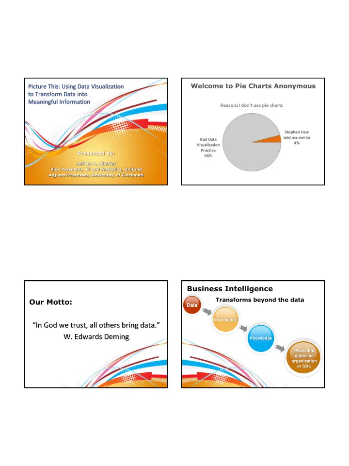
In God we trust, all others bring data. W. Edwards Deming Knowledge - - PDF document

in god we trust all others bring data w edwards deming
SMART_READER_LITE
LIVE PREVIEW

In God we trust, all others bring data. W. Edwards Deming Knowledge - - PDF document

Welcome to Pie Charts Anonymous Picture This: Using Data Visualization to Transform Data into Meaningful Information Presented by: Jeffrey A. Shaffer Vice President, IT and Analytics, Unifund Adjunct Professor, University of Cincinnati


slide-1
SLIDE 1

Presented by:

Picture This: Using Data Visualization to Transform Data into Meaningful Information

Jeffrey A. Shaffer Vice President, IT and Analytics, Unifund Adjunct Professor, University of Cincinnati

Welcome to Pie Charts Anonymous

Our Motto:

“In God we trust, all others bring data.”

  • W. Edwards Deming

Business Intelligence

Transforms beyond the data

Data

Information Plans that guide the

  • rganization
  • r SBU

Knowledge

slide-2
SLIDE 2

What is Data Visualization?

And why is it important?

5 2 8 3 6 1 9 3 6 2 5 3 7 4 3 8 3 8 5 8 9 6 2 1 4 4 3 9 3 6 5 2 4 9 1 0 2 7 5 2 8 3 6 1 6 2 9 3 8 3 8 5 8 4 7 2 0 3 7 3 5 4 7 1 8 2 0 1 2 5 3 6 4 3 9 1 0 8 9 5 7 3 4 5 3 2 7 5 2 8 3 6 1 6 2 9 3 8 3 8 5 8 4 7 2 0 3 7 3 5 4 7 1 8 2 0 1 9 6 2 1 4 4 3 9 3 6 5 2 4 9 1 0 2 7 5 2 8 3 6 1 6 2 9 3 8 3 8 5 8 4 7 2 0 3 7 3 5 4 7 1 8 2 0 1 2 5 3 6 4 3 9 1 0 8 9 5 7 3 4 5 3 2 7 5 2 8 3 6 1 6 2 4 6 2 7 5 9 1 5 2 6 3 6 How many times does the digit 7 appear? 5 2 8 3 6 1 9 3 6 2 5 3 7 4 3 8 3 8 5 8 9 6 2 1 4 4 3 9 3 6 5 2 4 9 1 0 2 7 5 2 8 3 6 1 6 2 9 3 8 3 8 5 8 4 7 2 0 3 7 3 5 4 7 1 8 2 0 1 2 5 3 6 4 3 9 1 0 8 9 5 7 3 4 5 3 2 7 5 2 8 3 6 1 6 2 9 3 8 3 8 5 8 4 2 7 0 3 7 3 5 4 7 1 8 2 0 1 9 6 2 1 4 4 3 9 3 6 5 2 4 9 1 0 2 7 5 2 8 3 6 1 6 2 9 3 8 3 8 5 7 4 8 2 0 3 7 3 5 4 7 1 8 2 0 1 2 5 3 6 4 3 9 1 0 8 9 5 7 3 4 5 3 2 7 5 2 8 3 6 1 6 2 4 6 2 7 5 9 1 5 2 6 3 6 5 2 8 3 6 1 9 3 6 2 5 3 7 4 3 8 3 8 5 8 9 6 2 1 4 4 3 9 3 6 5 2 4 9 1 0 2 7 5 2 8 3 6 1 6 2 9 3 8 3 8 5 8 4 7 2 0 3 7 3 5 4 7 1 8 2 0 1 2 5 3 6 4 3 9 1 0 8 9 5 7 3 4 5 3 2 7 5 2 8 3 6 1 6 2 9 3 8 3 8 5 8 4 2 7 0 3 7 3 5 4 7 1 8 2 0 1 9 6 2 1 4 4 3 9 3 6 5 2 4 9 1 0 2 7 5 2 8 3 6 1 6 2 9 3 8 3 8 5 7 4 8 2 0 3 7 3 5 4 7 1 8 2 0 1 2 5 3 6 4 3 9 1 0 8 9 5 7 3 4 5 3 2 7 5 2 8 3 6 1 6 2 4 6 2 7 5 9 1 5 2 6 3 6

slide-3
SLIDE 3

5 2 8 3 6 1 9 3 6 2 5 3 7 4 3 8 3 8 5 8 9 6 2 1 4 4 3 9 3 6 5 2 4 9 1 0 2 7 5 2 8 3 6 1 6 2 9 3 8 3 8 5 8 4 7 2 0 3 7 3 5 4 7 1 8 2 0 1 2 5 3 6 4 3 9 1 0 8 9 5 7 3 4 5 3 2 7 5 2 8 3 6 1 6 2 9 3 8 3 8 5 8 4 2 7 0 3 7 3 5 4 7 1 8 2 0 1 9 6 2 1 4 4 3 9 3 6 5 2 4 9 1 0 2 7 5 2 8 3 6 1 6 2 9 3 8 3 8 5 7 4 8 2 0 3 7 3 5 4 7 1 8 2 0 1 2 5 3 6 4 3 9 1 0 8 9 5 7 3 4 5 3 2 7 5 2 8 3 6 1 6 2 4 6 2 7 5 9 1 5 2 6 3 6 7 7 7 7 7 7 7 7 7 7 7 7 7 7 7 7 7 7 7 7 7 7 7 7 7 7 7 7 7 7 7 7 7 7 7 7 7 7 7 7 7 7 7 7 7 7 7 7 7 7 7 7 7 7 7 7 7 7 7 7 7 7 7 7 7 7 7 7 7 7 7 7 7 7 7 7 7 7 7 7 7 7 7 7 7 7 7 7 7 7 7 7 7 7 7 7 7 7 7 7 7 7 7 7 7 7 7 7 7 7 7 7 7 7 7 7 7 7 7 5 2 8 3 6 1 9 3 6 2 5 3 4 3 8 3 8 5 8 9 6 2 1 4 4 3 9 3 6 5 2 4 9 1 0 2 5 2 8 3 6 1 6 2 9 3 8 3 8 5 8 4 2 0 3 3 5 4 1 8 2 0 1 2 5 3 6 4 3 9 1 0 8 9 5 3 4 5 3 2 5 2 8 3 6 1 6 2 9 3 8 3 8 5 8 4 2 0 3 3 5 4 1 8 2 0 1 9 6 2 1 4 4 3 9 3 6 5 2 4 9 1 0 2 5 2 8 3 6 1 6 2 9 3 8 3 8 5 4 8 2 0 3 3 5 4 1 8 2 0 1 2 5 3 6 4 3 9 1 0 8 9 5 3 4 5 3 2 5 2 8 3 6 1 6 2 4 6 2 5 9 1 5 2 6 3 6 7 7 7 7 7 7 7 7 7 7 7 7 7 7 7 7 7 5 2 8 3 6 1 9 3 6 2 5 3 4 3 8 3 8 5 8 9 6 2 1 4 4 3 9 3 6 5 2 4 9 1 0 2 5 2 8 3 6 1 6 2 9 3 8 3 8 5 8 4 2 0 3 3 5 4 1 8 2 0 1 2 5 3 6 4 3 9 1 0 8 9 5 3 4 5 3 2 5 2 8 3 6 1 6 2 9 3 8 3 8 5 8 4 2 0 3 3 5 4 1 8 2 0 1 9 6 2 1 4 4 3 9 3 6 5 2 4 9 1 0 2 5 2 8 3 6 1 6 2 9 3 8 3 8 5 4 8 2 0 3 3 5 4 1 8 2 0 1 2 5 3 6 4 3 9 1 0 8 9 5 3 4 5 3 2 5 2 8 3 6 1 6 2 4 6 2 5 9 1 5 2 6 3 6

slide-4
SLIDE 4

# of times digit 7 appears: 17

7 7 7 7 7 7 7 7 7 7 7 7 7 7 7 7 7 5 2 8 3 6 1 9 3 6 2 5 3 4 3 8 3 8 5 8 9 6 2 1 4 4 3 9 3 6 5 2 4 9 1 0 2 5 2 8 3 6 1 6 2 9 3 8 3 8 5 8 4 2 0 3 3 5 4 1 8 2 0 1 2 5 3 6 4 3 9 1 0 8 9 5 3 4 5 3 2 5 2 8 3 6 1 6 2 9 3 8 3 8 5 8 4 2 0 3 3 5 4 1 8 2 0 1 9 6 2 1 4 4 3 9 3 6 5 2 4 9 1 0 2 5 2 8 3 6 1 6 2 9 3 8 3 8 5 4 8 2 0 3 3 5 4 1 8 2 0 1 2 5 3 6 4 3 9 1 0 8 9 5 3 4 5 3 2 5 2 8 3 6 1 6 2 4 6 2 5 9 1 5 2 6 3 6

Business Intelligence

Moving from data to action…

Data

Information Plan to guide actions or key decisions Knowledge

How many…? How much…? What are…? Why are…? How do we…? What can we…?

Visualization and Data Presentation

Visual Perception

slide-5
SLIDE 5

Used by Permission of Dr. Beau Lotto (www.LottoLab.org)

slide-6
SLIDE 6
slide-7
SLIDE 7

Visualization and Data Presentation

Compare And Contrast

slide-8
SLIDE 8

Source: www.cockeyed.com/photos/bodies/heightweight.html Source: www.cockeyed.com/photos/bodies/heightweight.html Source: www.OSTB.gov Office of Science and Technology Policy Blog 1/2009

slide-9
SLIDE 9

Source: www.OSTB.gov Office of Science and Technology Policy Blog 1/2009

Visualization and Data Presentation

Pie Charts

5 2 8 3 6 1 9 3 6 2 5 3 7 4 3 8 3 8 5 8 9 6 2 1 4 4 3 9 3 6 5 2 4 9 1 0 2 7 5 2 8 3 6 1 6 2 9 3 8 3 8 5 8 4 7 2 0 3 7 3 5 4 7 1 8 2 0 1 2 5 3 6 4 3 9 1 0 8 9 5 7 3 4 5 3 2 7 5 2 8 3 6 1 6 2 9 3 8 3 8 5 8 4 7 2 0 3 7 3 5 4 7 1 8 2 0 1 9 6 2 1 4 4 3 9 3 6 5 2 4 9 1 0 2 7 5 2 8 3 6 1 6 2 9 3 8 3 8 5 8 4 7 2 0 3 7 3 5 4 7 1 8 2 0 1 2 5 3 6 4 3 9 1 0 8 9 5 7 3 4 5 3 2 7 5 2 8 3 6 1 6 2 4 6 2 7 5 9 1 5 2 6 3 6

slide-10
SLIDE 10

3 3 3 3 3 3 3 3 3 3 3 3 3 3 3 3 3 3 3 3 3 3 3 3 3 3 3 3 3 3 3 3 3 3 2 2 2 2 2 2 2 2 2 2 2 2 2 2 2 2 2 2 2 2 2 2 2 2 2 2 2 2 5 5 5 5 5 5 5 5 5 5 5 5 5 5 5 5 5 5 5 5 5 5 5 8 8 8 8 8 8 8 8 8 8 8 8 8 8 8 8 8 8 8 8 8 8 6 6 6 6 6 6 6 6 6 6 6 6 6 6 6 6 6 6 6 4 4 4 4 4 4 4 4 4 4 4 4 4 4 4 4 4 4 1 1 1 1 1 1 1 1 1 1 1 1 1 1 1 1 1 1 7 7 7 7 7 7 7 7 7 7 7 7 7 7 7 7 7 9 9 9 9 9 9 9 9 9 9 9 9 9 9 9 0 0 0 0 0 0 0 0 0 0 This is how a Pie Chart Represents the Data Try to quickly compare the totals of the digits. 3 3 3 3 3 3 3 3 3 3 3 3 3 3 3 3 3 3 3 3 3 3 3 3 3 3 3 3 3 3 3 3 3 3 2 2 2 2 2 2 2 2 2 2 2 2 2 2 2 2 2 2 2 2 2 2 2 2 2 2 2 2 5 5 5 5 5 5 5 5 5 5 5 5 5 5 5 5 5 5 5 5 5 5 5 8 8 8 8 8 8 8 8 8 8 8 8 8 8 8 8 8 8 8 8 8 8 6 6 6 6 6 6 6 6 6 6 6 6 6 6 6 6 6 6 6 4 4 4 4 4 4 4 4 4 4 4 4 4 4 4 4 4 4 1 1 1 1 1 1 1 1 1 1 1 1 1 1 1 1 1 1 7 7 7 7 7 7 7 7 7 7 7 7 7 7 7 7 7 9 9 9 9 9 9 9 9 9 9 9 9 9 9 9 0 0 0 0 0 0 0 0 0 0 This is how a Pie Chart Represents the Data Baseline moves based on previous # of Digits Requires color encoding to differentiate

2222222222222222222222222222 55555555555555555555555 8888888888888888888888 6666666666666666666 444444444444444444 111111111111111111

This is how a Bar Chart Represents that Data Easier comparison even without color encoding!

slide-11
SLIDE 11
  • 1. Don’t Use Pie Charts

If you must break Rule #1 then:

  • 2. Make sure it adds up 100%
  • 3. Only a few categories
  • 4. Start at noon and move clockwise
  • 5. Largest to Smallest Values
  • 6. Add Labels for %
  • 7. Avoid 3D
  • 8. Keep it Simple

General Rules for Pie Charts

Source: The Wall Street Journal

=110%

Source: American Collectors Association

slide-12
SLIDE 12

Girl Scout Cookie Sales

Source: www.wired.com/magazine/2011/08/st_datagirlscoutcookies Photo: Celine Grouard

Bar Chart - category comparison (with target line) Line Chart - time series data Flow Chart – process flow (also Swimlane diagram) Bullet Graph 100% Stacked Bar Chart Scatter Plot – relationship/correlation Box Plot – grouping with summaries Control Charts Area Chart

The most common visualizations What’s wrong with this chart?

Visualization and Data Presentation Poor Choices:

  • Wrong Chart Type for the data
  • 3D chart
  • Use of gradient and shadows
  • Rotated Text
  • Hard to Read
  • Over use of gridlines
  • Over use of axis and data labels
  • Bad Color Choices
slide-13
SLIDE 13

This material is proprietary to Unifund Group Debt Investors, LLC (Unifund). It may not be replicated or transmitted in whole or part without express consent of Unifund.

Unifund Portfolio Enhancement

Unlock Hidden Value

Unifund Portfolio Enhancement

Unlock Hidden Value

This material is proprietary to Unifund Group Debt Investors, LLC (Unifund). It may not be replicated or transmitted in whole or part without express consent of Unifund.

Visualization and Data Presentation Really Poor Choice: Visualization and Data Presentation Even a bad 3D Pie Chart is better:

slide-14
SLIDE 14

Visualization and Data Presentation Acceptable use of the Pyramid:

Maslow’s Hierarchy of Needs

Visualization and Data Presentation Poor Choices:

  • Avoid Pyramids, Funnels and Cones
  • Cluttered Dashboard

– Too Much Information (Crammed on One Page) – Lots of Scroll

  • Over use of Graphs
  • Gauges
  • Flashing Cells
  • Wrong Message or No Message at all

Visualization and Data Presentation

Data Visualization by the Experts

Visualization and Data Presentation Best Practices:

  • Books on Data Visualization

– Jacques Bertin

  • Semiology of Graphics

– Edward Tufte

  • The Visual Display of Quantitative Information
  • Envisioning Information

– Stephen Few

  • Information Dashboard Design
  • Show Me the Numbers
  • Now You See it
slide-15
SLIDE 15

Visualization and Data Presentation

www.wayfind.com/napoleon.html

Visualization and Data Presentation

slide-16
SLIDE 16

On Minard’s graph: “This is one of the worse graphs ever made. He [Tufte]'s very happy because it shows five different pieces of information on three axis and if you study it for fifteen minutes it really is worth a thousand words. I don't think that's what graphs are for. I think they try to make a point in two seconds for people who are too lazy to read the forty words underneath.”

  • Seth Godin

“Dumbing it down for the executive”

Recreation of Jorge Camoes Redesign (www.ExcelCharts.com)

Every Few Months Never Every Few Weeks Every Few Days Daily

Default in Excel

slide-17
SLIDE 17

42% 29% 19% 8%

Every Few Months Never Every Few Weeks Every Few Days Daily

42% 29% 19% 8% 2% Every Few Months Never Every Few Weeks Every Few Days Daily

Frequency

42% 29% 19% 8% 2% Every Few Months Never Every Few Weeks Every Few Days Daily

Frequency

Target Every Few Months Never Every Few Weeks Every Few Days Daily Frequency 42% 29% 19% 8% 2% Cumulative % 42% 71% 90% 98% 100%

71%

0% 20% 40% 60% 80% 100% 0% 10% 20% 30% 40% 50%

Cumulative %

Frequency

71% of occurrences are caused by low frequency

slide-18
SLIDE 18

Time Utilization Chart Visualization and Data Presentation The KISS Principle:

  • Keep it Simple, Stupid!

“It seems that perfection is reached not when there is nothing to add, but when there is nothing left to take away.”

  • Antoine de Saint Exupéry
slide-19
SLIDE 19

“When we understand that slide, we’ll have won the war.”

  • General Stanley McChrystal

Clear - easily seen; sharply defined

  • who's the audience? what's the message?
  • clarity more important than aesthetics

Clean - thorough; complete; unadulterated

  • labels, axis, gridlines, formatting, right chart type, color

choice, etc.

Concise - brief but comprehensive;

  • not minimalist but not verbose

Captivating - to attract and hold by beauty or excellence

  • does it capture attention? is it interesting? does it tell

the story?

The Shaffer 4 C’s of Data Visualization Visualization and Data Presentation

Figure out the message Then apply the tools

slide-20
SLIDE 20

85% 15%

Percentage of Chart which Looks like PacMan

Looks Like PacMan Does Not Look Like PacMan

Looks like Pacman Does not look like Pacman % 15% 85% 0% 25% 50% 75% 100%

% of Chart that looks like Pacman

slide-21
SLIDE 21

0% 1/3 2/3 Rectangle?

0% 25% 50% 75% 100%

Full Container 3/4 Container 1/2 Container 1/4 Container Ingeniousness Amount of Pringles Left

How Ingenious a Pringles Can is:

This is Awesome! Hmm, this is getting awkward. Crap, my hand got stuck! @#$% it, I'll just drink them.

0% 25% 50% 75% 100%

Full Container 3/4 Container 1/2 Container 1/4 Container Ingeniousness Amount of Pringles Left

How Ingenious a Pringles Can is:

This is Awesome! Hmm, this is getting awkward. Crap, my hand got stuck! @#$% it, I'll just drink them.

Source: www.HamiltonCountyAuditor.org

slide-22
SLIDE 22

PacMan Eating Skittles Visualization and Data Presentation

What is the Message?

$500.07 $31.55

Food expenditure for one week

Germany Ecuador

Germany Ecuador $500.07 $31.55 $0.00 $200.00 $400.00 $600.00

Food expenditure for one week

slide-23
SLIDE 23

Germany: The Melander family of Bargteheide Food expenditure for one week: $500.07

Source: “Hungry Planet”

By Peter Menzel and Faith D’Aluisio

Ecuador: The Ayme family of Tingo Food expenditure for one week: $31.55

Source: “Hungry Planet”

By Peter Menzel and Faith D’Aluisio

Elle and Nina

Elle Nina

slide-24
SLIDE 24

A Data Visualization

  • f your checking account

Checking Acct #123456789: $843.62 Checking Acct #123456789: -$43.17 Current Balance

Visualization and Data Presentation Sparklines (Tufte): Visualization and Data Presentation Sparklines:

  • Small, high-resolution graphics embedded in a

context of words, numbers, images. Sparklines are data-intense, design-simple, word-sized graphics. (New in Excel 2010)

slide-25
SLIDE 25

Visualization and Data Presentation Sparklines: Visualization and Data Presentation Sparktweets Latest Developments Bandlines and Sparkstrips Invented by Stephen Few (January 2013) Visualization and Data Presentation Trellis Charts (Small Multiples):

  • "Illustrations of postage-stamp size are indexed by

category or a label, sequenced over time like the frames of a movie, or ordered by a quantitative variable not used in the single image itself."

slide-26
SLIDE 26

“Remixing Rosling” created by: Moritz Stefaner

slide-27
SLIDE 27

Color Blind

Color Blind

Protanomaly (1 out of 100 males) – “red weak” Deuteranomaly (5 out of 100 males) – “green weak” Dichromasy (2 out of 100 males) -no perceptible difference between red, orange, yellow, and green Protanopia (1 out of 100 males) -use light/dark Deuteranopia (one out of 100 males) – “green blind”

= 10% of males are Color Blind Main issue is Red and Green

slide-28
SLIDE 28

Color

slide-29
SLIDE 29

Created by: Steve Wexler www.datarevelations.com

“Don’t be Ugly By Accident!” OkCupid (blog.okcupid.com)

  • Collected 552,000 examples of users pictures
  • Asked people to rate their attractiveness
  • Compared with the data from the camera

Source: OkCupid (blog.okcupid.com)

slide-30
SLIDE 30

Source: OkCupid (blog.okcupid.com) Source: OkCupid (blog.okcupid.com) Source: OkCupid (blog.okcupid.com) Source: OkCupid (blog.okcupid.com)

slide-31
SLIDE 31

Visualization and Data Presentation

What did we learn from OkCupid?

  • 1. Someone went rogue with Microsoft Excel
  • 2. Take your profile picture with an SLR camera without

the flash at 6:30am or 5pm for your best chance of being considered attractive.

Visualization and Data Presentation

Compare And Contrast

Visualization and Data Presentation

Showing performance vs. target (ex. actual to forecast)

  • Bar Chart with Target line

– Easy to build – Good when single target for all categories

Visualization and Data Presentation

Show part-to-whole relationship (in lieu of Pie Charts)

100% Stacked Bar Chart

slide-32
SLIDE 32

Bullet Graph:

Target A Target B Target C

Invented by Stephen Few Visualization and Data Presentation

Two Variations on the Bullet Graph:

  • Remove performance bands
  • Now it’s simply actual to target
  • Easier to understand
  • Dual Axis Bullet Graph

– Shows both value and %

Visualization and Data Presentation Geospatial:

  • Location can relate disparate data
  • A Map is worth a thousand cells
  • Easy to see problem areas
  • By State, County, Zip, Block
  • Even down to Address
slide-33
SLIDE 33

Visualization and Data Presentation

slide-34
SLIDE 34

Foreclosures (July 2008)

Source: RealtyTrac (www.RealtyTrac.com) Source: Fox News (http://foxnewsinsider.com/2012/09/14/breaking- university-of-texas-in-austin-orders-evacuation-due-to-threats-on-campus/)

Breaking News: Missouri invades Arkansas, Mississippi and Alabama Land Swap

Source: 2011 Kroger Fact Book – Page 29

slide-35
SLIDE 35

Source: 2011 Kroger Fact Book – Page 29

Kroger Pharmacy Growth?

What the data actually shows: 2006 2007 2008 2009 2010 2011 77.8% 79.0% 79.5% 79.7% 80.0% 80.0% Pharmacies 1,920 1,964 1,973 1,967 1,966 1,948 Stores 2,468 2,486 2,481 2,468 2,458 2,435

The Real Story The Real Story

slide-36
SLIDE 36

What is the real message?

  • 1. From 2007 to 2010 Kroger closed stores that don’t

have pharmacies thus increasing the % of stores with a pharmacy.

  • 2. Kroger has increased Pharmacy Sales from $6.5B

to $7.3B with fewer stores and fewer pharmacies

They missed a very compelling Story 12% increase in Sales with Lower Costs!

Interactive Visualizations

Word Clouds

(tag clouds)

www.Wordle.net

Bush State of the Union - 2002

slide-37
SLIDE 37

Obama State of the Union - 2010

(left) Single-word phrases (unigrams) (right) Multiword phrases

Source: The Stanford Visualization Group (vis.stanford.edu) "Without the Clutter of Unimportant Words“: Descriptive Keyphrases for Text Visualization Jason Chuang, Christopher D. Manning, Jeffrey Heer

Tag cloud visualizations

  • nline biography of the pop singer Lady Gaga
slide-38
SLIDE 38

Visualization and Data Presentation

Hamilton County vs. Auditor’s Office Same data but a completely different story

slide-39
SLIDE 39

2008 2009 2010 2011 Hamilton County 6,080 5,404 4,717 4,638 Auditor's Office 97 98 89 84 97 84 6,080 4,638

  • 20

40 60 80 100 120 140

  • 2,000

4,000 6,000 8,000 Auditor's Office # of Employees Hamilton County # of Employees

Hamilton County vs. Auditor's Office

(# of Employees)

23.7% Reduction in FTE's 13.4% Reduction in FTE's

Created by Jeffrey A. Shaffer

Since 2008, Hamilton County has reduced 1,442 full-time employees while the Auditor's Office has only eliminated 13.

Interactive Visualizations

slide-40
SLIDE 40

Visualization and Data Presentation Additional Materials:

  • PerceptualEdge.com
  • JuiceAnalytics.com/writing/

– Blog

  • vis.stanford.edu
  • EdwardTufte.com
  • FlowingData.com
  • Storytellingwithdata.com
  • vizwiz.blogspot.com
  • Datarevelations.com

Presented by:

Jeffrey A. Shaffer Vice President, IT and Analytics, Unifund Adjunct Professor, University of Cincinnati