
SLIDE 1
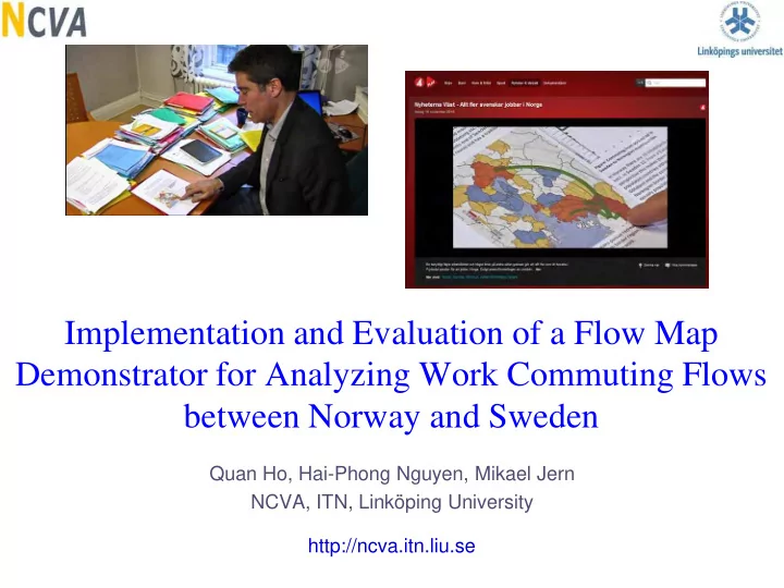
Implementation and Evaluation of a Flow Map Demonstrator for Analyzing Work Commuting Flows between Norway and Sweden
Quan Ho, Hai-Phong Nguyen, Mikael Jern NCVA, ITN, Linköping University http://ncva.itn.liu.se
Implementation and Evaluation of a Flow Map Demonstrator for - - PowerPoint PPT Presentation
Implementation and Evaluation of a Flow Map Demonstrator for Analyzing Work Commuting Flows between Norway and Sweden Quan Ho, Hai-Phong Nguyen, Mikael Jern NCVA, ITN, Linkping University http://ncva.itn.liu.se Applied Research based on
Quan Ho, Hai-Phong Nguyen, Mikael Jern NCVA, ITN, Linköping University http://ncva.itn.liu.se
Movements such as migration and commuting
Statistics foundations need a tool to show trends
⇒ A motivation for development of an interactive
3
Migration and commuting across the border
Commuting among counties/municipalities in
Trade flows (export, import) among countries
Flow visualization
Single origin Multi-origins
Comparison, finding trends and hubs Time series visualization Interaction Supporting analysis
5
Use directed weighted arrows Show both flows back and
Use quadratic Bezier curves
Use a dynamic filter to display
Use Google map/Bing map
6
7
8
Comparison multi-origins
9
Top flows
Top hubs-in Top hubs-out
10
Selection Panning Zooming Linking Filtering Tooltip
11
12
13
14
15
18
Prototypes are being used by several partners
To analyze in depth the geographic structures and
There is an increasing trend that
more Swedes prefer to commute to Norway than the reverse scenario.
This creates a serious tax reduction
for Sweden (that is about 20 billion SEK ≈ 2.2 billion EUR) because these people live in Sweden but pay taxes in Norway where they work.
19
To communicate the results to a wide range of users
20
Positive feedback from the partners Supporting better understanding of both
Online applications
21
Working with large datasets Improving GUI Using storytelling for better communication of
Performing a thorough evaluation
22
24
25