
SLIDE 1
3/7/2012 1
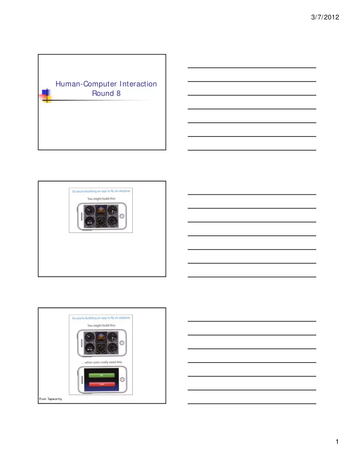
Human-Computer Interaction Round 8
From Tapworthy
Human-Computer Interaction Round 8 From Tapworthy 1 3/7/2012 - - PDF document
3/7/2012 Human-Computer Interaction Round 8 From Tapworthy 1 3/7/2012 Today Universal design highlights Exercise Graphic design Exercise discussion Mid-term course evaluations Research papers I7: Design Due in two
From Tapworthy
Universal design highlights Exercise Graphic design Exercise discussion Mid-term course evaluations Research papers
Due in two weeks http://www.ccs.neu.edu/home/intille/te
Big deal ... Get going!
What did you think?
equitable use flexibility in use simple and intuitive to use perceptible information (redundancy) tolerance for error low physical effort size and space for approach and use
E.g.: Captcha
http://www.google.com/recaptcha/learnmore
Channels
Increase bandwidth Beware of interference Emphasize if redundant
E.g. Sound
Keyclicks reduce errors Gamers and sound
E.g. Speech
Pros? Cons?
Different people speak differently:
accent, intonation, stress, idiom, volume, etc.
The syntax of semantically similar sentences may
vary.
Background noises can interfere. People often “ummm.....” and “errr.....” Words not enough - semantics needed as well
requires intelligence to understand a sentence context of the utterance often has to be known also information about the subject and speaker
e.g. even if “Errr.... I, um, don’t like this” is recognised, it is a fairly useless piece of information on it’s own
http://webaim.org/simulations/screenreader http://www.paciellogroup.com/resources/cont
rast-analyser.html# download
http://www.paciellogroup.com/resources/wat
http://www.iyiz.com/10-tools-for-evaluating-
web-design-accessibility-and-performance/
Single user or limited vocabulary systems
e.g. computer dictation
Open use, limited vocabulary systems can work
satisfactorily
e.g. some voice activated telephone systems
General user, wide vocabulary systems …
… still a problem
Great potential, however
When users hands are already occupied
e.g. driving, manufacturing
For users with physical disabilities Lightweight, mobile devices
The generation of speech Useful
Natural and familiar way of receiving information
Problems
Similar to recognition: prosody particularly
Additional problems
Intrusive - needs headphones, or creates noise in the
workplace
Transient - harder to review and browse
Successful in certain constrained applications when the user:
is particularly motivated to overcome problems
has few alternatives
Examples:
screen readers
read the textual display to the user utilised by visually impaired people
warning signals
spoken information sometimes presented to pilots whose visual and haptic skills are already fully occupied
Dual mode displays:
Information presented along two different sensory
channels
Redundant presentation of information Resolution of ambiguity in one mode through
information in another
Sound good for
Transient information Background status information
Use natural sounds to represent different types of
Natural sounds have associated semantics which can
be mapped onto similar meanings in the interaction
e.g. throwing something away ~ the sound of smashing glass
Problem: not all things have associated meanings Additional information can also be presented:
Muffled sounds if object is obscured or action is in the
background
Use of stereo allows positional information to be added
Synthetic sounds used to convey information Structured combinations of notes (motives )
represent actions and objects
Motives combined to provide rich information
compound earcons multiple motives combined to make one more complicated
earcon
Family earcons
similar types of earcons represent similar classes of action or similar objects: the family of “errors” would contain syntax and operating system errors
Earcons easily grouped and refined due to
compositional and hierarchical nature
Harder to associate with the interface task since
there is no natural mapping
Problems
Personal differences in letter formation Co-articulation effects
Breakthroughs:
Stroke not just bitmap Special ‘alphabet’ – Graffeti on PalmOS
Current state:
Usable – even without training But many prefer keyboards!
Applications
gestural input - e.g. “put that there” sign language
Technology
data glove position sensing devices and motion sensing devices (Wii) Kinect
Benefits
natural form of interaction - pointing enhance communication between signing and non-signing
users
Problems
user dependent, variable and issues of coarticulation
visual impairment
screen readers, SonicFinder
hearing impairment
text communication, gesture, captions
physical impairment
speech I/O, eyegaze, gesture, predictive systems (e.g. Reactive keyboard)
speech impairment
speech synthesis, text communication
dyslexia
speech input, output
autism
communication, education
No evidence averse to new tech
Lack familiarity May fear learning
People live longer
More disposable income More time More independence
More than half people over 65 have a
Age groups
older people e.g. disability aids, memory aids,
communication tools to prevent social isolation
children e.g. appropriate input/output devices, involvement
in design process
Cultural differences
influence of nationality, generation, gender, race, sexuality,
class, religion, political persuasion etc. on interpretation of interface features
e.g. interpretation and acceptability of language, cultural
symbols, gesture and colour
Elements of Graphic Design
Elements of Graphic Design
Elements of Graphic Design
Elements of Graphic Design
Elements of Graphic Design
Elements of Graphic Design
Elements of Graphic Design
Elements of Graphic Design
Elements of Graphic Design
Elements of Graphic Design
Can help tie things together, while organizing space to aid searching and avoiding an
Elements of Graphic Design
Elements of Graphic Design
Elements of Graphic Design
Elements of Graphic Design
Elements of Graphic Design
Elements of Graphic Design
Elements of Graphic Design
Elements of Graphic Design
Elements of Graphic Design
Elements of Graphic Design
Elements of Graphic Design
Elements of Graphic Design
Elements of Graphic Design
Elements of Graphic Design
Elements of Graphic Design
Elements of Graphic Design
Elements of Graphic Design
Elements of Graphic Design
Elements of Graphic Design
Elements of Graphic Design
Elements of Graphic Design
Elements of Graphic Design
Elements of Graphic Design
Elements of Graphic Design
Elements of Graphic Design
Elements of Graphic Design
Elements of Graphic Design
Elements of Graphic Design
Elements of Graphic Design
Elements of Graphic Design
Elements of Graphic Design
Elements of Graphic Design
Elements of Graphic Design
Elements of Graphic Design
Elements of Graphic Design
Experience Hawaii
Harrison et al., Kineticons: Using Iconographic Motion
in Graphical User Interface Design, CHI 2011 (Presenter: Serkan Okur)
Badshah et al., Interactive Generator: A Self-
Powered Haptic Feedback Device, CHI 2011 (Presenter: Chen Chu)
Andersen et al., Placing a Value on Aesthetics in
Online Casual Games, CHI 2011 (Presenter: Utsav Shah)
Have a great break! Read and take notes
Nielsen Ch 6, 7, 1) Olympic Message System (Gould on
Blackboard)
Models (Dix Ch 12).
Do Individual Homework I7 – Design Do Team Homework T5 – Paper
Be ready to implement...