SLIDE 1
Graphics and Design Keep the background consistent and subtledo not - - PDF document
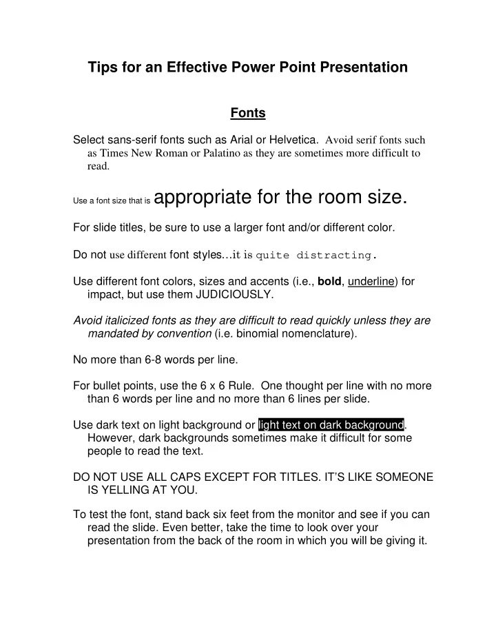
Tips for an Effective Power Point Presentation Fonts Select sans-serif fonts such as Arial or Helvetica. Avoid serif fonts such as Times New Roman or Palatino as they are sometimes more difficult to read. Use a font size that is appropriate for
SLIDE 2
SLIDE 3
Check all colors on a projection screen before the actual presentation. They will project differently than what appears on the monitor.
General Presentation
Check the spelling and grammar. Nothing makes you look like a dork more than misspelled words. Do not read the presentation or else everyone will fall asleep. Practice the presentation so you can speak from bullet points and fill in the blanks for the audience. The text should be a cue for the presenter rather than a message for the viewer. Give a brief overview at the start. Then present the information. Finally, review important points. It is often more effective to have bulleted points appear one at a time so the audience listens to the presenter rather than reading the screen. Try to move around as you speak. If the content is complex, print out the slides so the audience can take
- notes. They need these to doodle on before nodding off during your