
SLIDE 1
October 2019
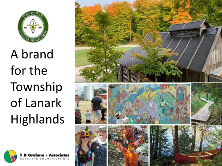
A brand for the Township
- f Lanark
for the Township of Lanark Highlands October 2019 Successful - - PowerPoint PPT Presentation
A brand for the Township of Lanark Highlands October 2019 Successful community economic development begins with a shared vision for the future of your community and a sound strategic plan to realize that vision. Community branding and
October 2019
2
“Successful community economic development begins with a shared vision for the future of your community and a sound strategic plan to realize that vision. “Community branding and marketing is more than a compelling logo, good promotional sales pitch, new website and communication materials. “Defining the identity of your community and its unique brand, and promoting that brand identity to investors and others, is an essential component of a community strategy.”
Adapted from the Community Branding & Marketing Toolkit, by the Federation of Canadian Municipalities. 2015
Township of Lanark Highlands Brand Development 2019
3
Township of Lanark Highlands Brand Development 2019
Business Retention + Expansion
Investment Attraction
More Expensive Higher Return on Investment
Source: OMAFRA
Stages in Community Economic Development
4
“Lanark Highlands provides an outdoor and naturalist experience style living that is not an urban setting. “The lakes and rivers are very impactful for the respondents combined with quiet and peaceful country living.”
(From the recent online survey.)
Township of Lanark Highlands Brand Development 2019
What People Said
5
Outdoors People Community Nature Quiet Proximity to Services Fresh Air Wildlife Fishing/Hunting Low Taxes Clean Water/Clean Air Beautiful Lakes/Rivers and Landscapes Close to Ottawa and amenities Escape from the City
Township of Lanark Highlands Brand Development 2019
Outdoor Recreation History Well Maintained Roads “Rural Living” Trails Community Halls Events Access to Youth Centre Medical Centre and Drug Store Talented musical community Safe (From the recent online survey.)
What makes Lanark Highlands a great place to live?
Lanark Highlands Brand Development 2019
6
Public Meetings – Branding & Community Strategy
Lanark Highlands Brand Development 2019
7
Comments from Public Branding & Strategy Sessions
Words used in brainstorm session:
“Preserving the diversity, celebrating history and the future.” “Celebrating history, preserving diversity and embracing the future ... With openness.” Mission: Working together as a community Community | Nature | Family “A Community built on family tradition – committed to our future.” “A place that is beautiful, healthy, exciting and fun for all ages.”
Lanark Highlands Brand Development 2019
8
Draft Slogans/Promotional Messaging “Explore the Beauty We Call Home” “Our Nature Welcomes You” “It’s in Our Nature to Welcome You” “A Natural Perspective”
9
Lanark Highlands Brand Development 2019
10
Lanark Highlands Brand Development 2019
11
Lanark Highlands Brand Development 2019
12
Township of Lanark Highlands Brand Development 2019
Other Municipal Logos
13
Current Logo & Brand Elements
Township of Lanark Highlands Brand Development 2019
Lanark Highlands Brand Development 2019
14
Lanark Highlands’ Colour Palette
Colours used in drafting designs for the new brand for Lanark Highlands are derived from the actual Lanark Highlands tartan shown here.
“This tartan was designed by Susi Reinink for the Township
The colours in the sett follow this symbolism: The fields of agricultural land (brown), dependent on the township’s many lakes and streams (dark blue), are surrounded by maple forests (green). Their foliage turns into bright autumn colours (red and yellow) by October. Soon winter sets in and the lakes start to freeze over (light blue). Finally snow (white) covers the township, so that the granite (grey) of the Great Canadian Shield is only
From Tartans of Canada website: http://www.stonearabie.com/ToC/07Ontario/LanarkHighla nds2637.html
Lanark Highlands Brand Development 2019
15
Logo Concepts
Lanark Highlands Brand Development 2019
16
Logo Refinement – Final Draft
Fonts: ‘Lanark’ in Italics highlights a friendly and approachable experience. The letter ‘L’ links the two words
capture the vastness of the Township’s
has a Celtic feel with sharp serif treatments – reminiscent of the tartan. Colours: Lanark in a dark red or burgundy is immediately attracts the eye like an autumn maple. It is an emotional colour signifying confidence, action & ambition. Green means life, the environment & safety. Blue represents water and is associated with stability, loyalty & trust. Graphic: This is a stylized treatment for the representation
landscape.
Lanark Highlands Brand Development 2019
17
A New Brand for Lanark Highlands
Lanark Highlands Brand Development 2019
18
Stationery
[Note: Graphics shown are concepts and suggestions only. Further design work will be required to implement them.]
Lanark Highlands Brand Development 2019
19
Website
Lanark Highlands Brand Development 2019
20
Website
Lanark Highlands Brand Development 2019
21
Truck Signage
[Note: Graphics shown are concepts and suggestions only. Further design work will be required to implement them.]
Lanark Highlands Brand Development 2019
22
Street Banners
[Note: Graphics shown are concepts and suggestions only. Further design work will be required to implement them.]
Lanark Highlands Brand Development 2019
23
Municipal Building Signage
[Note: Graphics shown are concepts and suggestions only. Further design work will be required to implement them.]
Lanark Highlands Brand Development 2019
24
Boundary Signage
[Note: Graphics shown are concepts and suggestions only. Further design work will be required to implement them.]
25
Discussion and Next Steps
Township of Lanark Highlands Brand Development 2019
26
Brand Refresh 2016
Discussion and Next Steps
Ignace Brand Development 2018