
SLIDE 1
CSS Styl e WHAT IS CSS? language for specifying the presentations - - PowerPoint PPT Presentation
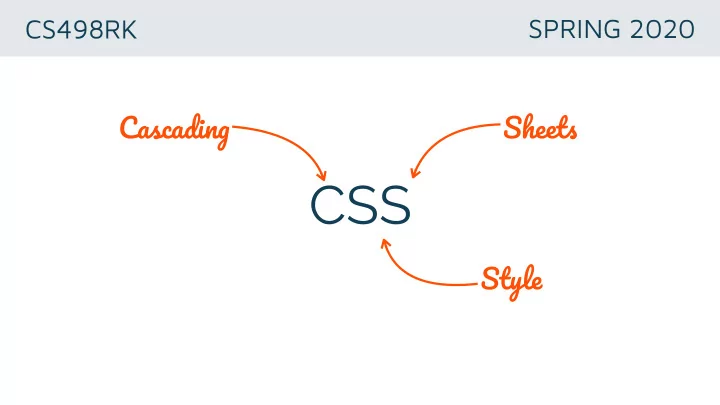
CS498RK SPRING 2020 Cascadin g Sheet s CSS Styl e WHAT IS CSS? language for specifying the presentations of Web documents www.w3.org/TR/CSS/ IF THERE WAS NO CSS tex t i n image s Hkon Wium Lie Interview THE POWER OF CSS CSS Zen Garden
www.w3.org/TR/CSS/
Håkon Wium Lie Interview
CSS Zen Garden
1989 1994: CSS draft Håkon Wium Lie
1993: 1st HTML spec Tim Berners-Lee
1996: CSS 1 W3C release
1999-2012: CSS3 released in modules
CSS4?
HTML2 HTML3
img { border:1px solid black; } .photo { width:300px; } .photo h3 { font-weight:bold; } ...
describe how markup should be rendered visual properties positioning in page’s layout
<!DOCTYPE html> <html> ... <body> <div class="photo"> <h3>My first photo</h3> <img src="picture1.jpg"/> </div> ... </body> </html> .photo { width:300px; } .photo h3 { font-weight:bold; } img { border:1px solid black; } ...
map HTML elements to CSS rules
img { border: 1px solid black; } selects all elements matching the tag name
<img src="picture1.jpg"/>
<div class=“photo”>… .photo { width:300px; }
<div id=“llama-photo”>… #llama-photo { width:300px; }
<div class="photo"> <h3>My first photo</h3>…
.photo h3 { font-weight:bold; }
Enhance existing selectors by defining a particular state Syntax: .selector:pseudo-class :hover, :visited, :focus :first-child, :last-child, :nth-child
https://developer.mozilla.org/en-US/docs/Web/CSS/Pseudo-classes
more than one rule can apply to an HTML element priority rules for resolving conflicts more specific = higher priority (class trumps element) some properties (font-size) are inherited, while
higher priority
<link rel=“stylesheet" href=“gallery.css" type="text/css"/> <html> <head> <style> h1 {color: red;} p {color: blue;} </style> <div style="color:blue;text-align:center">
(1) (2) (3)
background background-image color font-family font-size font-weight font-style text-align text-decoration
border-radius @font-face
box-shadow text-shadow background: linear-gradient(…
CONTENT PADDING BORDER MARGIN
CONTENT PADDING BORDER MARGIN width height
width and height properties refer to content area to calculate full-size of the element add padding, border, and margins VALUES default value is auto px, em, rem, in, cm, pt, %, vw, vh
CONTENT PADDING BORDER MARGIN
PROPERTIES margin (shorthand) margin-top margin-bottom margin-left margin-right VALUES default value is 0 px, em, rem, in, cm, pt, %, vw, vh auto
margin-top
margin-bottom margin-right margin-left
CONTENT PADDING BORDER MARGIN
PROPERTIES border(shorthand) border-top border-bottom border-left border-right ————————————————— border-width border-style border-color
border-width
border-bottom
border-right
CONTENT PADDING BORDER MARGIN
PROPERTIES padding (shorthand) padding-top padding-bottom padding-left padding-right VALUES default value is 0 px, em, rem, in, cm, pt, %, vw, vh
padding-top
padding-bottom padding-right
padding-left
padding: 10px; padding: 1em 1.5em padding: 6pt 1em 12pt padding: 2px 4px 6px 8px
top, right, bottom, left 10px top 6pt | right, left 1em | bottom 12pt top, bottom 1em | right, left 1.5em top 2px | right 4px | bottom 6px | left 8px
rendered with preceding and following line breaks (stacked) line breaks within nested elements collapsed if no other content width of auto (default) will expand to fill entire width
www.w3.org/wiki/The_CSS_layout_model_-_boxes_borders_margins_padding
rendered on a common baseline or wrap onto a new baseline below margin, width, height properties don’t affect these elements can only contain text or other inline elements
absolute (px, in, cm, pt) vs relative (em,rem,%) em: relative to the font-size of its direct or nearest parent rem: relative to the html (root) font-size. be careful when mixing different units
VALUE DESCRIPTION fixed positioned relative to browser window; will not move when window is scrolled static
unaffected by top, bottom, left, right relative positioned relative to its normal position absolute positioned relative to the first ancestor where position!=static
use with top bottom left right
VALUE DESCRIPTION block default if the element is a block-element (e.g., div) displays element as block element inline default if the element is an inline element (e.g., span) displays element as inline element table element behaves like table element none element not displayed (doesn’t appear in DOM)
not the same as visibility: hidden;
breaks with the flow model pushes element to left or right, allowing other elements to wrap around it use clear (left, right, both) to force other elements below floated ones
CodePen
.outer { height: 300px; background-color: #144057; } .inner { width: 100px; height: 100px; background-color: #B6C4C9; margin: 0 auto; } <div class="outer"> <div class="inner"> </div> </div>
CodePen
.outer { height: 300px; background-color: #144057; position:relative; } .inner { width: 100px; height: 100px; background-color: #B6C4C9; position: absolute; top: 50%; margin-top: -50px; }
<div class="outer"> <div class="inner"> </div> </div>
known height!
CodePen
.table-outer { width: 100%; display: table; } .outer { height: 200px; background-color: #144057; display: table-cell; vertical-align: middle; } .inner { width: 100px; height: 50%; background-color: #B6C4C9; }
<div class=“table-outer"> <div class="outer"> <div class="inner"> </div> </div> </div>
css tables!
<div class=“table-outer"> <div class="outer"> <div class="inner"></div> </div> </div>
purely presentational html!
a lot of HTML suffers from presentational div bloat
good in theory, doesn’t always work in practice DOMs are often cluttered with presentational HTML Add higher-level design attributes to CSS (i.e., CSS3 implemented rounded corners) Research: Cascading Tree Sheets (CTS) [Benson et al.]
languages that extend CSS in meaningful ways features: variables, nesting, mixins, inheritance shrinks developer’s codebase and compiles into CSS popular CSS preprocessors: LESS and SASS
All examples are written in SASS
$heading_font:'Source Sans Pro', sans-serif; $body_font: 'Raleway', sans-serif; $nav_font: 'Maven Pro', sans-serif; $text_color: #181818; $attention_color: #ff500a; body { font-family: $body_font; font-size: 14px; color: $text_color; } …
.class { div { font-family: $nav_font; } a { color: $attention_color; text-decoration: none; } li { margin-bottom: 10px; } } .class div { font-family: $nav_font; } .class a { color: $attention_color; text-decoration: none; } .class li { margin-bottom: 10px; }
compiles into
All examples are written in SASS
@mixin border-radius($radius) {
border-radius: $radius; } .small-box { @include border-radius(5px); } .big-box { @include border-radius(10px); } .small-box {
border-radius: 5px; } .big-box {
border-radius: 10px; }
compiles into
All examples are written in SASS
.text-upper { font-size: 14px; letter-spacing: 0.1em; text-transform: uppercase; } .product-title { @extend .text-upper } .card-content { @extend .text-upper } .text-upper, .product-title, .card-content { font-size: 14px; letter-spacing: 0.1em; text-transform: uppercase; }
compiles into
All examples are written in SASS