
SLIDE 1
1/24/2018 1
- Dr. Tom Way
CSC 4700 1
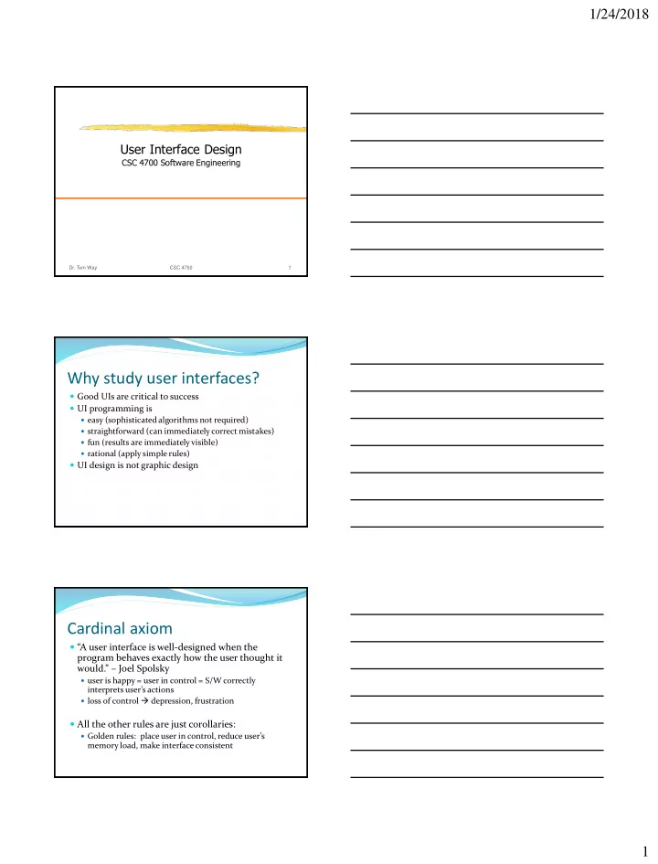
User Interface Design
CSC 4700 Software Engineering
Why study user interfaces?
Good UIs are critical to success UI programming is
easy (sophisticated algorithms not required) straightforward (can immediately correct mistakes) fun (results are immediately visible) rational (apply simple rules)
UI design is not graphic design
Cardinal axiom
“A user interface is well-designed when the program behaves exactly how the user thought it would.” – Joel Spolsky
user is happy = user in control = S/W correctly
interprets user’s actions
loss of control depression, frustration
All the other rules are just corollaries:
Golden rules: place user in control, reduce user’s
memory load, make interface consistent