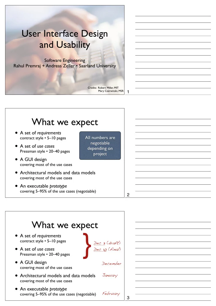
} A set of requirements contract style 510 pages Dec 3 (draft) A - - PDF document

a set of requirements contract style 5 10 pages dec 3
SMART_READER_LITE
LIVE PREVIEW

} A set of requirements contract style 510 pages Dec 3 (draft) A - - PDF document

User Interface Design and Usability Software Engineering Rahul Premraj + Andreas Zeller Saarland University Credits: Robert Miller, MIT Mary Czerwinski, MSR 1 What we expect A set of requirements All numbers are contract style


slide-1
SLIDE 1

User Interface Design and Usability

Software Engineering Rahul Premraj + Andreas Zeller • Saarland University

Credits: Mary Czerwinski, MSR Robert Miller, MIT

What we expect

  • A set of requirements

contract style • 5–10 pages

  • A set of use cases

Pressman style • 20–40 pages

  • A GUI design

covering most of the use cases

  • Architectural models and data models

covering most of the use cases

  • An executable prototype

covering 5–95% of the use cases (negotiable)

All numbers are negotiable depending on project

What we expect

  • A set of requirements

contract style • 5–10 pages

  • A set of use cases

Pressman style • 20–40 pages

  • A GUI design

covering most of the use cases

  • Architectural models and data models

covering most of the use cases

  • An executable prototype

covering 5–95% of the use cases (negotiable) Dec 3 (draft) Dec 10 (final) January February

}

December 1 2 3

slide-2
SLIDE 2

What we expect

  • A set of requirements

contract style • 5–10 pages

  • A set of use cases

Pressman style • 20–40 pages

  • A GUI design

covering most of the use cases

  • Architectural models and data models

covering most of the use cases

  • An executable prototype

covering 5–95% of the use cases (negotiable) Dec 3 (draft) Dec 10 (final) January February

}

December

User Interface Design and Usability

Software Engineering Rahul Premraj + Andreas Zeller • Saarland University

Credits: Mary Czerwinski, MSR Robert Miller, MIT

  • When an application has been designed to

market or sell products or ideas, aesthetics may have as much to do with success as technical design.

What is good design?

4 5 http://www.ingenfeld.de/ 6

slide-3
SLIDE 3

Don't go to the right?

http://www.baddesigns.com/examples.html

What do these symbols mean? How much is the gas?

Check the link for examples of bad designs. 7 Real example from a (expensive) car (as in the picture, no idea which model)---the icons on the buttons placed on the carʼs dashboard are

  • unclear. I have highlighted the vague
  • nes in red.

8 It is not obvious which label belongs to which field. 9

slide-4
SLIDE 4

Interface Interface

interface

  • n. Computer Science
  • The point of interaction or communication between a

computer and any other entity, such as a printer or human

  • perator.
  • The layout of an application's graphic or textual controls in

conjunction with the way the application responds to user activity: an interface whose icons were hard to remember.

definition

Interface

Examples of “cool” interfaces. 10 Some non-apple “cool” interfaces. 11 12

slide-5
SLIDE 5

What is Design? What is Design?

Design is not just what it looks like and feels like. Design is how it works.

What is Design?

13 14 Super cool chopstick - the front end doesnʼt touch the table. 15

slide-6
SLIDE 6

What is Design?

What is Design?

Design is not just what it looks like and feels like. Design is how it works.

What is Design?

2007 Balenciaga Collection

The User

at the centre of any design activity

Apple isnʼt perfect. Some examples of problems with Apple products – faulty CDs, discolored handrests, smoking connectors, and exploding batteries. 16 It is easy to overdo design and make the product utterly useless. 17 User is centric to design. Every decision should be made keeping the user in mind. 18

slide-7
SLIDE 7

User-Centric Design

  • Cost saving!
  • Competitive market - user expectations.
  • Political demands
  • Is Help always helpful?

Credits: Mary Czerwinski

Human Capabilities

  • Memory
  • Attention
  • Visual Perception
  • Learning
  • Color
  • Language + Communication
  • Ergonomics

Memory

  • Associations are built by

repetition.

  • Scaffold model (more likely to

remember items that have many associations).

  • Recognition is easier than

recall.

  • Working memory has small

capacity.

  • Long-term memory has large

capacity.

Why Uset-Centric Design? 19 20 21

slide-8
SLIDE 8
  • Attention is a resource –

gets divided amongst tasks.

  • Automatic well-learnt

processes not need much attention.

  • Important to get (for you

as a designer).

Attention

  • We excel at pattern

recognition.

  • We automatically try to
  • rganize visual displays and

look for cues.

  • Motion, grouping, contrast,

color can make different parts

  • f a display more or less

salient.

Visual Perception

  • Learning is improved by
  • rganization.
  • Consistency and mnemonics

improve learning.

  • Targeted feedback facilitates

learning.

  • Learning occurs across people

and organizations.

Learning

22 23 24

slide-9
SLIDE 9
  • Incrementally presented

information accelerates learning.

  • Some users like to explore

systems to learn; others will not.

  • Workers focus on

accomplishing tasks, not learning software.

Learning Color

  • Red-green color blindness (protanopia & deuteranopia)
  • 8% of males
  • 0.4% of females
  • Blue-yellow color blindness (tritanopia)
  • Far more rare
  • Guideline: don’t depend solely on color distinctions
  • use redundant signals: brightness, location, shape

25

Protanopia = absence of red receptors Deuteranopia = absence of green receptors Tritanopia = absence of blue receptors

26

Traffic lights are readable even for color-blind people (due to location of lights). Also notice the blueish tint in the “green” light.

27

slide-10
SLIDE 10

syntax, semantics, pragmatics; conversational interaction, specialized languages

Language + Communication

arrangement of displays and controls; cognitive and sensory limits; effects of display technology; fatigue and health; furniture and lighting; design for stressful and hazardous environments; design for the disabled...

Ergonomics

Example of an Ishihara color test plate. [Note 1] The numeral "74" should be clearly visible to viewers with normal color

  • vision. Viewers with dichromacy or

anomalous trichromacy may read it as "21", and viewers with achromatopsia may not see numbers. [Wikipedia[

28 29 30

slide-11
SLIDE 11

Where does UCD fit into the development process? Traditional Waterfall Model

Requirements Design Code Integration Acceptance Release

Traditional Waterfall Model

Requirements Design Code Integration Acceptance Release

with Feedback

31 32 33

slide-12
SLIDE 12

Waterfall Model Poor for UI Design

  • UI design is risky.
  • So we are likely to get it wrong.
  • Users are not involved in validation until

acceptance testing.

  • So we won’t find out until the end.
  • UI flaws often cause changes in requirements

and design.

  • So we have to throw away carefully written

and tested code.

Iterative Design

Design Evaluate Implement

Why NOT Iterative Design?

  • Every iteration corresponds to a release
  • Evaluation (complaints) feeds back into

next version’s design

  • Using your paying customers to evaluate

your usability

  • They won’t like it
  • They won’t buy version 2

34 Iterative design is the current best- practice process for developing user

  • interfaces. Itʼs a specialization of the

spiral model described by Boehm for general software engineering. 35 36

slide-13
SLIDE 13

Spiral Model

  • Early iterations use cheap prototypes

(paper prototyping).

  • Later iterations have richer

implementations.

  • More iterations generally means better UI.
  • Only mature iterations are seen by the

world.

Spiral Model Iterations Paper Prototyping

each iteration has a cost or fidelity or accuracy 37 38 39

slide-14
SLIDE 14

2. 3. 4. 1. 5. 6. 7.

Paper Prototyping

Credits: Nielsen Norman Group

Paper Prototyping

Credits: Nielsen Norman Group

  • Fast way to mock up an interface - no coding

required.

  • Finds a variety of problems with the interface.
  • Allows an interface to be refined based on user

feedback before implementation begins.

  • A multidisciplinary team can participate.
  • Encourages creativity from the product team

and users alike.

Benefits

Credits: Paper Prototyping

40 41 42

slide-15
SLIDE 15
  • Doesn’t produce any code.
  • Does not find all classes of problems with an

interface.

  • Can affect the way users interact with the

interface.

  • Users might think it is unprofessional. (ch. 13)
  • Has stronger benefits in some situations than in
  • thers.

Disadvantage

Credits: Paper Prototyping

  • Iterative Design using a Spiral Model.
  • Early focus on users and tasks.
  • User analysis: who the users are.
  • Task analysis: what they need to to?
  • Involve users as evaluators, consultants

and sometimes designers.

  • Constant Evaluation

UI Analysis & Design Know Your User

  • Novice
  • Knowledgeable,

intermittent user

  • Knowledgeable,

frequent user

  • Age, gender, ethnicity
  • Physical abilities
  • Domain experience
  • Application

experience

  • Work environment
  • Communication

patterns For 2nd pt., imagine you need to test how to draw a curved line on Adobe

  • Photoshop. Paper prototyping is not

the best way! 43 Based on Rob Miller: "UI Design and Implementation – User-Centered Design" 44 45

slide-16
SLIDE 16

Know Your User

  • T

echniques

  • Questionnaires
  • Interviews
  • Observations
  • Obstacles
  • Artificial barriers between developers and users.
  • Some users are expensive to talk to.

Example: Self-Service Grocery Checkout

  • Who are the users?
  • Grocery shoppers
  • Wide age range
  • Possibly no computer experience
  • No training
  • Knowledge of products, but not management
  • Shoppers help each other.
  • Mostly women with small children.
  • Store assistants to help users.

Task Analysis

  • Identify the individual tasks to be solved.
  • Each task is a goal.
  • Start with the big goal and then, decompose

hierarchically.

  • Overall goal: Shoppers want to purchase

groceries.

  • Tasks:
  • Register groceries into the system.
  • Pay

46 Letʼs look at an example. Suppose weʼve been charged with designing a system that will allow grocery shopper to ring up and pay for their purchases themselves. 47 The next step is figuring out what tasks are involved in the problem. A task should be expressed as a goal: whatneeds to be done, not how. 48

slide-17
SLIDE 17

Essential Parts

  • f Task Analysis

1.What must be done?

  • Goal

2.What must be done before to make it possible?

  • Preconditions
  • Tasks on which this task depends
  • Information that must be known to the user

3.What steps are involved in doing the task?

  • Subtasks (may be decomposed recursively)

Example: Self-Service Grocery Checkout

  • Goal
  • Enter groceries into register
  • Preconditions
  • All groceries that you want are in the cart
  • Subtasks
  • Enter pre-packaged items
  • Bag loose items, weigh and register them.

Dangers of Task Analysis

  • Duplicating a bad existing procedure in software.
  • Example: Flipping through a book
  • Failing to capture good aspects of existing

procedure

  • Ask users why they do what they do, not just what

they do Once youʼve identified a list of tasks, fill in the details on each one. Every task in a task analysis should have at least these parts. 49 50 Suppose we did a task analysis by

  • bserving users interacting with paper
  • manuals. Weʼd see a lot of page

flipping: “Find page N”might be an important

  • subtask. We might naively conclude

from this that an online manual should provide really good mechanisms for paging & scrolling, and that we should pour development effort into making those mechanisms as fast as possible. But page flipping is an artifact of physical books! It would pay off much more to have fast and effective searching and hyperlinkingin an online manual. Thatʼs why itʼs important to focus on why users do what they do, not just 51

slide-18
SLIDE 18

Improve Task Analysis

  • Questions to ask
  • Why do you do this? (goal)
  • How do you do it? (subtasks)
  • Look for weaknesses in current situation
  • Goal failures, wasted time, user irritation
  • Contextual inquiry
  • Participatory design

User Design Principles Usability Principles

Jacob Nielson

Nielson’s 10 Principles Of UI Design

  • Shneiderman’s 8 Golden Rules
  • T
  • g’s 16 Principles

Observe users doing real work, Challenge assumptions and probe surprises 52 53 54

slide-19
SLIDE 19

Nielson’s Principles

  • 1. Match the real

world

  • 2. Consistency and

Standards

  • 3. Help and

Documentation

  • 4. User Control

and Freedom

  • 5. Visibility of

System Status

  • 6. Flexibility and

Efficiency

  • 7. Error Prevention
  • 8. Recognition, not

Recall

  • 9. Error Reporting,

Diagnosis, Recovery

  • 10. Aesthetic and

Minimalist Design

Match the Real World

1

Match the Real World

  • Examples
  • Desktop
  • Trashcan
  • Dangers of metaphors
  • Often hard for designers to find
  • Deceptive
  • Constraining
  • Breaking the metaphor
  • Use of a metaphor doesn’t excuse other bad

design decisions

55 56 57

slide-20
SLIDE 20

Direct Manipulation

  • User interacts with visual representation of data objects
  • Continuous visual representation
  • Physical actions or labeled button presses
  • Rapid, incremental, reversible, immediately visible effects
  • Examples
  • Files and folders on a desktop
  • Scrollbar
  • Dragging to resize a rectangle
  • Selecting text
  • Visual representation and physical interaction are important
  • Perceived and actual properties of a thing that determine how

the thing could be used

  • Chair is for sitting
  • Knob is for turning
  • Button is for pushing
  • Listbox is for selection
  • Scrollbar is for continuous scrolling or panning
  • Perceived vs. actual

Affordances

  • f direct manipulation

Natural Mapping

  • Physical arrangement of controls should match arrangement of

function

  • Best mapping is direct, but natural mappings don’t have to be

direct

  • Light switches
  • Stove burners
  • Turn signals
  • Audio mixer

58 59 60

slide-21
SLIDE 21

Feedback / Responsiveness

  • Actions should have immediate, visible effects
  • Push buttons
  • Scrollbars
  • Drag & drop
  • Kinds of feedback
  • Visual
  • Audio
  • Haptic (conveyed by sense of touch)

Consistency and Standards

Mac, Windows, Gnome, and KDE guidelines

2

Help and Documentation

3

61 62 Help should be (a) searchable, (b) context-sensitive, ( c) task senstitive, (d) concrete, (e) short 63

slide-22
SLIDE 22

User Control and Freedom

4

Visibility of System Status

5

Flexibility and Efficiency

6

Provide Undo Long operations should be allowed to be paused/suspended all dialogs should have a cancel button 64 change cursor to indicate action use highlights to show selected objects use status bar to show progress 65 Recently-used history is one very useful kind of shortcut, like this recently-used files menu 66

slide-23
SLIDE 23

Error Prevention

7

Recognition, not Recall

8

Error Reporting, Diagnosis, Recovery

9

Murphyʼs Law - “if something can go wrong, it will” One way to prevent errors is to allow users to select rather type. Misspellings then become impossible. 67 use menus, not command languages use combo boxes, not textboxes use generic commands all needed information must be visible 68 A good error message should (1) be precise; (2) speak the userʼs language, avoiding technical terms and details unless explicitly requested; (3) give constructive help; and (4) be polite 69

slide-24
SLIDE 24

Aesthetic and Minimalist Design

10

Principle 1

Focus on the user and their tasks, not the technology.

The User

at the centre of any design activity

70 71 Some other important principles 72

slide-25
SLIDE 25

Principle 2

Consider function first, presentation later.

Principle 3

Conform to users’ view of the task.

Principle 4

Don’t complicate the users’ task.

73 74 75

slide-26
SLIDE 26

Principle 5

Promote Learning

Principle 6

Deliver information, not just data.

Principle 7

Try it out on users, then fix it!

76 77 78

slide-27
SLIDE 27

Usability T ests

  • Time T to move your hand to a target of

size S at distance D away is: T = a + b log (2D/S)

  • Depends only on index of difficulty

log(2D/S)

Fitt’s Law

S D

Implications of Fitt’s Law

  • Targets at screen edge are easy to hit
  • Mac menubar beats Windows menubar
  • Unclickable margins are foolish
  • Hierarchical menus are hard to hit
  • Gimp/GTK: instantly closes menu
  • Windows: .5 s timeout destroys causality
  • Mac does it right: triangular zone

The following heatmap from one of our eyetracking studies shows how users looked at this homepage. Their task was to find the current population of the United States. 79 http://en.wikipedia.org/wiki/Fitts'_law No formulae, just understand the law and its implications. 80 81

slide-28
SLIDE 28

All these aspects

  • Functionality
  • Performance
  • Cost
  • Security
  • Usability
  • Size
  • Reliability
  • Standards

Design decisions involve tradeoffs among different attributes.

GUI Hall of Shame

http://homepage.mac.com/bradster/iarchitect/

Tabs

Usability is only one aspect of s/w development 82 This and the following are poor examples of GUI design. In this slide, there is basically so many options, full

  • f text, non-descriptive icons.

83 Too many tabs??? 84

slide-29
SLIDE 29

Rewind Help

In Microsoft Assistant Killed in Denver, it was reported that Microsoft program managers demonstrated a technique to kill the assistant to a crowd attending a development conference.

Options

This seems to be a print dialog. Only the designers know what does the “rewind” button mean. 85 MS super letter writing assistant! 86 On MS-word, there are so many possible effects on the same text. Note that options such as Strikethrough and Doublestrikethough can be opted together for the same text. Similarly subscript and supersubscript. 87

slide-30
SLIDE 30

Puzzle 503 Polite People Type “Mismatch”

88 “503 polite people say hello first” 89 The poor secretary, confronten with this message, simply typed “mismatch” – without success :-( 90

slide-31
SLIDE 31

Summary

Interface

The User at the centre of any design activity

Spiral Model Usability Principles

Jacob Nielson

Nielson’s 10 Principles Of UI Design

  • Shneiderman’s 8 Golden Rules
  • Tog’s 16 Principles

91