
SLIDE 1
ED VUL | UCSD Psychology
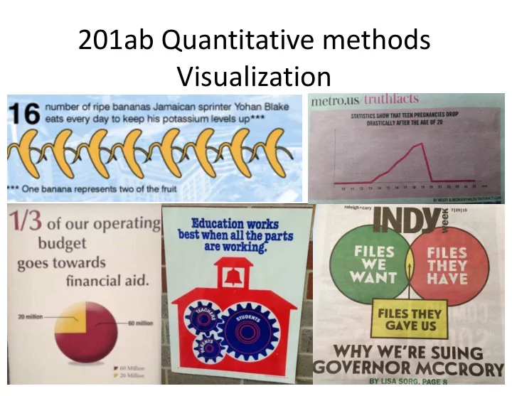
201ab Quantitative methods Visualization E D V UL | UCSD Psychology - - PowerPoint PPT Presentation
201ab Quantitative methods Visualization E D V UL | UCSD Psychology Visualization failure modes Cool vs informative visualizations Ways graphs can mislead Making a graph pretty ggplot: grammar of graphics E D V UL | UCSD
ED VUL | UCSD Psychology
ED VUL | UCSD Psychology
ED VUL | UCSD Psychology
ED VUL | UCSD Psychology
ED VUL | UCSD Psychology
ED VUL | UCSD Psychology
ED VUL | UCSD Psychology
Credit: xkcd
ED VUL | UCSD Psychology
ED VUL | UCSD Psychology
ED VUL | UCSD Psychology
ED VUL | UCSD Psychology
ED VUL | UCSD Psychology
Credit: xkcd
ED VUL | UCSD Psychology
ED VUL | UCSD Psychology
ED VUL | UCSD Psychology
ED VUL | UCSD Psychology
ED VUL | UCSD Psychology
ED VUL | UCSD Psychology
ED VUL | UCSD Psychology
ED VUL | UCSD Psychology
From dynamicdiagrams.com
ED VUL | UCSD Psychology
From dynamicdiagrams.com
ED VUL | UCSD Psychology
From dynamicdiagrams.com
ED VUL | UCSD Psychology
From dynamicdiagrams.com
ED VUL | UCSD Psychology
24 This one.
comparisons, or extract numbers This is a bad scientific data display But it is a cool visualization This one.
magnitudes.
comparisons, and extract numbers This is a good scientific data display But might not be as interesting a visualization
ED VUL | UCSD Psychology
ED VUL | UCSD Psychology
ED VUL | UCSD Psychology
ED VUL | UCSD Psychology
ED VUL | UCSD Psychology
May have gone a bit overboard into “visualization” territory – looks good, but starts violating some conventions:
ED VUL | UCSD Psychology
ED VUL | UCSD Psychology
library(ggplot2) Fig <- ggplot(data=..., mapping=aes(...)) + facet_*() + geom_*() + stat_*() + scale_*() + theme*()
ED VUL | UCSD Psychology
ED VUL | UCSD Psychology
ED VUL | UCSD Psychology
ED VUL | UCSD Psychology
How does height (numerical response) vary across sex (categorical), nationality (categorical), and parents’ income (numerical):
ED VUL | UCSD Psychology
(1 categorical response variable, with 0 explanatory variables)
Pie chart
++ easiest proportion
Histogram barplot of counts ++ Easiest comparisons
Stacked bar plot + easy-ish comparisons + easy-ish proportion + socially acceptable pie chart Data: http://vulstats.ucsd.edu/data/spsp.demographics.cleaned.csv
ED VUL | UCSD Psychology
(1 categorical response variable, with 0 explanatory variables)
Data: http://vulstats.ucsd.edu/data/spsp.demographics.cleaned.csv Counts: highlight sample size when n is small proportions: easier interpretation.
ED VUL | UCSD Psychology
(1 numerical response variable, with 0 explanatory variables)
Smoothed density
+ not too sensitive to reasonable kernel width. Histogram + Portrays noisiness.
Data: http://vulstats.ucsd.edu/data/cal1020.cleaned.Rdata
ED VUL | UCSD Psychology
(1 numerical response variable, with 0 explanatory variables)
ED VUL | UCSD Psychology
(1 numerical response variable, with 1 categorical explanatory variable)
Mean+error boxplot Jitter Useful when n is small violin Useful when n is large densities
(coords flipped)
Emp CDF
(coords flipped)
Best when coords not flipped, Best for few categories (<4?). Easy stat. comparison
ED VUL | UCSD Psychology
Credit: xkcd
ED VUL | UCSD Psychology
(1 numerical response variable, with 1 categorical explanatory variable)
ED VUL | UCSD Psychology
(my suggestions)
With small n: Show all the data points with jitter (here, data are sub- sampled to generate a low n scenario) With large n: Show distribution with violin or density.
ED VUL | UCSD Psychology
(eclectic plots, useful with large n, weird distributional differences)
Overlayed density/histograms With large n can show weird differences. Cumulative distribution functions Highlights differences in the tails. Only useful with really large n (so tails aren’t just noise).
ED VUL | UCSD Psychology
(1 numerical response variable, with 1 numerical explanatory variable)
Scatterplot: Best option with small n. Hard to make legible with large n. 2D histogram heatmap: Useless for small n. Best option with large n.
ED VUL | UCSD Psychology
(1 numerical response variable, with 1 numerical explanatory variable)
Conditional means This will require binning by x. Fitted conditional means Very rarely should you show these on their
Generally: use method=lm, rather than loess.
ED VUL | UCSD Psychology
Credit: xkcd
ED VUL | UCSD Psychology
(my recommendation)
My recommendation: Show data, show fit.
ED VUL | UCSD Psychology
(1 numerical response variable, with 1 numerical explanatory variable)
Normalization by x useful when you don’t care about distribution over x. Note: you are unlikely to luxuriate in this much data.
ED VUL | UCSD Psychology
(1 numerical response, with numerical & categorical explanatory variable)
Color-coded scatterplot Hard to parse with lots of data. Fitted lines / conditional means. Show error bars. If y is smooth in x, show conditional means (as in here). Bin width matters. Note importance of explanatory variable on the x axis!
ED VUL | UCSD Psychology
(1 numerical response, with numerical & categorical explanatory variable)
If scatterplots are important, split into facets with large n. If line comparison is important, keep in same panel.
ED VUL | UCSD Psychology
ED VUL | UCSD Psychology
ED VUL | UCSD Psychology
ED VUL | UCSD Psychology
ED VUL | UCSD Psychology
ED VUL | UCSD Psychology
Make plots to…
personality traits:
conscientiousness and grit?
ED VUL | UCSD Psychology
ED VUL | UCSD Psychology
(2 categorical response variable, with 0 explanatory variables)
ED VUL | UCSD Psychology
(1 categorical response variable, with 1 categorical explanatory variable)
ED VUL | UCSD Psychology
(1 categorical response variable, with 1 numerical explanatory variable)
Stacked area charts. Generally, must round/bin numerical variable. Stacked counts show the distribution of numerical variable. Proportions show how categorical variable changes.
ED VUL | UCSD Psychology
(with small n, binning must be very coarse; most useful with large n)
ED VUL | UCSD Psychology
Same data, but they invite different comparisons and interpretations.
ED VUL | UCSD Psychology
(1 numerical response variable, with 1 categorical explanatory variable)
ED VUL | UCSD Psychology
(1 numerical response variable, with 2 categorical explanatory variable)
Notes: can’t show error, so it better be tiny (as in here, with enormous n). Which comparisons jump out is determined by number -> color mapping, so be careful.
ED VUL | UCSD Psychology
(1 numerical response variable, with 2 numerical explanatory variable)
Heat map or surface plot Generally your data need to be: complete, smooth, abundant Bubble chart: Comparisons across dot size are not easy, so that shouldn’t be a very important variable.
ED VUL | UCSD Psychology
(2 numerical response variable, with 1 numerical explanatory variable)
Double-axis plot. Usually a terrible idea.
ED VUL | UCSD Psychology