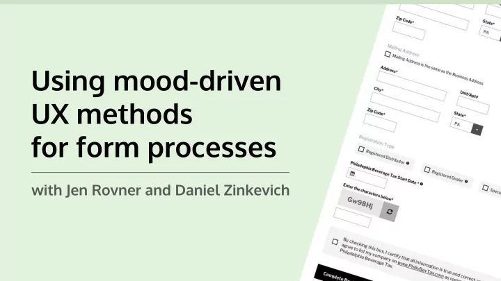
SLIDE 1
Using mood-driven UX methods for form processes
with Jen Rovner and Daniel Zinkevich
SLIDE 2
Jen Rovner Daniel Zinkevich
Lead UX/UI Designer Full Stack Developer
SLIDE 3
Forms we’ve recently improved
SLIDE 4
Before After
SLIDE 5
Before After
SLIDE 6
What are some common pain points we run into on forms?
SLIDE 7
Confusing field label placement
SLIDE 8
Completion button outside of expected area
SLIDE 9
Little to no size variation of fields
SLIDE 10
Fields not being chunked
SLIDE 11
Errors on submission clears all fields
SLIDE 12
What is the deeper issue we run into on forms?
SLIDE 13
We’re lazy.
SLIDE 14
Here to help at a base level:
The Laws of UX by Jon Yablonski
https://lawsofux.com/
SLIDE 15
Hick’s Law:
The time it takes to make a decision increases with the number and complexity of choices.
SLIDE 16
Tesler's Law (The Law of Conservation of Complexity):
For any system there is a certain amount of complexity which cannot be reduced
SLIDE 17
Zeigarnik Effect:
People remember uncompleted or interrupted tasks better than completed tasks.
SLIDE 18
Serial Position Effect:
Users have a propensity to best remember the first and last items in a series.
SLIDE 19
The Pareto Principle:
For many events, roughly 80% of the effects come from 20% of the causes.
SLIDE 20
How do we add these laws and mood in the form design equation?
SLIDE 21
The initial assumption method
Establish personality-based goals
SLIDE 22
SLIDE 23 Initial personality assumptions: Campers
- Generally not in a rush (positive)
- Mostly on the calm side (positive)
- Appreciate a serene type of aesthetic (positive)
- Can handle a challenge (positive)
- May potentially be on the less tech-savvy side (negative)
SLIDE 24 Initial user type assumptions: Campers
- Seasoned campers who know what they’re
looking for, and confidently select it. (mostly positive, but high expectations)
- Campers with moderate knowledge of what they need,
but could use a little assistance and comparing. (most neutral, but biggest target audience to keep happy)
- New campers who have no idea where to begin, and are
- verwhelmed by the options. (mostly negative)
SLIDE 25 Initial personality-based goals: Campers
- Maintain calm excitement with layouts and processes
driven by images and white space.
- Provide an optional guide for purchasing to ease
a potentially overwhelmed state.
- Have clear outlines of the product details at each stage
- f the process for all user types.
- Include bold, friendly messaging that can be slightly
playful, yet concise.
SLIDE 26
SLIDE 27
SLIDE 28
SLIDE 29
SLIDE 30
SLIDE 31
The task analysis method
Mood mapping to gather places of opportunity
SLIDE 32
SLIDE 33 Highlights of the core user persona: CPA Accountant
- Manages many accounts mostly around the third week of the month
- Is used to working with long forms
- Has many processes to perform on the portal most days
- Accesses the portal with moderately low stress
- Has a more difficult time with government form portals than internal
accounting portals
SLIDE 34 Personality & role-based goals: CPA Accountant
- Make finding and creating accounts a simpler process
- Combine form field groups for less pages to click through
- Give quick access to return views per account
- Add more outlets for exporting tax forms and data for clients
- Provide statuses and date reminders per account
SLIDE 35
SLIDE 36
SLIDE 37
SLIDE 38
SLIDE 39
SLIDE 40
SLIDE 41
SLIDE 42 Highlights of our second core user persona: Small business owners
- Paying monthly hurts their business
- Has one account to manage
- Logs on once a month on average
- Requires visual clues (English knowledge may be low)
- Is avoiding the need for help from an accountant
SLIDE 43 Personality & role-based goals: Small business owner
- Decrease the length of form field labels
- Give quicker access to current month payment
- Make paying and amending returns available at multiple steps
- Show what their payment helps in the city
SLIDE 44
SLIDE 45
SLIDE 46
SLIDE 47
SLIDE 48
SLIDE 49
SLIDE 50
SLIDE 51
What can we consistently add to forms to improve our users’ mood?
SLIDE 52
Make dropdowns searchable
SLIDE 53
Chunk long forms into sections
Use the Serial Positioning Effect to make the first and last section the lowest level of effort
SLIDE 54
SLIDE 55
Add tooltips, descriptions under fields, or hover info to non-obvious field labels
SLIDE 56
Add real-time validation when applicable
Keep the Zeigarnik Effect in mind. Make sure users are immediately aware of incomplete tasks.
SLIDE 57 Keep consistent eye patterns
Image courtesy of Pinterest.com
SLIDE 58
On mobile, put submission buttons towards the bottom center (or full-width) of screen
SLIDE 59
Set your form fields to autocomplete
SLIDE 60
Add placeholder text when it adds context, not clutter
SLIDE 61
CHALLENGE TIME
SLIDE 62 Out of the box technologies used
- Bootstrap theme https://www.drupal.org/project/bootstrap )
- Field_group module for vertical tabs
https://www.drupal.org/project/field_group
- HTML5 form validation
- Drupal Core for field help description
- Select2 for filterable selects (https://select2.org/)
- Jquery/css for big radio buttons
- Address Module for address https://www.drupal.org/project/address
SLIDE 63 Gotchas
- Radio button labels were fieldset legends with different styles
- Text fields were full width by default
- Save button had unclear text (What does "Save" mean? What will
happen when I click it?)
- Save button was small and in the wrong corner
- I needed to write an alter hook to set the US as the default country
- Address fieldsets bumped fields out of vertical alignment
- Labels were inline by default
- HTML5 form validation doesn't select on vertical tabs - patch
forthcoming?
- Date field felt VERY clunky
SLIDE 64
Thank you! Questions?