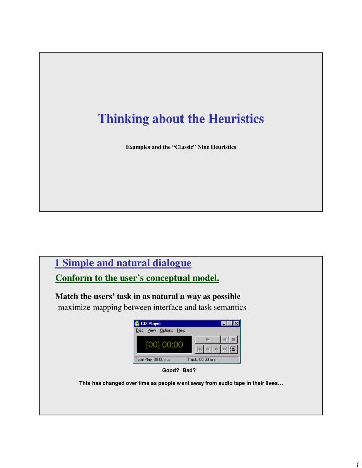
Thinking about the Heuristics Examples and the Classic Nine - - PDF document

thinking about the heuristics
SMART_READER_LITE
LIVE PREVIEW

Thinking about the Heuristics Examples and the Classic Nine - - PDF document

Thinking about the Heuristics Examples and the Classic Nine Heuristics 1 Simple and natural dialogue Conform to the users conceptual model. Match the users task in as natural a way as possible maximize mapping between interface and


slide-1
SLIDE 1

1

Thinking about the Heuristics

Examples and the “Classic” Nine Heuristics

1 Simple and natural dialogue

Conform to the user’s conceptual model.

Match the users’ task in as natural a way as possible maximize mapping between interface and task semantics

Good? Bad? This has changed over time as people went away from audio tape in their lives…

slide-2
SLIDE 2

2

1 Simple and natural dialogue

Present exactly the information the user needs.

less is more

–less to learn, to get wrong, to distract...

information should appear in natural order

–related information is graphically clustered –order of accessing information matches user’s expectations

remove or hide irrelevant or rarely needed information

–competes with important information on screen

use windows frugally

–don’t make navigation and window management excessively complex

2 Speak the users’ language

slide-3
SLIDE 3

3

2 Speak the users’ language

Use terminology based on users’ language for task.

e.g. withdrawing money from a bank machine

Use meaningful mnemonics, icons, and abbreviations.

eg: File / Save

–Ctrl + S (abbreviation) –Alt F S (mnemonic for menu action) –Floppy Disk (tooltip icon)

Bad Better NOTE: This could fall under #7 providing shortcuts.

2 Speak the users’ language

Consider a virus detection program that may have to be

  • ccasionally turned off.

One option would be to have an “override mode” that when activated would turn off the virus detection.

But this would be on when the user wanted the utility to be off – conflicting with the users’ model Alternatively, a checkbox that was on when the utility would be on would speak the users’ language.

slide-4
SLIDE 4

4

3 Minimize user’s memory load

Promote recognition over recall.

  • computers are good at remembering thing, people not as much…
  • menus, icons, choice dialog boxes vs command lines, field formats
  • relies on visibility of objects to the user (but less is more!)

Bad Better

3: Minimize user’s memory load

Describe required input format and provide an example or a default

  • r a selection interface.

Small number of rules applied universally.

generic commands

– same command can be applied to all interface objects

  • interpreted in context of interface object

– copy, cut, paste, drag ’n drop, ... for characters, words, paragraphs, circles, files

Bad Better

slide-5
SLIDE 5

5

4: Be consistent

Consistency of effects.

same words, commands, actions will always have the same effect in equivalent situations

– predictability

Consistency of language and graphics.

same information/controls in same location on all screens / dialog boxes

  • forms follow boiler plate
  • same visual appearance across the system (e.g. widgets)

– e.g. different scroll bars in a single window system!

Consistency of input.

consistent syntax across complete system

Ok Cancel Ok Cancel Done Never Mind Accept Dismiss Cancel Ok

4: Be consistent

In application suites, have individual applications consistent with the

  • ther individual applications in the suite.

PowerPoint 2016 Word 2016

  • vs-
slide-6
SLIDE 6

6

4: Be consistent

In application suites, have individual applications consistent with the

  • ther individual applications in the suite.

All from same “suite” of programs?

4: Be consistent

There are often style guides for product lines, but if not, you might bring up the idea with the team.

An example page from the OS X interface guidelines for dialogs:

https://developer.apple.com/macos/human-interface-guidelines/windows-and-views/dialogs/

An example page from the Windows interface guidelines for dialogs:

https://msdn.microsoft.com/en-us/library/windows/desktop/bb246466(v=vs.85).aspx

Each platform has a different “standard” (OK first for a natural reading order versus OK last for the typical choice being the last that you read) which brings up the question of platform-consistency.

slide-7
SLIDE 7

7

5: Provide feedback

Continuously inform the user about.

  • what it is doing
  • how it is interpreting the user’s input
  • user should always be aware of what is going on

What’s it doing? Time for coffee.

  • 5. Provide feedback

What did I select? What mode am I in now? How is the system interpreting my actions?

slide-8
SLIDE 8

8

  • 5. Provide feedback

Should be as specific as possible, based on user’s input. Best within the context of the action rather than with a dialog box.

Bad Better

  • 5. Provide feedback

Response time is important…

how users perceive delays

0.1 second max: perceived as “instantaneous” 1 seconds max: user’s flow of thought stays uninterrupted, but delay noticed 10 seconds: limit for keeping user’s attention focused on the dialog > 10 seconds: user will want to perform other tasks while waiting and might think that the application has failed

If you are waiting for someone else, how do you know?

Think about things like IM or Facebook or other multi-person communication systems letting you know the other person is typing…

slide-9
SLIDE 9

9

  • 5. Provide feedback

Dealing with long delays…

Cursors

– for very short transactions

Percent-done dialogs (http://dl.acm.org/citation.cfm?id=317459)

– for longer transactions

  • how much left
  • estimated time
  • what it is doing

NOTE: When giving this type of feedback, take care to do so in a meaningful fashion based upon percent of time. For example, if doing a progress bar for an e-mail client, rather than the % of messages sent, use % of size of messages.

“Still Working”

– for unknown/changing times

  • 6. Provide clearly marked exits
slide-10
SLIDE 10

10

  • 6. Provide clearly marked exits

Users don’t like to feel trapped by the computer!

should offer an easy way out of as many situations as possible Strategies:

  • Cancel button (for dialogs waiting for user input)
  • Universal Undo (can get back to previous state)
  • Interrupt (especially for lengthy operations)
  • Quit (for leaving the program at any time)
  • Defaults (for restoring a property sheet)

Core Dump

  • 7. Provide shortcuts

Experienced users should be able to perform frequently used operations quickly!

Strategies: keyboard and mouse accelerators

– abbreviations, command completion, menu shortcuts, function keys, double clicking versus menu selection

type-ahead (allow for entering input before the system is “ready” for it)

– note that this can be confusing in certain situations

navigation jumps

– going to window/location directly, and avoiding intermediate nodes (eg: avoid going from one page of

  • ptions to another page of options)

history systems

– how many of your web page visits are probably to places you’ve been before – make use of the histories of other users too (can raise privacy issues)

  • consider how Google Search does this…
slide-11
SLIDE 11

11

Keyboard accelerators for menus Customizable toolbars and palettes for frequent actions Split menu, with recently used fonts on top Right-click raises

  • bject-specific

context menu Scrolling controls for page-sized increments Right-click raises toolbar dialog box Alternate representations for quickly doing different set of tasks

slide-12
SLIDE 12

12

8: Deal with errors in a positive and helpful manner People will make errors – plan for it!

Categories of errors users make:

Mistakes

– arise from conscious deliberations that lead to an error instead of the correct solution

Slips

– unconscious behavior that gets misdirected en route to satisfying goal e.g. plan to drive to store, end up at your office – shows up frequently in skilled behavior usually due to inattention – often arises from similarities of actions

http://dilbert.com/strip/2010-05-20

slide-13
SLIDE 13

13

Types of slips

Capture error (habit) A frequently performed activity/task can have you running “on autopilot” instead of making the choice you intended this time. This occurs when common and rarer actions have same initial sequence –William James made observations in Psychology: The Briefer Course in 1890 about odd triggers like going upstairs to change clothes for dinner on an occasion but starting to get ready for bed out

  • f habit. He also commented, “Could the young but realize how

soon they will become mere walking bundles of habit they would give more heed to their conduct while in the plastic state.” – A more modern problem is confirm saving of a file when you don’t want to replace it or saying to exit without saving when you meant to save it.

Types of slips

Description error: intended action has much in common with others that are possible

–usually occurs when right and wrong objects physically near each other –pour juice into bowl instead of glass –go jogging, come home, throw sweaty shirt in toilet instead of laundry basket –move file to trash instead of to folder

Loss of activation: forgetting what the goal is while undergoing the sequence of actions

–start going to room and forget why you are going there –navigating menus/dialogs and can’t remember what you are looking for –but continue action to remember (or go back to beginning)!

Mode errors: people do actions in one mode thinking they are in another

–refer to file that’s in a different directory –look for commands / menu options that are not relevant

slide-14
SLIDE 14

14

Designing for slips

General rules

  • Prevent slips before they occur
  • Detect and correct slips when they do occur
  • User correction through feedback and undo

Examples

  • capture errors

– instead of confirmation, make actions undoable – allows reconsideration of action by user e.g. “recycle” bin in OS can be opened and “deleted” file taken back out

  • description errors

– for icon-based interfaces, make sure icons are not too similar – check for reasonable input, etc.

  • loss of activation

– if system knows goal, make it explicit – if not, allow person to see path taken

  • mode errors

– have as few modes as possible (preferably none) – make modes highly visible

Generic system responses for errors

Interlock deals with errors by preventing the user from continuing

–eg cannot delete an object if none are selected

Warn

  • warn people that an unusual situation is occurring
  • when overused, becomes an irritant – for example…

audible bell alert box

slide-15
SLIDE 15

15

Generic system responses for errors continued...

Do nothing

  • illegal action just doesn’t do

anything

  • user must infer what happened

–enter letter into a numeric-only field (key clicks ignored) –put a file icon on top of another file icon (returns it to original position)

Self-correct

  • system guesses valid action and

does it instead

  • but leads to a problem of trust

–spelling corrector

Lets talk about it

  • system initiates dialog with user to

come up with solution to the problem

–compile error brings up offending line in source code

Teach me

  • system asks user what the action

was supposed to have meant

  • action then becomes a valid one

HUH ?!?

8 Deal with errors in a positive and helpful manner

slide-16
SLIDE 16

16

8 Deal with errors in a positive and helpful manner

http://dilbert.com/strip/2000-04-30

8 Deal with errors in a positive and helpful manner

Provide meaningful error messages!

error messages should be in the user’s language (preferably task language) don’t make people feel stupid Bad

Try again… Error 25 Cannot open this document.

Better?

Cannot open “Chapter 5.docx” because the application “Microsoft Word” is not on your system. Cannot open “Chapter 5.docx” because the application “Microsoft Word” is not on your system. Open it with “GoogleDocs” instead?

slide-17
SLIDE 17

17

8 Deal with errors in a positive and helpful manner

Prevent errors or provide checks on input data.

try to make errors “impossible” to make modern widgets: only “legal commands” selected, or “legal data” entered (which if these might allow you to enter February 29th, 2014?) if entering numbers, have “normal” and “abnormal” ranges

– “5000 pencils is an unusually large order. Do you really want to order that many?” – “Most products are listed as $1.00, are you sure this one is $0.01?”

8 Deal with errors in a positive and helpful manner

If you know a certain type of error is common and very bad, do you prepare for it and alert the user, as Office 2013 does, and give them a chance to avoid a potential error? Or do you prepare for it, alert the user, and also have an announced “ooops” recovery option, like Office 2010 did? …or do you just avoid it completely as some systems, like Google Drive, do by just removing, for example, the thought of saving from the user by making it automatic and mandatory (and trusting the browser won’t let you close a tab/window without warning you if auto-save is pending)

slide-18
SLIDE 18

18

  • 9. Provide help

Help is not a replacement for bad design!

  • 9. Provide help

Help is not a replacement for bad design! Simple systems: Should be used to walk up and use

–minimal instructions needed

Most other systems:

  • Many features available…
  • Some users will want to become “experts” rather than “casual” users

either right away or over time.

  • Even intermediate users need reminding at times and there should be a

good path toward learning things.

slide-19
SLIDE 19

19

Documentation and how it is used

NOTE: Many users do not read manuals/documentation.

they prefer to spend their time actually pursuing their task!

Usually used when users are in some kind of panic, they will want (and perhaps need) immediate help.

  • indicates need for online documentation, good search/lookup tools
  • online help can be specific to current context
  • Kindle “Mayday” option? Siri/Cortana/GoogleNow option?

NOTE: paper or CD manuals were unavailable in many business environments so online/embedded help took over, then people started to just hit their favorite search engine or support site

Sometimes documentation is used for quick reference in advance.

  • syntax of actions, possibilities...
  • list of shortcuts ...

Types of help

Tutorial and/or getting started manuals

short guides that people are likely to read when first obtaining their systems

– encourages exploration and getting to know the system – tries to get conceptual material across and essential syntax

  • n-line “tours”, exercises, and demos

– demonstrates very basic principles through working examples Why weren’t Clippy and his ilk well received by many?

slide-20
SLIDE 20

20

Types of help

Tips to the user

  • can provide migration path to learning system features
  • also context-specific tips on being more efficient
  • must be “smart”, otherwise boring and/or tedious and/or interrupts user’s work flow

(ie: Office Assistant had good and bad elements)

Types of help

Reference manuals

embedded ones used mostly for detailed lookup by “expert” users

– rarely introduces concepts – table of contents, index, cross-index – thematically arranged

  • n-line web pages commonly used by typical users

– think about search (and SEO)

slide-21
SLIDE 21

21

Types of help

Reminders to the user. short reference cards used to be VERY popular

–expert user who just wants to check facts –novice who wants to get overview of system’s capabilities

keyboard templates used to be VERY popular

–shortcuts/syntactic meanings of keys; recognition vs. recall; capabilities

tooltips are STILL very popular!

–text over graphical items indicates their meaning or purpose –no way to do this with touch interfaces

Types of help

Context-sensitive help.

system provides help on the interface component the user is currently working with

– Macintosh “balloon help” – Microsoft “What’s this” help

  • brief help explaining whatever the user is pointing at on the screen

Title bar To move the window, position the pointer in the title bar, press the button, and drag it to the new position

slide-22
SLIDE 22

22

Types of help

Wizards specific to task.

walks the user through stages of typical tasks but very frustrating if the user gets stuck within it