
SLIDE 1
2016/05/20 1 The Art of Confident Public Speaking
Postgraduate Skills Programme
Vicky Davis
BDram, MDram Acknowledgements to Corina du Toit (co-author of this workshop)
POWERPOINT SLIDES
Avoiding the Pitfalls of Bad Slides
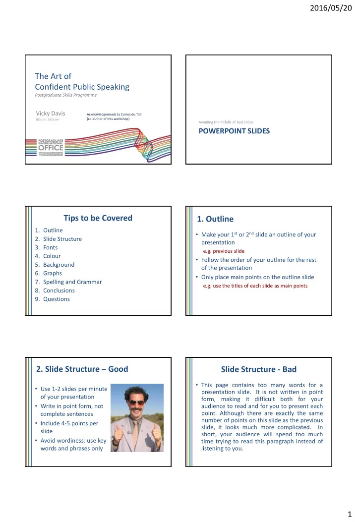
Tips to be Covered
- 1. Outline
- 2. Slide Structure
- 3. Fonts
- 4. Colour
- 5. Background
- 6. Graphs
- 7. Spelling and Grammar
- 8. Conclusions
- 9. Questions
- 1. Outline
- Make your 1st or 2nd slide an outline of your
presentation
e.g. previous slide
- Follow the order of your outline for the rest
- f the presentation
- Only place main points on the outline slide
e.g. use the titles of each slide as main points
- 2. Slide Structure – Good
- Use 1-2 slides per minute
- f your presentation
- Write in point form, not
complete sentences
- Include 4-5 points per
slide
- Avoid wordiness: use key
words and phrases only
Slide Structure - Bad
- This page contains too many words for a
presentation slide. It is not written in point form, making it difficult both for your audience to read and for you to present each
- point. Although there are exactly the same